|
| Group |
Round |
C/R |
Comment |
Date |
Image |
| 71 |
Aug 25 |
Reply |
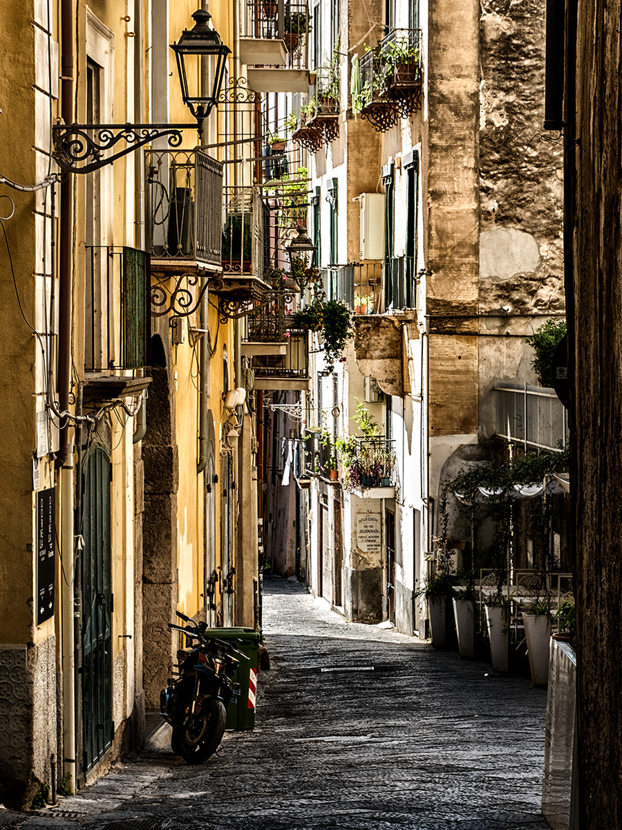
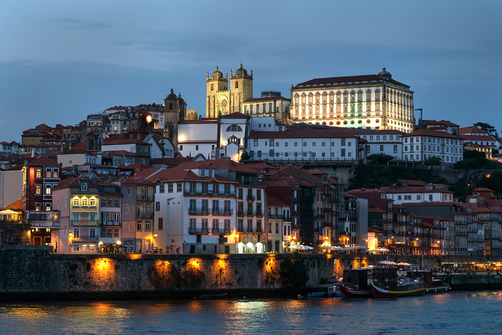
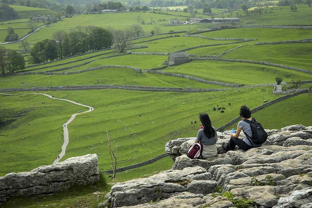
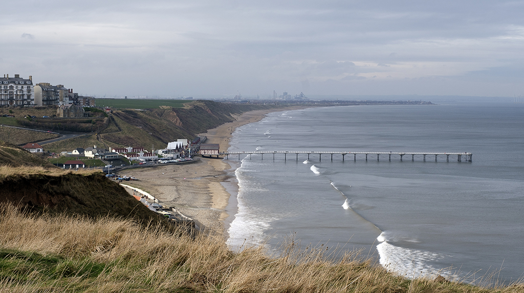
Thanks Spring it is a lovely part of the Country and one we hadn't walked before.
Thanks Tom, I also liked John's edit and the suggestion from Michele re: flatness was spot on.
|
Aug 13th |
| 71 |
Aug 25 |
Comment |
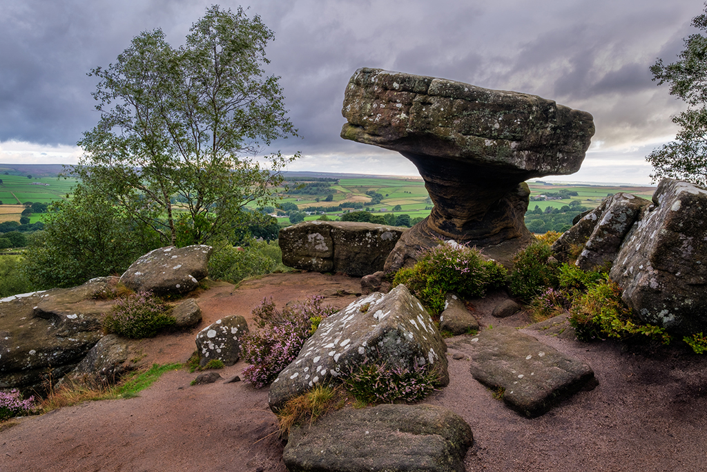
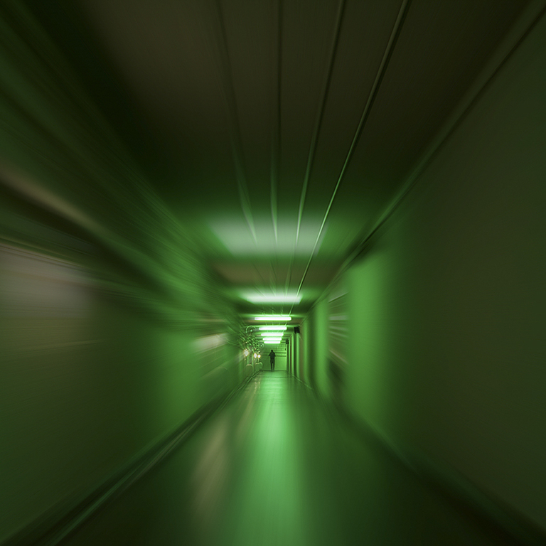
Thanks guys for your feedback. It was never meant to be a competition entry so maybe I've been a bit lazy in PP!
I agree about the flatness and tweaked it a bit Michele, thank you. Also agree that the image is better 16:9 without the sky John, thank you.
I think the appearance might be down to compression Dennis, the original is really nice - thank you.
|
Aug 9th |
 |
| 71 |
Aug 25 |
Comment |
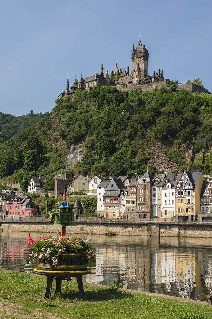
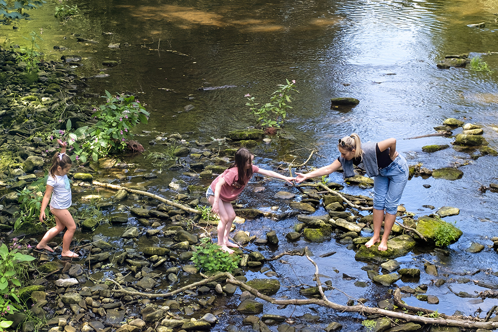
I also think it looks a bit overdone but the composition could be improved as well. There's a little too much greenery on the left hand side and in an ideal world I'd like to see the stream running into the left hand bottom corner. This would have meant stepping a few paces to the right (if you could that is). Doing this would also have given you a less square on view of the waterwheel and we would have seen more of the spokes. A lovely spot to photograph though. |
Aug 7th |
| 71 |
Aug 25 |
Comment |
Funny that when there's a super image like this less comment is more. Lovely capture John.
|
Aug 7th |
| 71 |
Aug 25 |
Comment |
For 1/200 second exposure you've captured this well Mike. We have them around us and they're incredibly fast. I agree the image is a little soft but I think you could use some clarity and/or vibrance to bring out the birds' throats especially. Worth having this image in your collection for sure. I think you have to take 1000's of these to get the perfect shot that we all see in nature magazines. |
Aug 7th |
| 71 |
Aug 25 |
Comment |
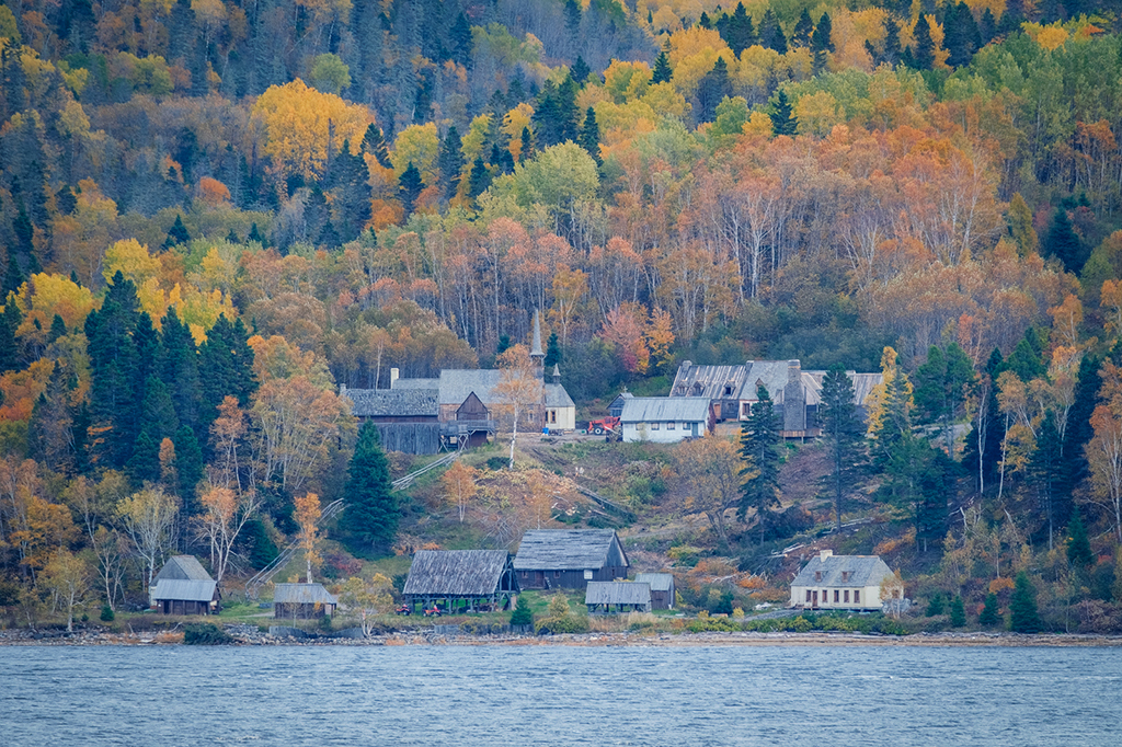
Been here myself - a lovely place with all the fish congregating in all the little side pools. I agree with Mike that the saturation levels overall are a little too much but I think this is more evident in the trees where I believe you've accentuated the tonal range just a little too much. The water tends to carry a fair bit of colour in it so that's not as overcooked. The exposure time does the water justice for that kind of presentation. |
Aug 7th |
| 71 |
Aug 25 |
Comment |
I'm pleased you included the mono version of this one Michele and that's the one I prefer. Looking at the original image I like the colour of the water better than the edited version. Having said that, your edited temple is much much nicer than the original. The sky isn't very appealing in either edit but you've brought some detail out in the mono version. I like the exposure time to flatten the water out because this leaves us less distraction so we can concentrate on the lovely temple. |
Aug 7th |
| 71 |
Aug 25 |
Comment |
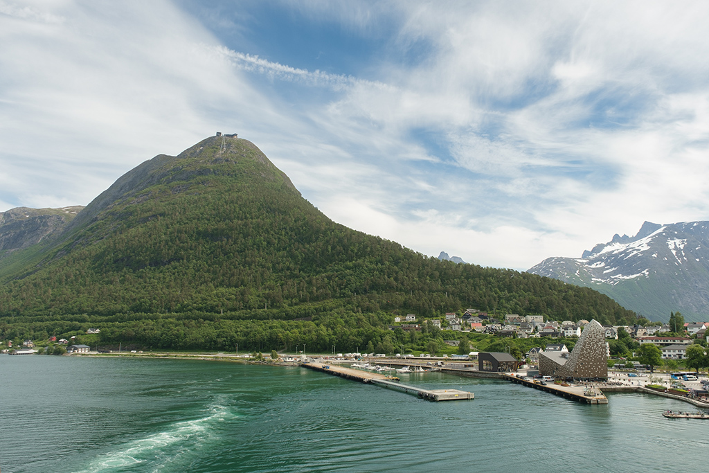
I agree with Mike about the difference between the two different blues. One is definitely cyanish and the other is blueish so it looks unnatural. The overall idea of capturing the reflection is a good one. All the detail you want to look at is centrally placed so I would have been tempted to concentrate on the middle of the image and make it into a square crop. You have to be a little careful about composition because you've missed off the top of the spire both on the main image and on the reflection. If you were to enter this into a competition, judges would mark you down for that. Nevertheless, a good spot. |
Aug 7th |
7 comments - 1 reply for Group 71
|
7 comments - 1 reply Total
|