|
| Group |
Round |
C/R |
Comment |
Date |
Image |
| 71 |
Jun 24 |
Comment |
Can't add anything about the crop John - that would work well.I'd probably pop the colours a little more but that's personal taste - nothing wrong with your interpretation. |
Jun 18th |
| 71 |
Jun 24 |
Comment |
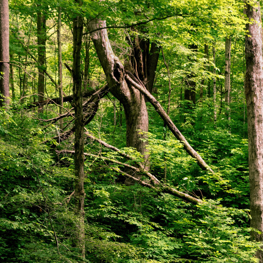
Funny how peoples' perceptions of composition all differ. The thing that caught my eye was the vertical trees to left and right and I thought a square crop would bind this well. I see Michele's point about the diagonal lead in from bottom right but thought the vertical was stronger. I like the colour range and depth. |
Jun 18th |
 |
| 71 |
Jun 24 |
Comment |
Good conversion here Michele and better in mono, I agree. The prominence you've given on conversion, to the bridge itself and the water draws your eyes straight in there. There could be some advantage in giving the image more depth by creating some light in the lighter area of the trees to help break up the tonal range a bit. |
Jun 18th |
| 71 |
Jun 24 |
Comment |
Good colour palette on this image Tom. As with all bridges it's good to get both sides of the water and that's the only thing missing here. All the conical domes are very eye catching and as John said, the central pillars are prominent. |
Jun 18th |
4 comments - 0 replies for Group 71
|
4 comments - 0 replies Total
|