|
| Group |
Round |
C/R |
Comment |
Date |
Image |
| 40 |
Dec 23 |
Reply |
Upon checking your mono edited version I see that the size is 1000 x 667 so am assuming you have blown it up from the original which will also add to the problem. You will get decent results if you work on the RAW file and then crop. |
Dec 11th |
| 40 |
Dec 23 |
Comment |
Hi Don, I came over from Group 71 as I do sometimes, just to take a peek. This image throws up a few questions for me.
The size of the original image when you open it up is 698px x 465px. That's a strange size to be working with. Then I looked at the file size which is just under 1MB and I thought it might be in order to get below the 1MB limit on here. Then I looked at the colour space and it said P3. I thought it must be a phone pic until I saw you had used a Nikon and 50mm lens. What was also surprising was that your ISO is stated to be 100 (I didn't check this) - so the level of noise is a mystery. If I can suggest a couple of things.
Your image size allowed on here is 1024 x 768 and I would have cropped to that size. IF that gave me a file size of over 1MB I would have saved at a reduced format, 7,8,9 or whatever it needed to take it below 1MB. I would also have changed the colour space to sRGB. On closer inspection, the image is quite pixelated and noisy due to the very small crop size. Using Topaz on a file of this size often introduces more artefacts and noise than it cures. I have had a go with the small size myself although its a super shot and I'd love to have had a play with the full sized RAW image. What I did was to crop it, similar to yours, then set the black, white and grey points and converted to mono using a gradient map. I haven't tweaked any further than that but for me, the clouds seem to have a decent level of contrast without being overworked and the roof tiles seem to have a more natural level of tone as well. I hope that's OK.
|
Dec 11th |
 |
1 comment - 1 reply for Group 40
|
| 71 |
Dec 23 |
Reply |
Thanks Mike
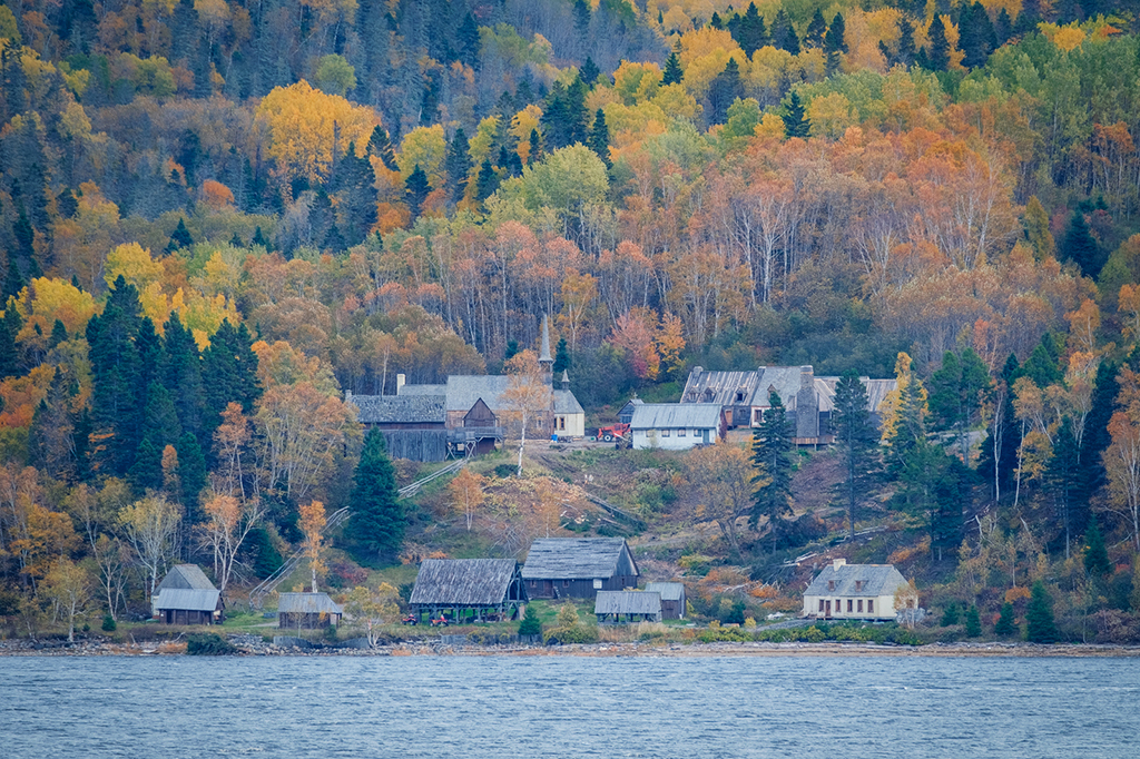
Maybe I ought to submit the image to the cruise company to see if they'll use it and give me a discount in return! |
Dec 14th |
| 71 |
Dec 23 |
Reply |
Thanks Theresa
I hope the next time we go I have the opportunity to take a few more |
Dec 14th |
| 71 |
Dec 23 |
Comment |
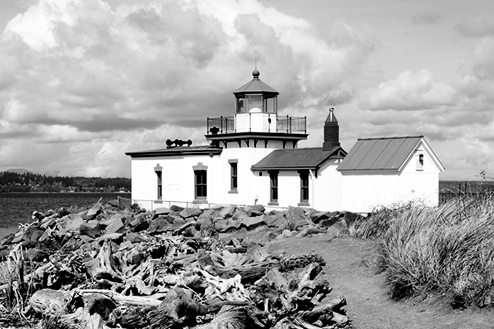
A difficult image to balance because all the interest is in two different areas of the image. I like the effect you've created in the sky, which goes all the way across the image. I also like the height on the right hand side showing the lighthouse. Unfortunately this means that you have the bottom left hand quarter with little interest. There's the dilemna really because if you choose to crop it square to take away the negative space on the left, you lose some of the sky you've created. Which is better I wonder!
Good PP. |
Dec 9th |
| 71 |
Dec 23 |
Comment |
I think we could have had a better composition with a larger moon and more barn to give us more of a focal point. If you didn't want to use the hyperfocal point you could have taken two images, one for the moon and one for the barn and blended them for sharpness. These type of shots also work well when you're in the blue hour. Good idea though. |
Dec 9th |
| 71 |
Dec 23 |
Comment |
I think much the same as Michele concerning the composition and light but I'm personally wondering whether a similar tree on the left would have provided better framing. Try putting the tree on its own layer, flipping it and putting it on the left to see whether that would be an interesting balancer. |
Dec 9th |
| 71 |
Dec 23 |
Comment |
A cracking image Michele. The vantage point is super and the positioning of the lady with her shawl showing the sun through it is great.I'd never thought of using Fluorescent WB to create this light so thanks for the tip! |
Dec 9th |
| 71 |
Dec 23 |
Comment |
Lovely light on the water and whether you've created the accent or it was natural it certainly looks great. Good foreground and an interesting sky. I would only say that the yellow in the foreground looks a little out of keeping with the rest of the image when compared to the original. |
Dec 9th |
| 71 |
Dec 23 |
Comment |
I had to look twice at this to realise it was Cuba. It's not the usual vibrant in your face colour image that you seen from there. There's a good line as Michele says, which takes you all the way through the image. Well taken. |
Dec 9th |
| 71 |
Dec 23 |
Comment |
Thanks Michele
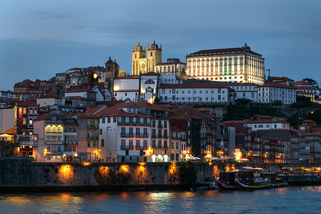
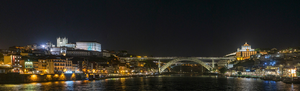
It was the first time we'd been to Porto - we've been to Lisbon a couple of times and thoroughly enjoyed it. Portugal is a much underrated Country. We're going back again next year! On the Douro, I hadn't realised that there were so many birds of prey, there were red kites and Buzzards all along the river so the long lens will be going with me next time. |
Dec 9th |
7 comments - 2 replies for Group 71
|
8 comments - 3 replies Total
|