|
| Group |
Round |
C/R |
Comment |
Date |
Image |
| 71 |
Feb 23 |
Comment |
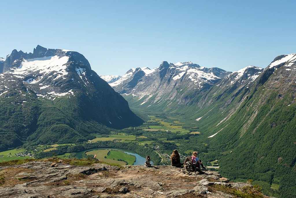
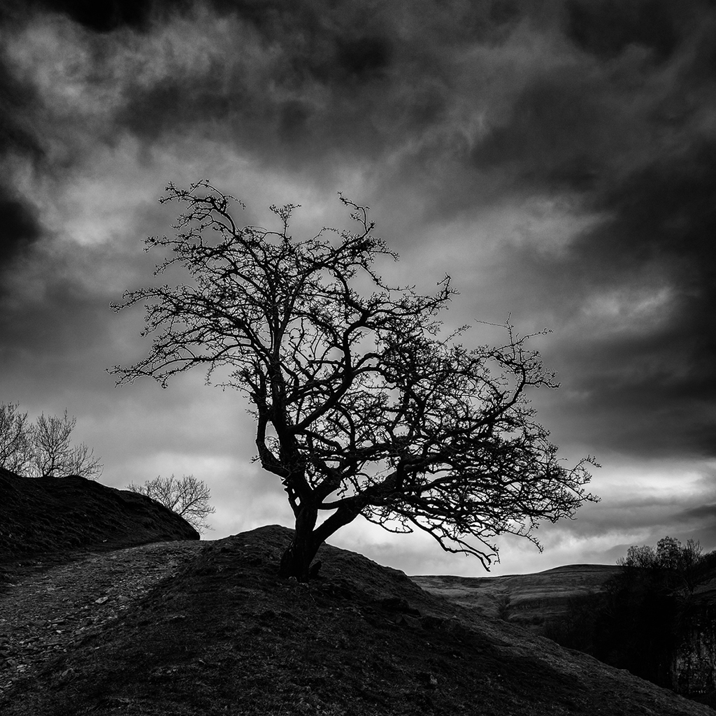
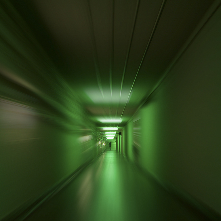
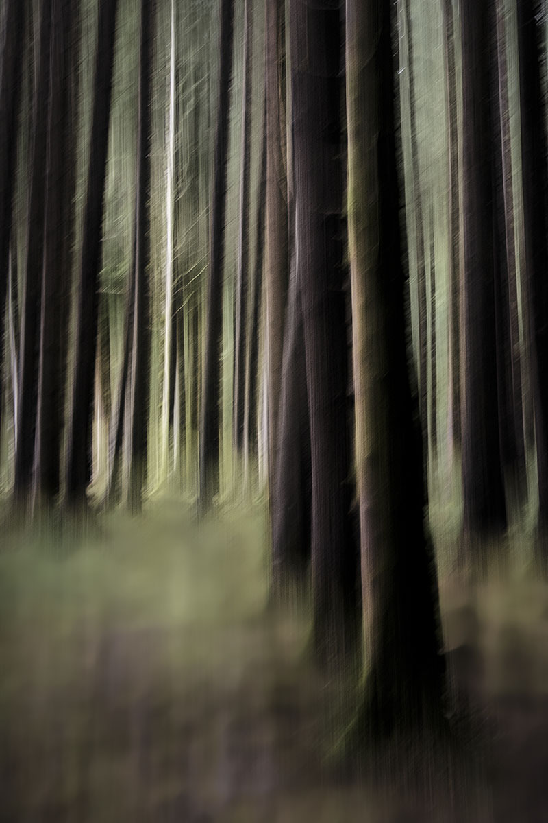
First thing I thought when I saw this was vertical pano just like Tom. Great depth and perspective to the image. I agree about darkening the top bit and I think it would stand a bit more but that's just me. It looks great anyway. There's a lot of green going on and I wondered whether or not it might stand some selective tweaking to differentiate between tree groups. I'll have a play tomorrow!
Well taken John. |
Feb 16th |
| 71 |
Feb 23 |
Reply |
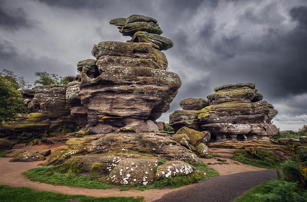
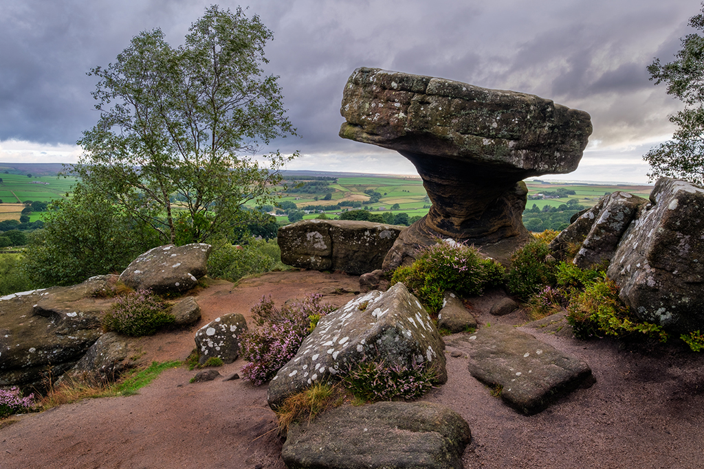
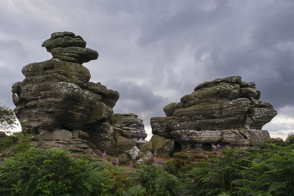
I added some more contrast to the sky and to the rocks and created a little pool of light in the centre to bring out the flowers. Too Much?
|
Feb 10th |
 |
| 71 |
Feb 23 |
Reply |
That's kind Theresa - thank you.
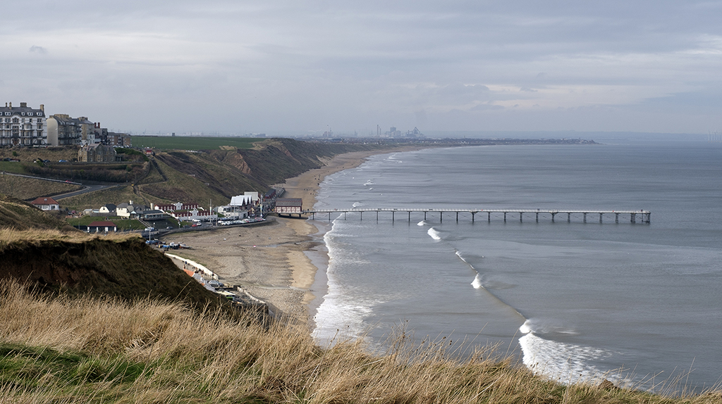
The lighter band was unfortunate but just hung around for a while. Both John and yourself have commented about the sky so it merits another edit I think, together with pulling some more contrast out of the rocks. |
Feb 10th |
| 71 |
Feb 23 |
Reply |
Thanks John, I'm going to have another go at the sky. |
Feb 10th |
| 71 |
Feb 23 |
Comment |
Yes, I think toning down rather than cropping would be my preference Tom, thanks. |
Feb 3rd |
| 71 |
Feb 23 |
Comment |
The idea and title suit the image but I agree that it's a pity they all weren't in focus. An idea with shallow depth of field like this might have been to focus one shot on the coyote and another on the birds, then blend them together. |
Feb 3rd |
| 71 |
Feb 23 |
Comment |
Lucky with that amount of light Michele. I like the composition and the darkening of the brighter spots as Mike suggested works well. Good lead in from the left corner. |
Feb 3rd |
| 71 |
Feb 23 |
Comment |
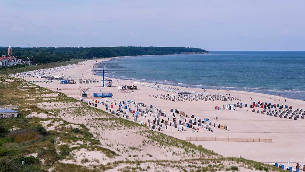
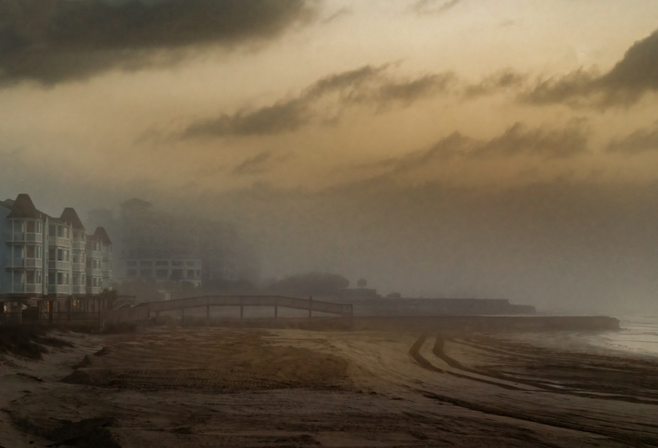
I always like a play with your images Theresa. This one has a good feel to it, a little off the left and base for me and I thought it might look good with the sand and sky warmed up so I used a couple of radial filters and pushed the temperature slider towards yellow and opened the shadows slightly in both cases. Might not be the look you were going for but I'd have been pleased to take it in either case. |
Feb 3rd |
 |
| 71 |
Feb 23 |
Comment |
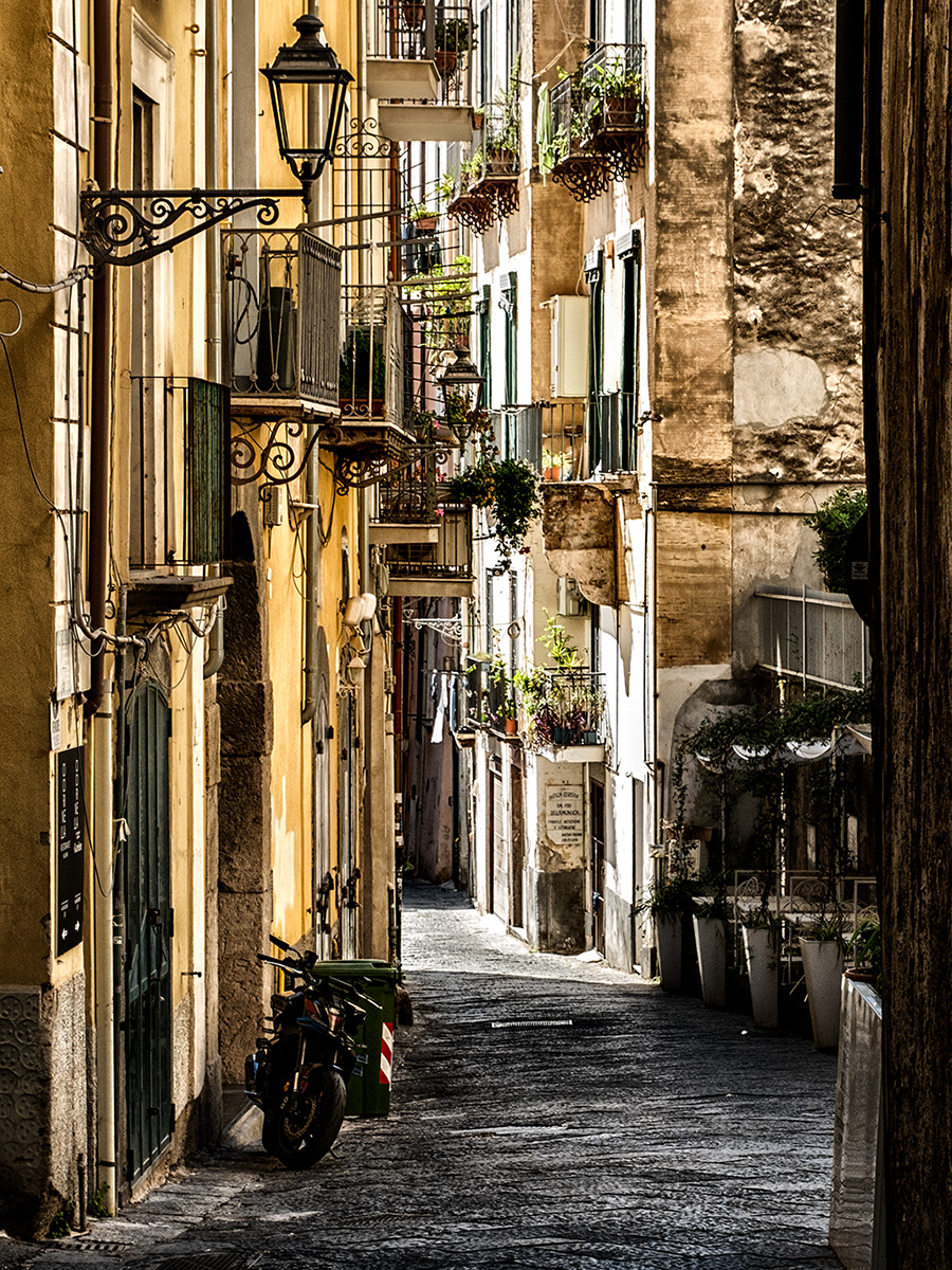
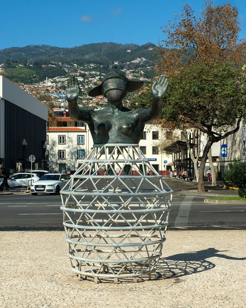
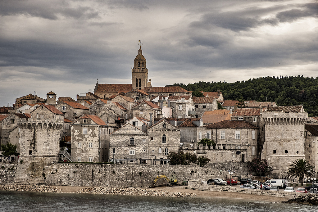
Lighten the faces and straighten the walls is all I'd do. Great spot matching the car and the lady's dress. Some might comment that there's too much foreground but it's good to have something to walk into. Nice! |
Feb 3rd |
| 71 |
Feb 23 |
Comment |
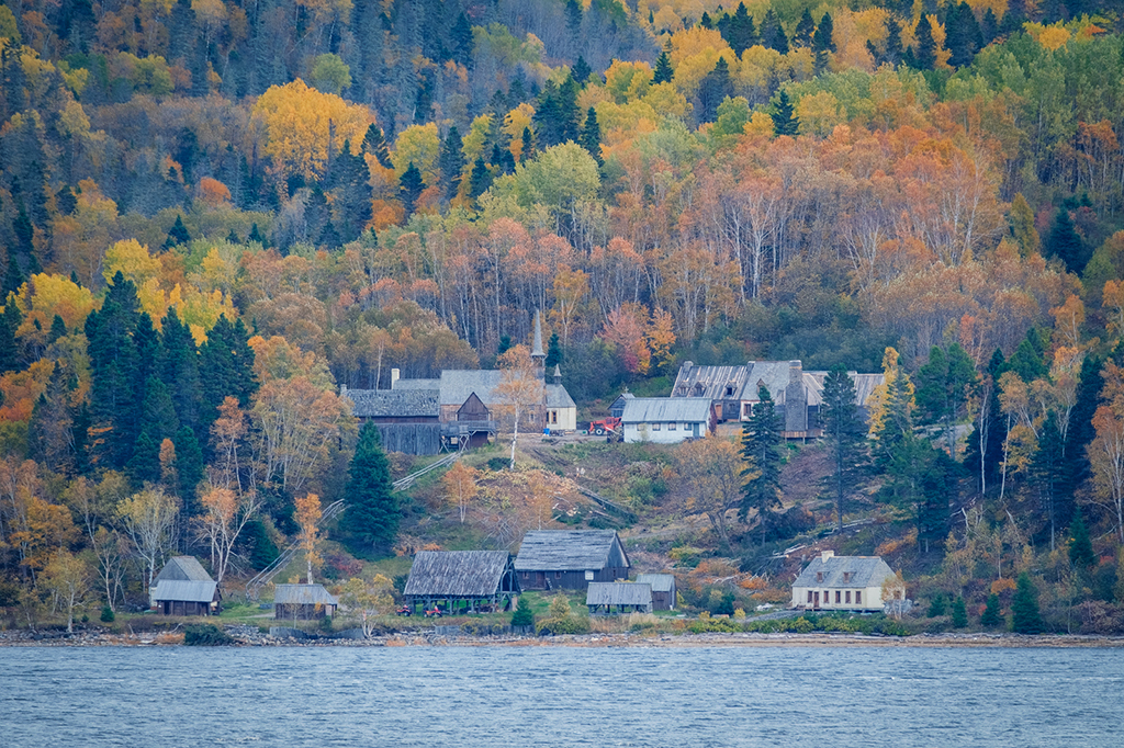
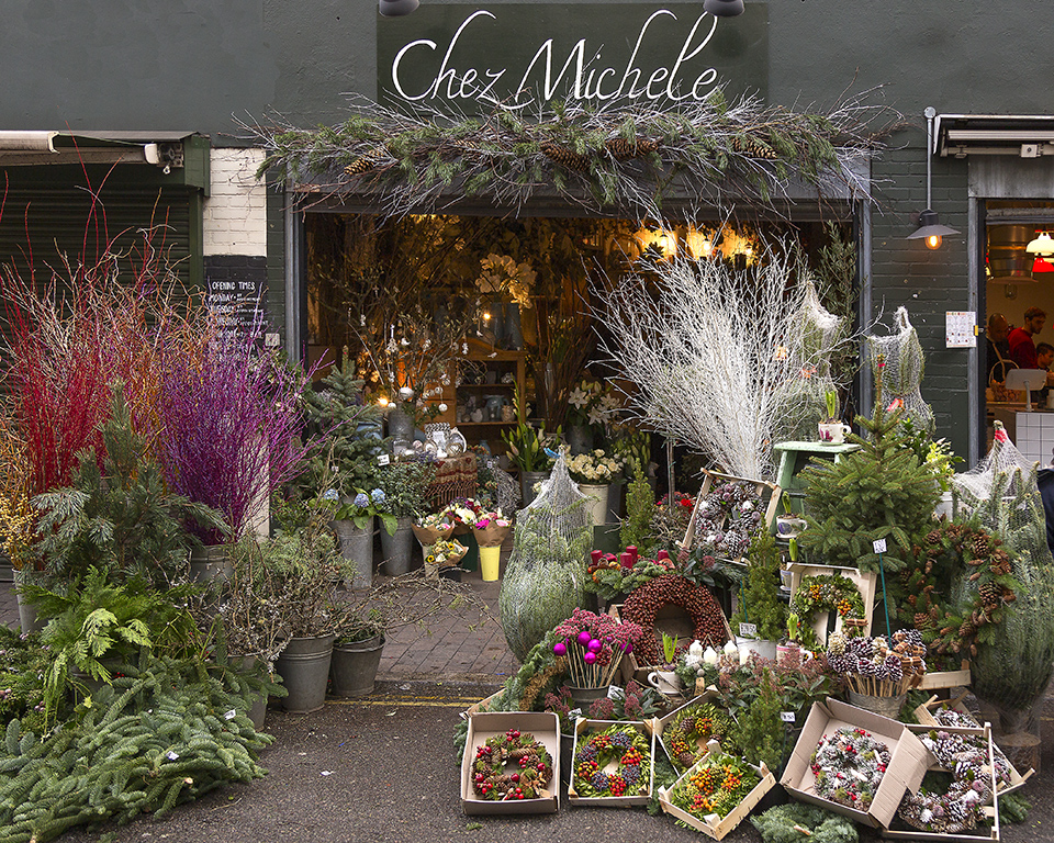
Thanks for commenting Michele. The rocks are the stars at this location, the flowers just gave me a splash of colour to add to the image. The margins of the shot could be cropped I guess but otherwise I like the composition. I'll have to go back when the light is more favourable. I've seen better than mine for sure. |
Feb 3rd |
7 comments - 3 replies for Group 71
|
7 comments - 3 replies Total
|