|
| Group |
Round |
C/R |
Comment |
Date |
Image |
| 25 |
Dec 21 |
Comment |
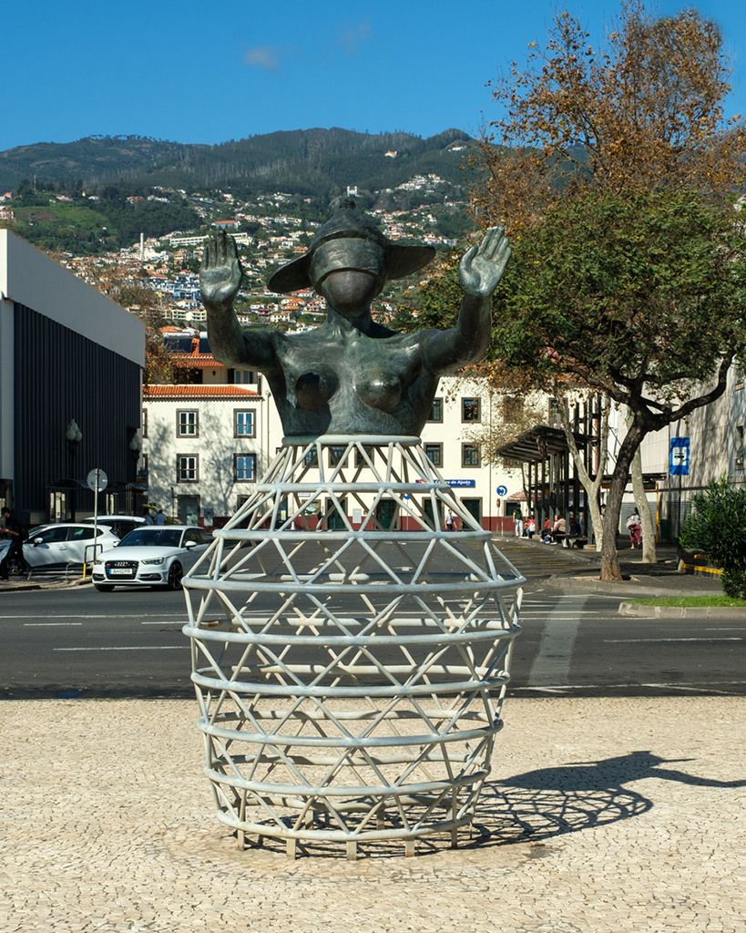
Yellow and black - does what it says on the tin. The model has a lovely pose and you've framed the shot well. You can certainly tell that a shallow depth of field has been used to centre the interest on the eyes. The lips are also nicely in focus, but the nose is a touch soft for me. There seems to be a shadow area on the left cheek which would be better blended in with the rest of the face which has a lovely tone to it, albeit a bit saturated. The fact that the blacks are so intense means you've lost a bit of definition in the jacket but it has the effect of concentrating the viewer on to the face.
I gave it some selective high pass sharpening on the eyes and lips and think it might benefit from that. Well shot. |
Dec 17th |
1 comment - 0 replies for Group 25
|
| 71 |
Dec 21 |
Comment |
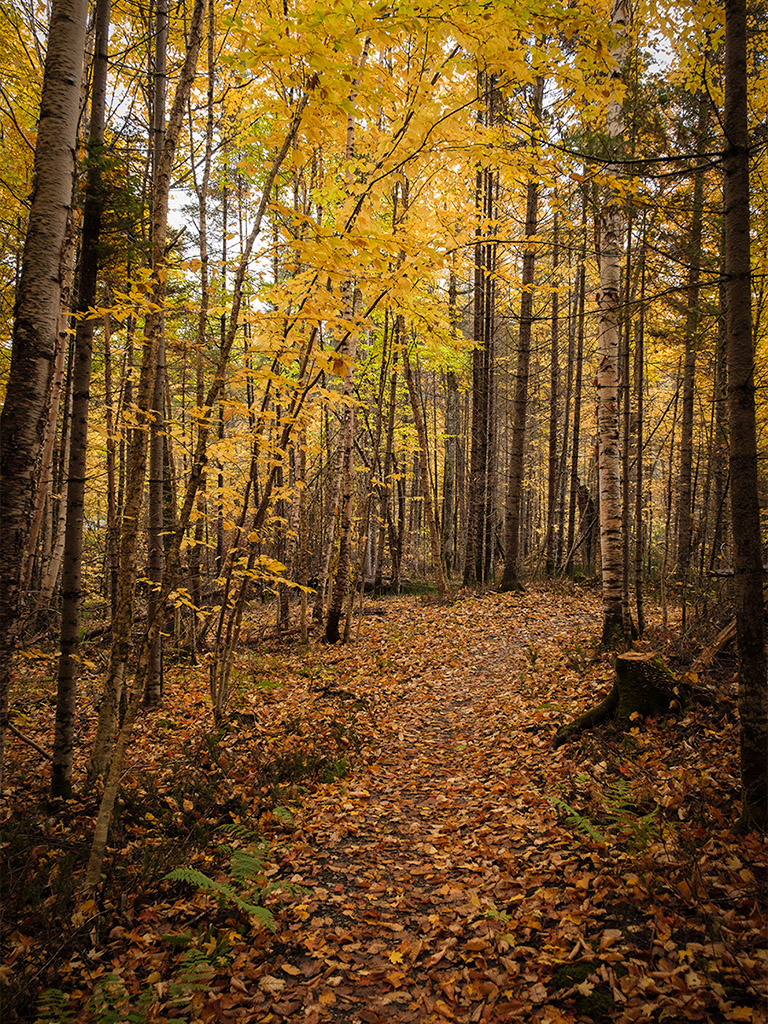
The original is the one in the main picture Theresa and my first crop is the smaller one on the right hand side. I cropped off the top because I thought it not relevant to the image but Stephen's is simpler and more appealing. I've gone with his edit.
|
Dec 10th |
| 71 |
Dec 21 |
Comment |
The original is the one in the main picture Theresa and my first crop is the smaller one on the right hand side. I cropped off the top because I thought it not relevant to the image but Stephen's is simpler and more appealing. I've gone with his edit.
|
Dec 10th |
| 71 |
Dec 21 |
Comment |
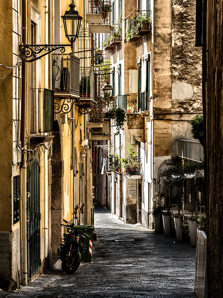
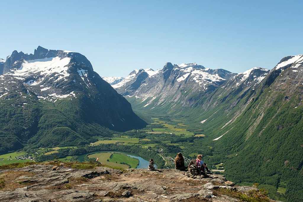
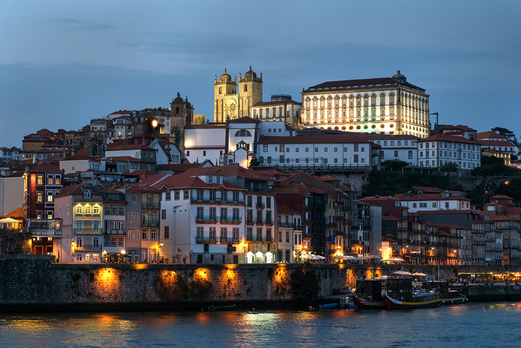
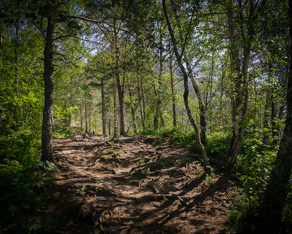
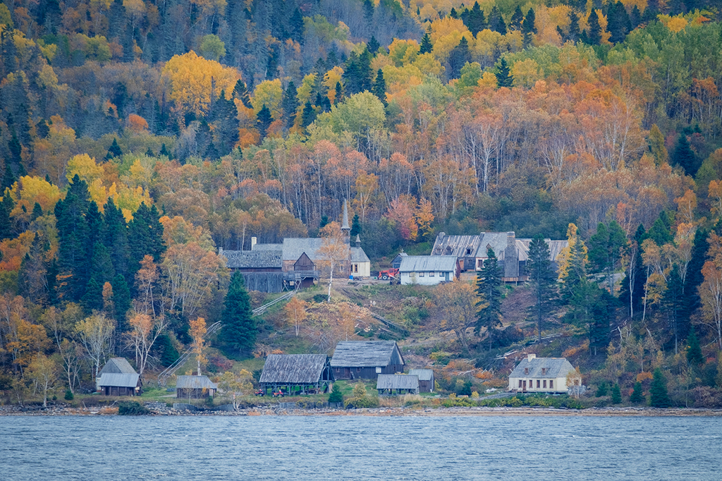
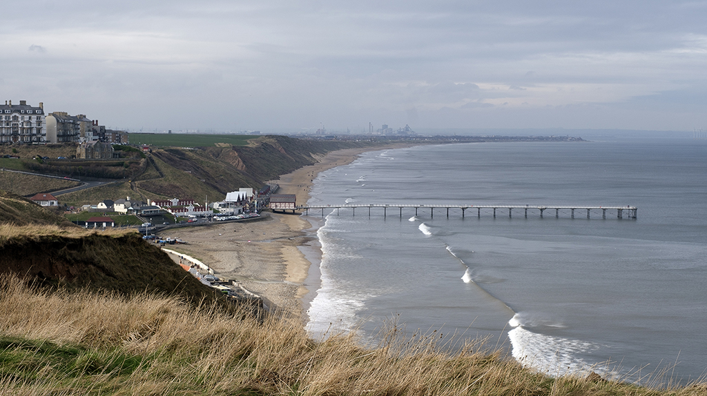
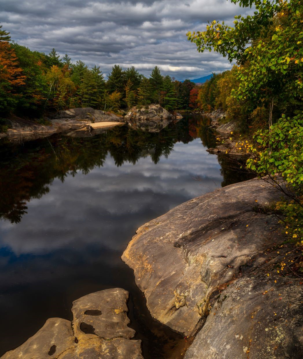
Lovely peaceful scene and well taken. There's a small distracting branch end or something on the extreme right which I think needed removing and I think the tree on the left is almost surplus to requirements. Either that or you could clone out the 2 twiggy bits near it. |
Dec 8th |
 |
| 71 |
Dec 21 |
Comment |
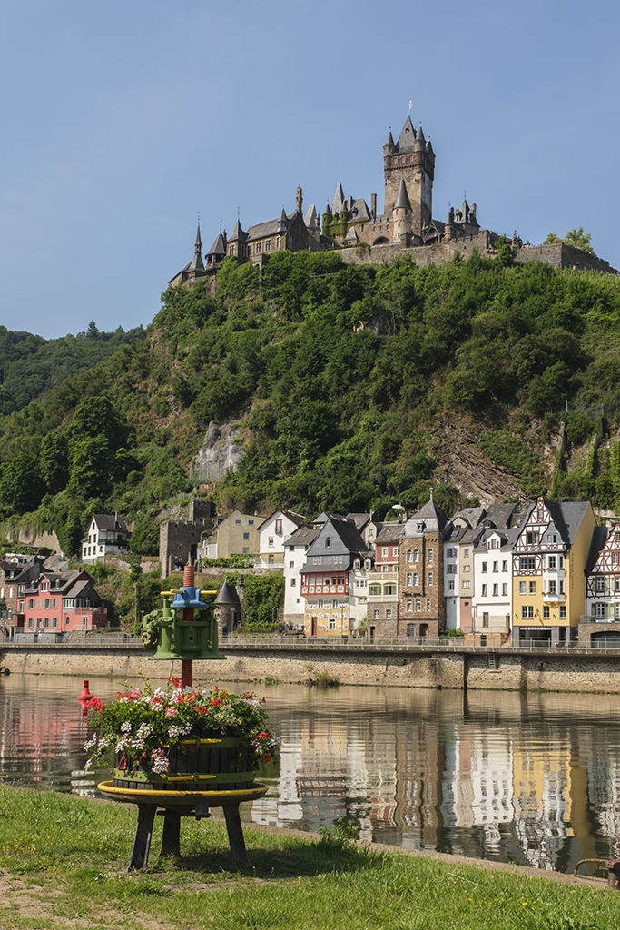
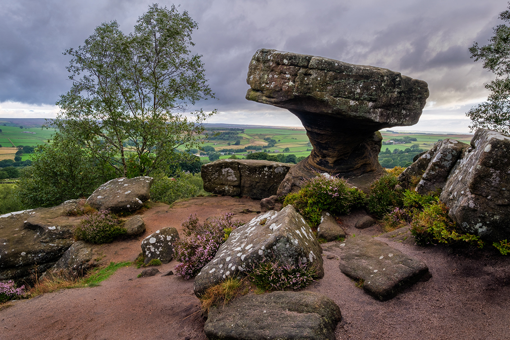
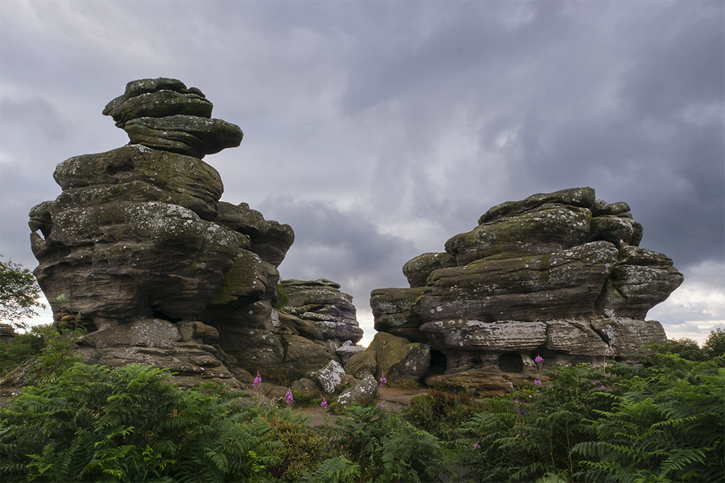
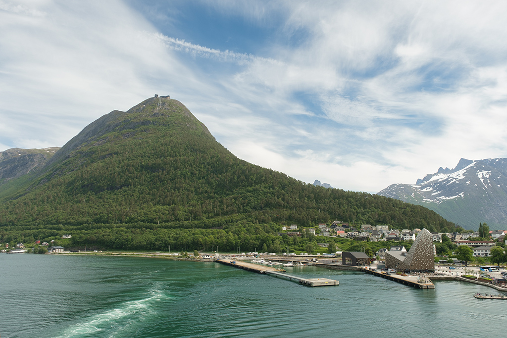
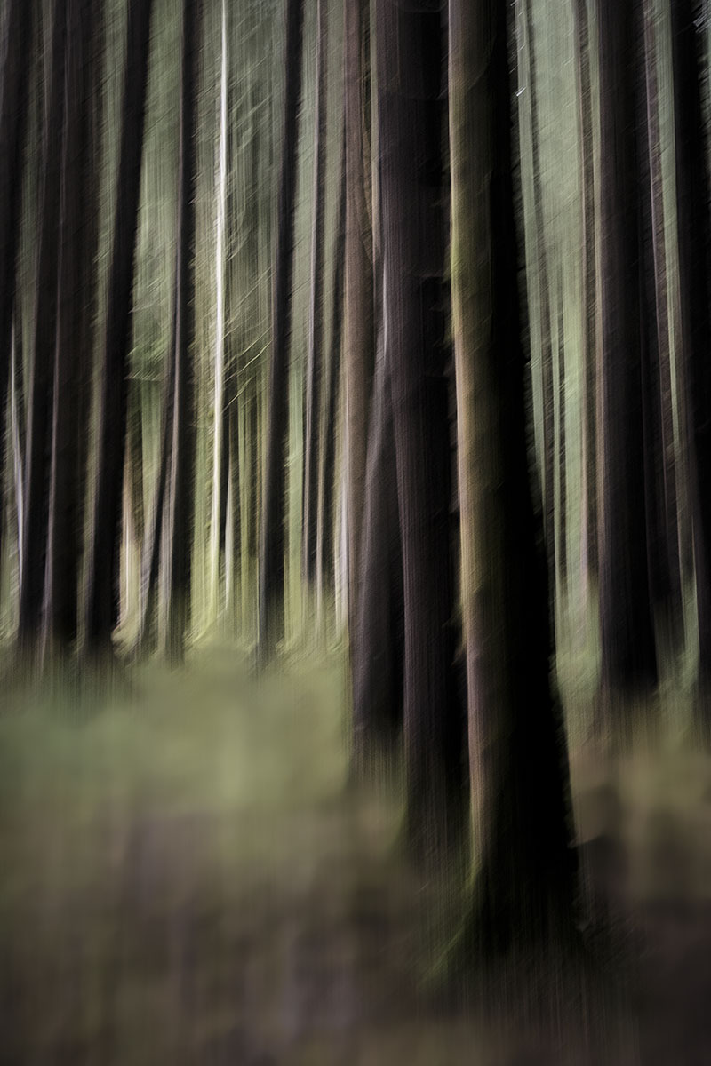
Lovely capture and leading lines. I thought there might be something very minor you could do to emphasise the colours so I applied a smallradial filter to raise the shadows only on the trees on the let hand side and at the vanishing point in the distance and also to their reflections. |
Dec 8th |
 |
| 71 |
Dec 21 |
Comment |
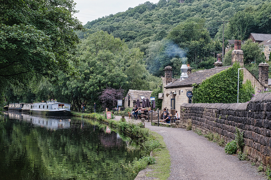
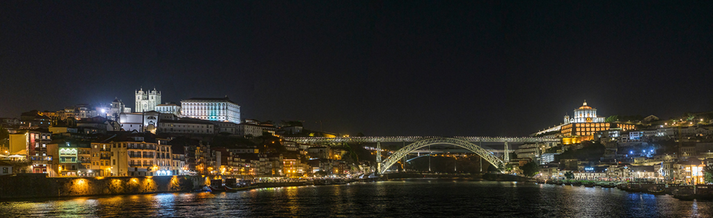
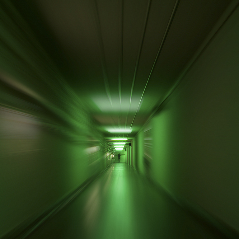
The intrigue is increased with the post processing you've done and I like the effect. I think it would look good in mono as well (not that I tried it. The edit you've made by cropping from the tree trunk and taking out the debris in the foreground simplifies the image well.I agree with Mike about the focus - it seems to have changed a little from the original to the edited version. |
Dec 8th |
| 71 |
Dec 21 |
Reply |
That works very well Stephen - thanks for the re-work. It again reduces the content of the image but this time it focusses the mind on the diagonals. I'll use this concept if you don't mind. |
Dec 8th |
5 comments - 1 reply for Group 71
|
6 comments - 1 reply Total
|