|
| Group |
Round |
C/R |
Comment |
Date |
Image |
| 71 |
Nov 21 |
Comment |
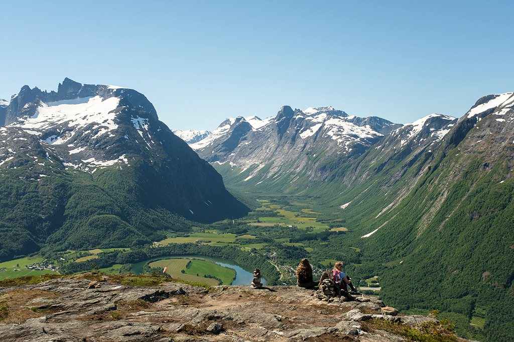
A restful image. I agree that there should be more emphasis on the sheep. The stragglers on the perimeters aren't contributing all that much and the tops of the mountains aren't either so I cropped in from the left and right and off the top. Firstly though I used threshold and levels to find the true white and black points.
|
Nov 18th |
 |
| 71 |
Nov 21 |
Comment |
Funny you should have edited it like that John. My original edit had the sky much darker and someone somewhere else said they thought it was unnatural so I lightened it a bit. Also, the lighthouse has already been lightened - it was quite a dirty white. Thanks for your comments. |
Nov 18th |
| 71 |
Nov 21 |
Comment |
Yes, the sky doesn't help and your revised image is much stronger. |
Nov 18th |
| 71 |
Nov 21 |
Comment |
A good line from the bottom left up to the main flow of the waterfall. It needs a small amount of straightening. I wondered what the circular light patch was to the centre of the image. It looks like some selective lightening that hasn't quite been finished off or maybe like I do sometimes, catch a key or make an extra brush stroke without realising it. Great subject - just a bit of a tidy up really. Do you need all the sky do you think?
|
Nov 5th |
| 71 |
Nov 21 |
Comment |
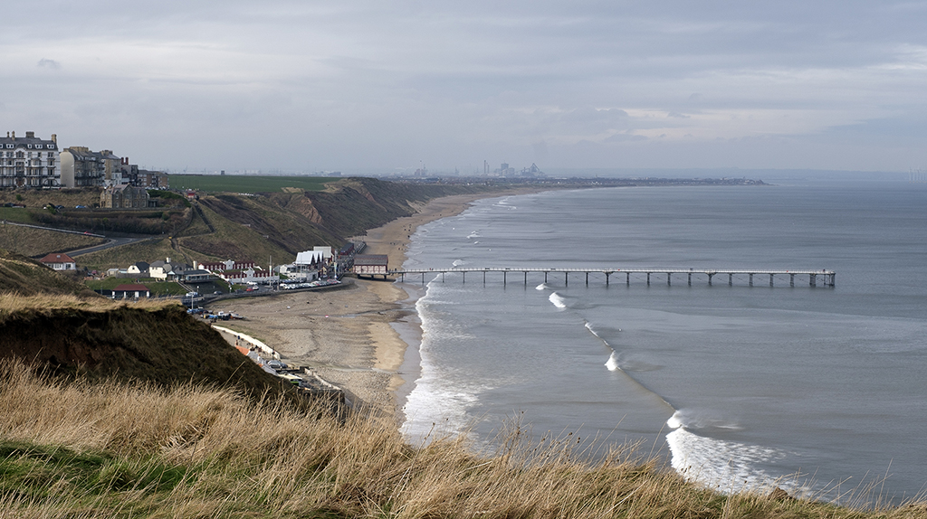
You've chosen a good image here Paul. Sky has drama and there's motion in the sea. It is a 50/50 split down the middle though which detracts from the appeal. I think a crop into a letterbox at the point where the sea meets the beach on the left hand side is much more powerful. |
Nov 4th |
5 comments - 0 replies for Group 71
|
5 comments - 0 replies Total
|