|
| Group |
Round |
C/R |
Comment |
Date |
Image |
| 5 |
Feb 26 |
Reply |
Thanks Sophia, yes in the comps I usually do black and white is ok and these kinds of images often look really good that way. And it does create more license to darken backgrounds etc. Mind you I do like showing the beak colors which for most of the year are yellow. So color works here!
|
Feb 12th |
| 5 |
Feb 26 |
Reply |
Thanks Anna. They are good points |
Feb 6th |
| 5 |
Feb 26 |
Reply |
Thanks Pete, agree with both points |
Feb 6th |
| 5 |
Feb 26 |
Reply |
Thanks Anna. They are good points |
Feb 5th |
| 5 |
Feb 26 |
Reply |
Thanks Natalia |
Feb 5th |
| 5 |
Feb 26 |
Comment |
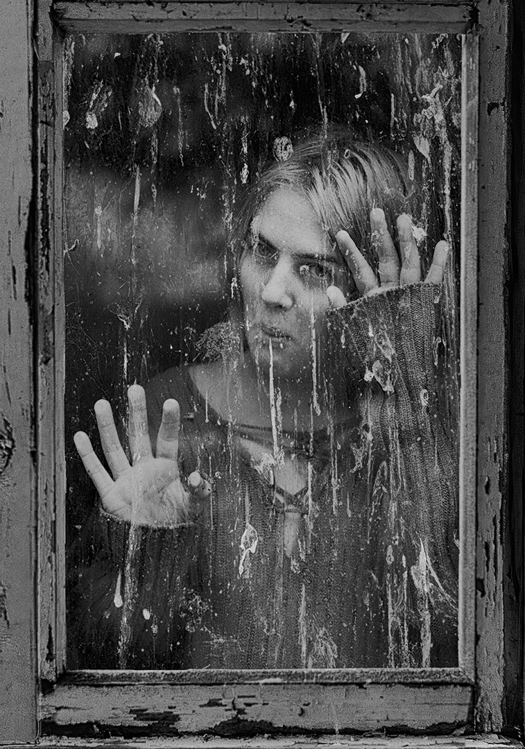
Hi Richard, this image is filled with wonderful detail and textures which make it fun to explore. I love the sign that you have included in the frame which really emphasises the leading line continued by the track that takes us to the temple. I thought you could use the key stoning tool to make the buildings vertical but it may be moot if the lean on the LHS structure is optical or natural. Only a visitor would know. I am guessing there were power lines over the temple that you cloned out. Thing is there are 3 identical objects remaining. There is a cloning artefact just at the top o f the extreme RHS shrub. These are all minor though. I love the image. Thanks for sharing this amazing place! |
Feb 3rd |
| 5 |
Feb 26 |
Comment |
Hi Sophia, there are numerous narratives here and your take is very personal. For the detached observer (for me) it tells a story of an almost bored bystander watching a fish in distress, fighting for life. The bird is only just interested and tells us that creatures have little empathy even in dire circumstances. As you say it would be a meal if it were smaller. Suzanne has sharp eyes and spotted the reduced detail in the fin/gills and I don't have any edits to suggest. There is still a lot of water in the frame but if you cropped it down more then we get a very letter box crop. But maybe you could slice a little more top and bottom |
Feb 2nd |
| 5 |
Feb 26 |
Reply |
Thanks Suzanne. Agree highlights can be reduced on the lower bird and I have done that. Thanks for spotting it. I don't know what I can do about the top bird's head!! |
Feb 2nd |
| 5 |
Feb 26 |
Comment |
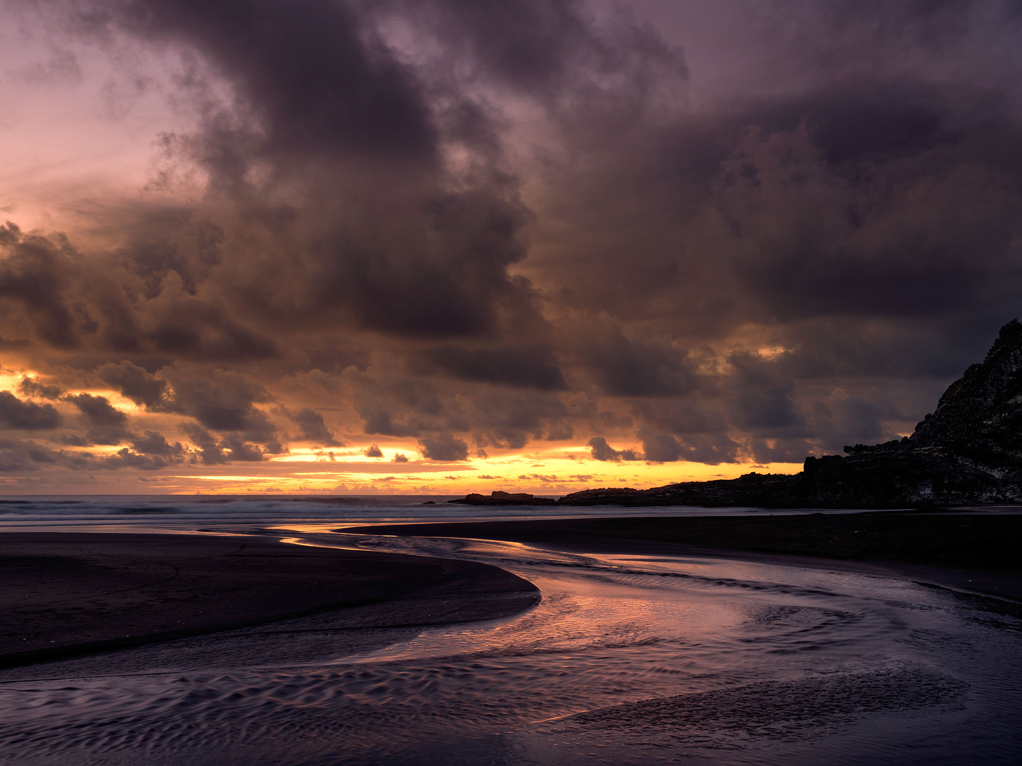
Hi Suzanne, you have captured this at a beautiful time of day: all the richness of sunset but with the sun below the horizon. We can even see a couple of early stars! The reflection adds a lot and in many ways I would have liked more but less dark foreground. Maybe by getting lower and closer to the foreground water would have enlarged the reflections. As it stands I would suggest a crop of the dark sand below the reflections. |
Feb 2nd |
| 5 |
Feb 26 |
Comment |
Hi Pete, I think you have discovered a hidden talent for still life! I think the lighting is really well handled and works on the main elements in a sympathetic way. I like the consistent patina of all the objects in your scene and their age does suggest a classical still life style. I don't want to think to much about what it means. Sadly we all have a use by date. The composition is interesting featuring a strong "L" in the frame and a lot of negative space. This is just an observation. I don't know what I think about it (I have never done a still life). |
Feb 1st |
| 5 |
Feb 26 |
Comment |
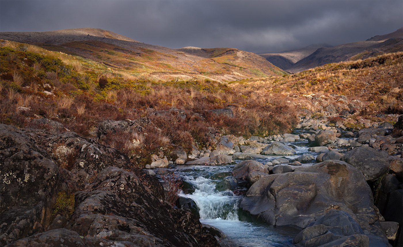
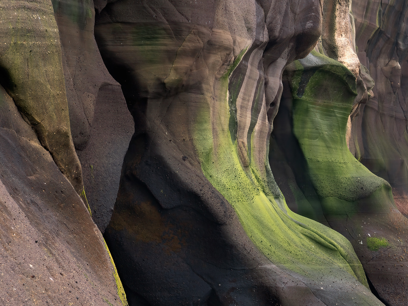
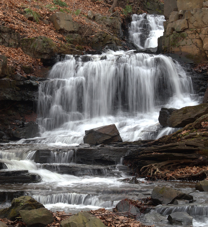
Hi Anna, I like your treatment of the water with the use of a longer shutter to get some blur in the falls. And I can see from the Original that its a late fall image with plenty of brown leaves in the scene. I thought the branch in the foreground is a messy distraction and that it could go. But overall the image seems to lack balance and I think there is only so much you can do about it now. The river starts hard right and then s back to the right hand side and we have a large area of dark tones on almost the left half of the image. I tried a crop to remove it. The original had soft fall tones that I liked but the B and W conversion is quite high contrast. So I worked with the original, increasing the saturation of the reds and yellows |
Feb 1st |
 |
| 5 |
Feb 26 |
Comment |
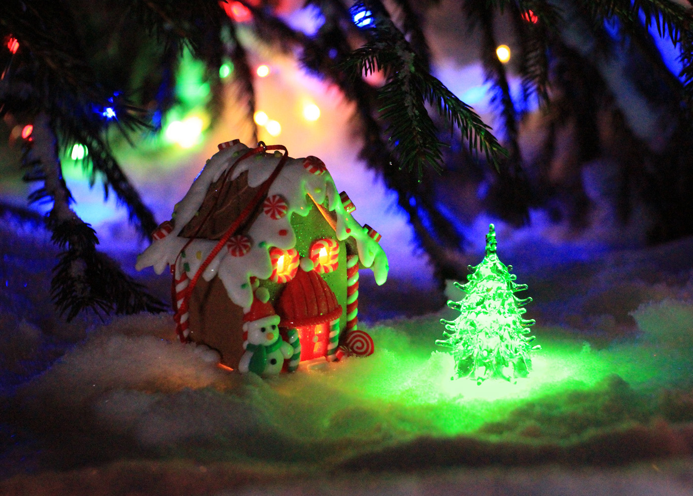
Hi Natalia, I think your image is wonderfully evocative of the Christmas period and all that it means to so many people. For me the windows of the toy house look like eyes and so I am imagining the idea of Christmas being a time to look forward and beyond. To make this work I would flip the image since we interpret left to right as being from now to the future. The lighting around the tree does have some blown out highlights and I think you could paint in an opaque green layer over those areas to tame them a little. |
Feb 1st |
 |
6 comments - 6 replies for Group 5
|
6 comments - 6 replies Total
|