|
| Group |
Round |
C/R |
Comment |
Date |
Image |
| 5 |
Apr 25 |
Comment |
Hi Xiao, welcome to the group
I think this is a beautiful capture of a delightful small bird. Love the soft background. I thought you could go a step further than Pete's suggestion and get rid of the sticks on the left and then a crop. If you thought that was too tight then expand the canvas to restore some of the negative space. |
Apr 14th |
 |
| 5 |
Apr 25 |
Reply |
Thanks David |
Apr 10th |
| 5 |
Apr 25 |
Comment |
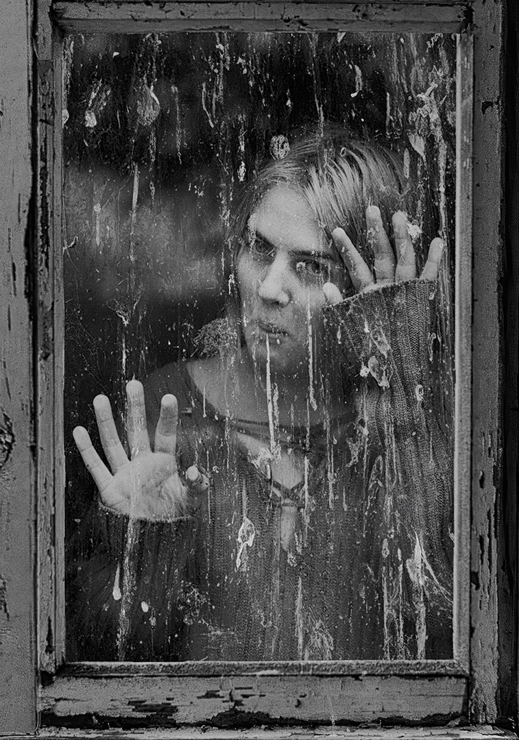
Super portrait. Its unconventional so something to celebrate. I don't mind the face being largely obscured: I know some photographers go further and cover their models with translucent fabric. I think it makes a statement. |
Apr 9th |
| 5 |
Apr 25 |
Comment |
Those eyes are remarkable and the colors are crazy. Noted one has contacts but the other one is off the planet intense. When first looking at the image I did not realise you had done a black and white conversion and its quite natural working as you wanted. Good idea. Richard's 16 by 9 crop does suite the focal point. I like it!! |
Apr 9th |
| 5 |
Apr 25 |
Comment |
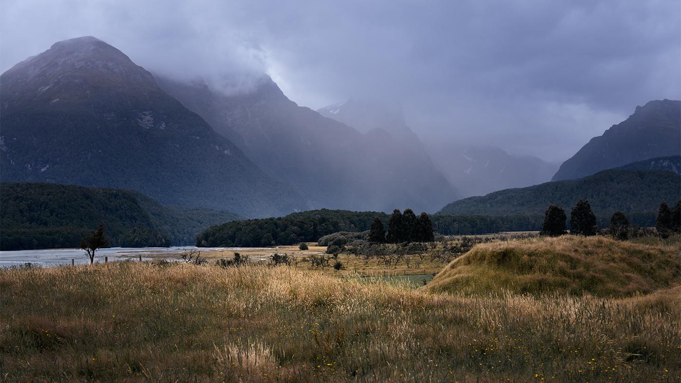
Hi Pete, really well seen shot and an atmospheric morning. I think the silhouette works really well and for some reason stands out more in the original. The tones on the water are also more subtle in the original so I would tend in that direction. |
Apr 9th |
| 5 |
Apr 25 |
Comment |
Love the intensity of this and the perfect positioning of that flattened nose of the woman with the ball. Great teamwork from the red team trying to keep the ball from being grounded! I also like the color better! |
Apr 9th |
| 5 |
Apr 25 |
Comment |
...and I meant to say having looked at the EXIF data I think you could be shooting wide open (looks like f4) |
Apr 9th |
| 5 |
Apr 25 |
Comment |
Hi Keisha, I get the vigour and effort that the performers are putting into their performance. Its nicely composed and quite tight. A couple of comments come to mind. Their heads are just inside the black background that runs across the top of the image. Possibly you were forced to shoot this quite low down but it doesn't help the framing. And I understand your rationale for black and white but the colour version has so much more pop. |
Apr 9th |
| 5 |
Apr 25 |
Reply |
Thanks Sophia, appreciate your insights! |
Apr 9th |
| 5 |
Apr 25 |
Reply |
Thanks Richard, appreciate frank comments! |
Apr 9th |
| 5 |
Apr 25 |
Reply |
Hi Stephen. Its something else: Otago New Zealand in summer |
Apr 2nd |
| 5 |
Apr 25 |
Comment |
Here is the image as it should be! Thanks to Barbara for trying to make this right. |
Apr 1st |
 |
8 comments - 4 replies for Group 5
|
8 comments - 4 replies Total
|