|
| Group |
Round |
C/R |
Comment |
Date |
Image |
| 5 |
Apr 24 |
Reply |
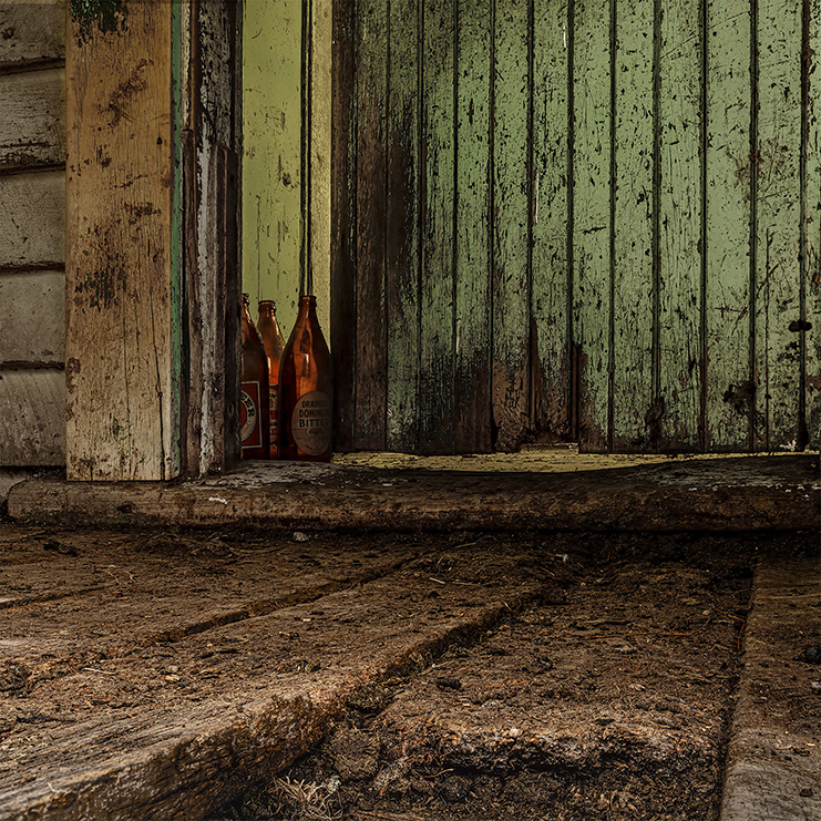
Hi, good point. The Theme is Windows " use the window as a frame, to direct lighting, or as an architectural element, but the window should feature distinctly in your image.". I think the tighter crop is simpler and makes a better image and it's obvious it's a window. I might try less frame. Just a whisker! |
Apr 19th |
| 5 |
Apr 24 |
Reply |
Ok Jim, I was just responding to your comment about being disappointed it did not show the vast number of stars etc |
Apr 14th |
| 5 |
Apr 24 |
Reply |
Hi, good point. The Theme is Windows " use the window as a frame, to direct lighting, or as an architectural element, but the window should feature distinctly in your image.". I think the tighter crop is simpler and makes a better image and it's obvious it's a window. I might try less frame. Just a whisker! |
Apr 7th |
| 5 |
Apr 24 |
Comment |
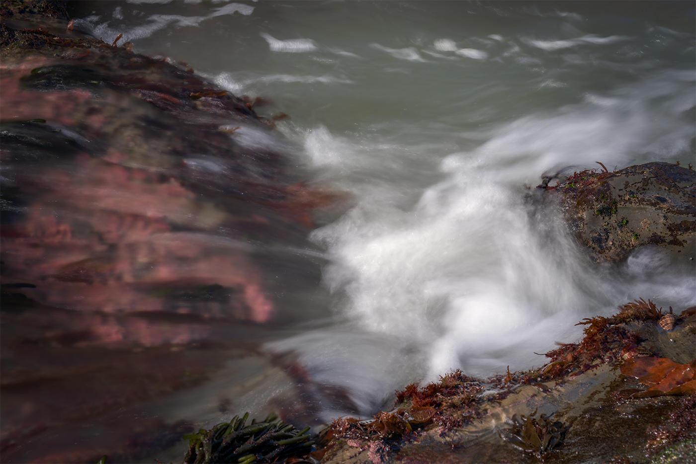
Hi Richard, I think it is really difficult to set up good lighting for groups because if people have triggers they may not be compatible with the lights so I guess camera mounted flash and a continuous light is a practical option. As you say a rim light for the hair would have been good and the bodice has sucked up all the light too so I think the lighting was a bit underpowered. Maybe you can lift it more. Also would be nice to see more of the floor to help ground her more. |
Apr 6th |
| 5 |
Apr 24 |
Comment |
Hi Jim, my astro efforts have been limited to wide field Milky Way shots and I have never tried this so congratulations on getting a good result. I cannot offer anything on why there are not more stars although I though I read somewhere that there is software designed to remove them so presumably some people think that small stars distract from the nebula. |
Apr 6th |
| 5 |
Apr 24 |
Comment |
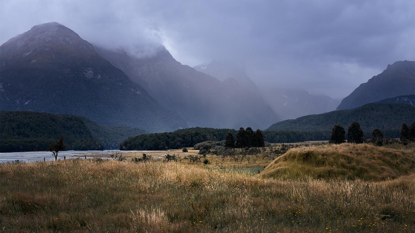
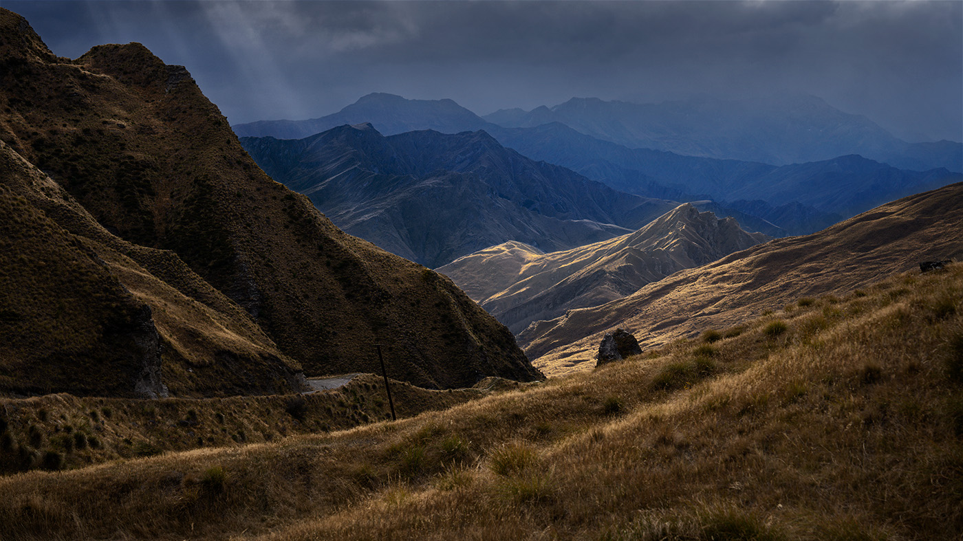
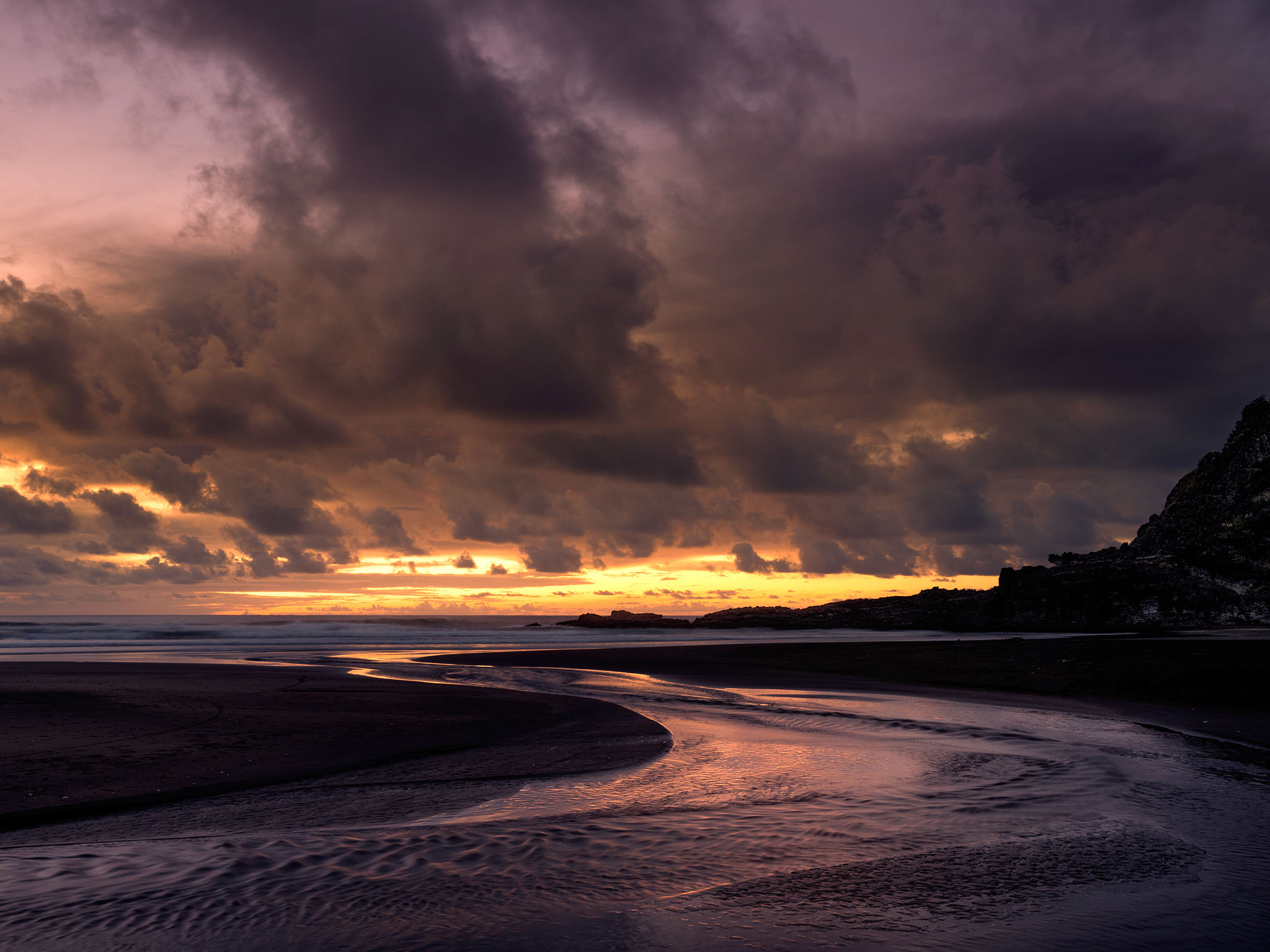
Hi Sophia, this is such a great image and well worth having a worry about. By "flat" I presume you mean the foreground rock and the first range of mountains are finally quite similar. The original shows strong moonlight spilling over part of the near range extending the leading line of the road so can we preserve this natural contrast more? Ie less brightening of the surrounding area or just lift all of it. Curiously I prefer the unflipped version as I am one of those read left to right people. |
Apr 6th |
| 5 |
Apr 24 |
Reply |
Thanks Richard, I agree that helps |
Apr 3rd |
| 5 |
Apr 24 |
Reply |
Good point, thanks Jim |
Apr 3rd |
3 comments - 5 replies for Group 5
|
3 comments - 5 replies Total
|