|
| Group |
Round |
C/R |
Comment |
Date |
Image |
| 5 |
Jan 23 |
Reply |
Thanks David |
Jan 16th |
| 5 |
Jan 23 |
Reply |
Thanks Oliver, I think the extra crop is fine but not so sure it's a significant one. I was happy with the out of focus background and the two following cars. Applying sharpening to them has formed some odd artifacts. I frequently use sharpnesses and saturation to direct attention to the intended focal point. |
Jan 9th |
| 5 |
Jan 23 |
Comment |
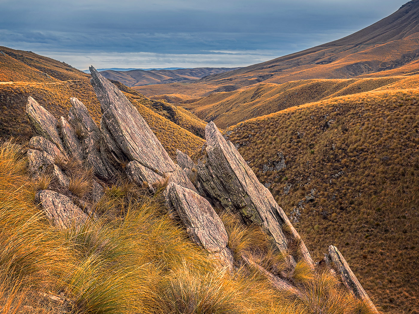
Such an appealing image! My first thought was the out of focus green leaf so agree with David on that front. |
Jan 7th |
| 5 |
Jan 23 |
Comment |
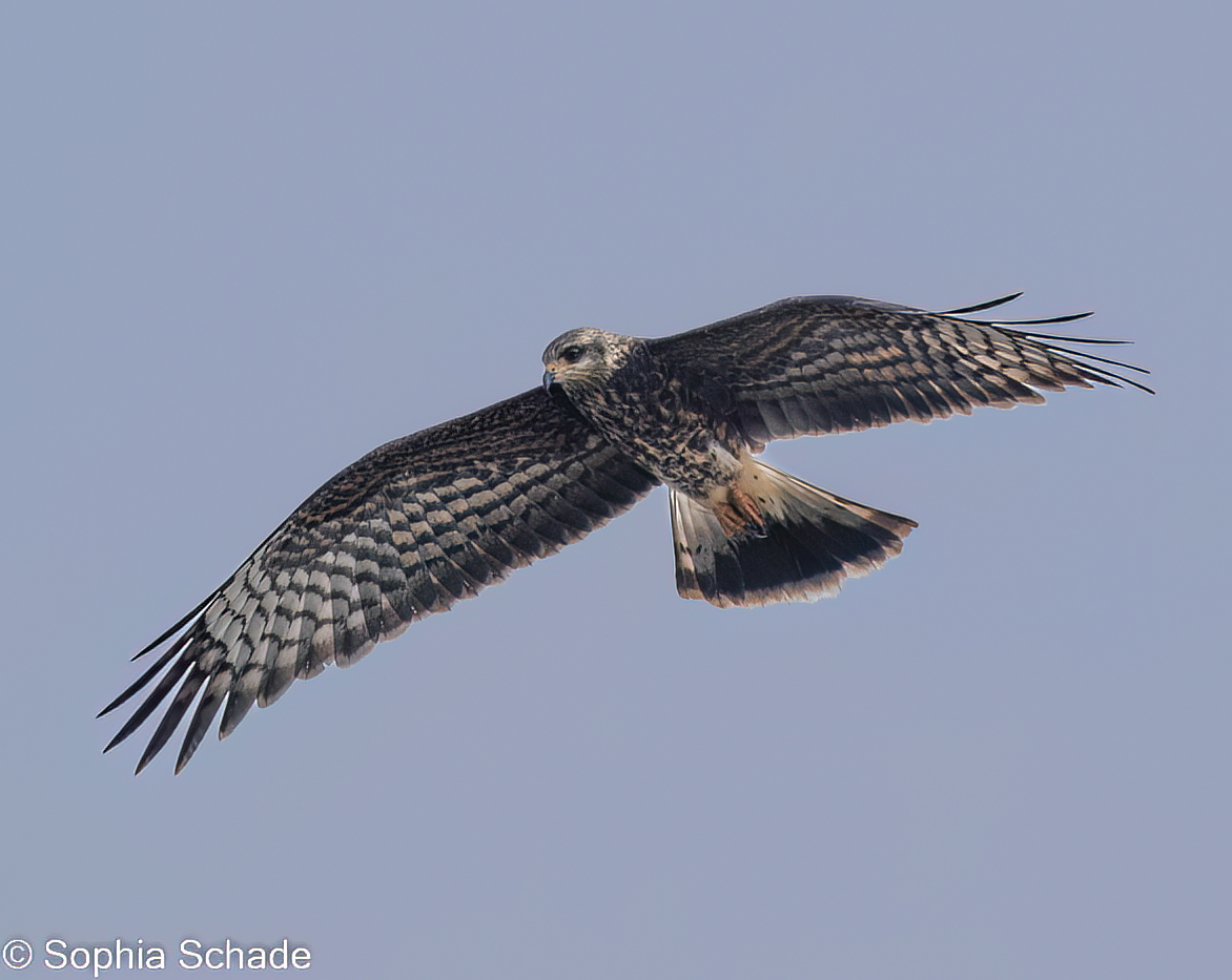
Hi Sophie. Always love your nature shots. I wasn't so convinced about the totally dark background so tried this treatment from the original. (mainly using select subject to raise the shadows and brighten the bird while darkening the sky a bit). |
Jan 7th |
 |
| 5 |
Jan 23 |
Comment |
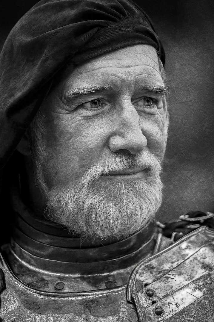
Great capture. Love his wistful look. Life as a Knight has been tough and there is plenty of regret there. So the distant look seems perfect for the subject. Its probably a matter of taste but I would have added some additional texture as he looks a bit clean cut. |
Jan 7th |
 |
| 5 |
Jan 23 |
Comment |
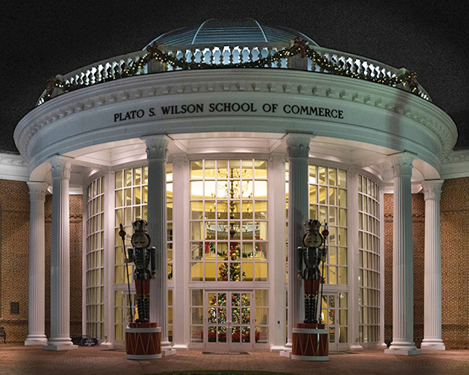
How wonderful to combine the Christmas celebration with another milestone in your grandson's life. And what a lot of work you have done (and agree with the power of modern cameras coupled with Topaz Denoise. My favourite plug-in! For correcting the perspective warp I wondered if the dedicated tool in Adobe Camera Raw (I guess there is the same thing in Develop) would do a better job. I used it in this version and I think the glazed windows are all accurately perpendicular. |
Jan 7th |
 |
| 5 |
Jan 23 |
Comment |
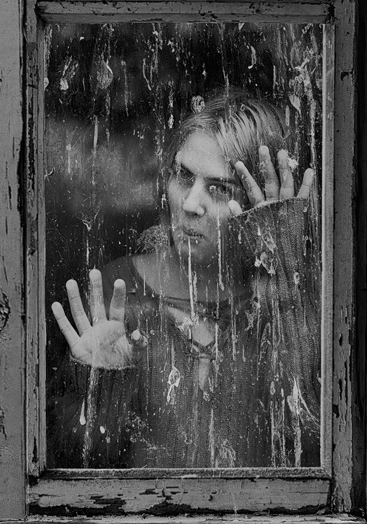
Love the concept and all the creativity. I do notice a heavy texture over the background whereas the vampire has retained its sharpness and I would try using the same texture (or something less strong) in order to unify the composite better. In the background the light comes from the left whereas the vampire is evenly lit so I would burn his right hand side. I think I would do the same to his hands which have a prominence due to their pose. |
Jan 7th |
| 5 |
Jan 23 |
Comment |
Love the concept in creating motion blur by panning with the horse and the slow shutter. I don't t hink I would sharpen it either because the image is intentionally soft being captured at 1/25. If there is room to move the crop I would go for some space above the rider's head and less of the track. I would assume the white down the front of the horse's face is real but distorted by the slight motion blur. |
Jan 7th |
6 comments - 2 replies for Group 5
|
6 comments - 2 replies Total
|