|
| Group |
Round |
C/R |
Comment |
Date |
Image |
| 9 |
Jul 22 |
Reply |
Thanks, you're very kind! |
Jul 25th |
| 9 |
Jul 22 |
Comment |
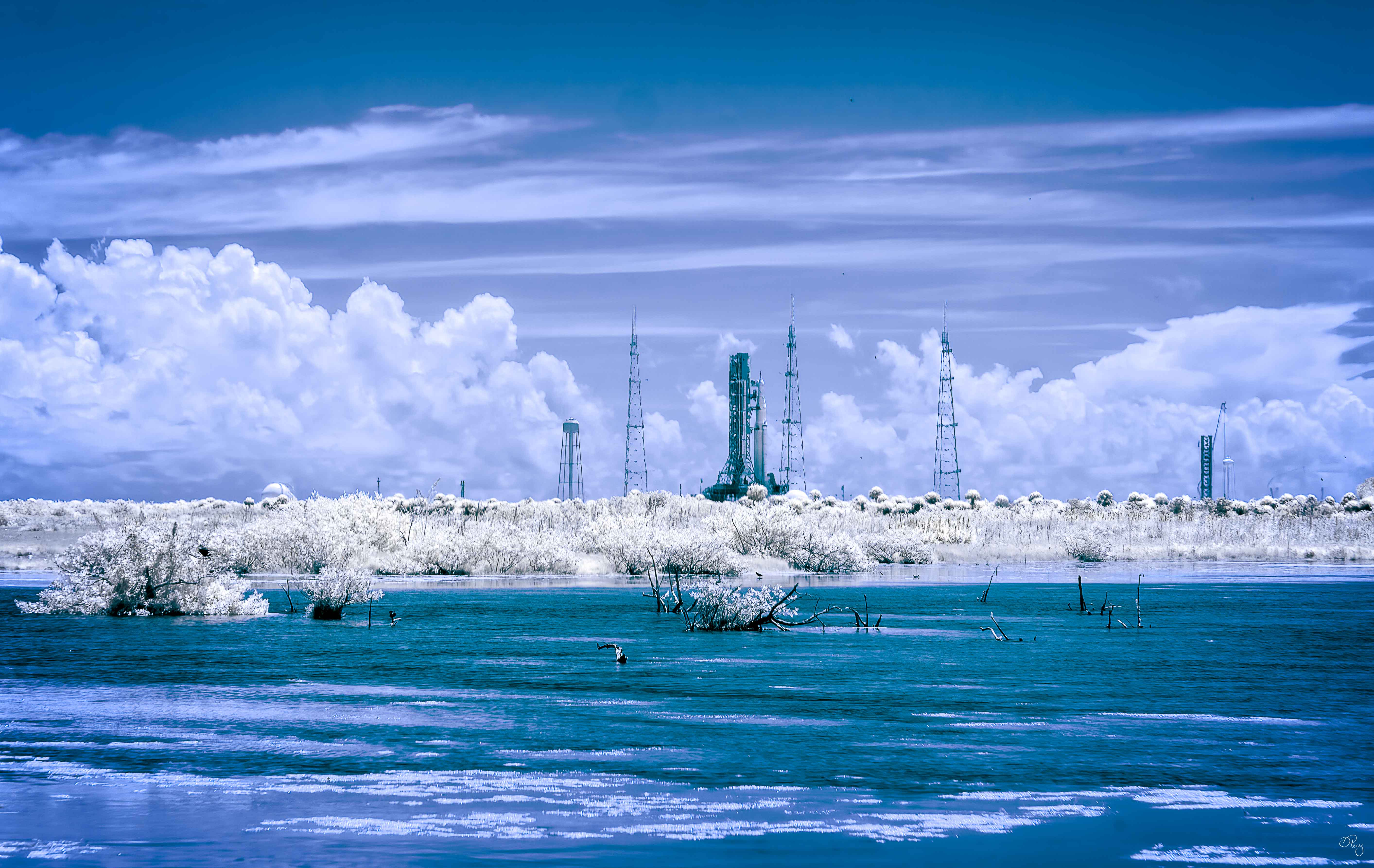
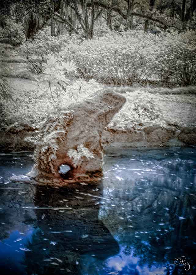
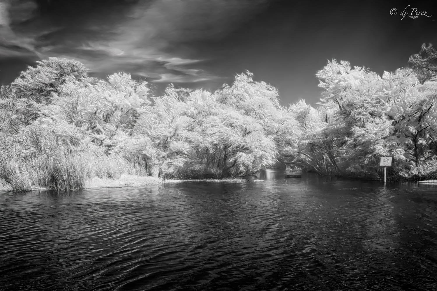
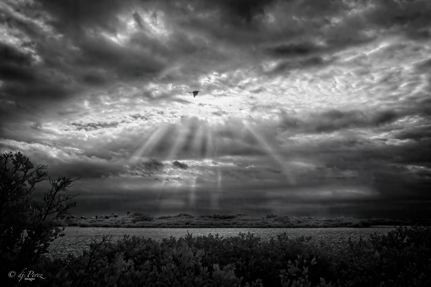
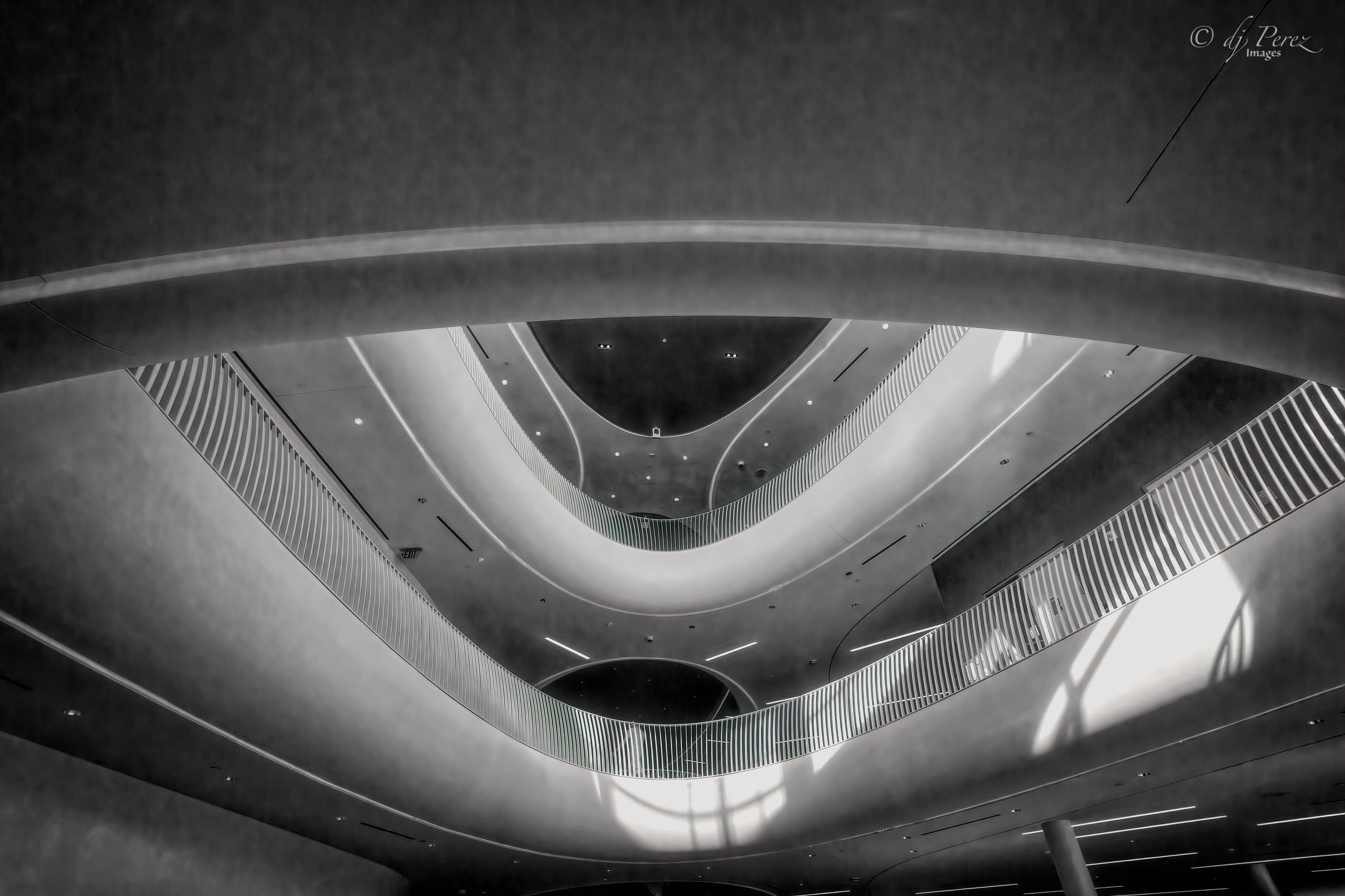
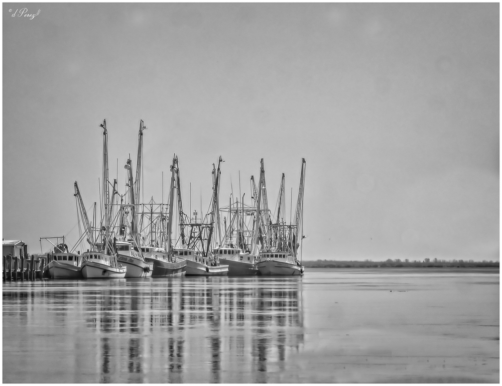
Exceptional!! You have captured a very dynamic image. The clouds and the rippling in the water, the smooth and sleekness of the building, light and dark all make for a very powerful view. Great job! |
Jul 14th |
| 9 |
Jul 22 |
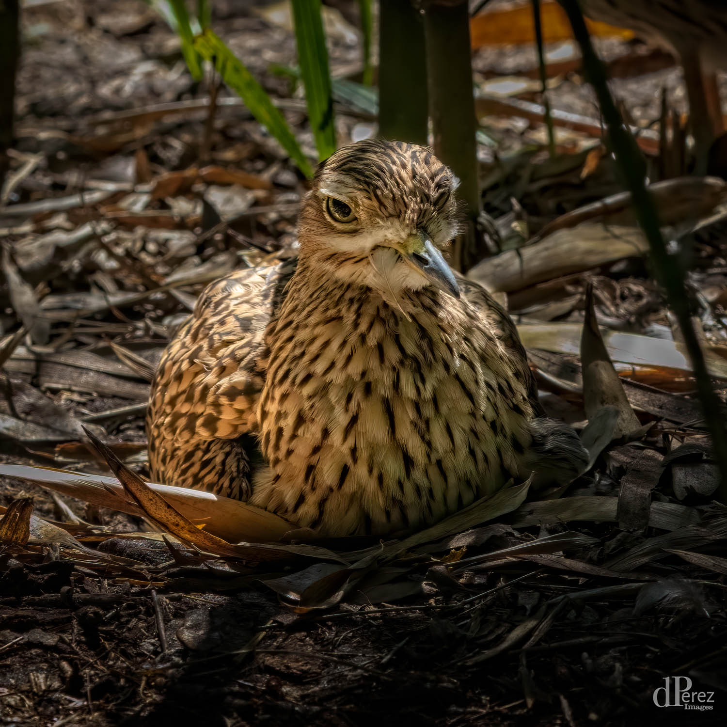
Comment |
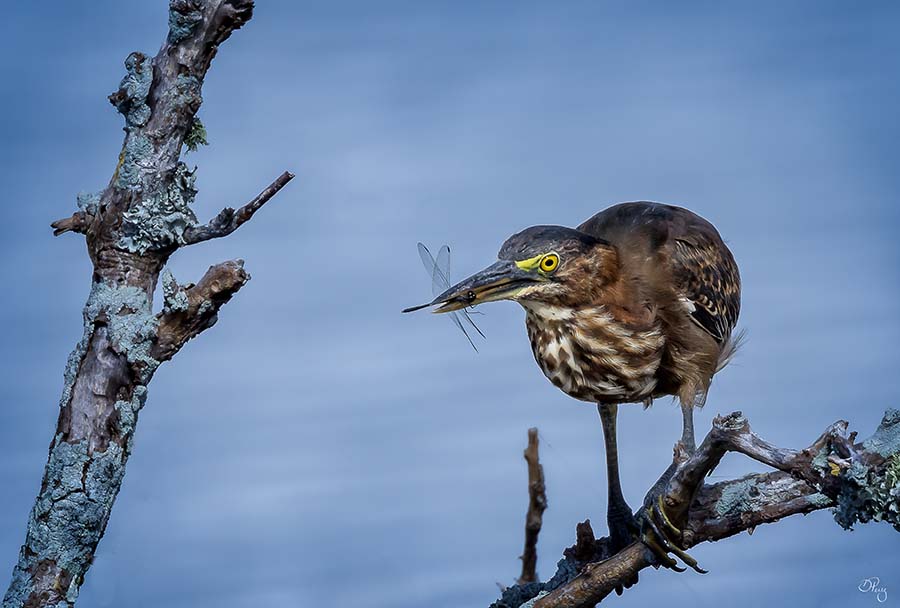
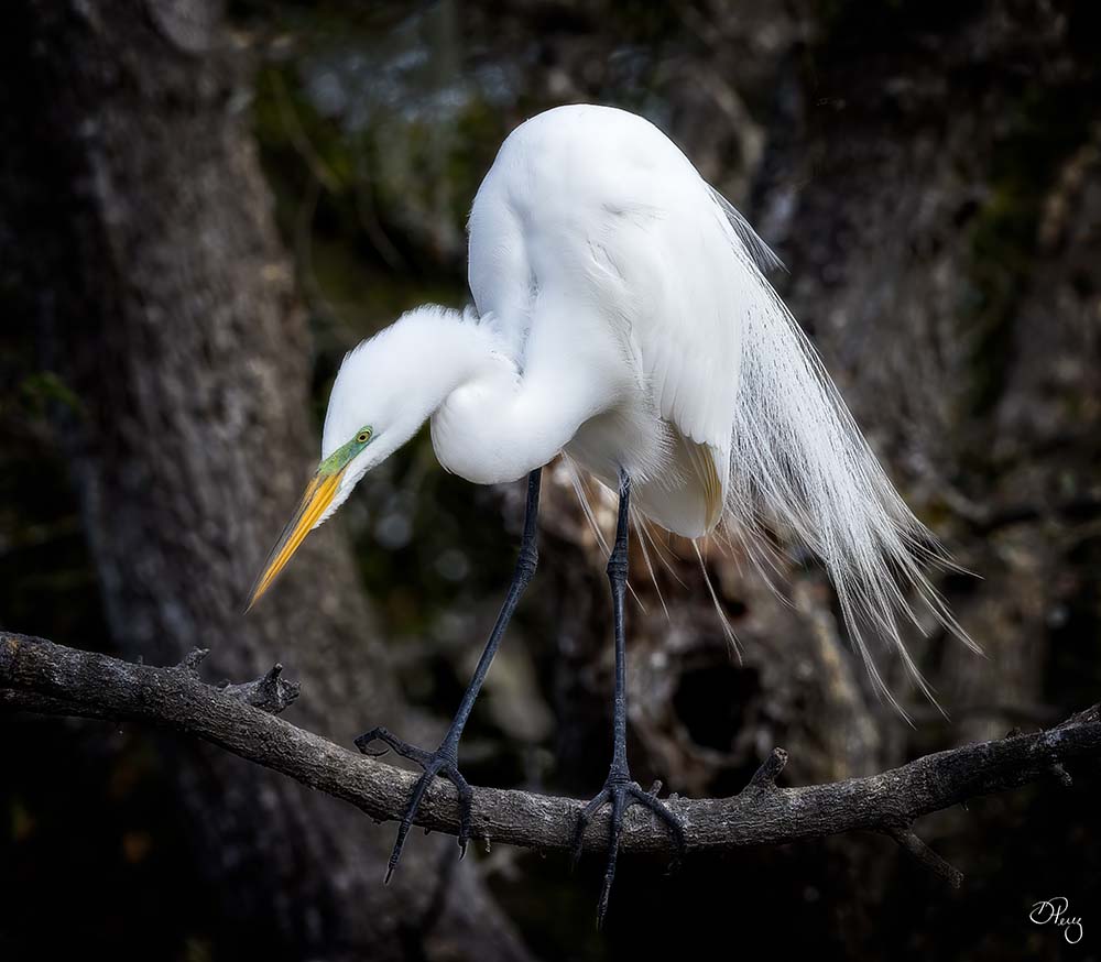
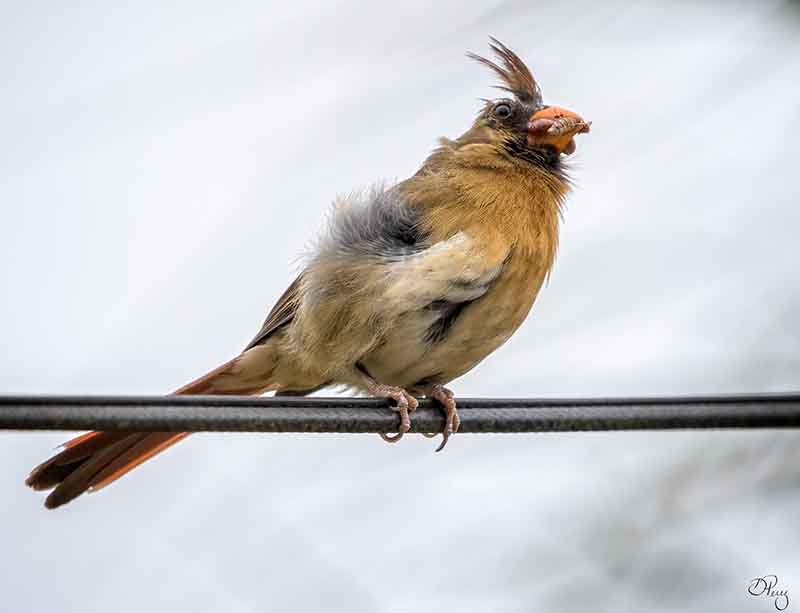
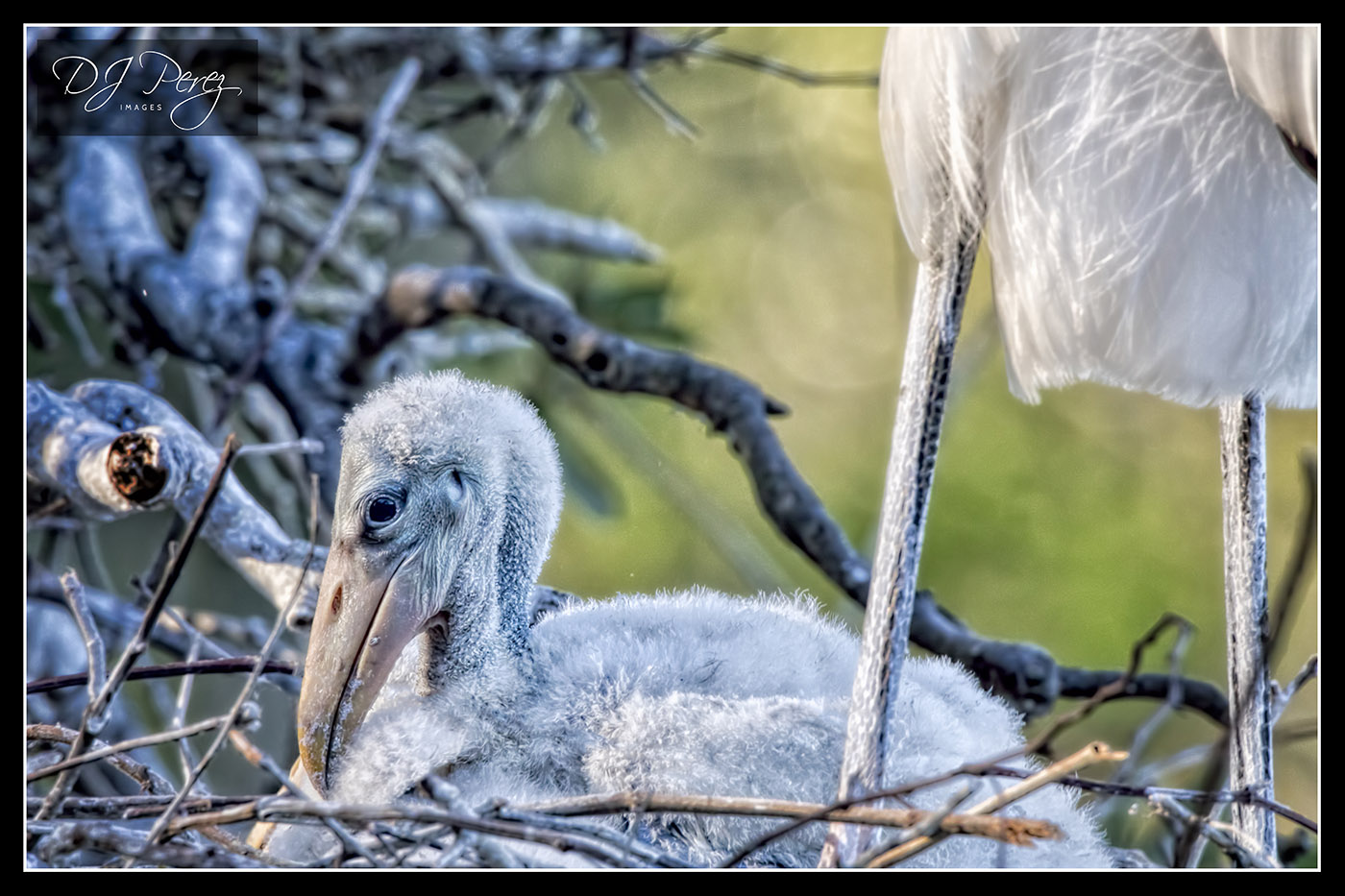
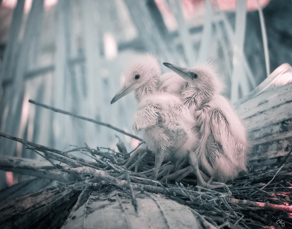
Excellent editing on such a cute subject!! The only thing I might change is to mask off the darkness on his/her little toes near viewer's left side just a little. |
Jul 14th |
| 9 |
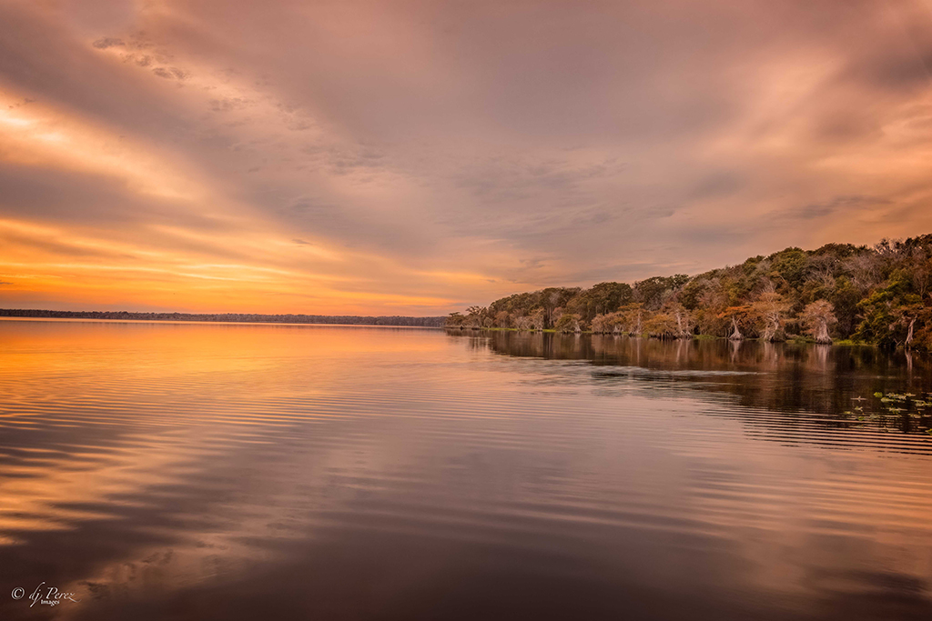
Jul 22 |
Comment |
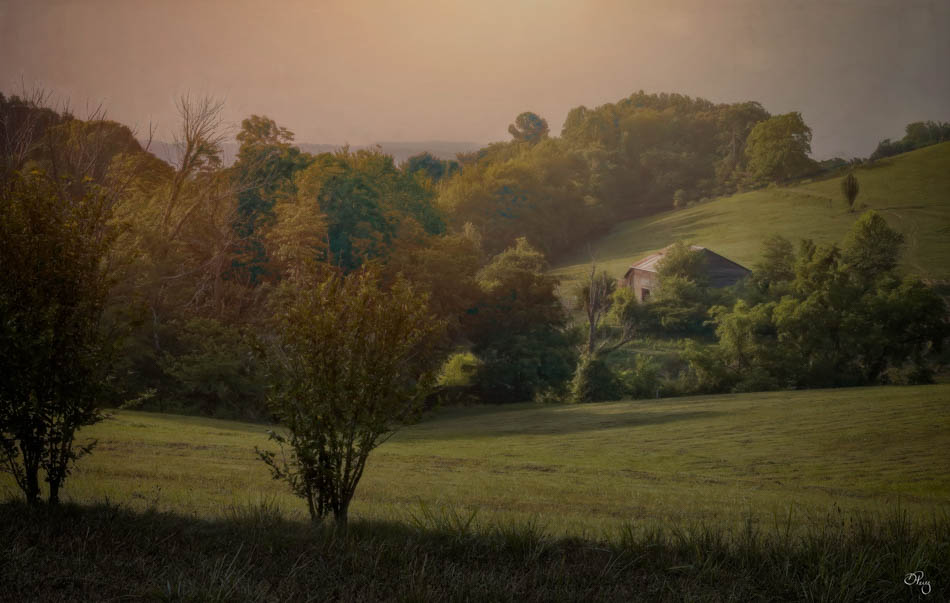
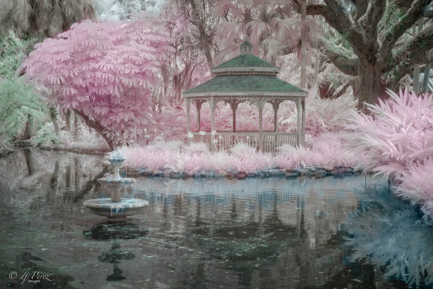
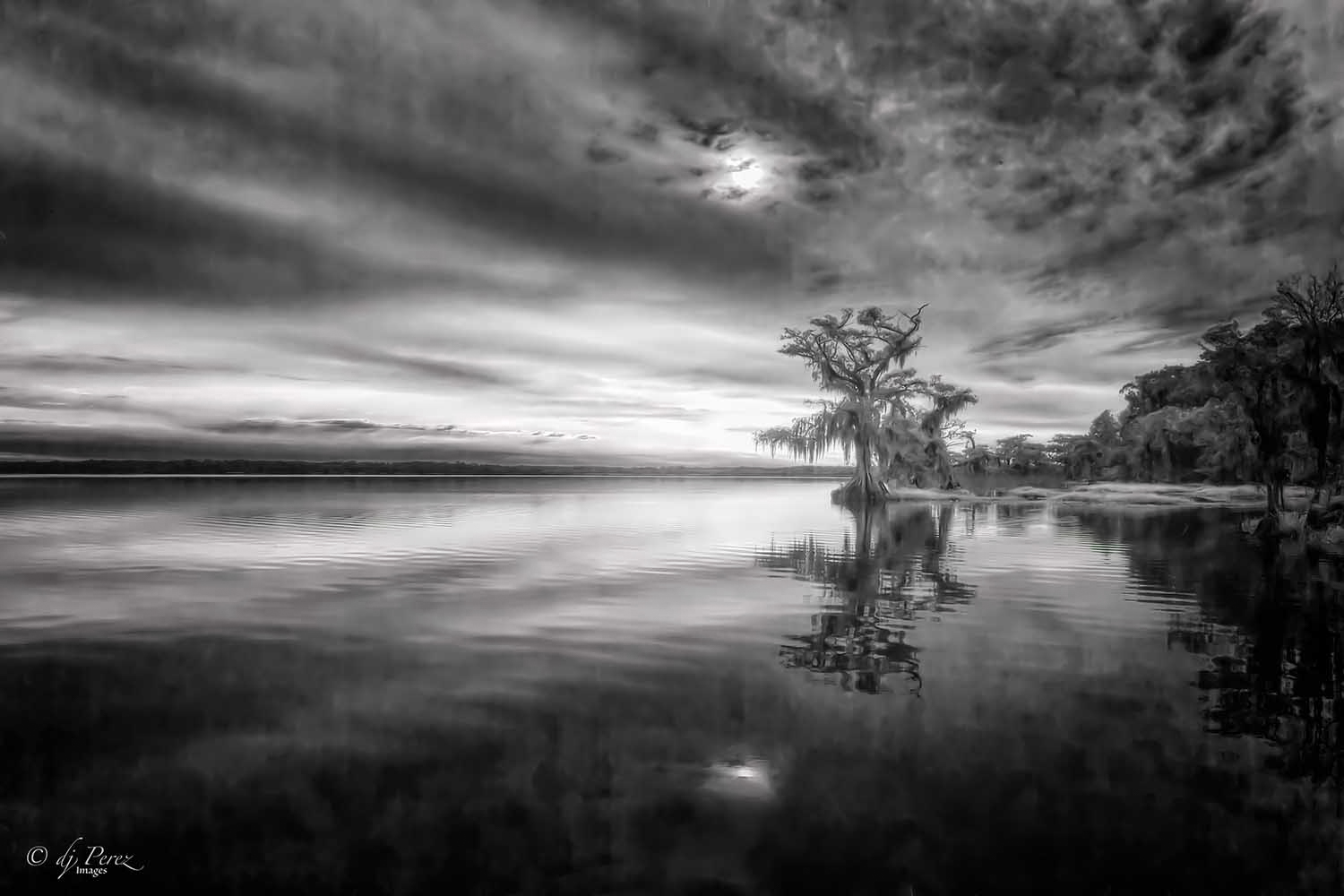
It's a nice sunset and I like the colors you captured in the sky. I do think Bill's crop really works nicely in that it draws me into the lovely colors even more. I like your perspective of the river, it's there but it is there to support the sunset. Nice! |
Jul 14th |
| 9 |
Jul 22 |
Reply |
Love your edit, well done! |
Jul 14th |
| 9 |
Jul 22 |
Comment |
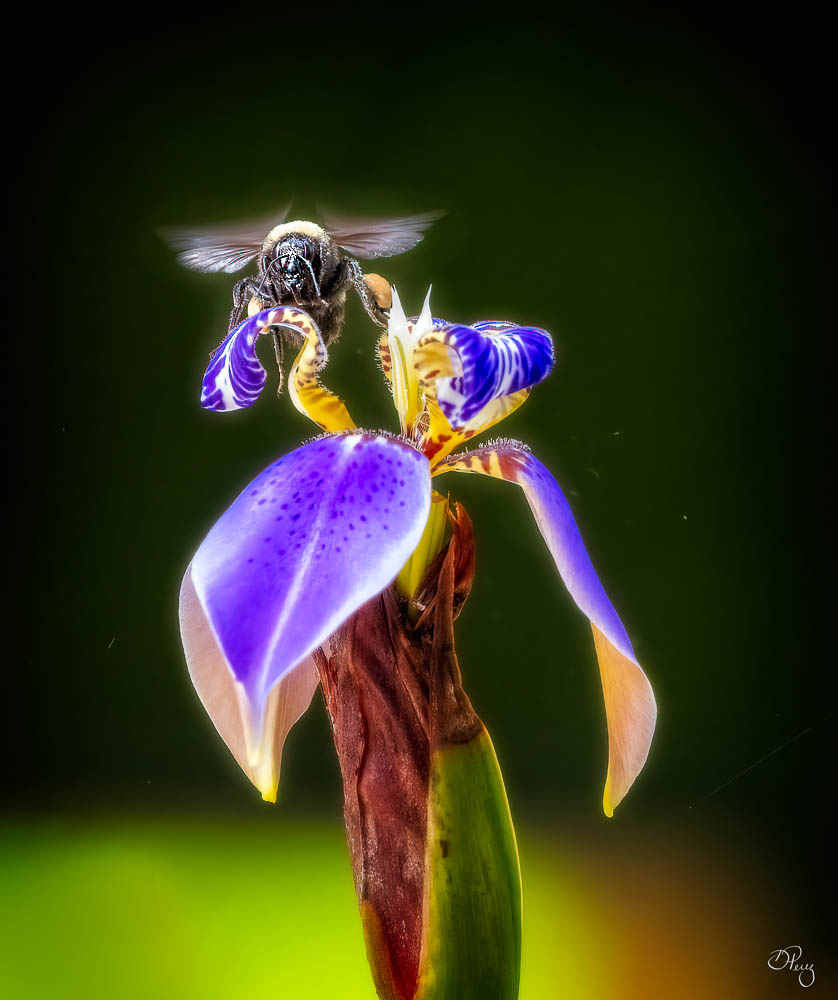
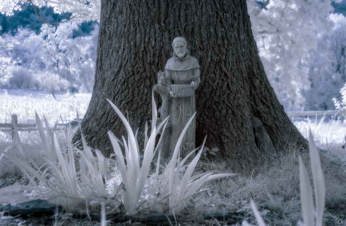
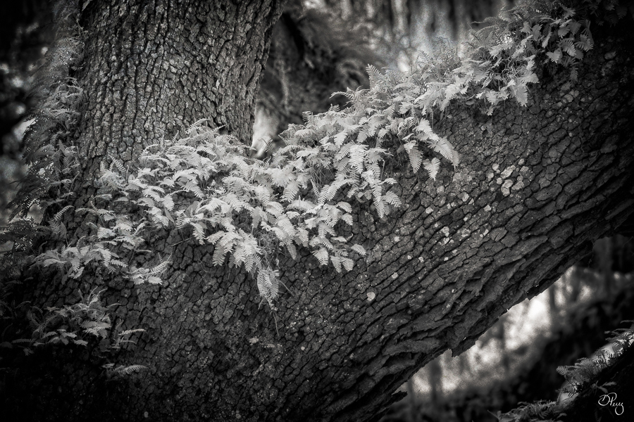
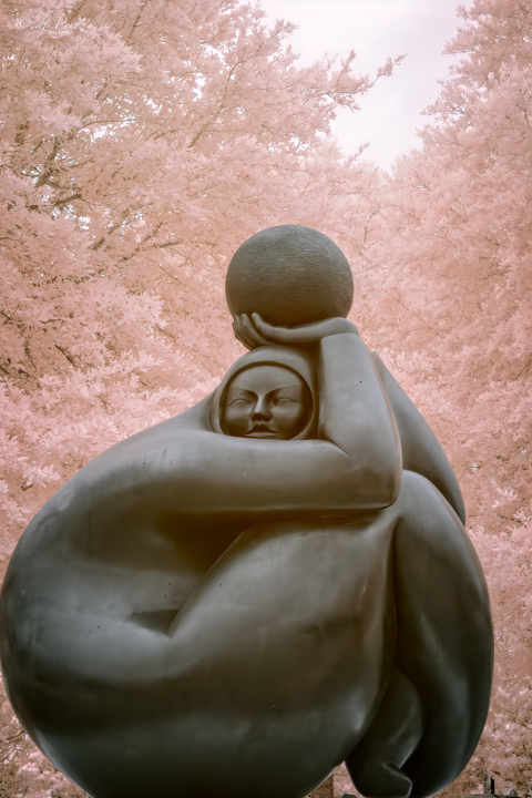
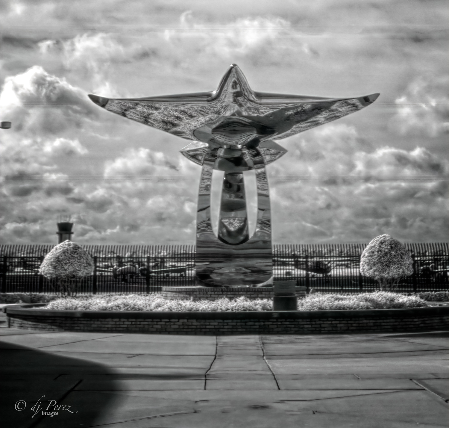
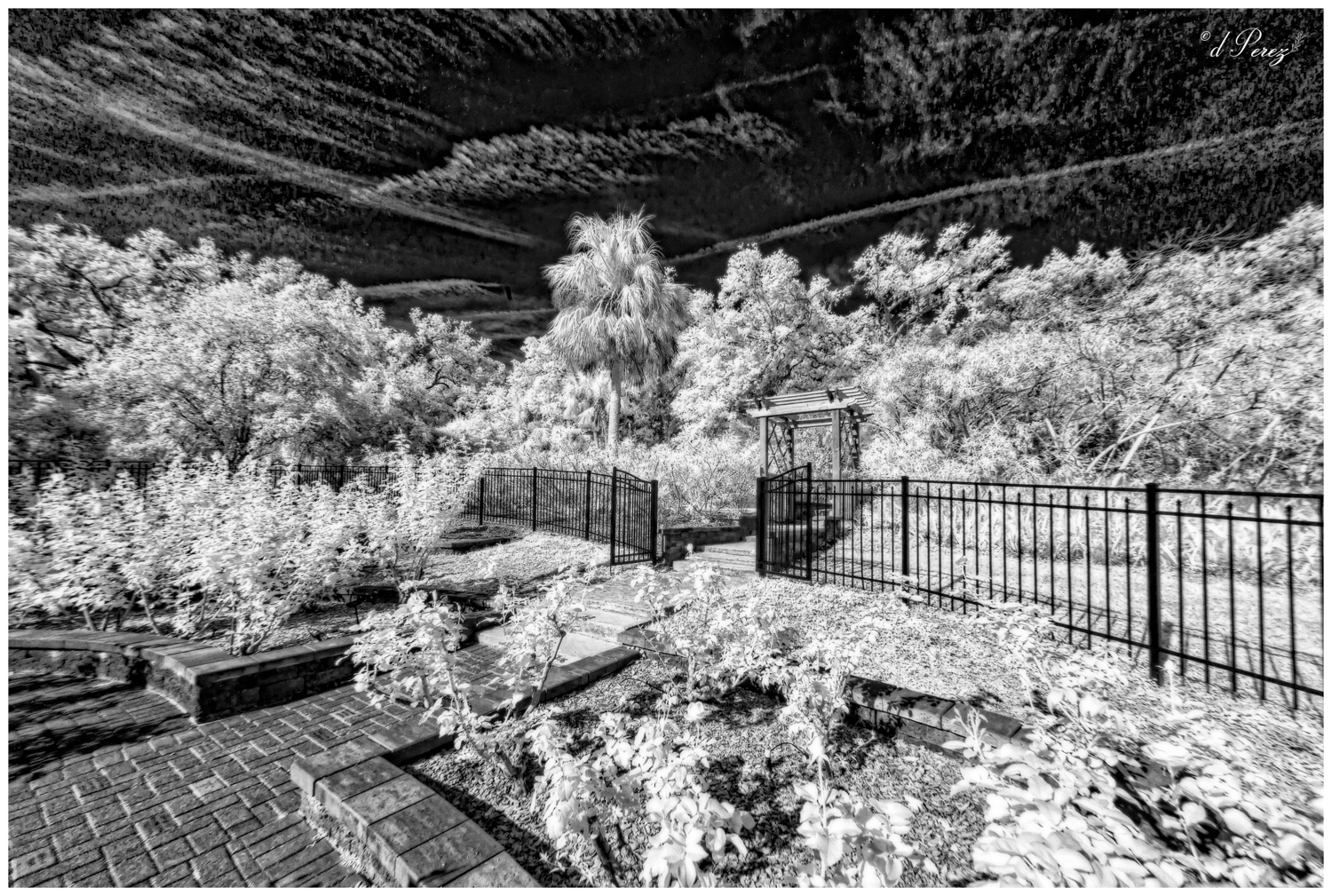
Well done!! I love the B&W version so much and the color is nice, too! For me, the cloud texture and the statue add a bit of mystic to the overall feel and the details of the irises are amazing. Masterful editing!! |
Jul 14th |
| 9 |
Jul 22 |
Comment |
Nice to have you posting again!! I'm starting to experiment more with my cell phone so happy to see other's photos. Don't remember what software you use but a couple of suggestions that I might use on something like this. First, I think I might try a little dehaze to cut some of the haze in the sky. It works with blue contrast so it might give a little more pop to those fireworks and I would either crop the bottom or clone out the gold "stripe" that is almost in the center. A vignette might add a nice touch, too. |
Jul 14th |
| 9 |
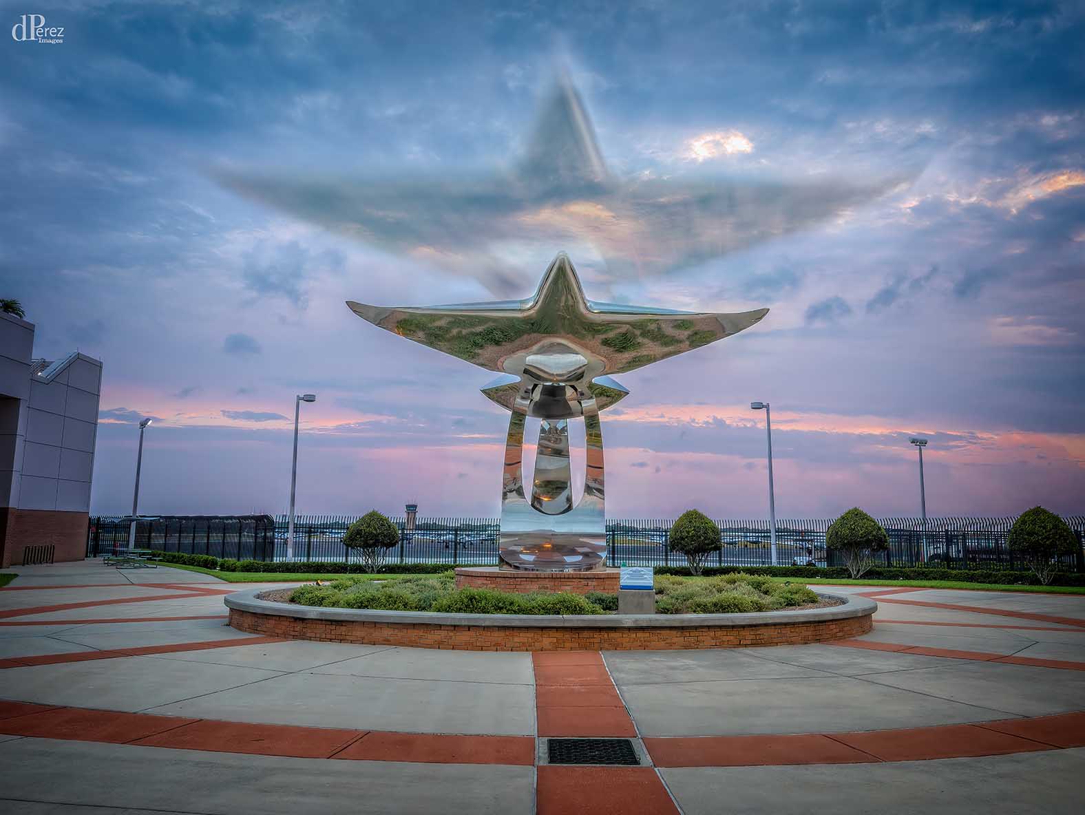
Jul 22 |
Comment |
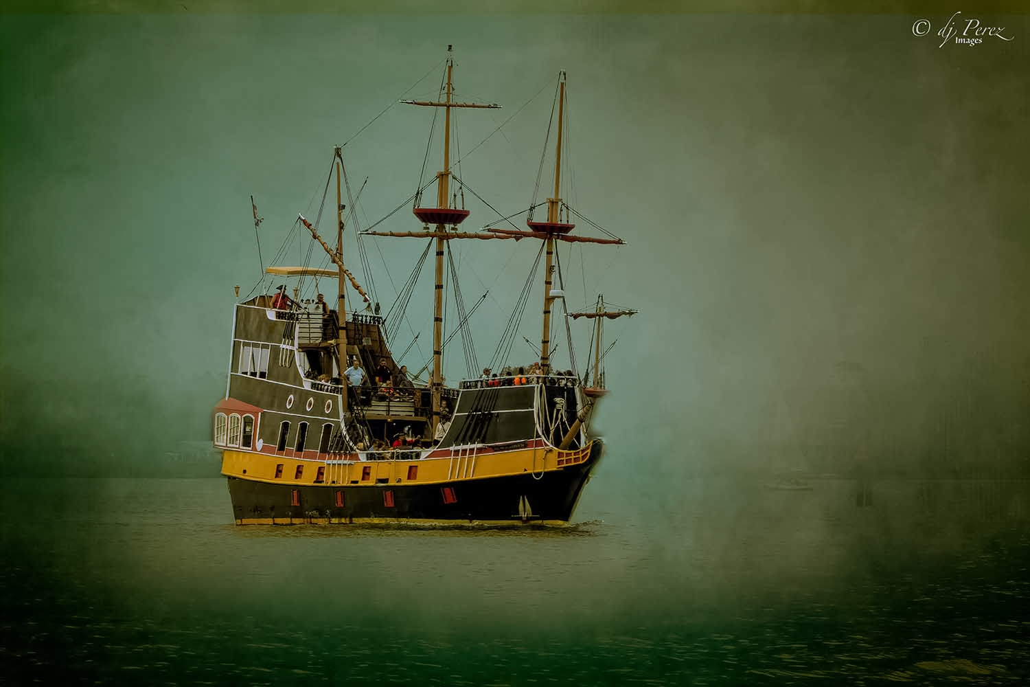
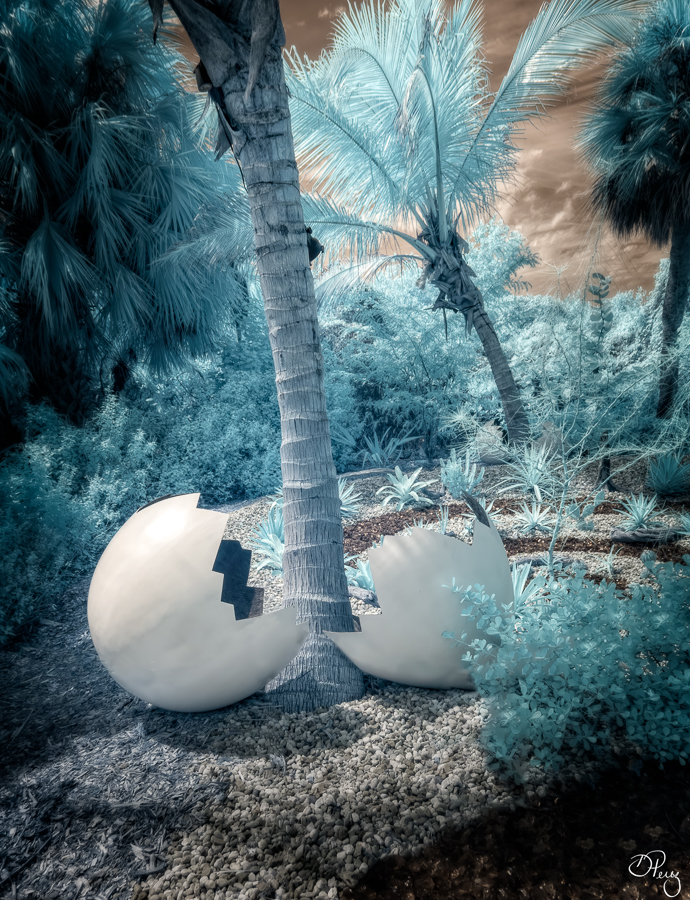
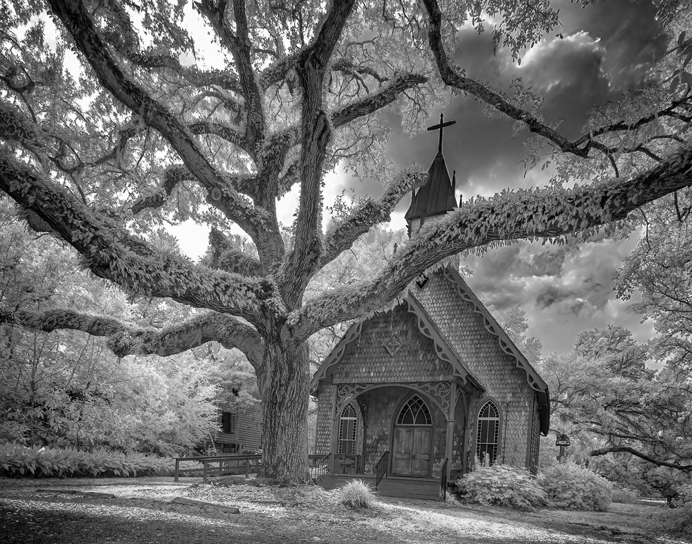
When I first saw your photo, I thought this was some sort of degaussing device for a ship but then I read 'bridge'. My mind is boggled! Agree that it should be a bit straighter but don't sacrifice the bottom (maybe AI to create content?). Like the duo and the single photos, just an awesome sight. Well done! |
Jul 14th |
| 9 |
Jul 22 |
Reply |
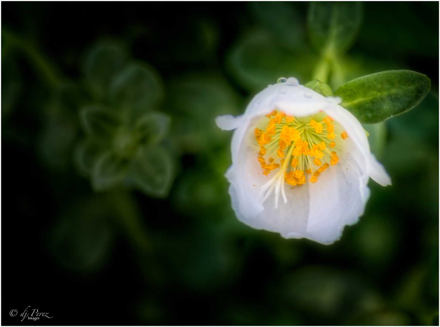
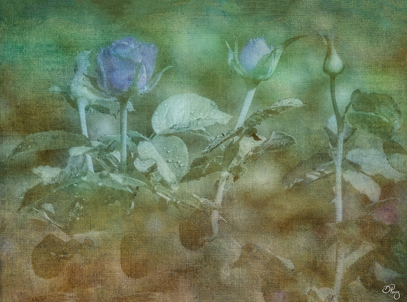
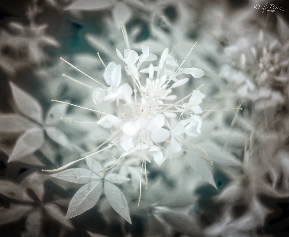
Thanks! I did intentionally blend texture on some of the flower edges especially the one in the back because it was showing the most damage. I did apply the same texture to the flowers twice, once to create the background with lots of masking and the a second time in soft light at a low opacity to blend the scene. Wonder if adding a hue/saturation to the layer creating the background would add the contrast to the edges??? Certainly food for thought so again thanks!! |
Jul 14th |
| 9 |
Jul 22 |
Reply |
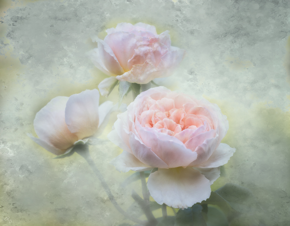
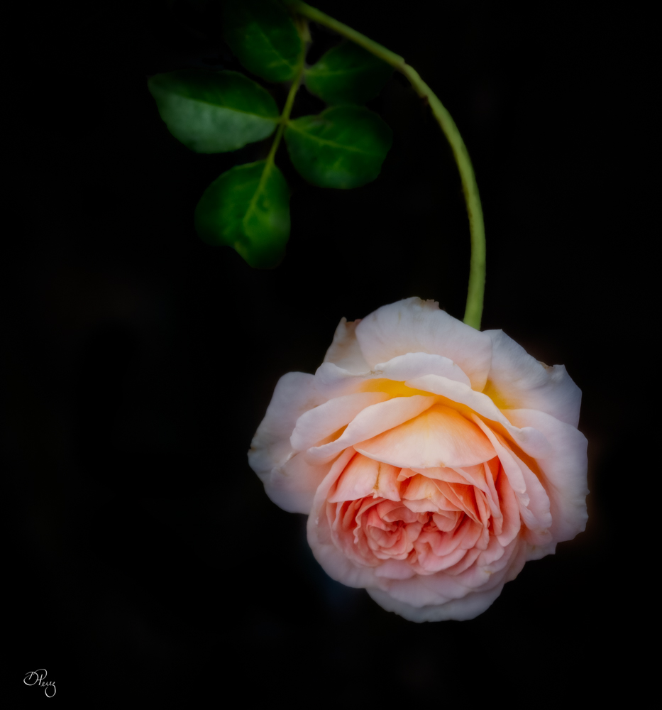
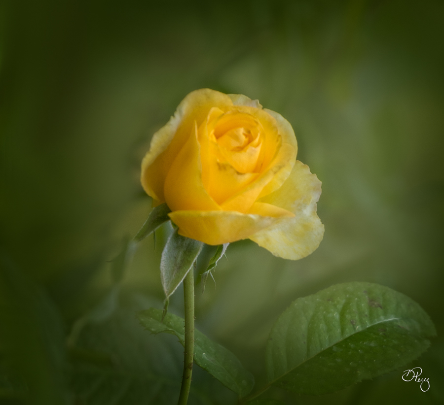
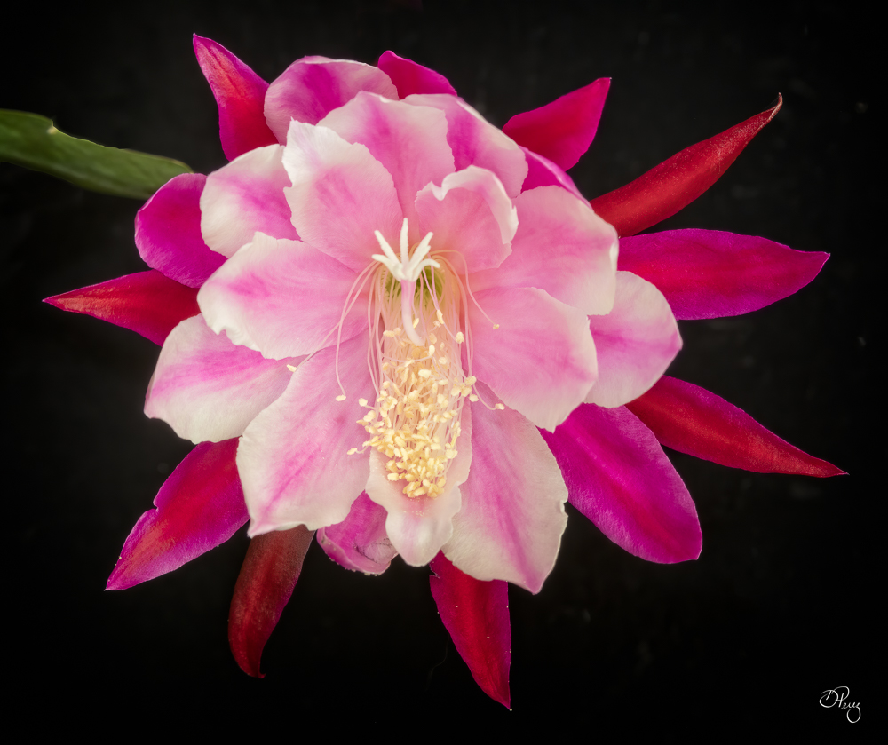
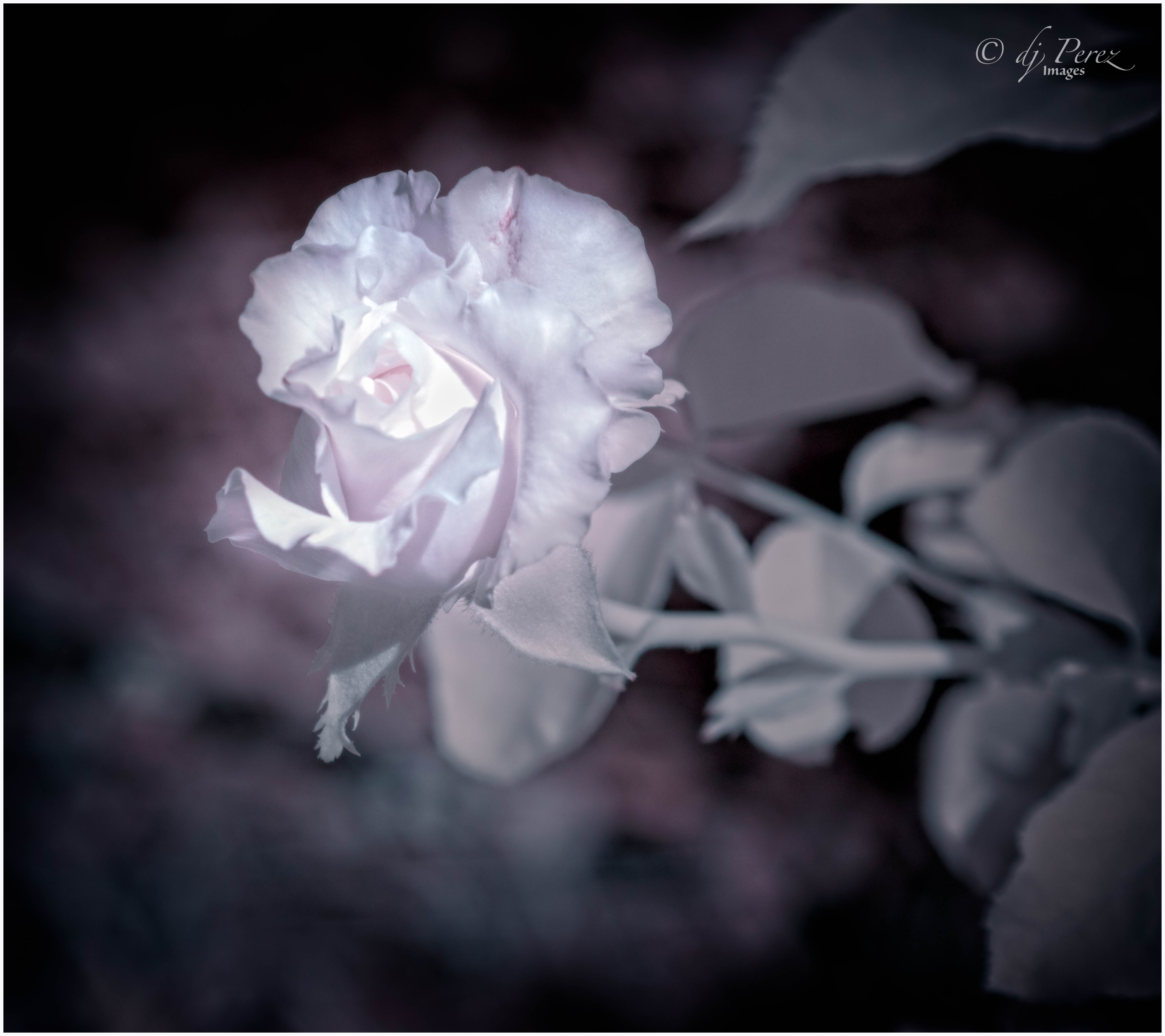
Thank you, these are floribunda roses which are considered an old fashion variety. Wish we could grow peonies here but it's too hot. |
Jul 9th |
6 comments - 4 replies for Group 9
|
| 35 |
Jul 22 |
Comment |
Nope, not breaking any rules and I applaud your creativity. I, too, didn't know the story of Edith Stein. I knew of the stumbling stones slightly. I would maybe lighten the brass a tad and try to get the lettering to pop on the stones. I would also think about moving them so they sort of encircle the statue, and if I had more photos of the stones add them. The statue and the stones are where we should look and I think you have what could be a very powerful photo. |
Jul 14th |
| 35 |
Jul 22 |
Comment |
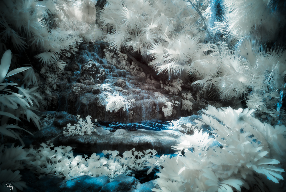
Very nice and peaceful! I love the rocks(?) that we see in the stream and how the stream meanders away. The sky and the dabbled light on the grass are lovely details but I do agree with Lauren and Chuck on the white objects. Not sure what they are but I would tone them down or get rid of them. |
Jul 14th |
| 35 |
Jul 22 |
Comment |
What a wicked looking lighthouse, love it!!! For my eye, the viewer's right doesn't have much appeal. I would suggest cropping like Chuck mentioned or developing more areas of contrast (close to the levels in the original) to break up the starkness of the area. Foreground could use a little more contrast too. |
Jul 14th |
| 35 |
Jul 22 |
Comment |
I love the original of this!! I would work a little on it, Perhaps with some vignette, to lead the view down the trail. For me, the process version is too much of the same and agree with Stuart that I can't easily find a point of focus. If you prefer the B&W, vignette and some creative dodging and burning may aid in developing a strong focus area. |
Jul 14th |
| 35 |
Jul 22 |
Reply |
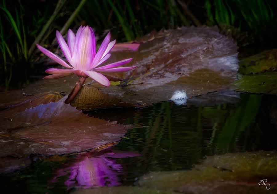
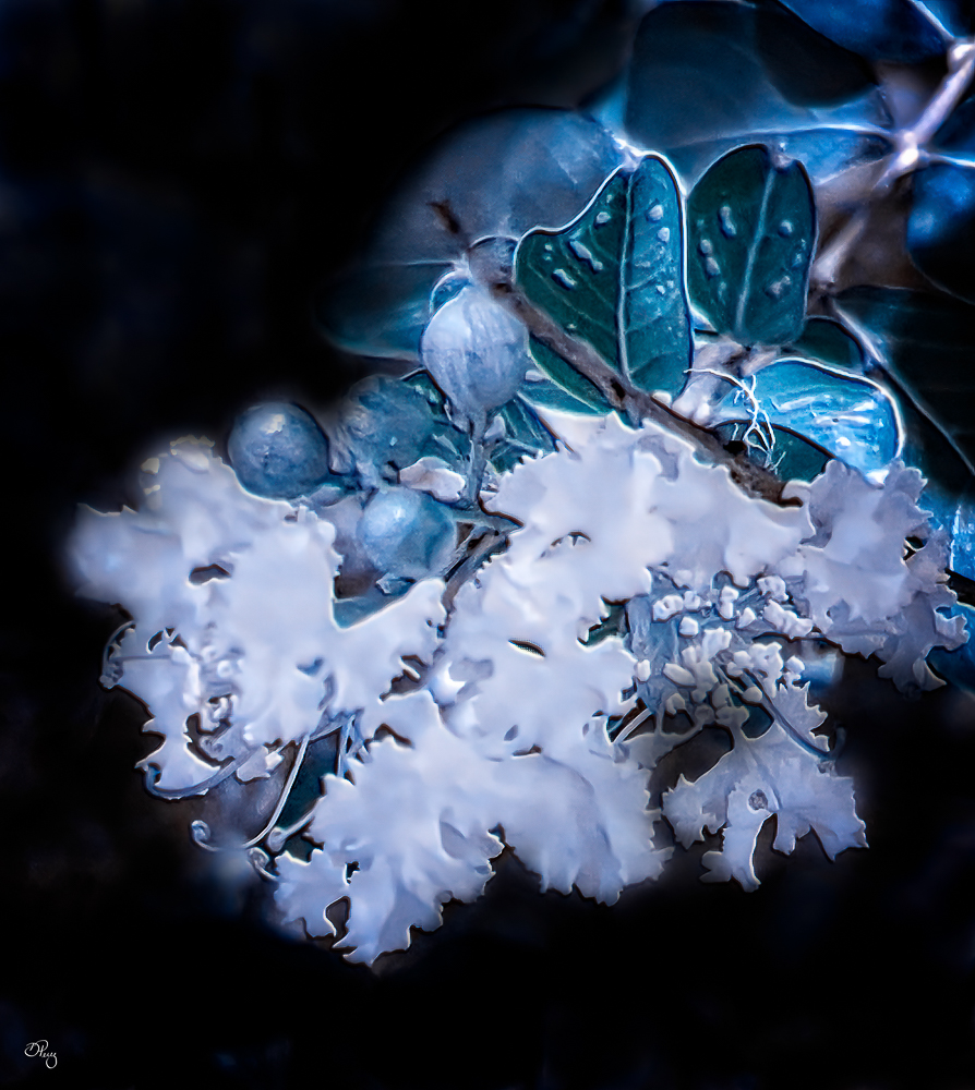
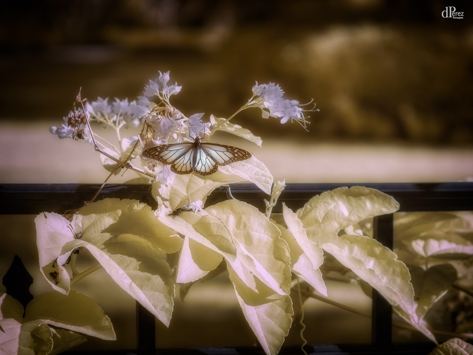
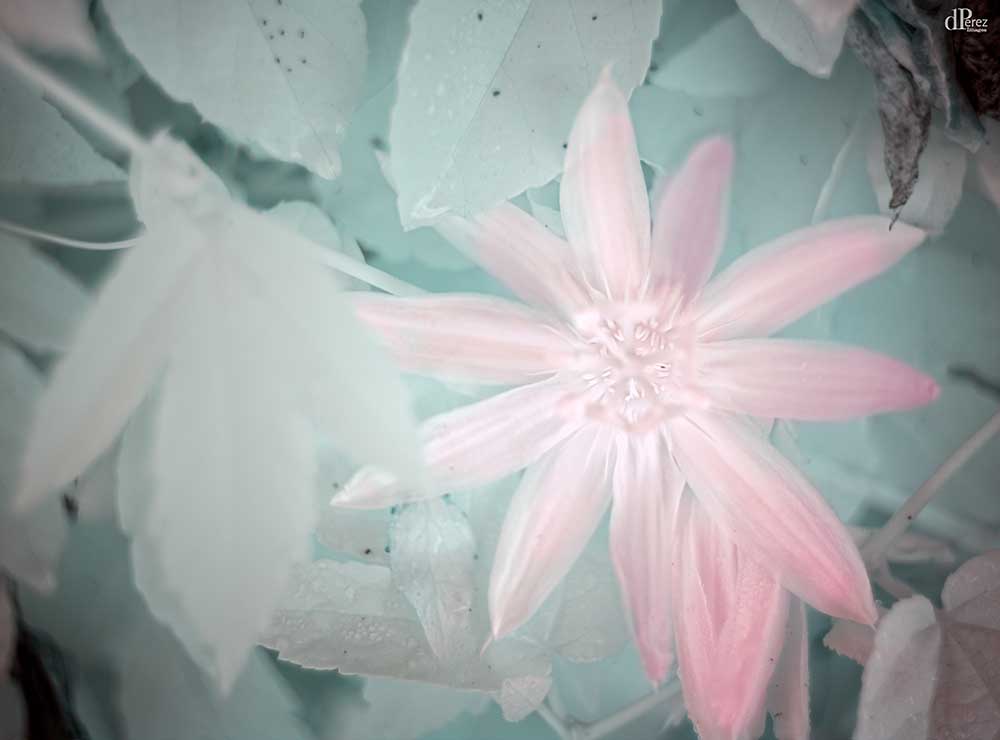
The white area didn't have any detail because of the conversion (pink flower didn't have much detail in color, either), there is some slight variation in the unprocessed photo. BUT I understand what you're saying and think the subject matter may have not been the best. I was very impressed with the detail in the leaves and buds (chlorophyll rich areas). For me, this will be an ongoing experiment to see what I can render with my cell phone. |
Jul 14th |
| 35 |
Jul 22 |
Reply |
I have done additional research and the LIDAR sensor does need to be able to receive 'light' in the IR spectrum to determine depth and helps in low light situation. That, to me, means there would be no 'hot mirror' and the IR light travels to the camera sensor. SO if we use an IR filter, we would only be that frequency to pass to the camera sensor. Do know there are some "professional" photographers who are touting IR iPhone photography. |
Jul 14th |
4 comments - 2 replies for Group 35
|
10 comments - 6 replies Total
|