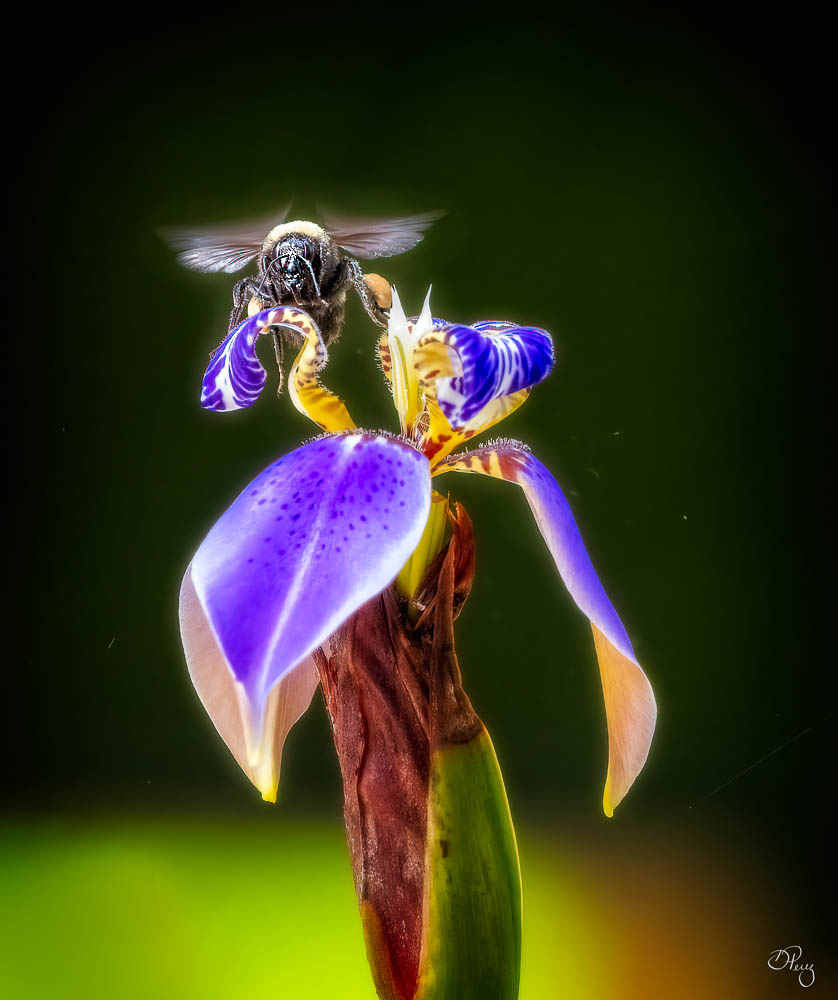
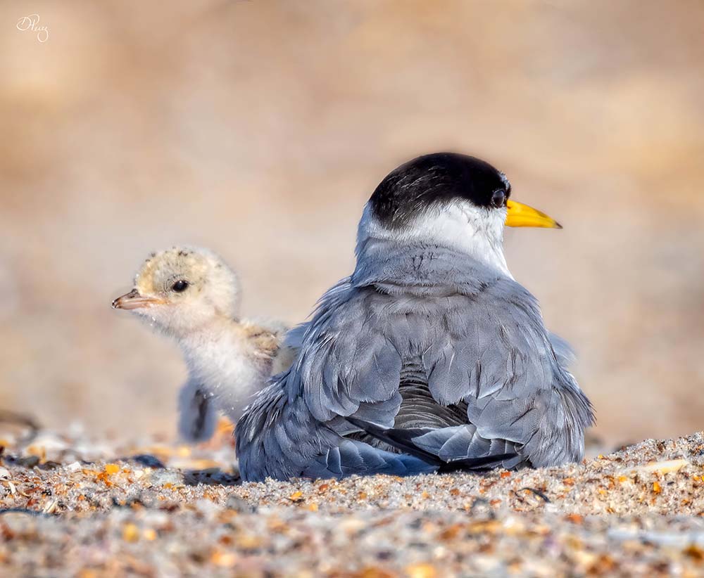
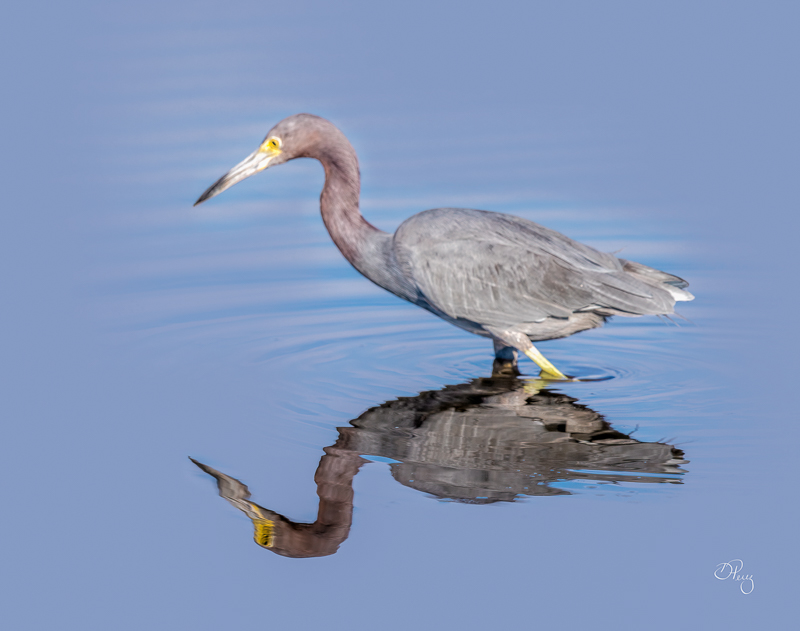
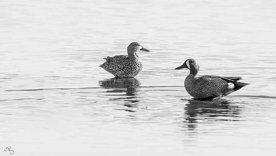
Activity for User 148 - Debbie Perez - djperezus@yahoo.com
Avatar
Close this Tab when done
657 Comments / 242 Replies Posted
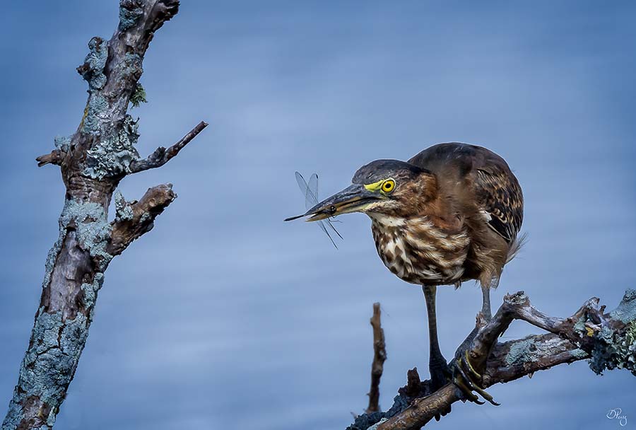
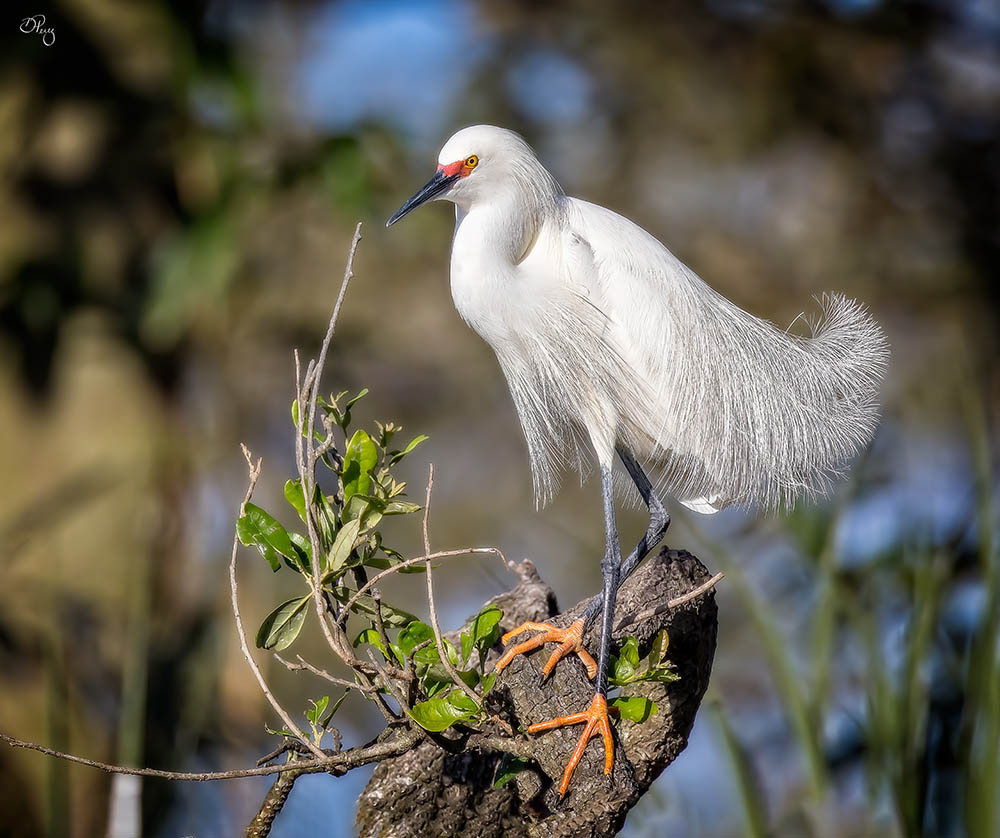
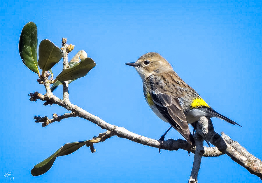
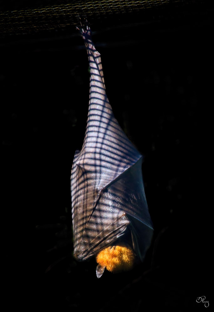
118 Images Posted
| = Current Round | = Previous Round |
| Group 09 | |||||||||||
|---|---|---|---|---|---|---|---|---|---|---|---|
 Sep 22 |
 Aug 22 |
 Jul 22 |
 Jun 22 |
 May 22 |
 Apr 22 |
 Mar 22 |
 Feb 22 |
 Dec 21 |
 Nov 21 |
 Oct 21 |
 Sep 21 |
 Aug 21 |
 Jul 21 |
 Jun 21 |
 May 21 |
 Apr 21 |
 Mar 21 |
 Feb 21 |
 Jan 21 |
 Dec 20 |
 Nov 20 |
 Oct 20 |
 Sep 20 |
 Aug 20 |
 Jul 20 |
 Jun 20 |
 May 20 |
 Apr 20 |
 Feb 20 |
 Jan 20 |
 Dec 19 |
 Nov 19 |
 Oct 19 |
 Sep 19 |
 Aug 19 |
 Jul 19 |
 Jun 19 |
 May 19 |
 Apr 19 |
 Mar 19 |
 Feb 19 |
 Jan 19 |
 Dec 18 |
 Nov 18 |
 Oct 18 |
 Sep 18 |
 Aug 18 |
 Jul 18 |
 Jun 18 |
 May 18 |
 Apr 18 |
 Mar 18 |
 Feb 18 |
 Jan 18 |
 Dec 17 |
 Nov 17 |
 Oct 17 |
 Sep 17 |
 Aug 17 |
 Jul 17 |
 Jun 17 |
 May 17 |
 Apr 17 |
 Mar 17 |
 Feb 17 |
 Jan 17 |
|||||
| Group 35 | |||||||||||
 Sep 22 |
 Aug 22 |
 Jul 22 |
 Jun 22 |
 May 22 |
 Apr 22 |
 Mar 22 |
 Feb 22 |
 Dec 21 |
 Nov 21 |
 Oct 21 |
 Sep 21 |
 Aug 21 |
 Jul 21 |
 Jun 21 |
 May 21 |
 Apr 21 |
 Mar 21 |
 Feb 21 |
 Jan 21 |
 Dec 20 |
 Nov 20 |
 Oct 20 |
 Sep 20 |
 Aug 20 |
 Jul 20 |
 Jun 20 |
 May 20 |
 Apr 20 |
 Feb 20 |
 Jan 20 |
 Dec 19 |
 Nov 19 |
 Oct 19 |
 Sep 19 |
 Aug 19 |
 Jul 19 |
 Jun 19 |
 May 19 |
 Apr 19 |
 Mar 19 |
 Feb 19 |
 Jan 19 |
 Dec 18 |
 Nov 18 |
 Oct 18 |
 Sep 18 |
 Aug 18 |
 Jul 18 |
 Jun 18 |
 May 18 |
|||||||||