|
| Group |
Round |
C/R |
Comment |
Date |
Image |
| 9 |
Mar 21 |
Reply |
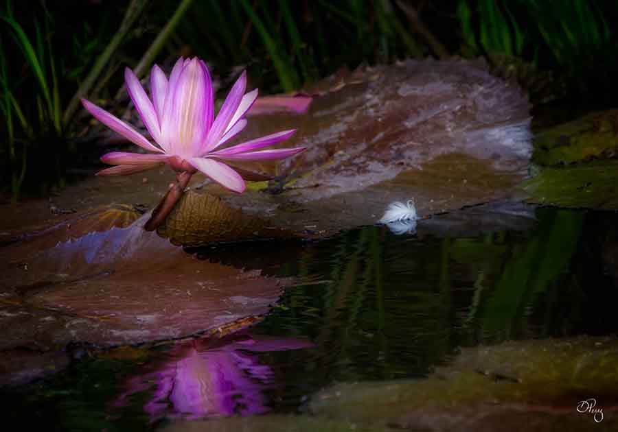
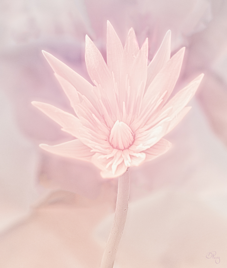
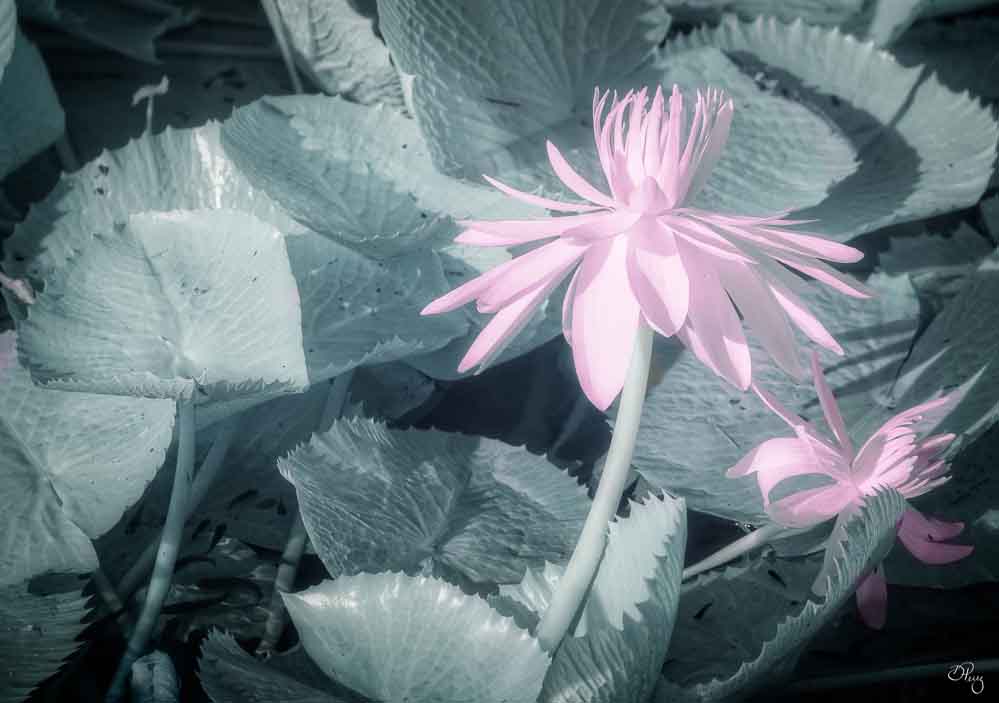
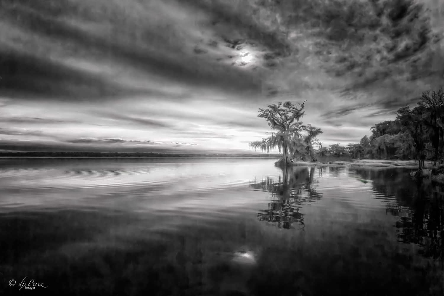
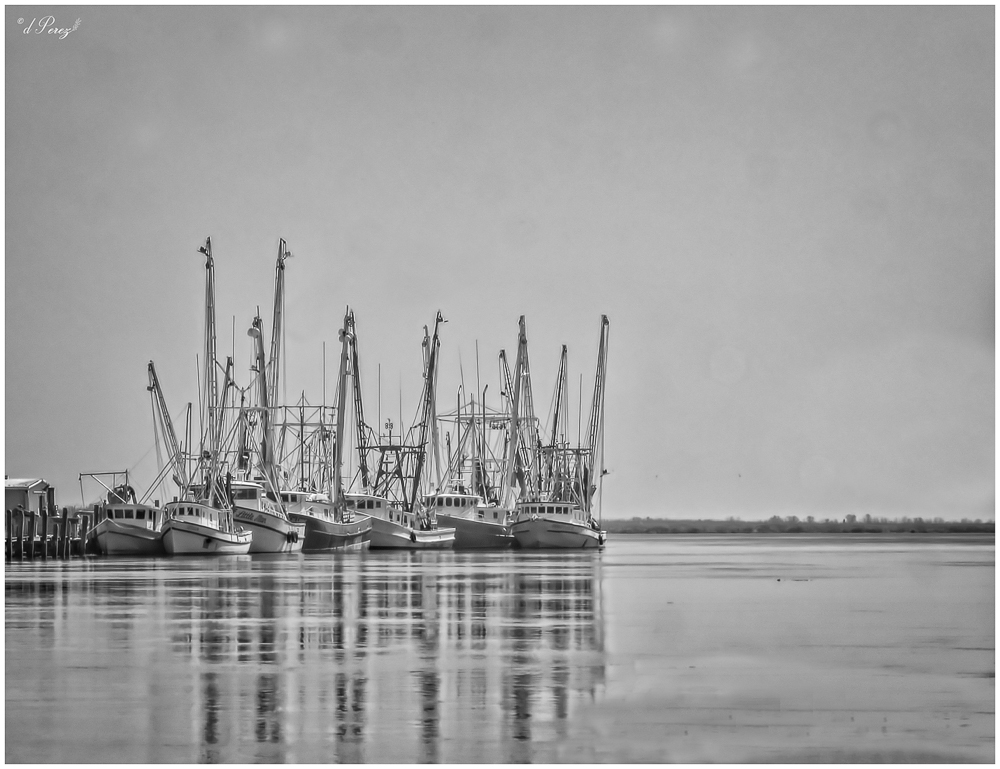
I'm guessing I grabbed a low res file and that's what caused the softness. BUT it is a good thing to remember when posting to the web to sharpen a bit. I had been working on prints prior to these post and that might of messed me up, too! I like trying new techniques, not sure I always get them right but it's fun! |
Mar 16th |
| 9 |
Mar 21 |
Reply |
Hi Stuart!
I may have put this through Denoise but honestly can't remember. The original photo is fairly sharp and I'm thinking I used too low a res photo when I posted. Need to remember to sharpen a bit before I post. I use all three programs you mentioned but hadn't considered Luminar AI for these types. Did you use one of their presets??? Always great to find another software to add to the process!
|
Mar 16th |
| 9 |
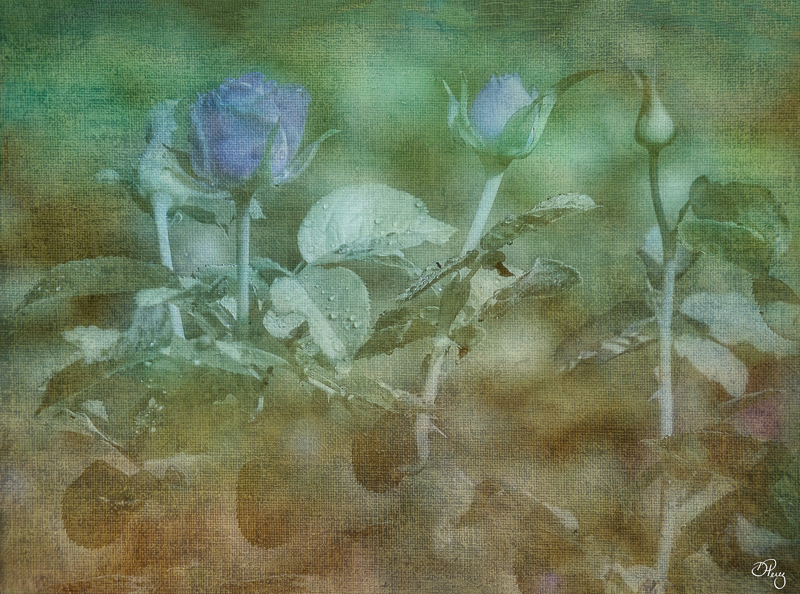
Mar 21 |
Reply |
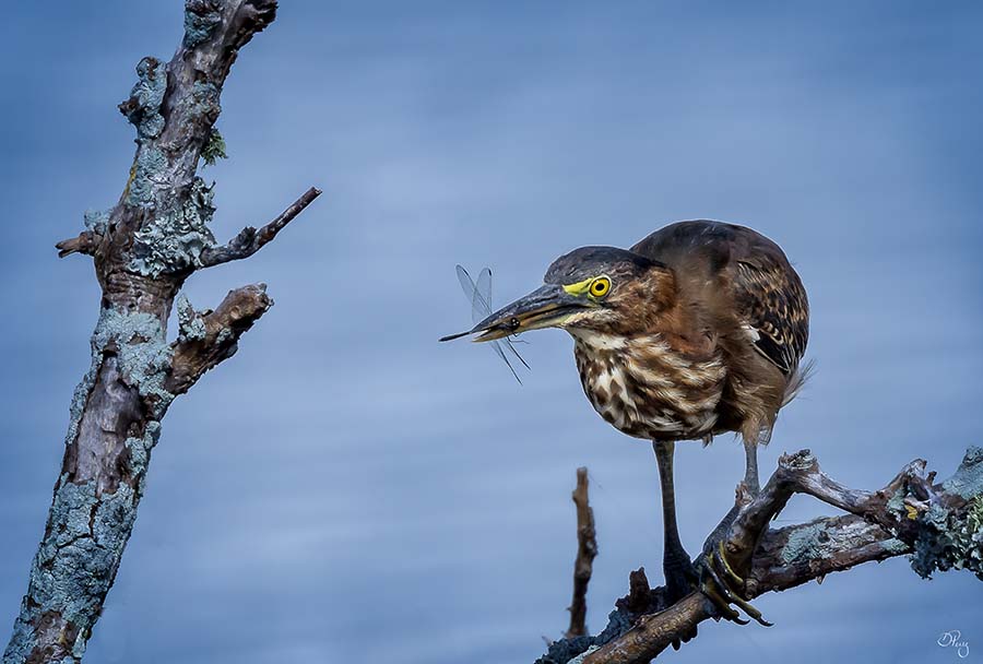
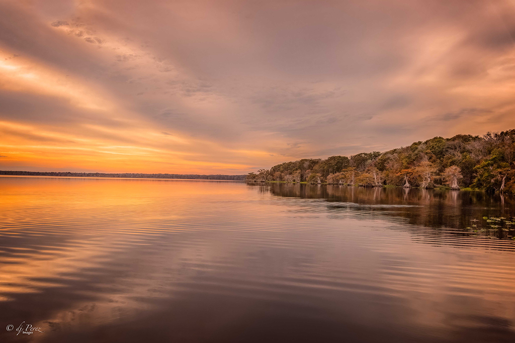
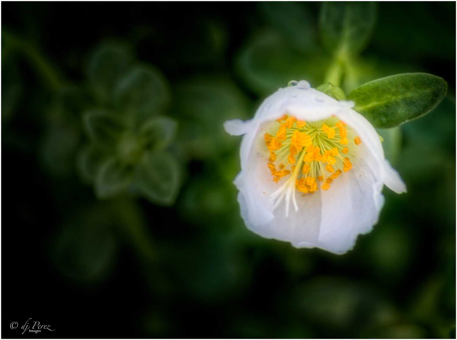
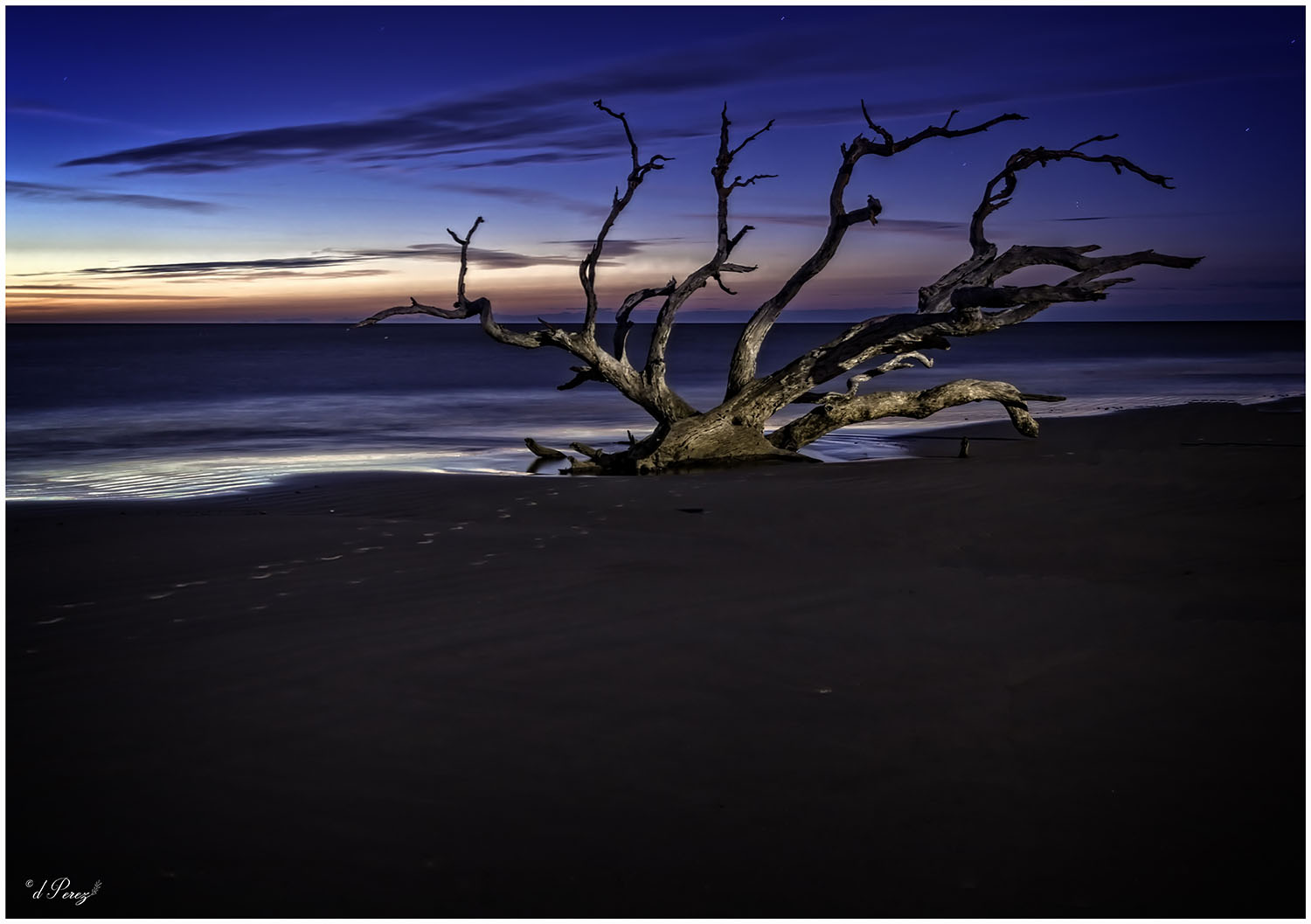
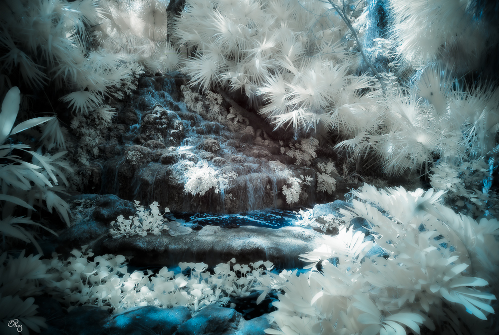
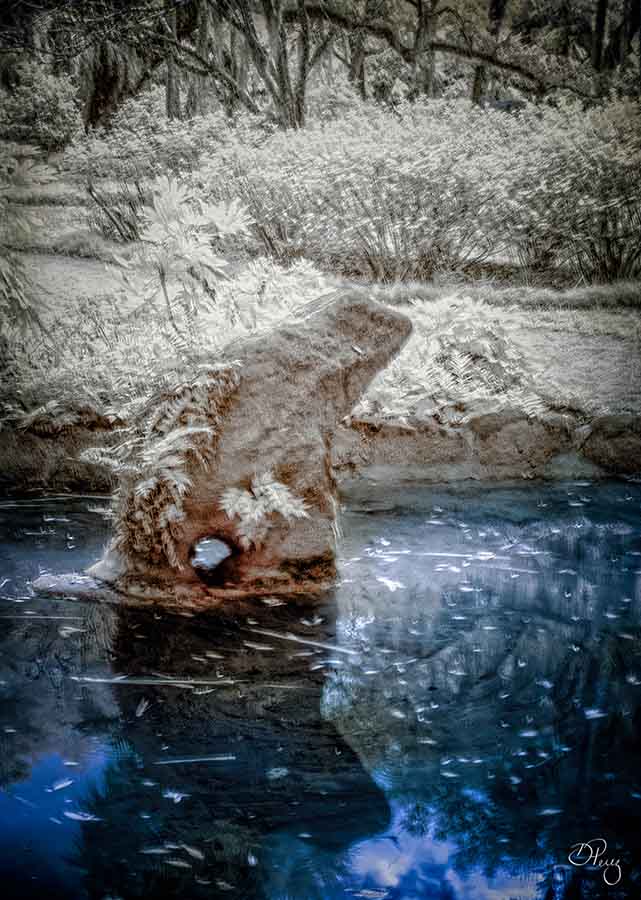
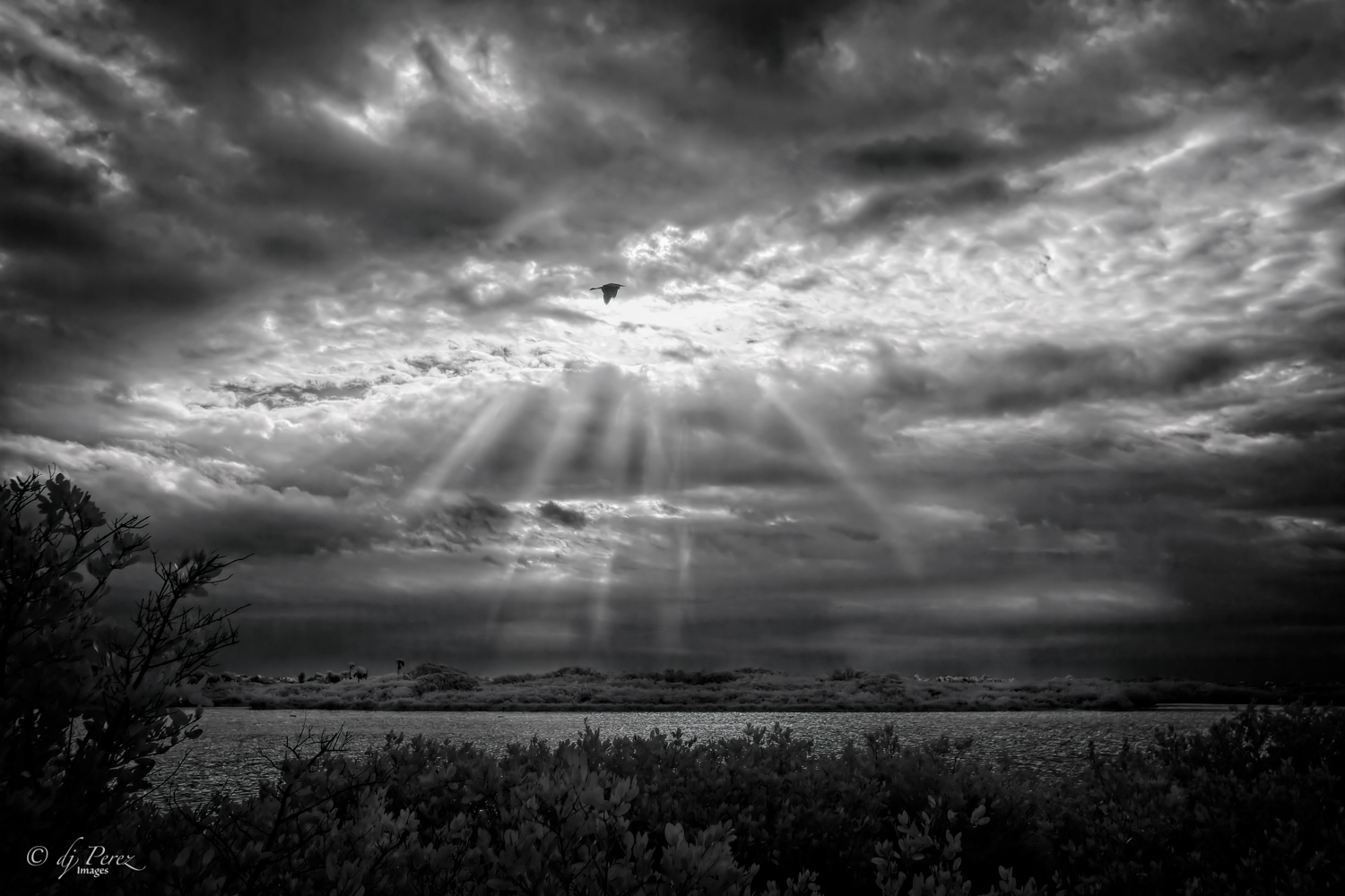
That blue was just how the water rippled, I didn't add it. I usually don't sharpen much but I do think there was a bit of softening when I posted. It could be that I used too low a res file. Will have to try to remember that for future post. I like the reflection!! |
Mar 16th |
| 9 |
Mar 21 |
Comment |
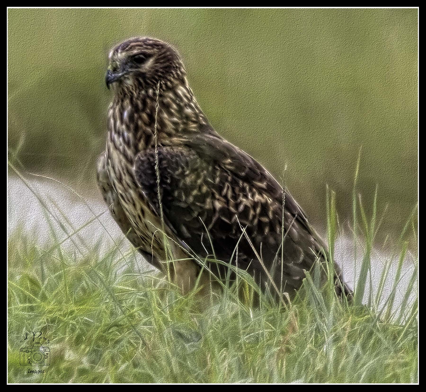
Cute little anole! Very nice color contrast and I can see why it attract you. I really like how big his shadow is as well. Looks like this little guy is well fed and healthy, too! Think you did quite well with this! |
Mar 15th |
| 9 |
Mar 21 |
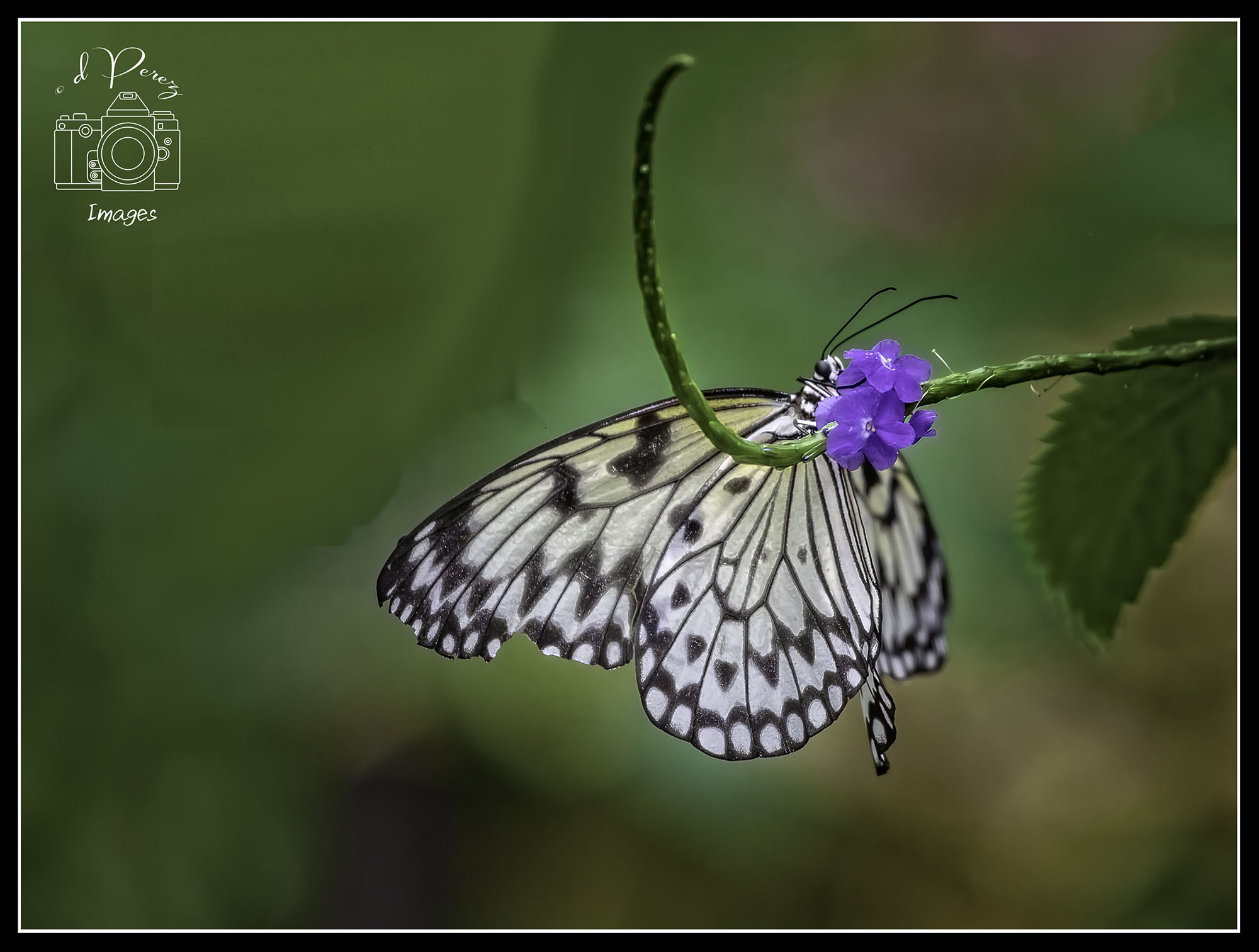
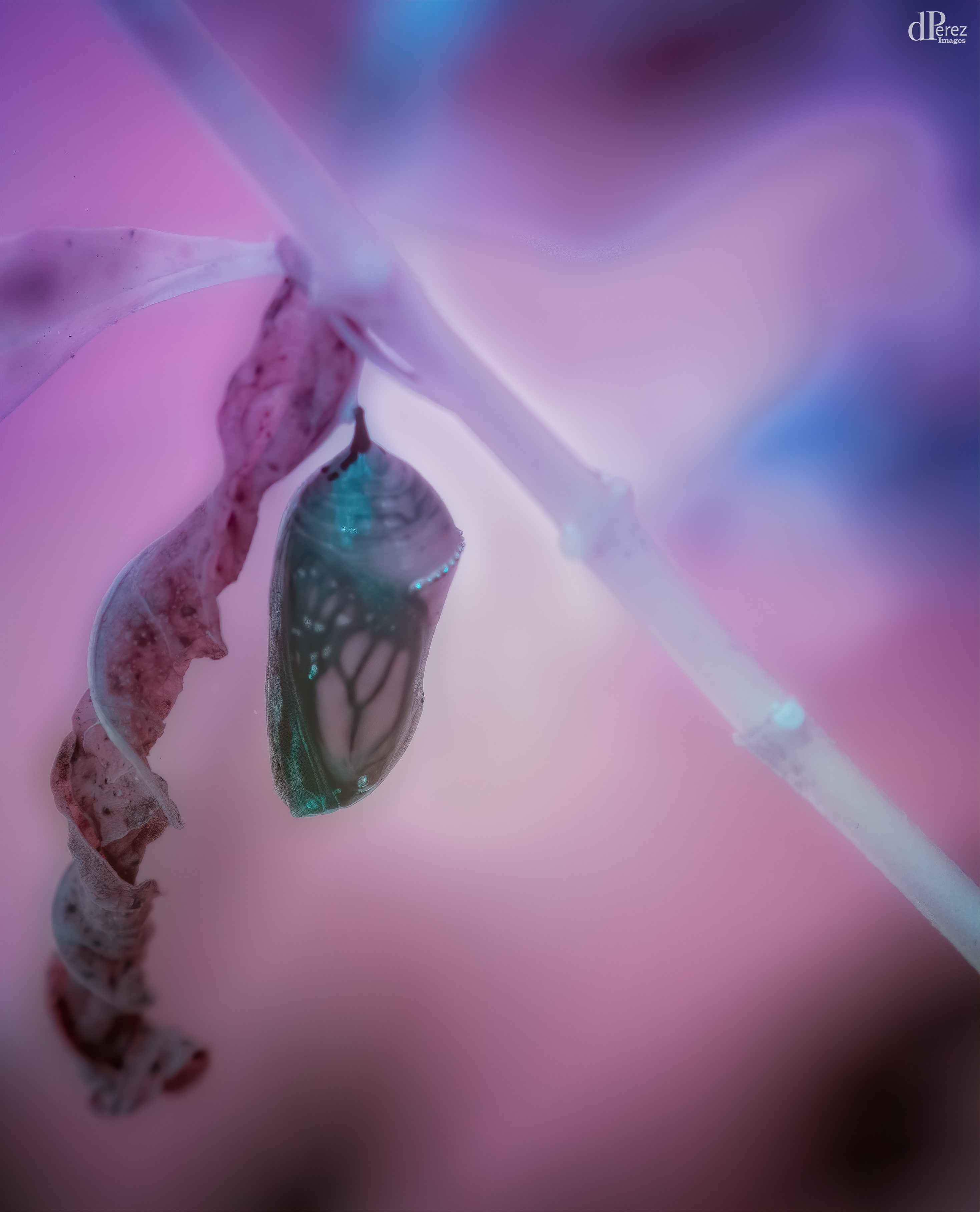
Comment |
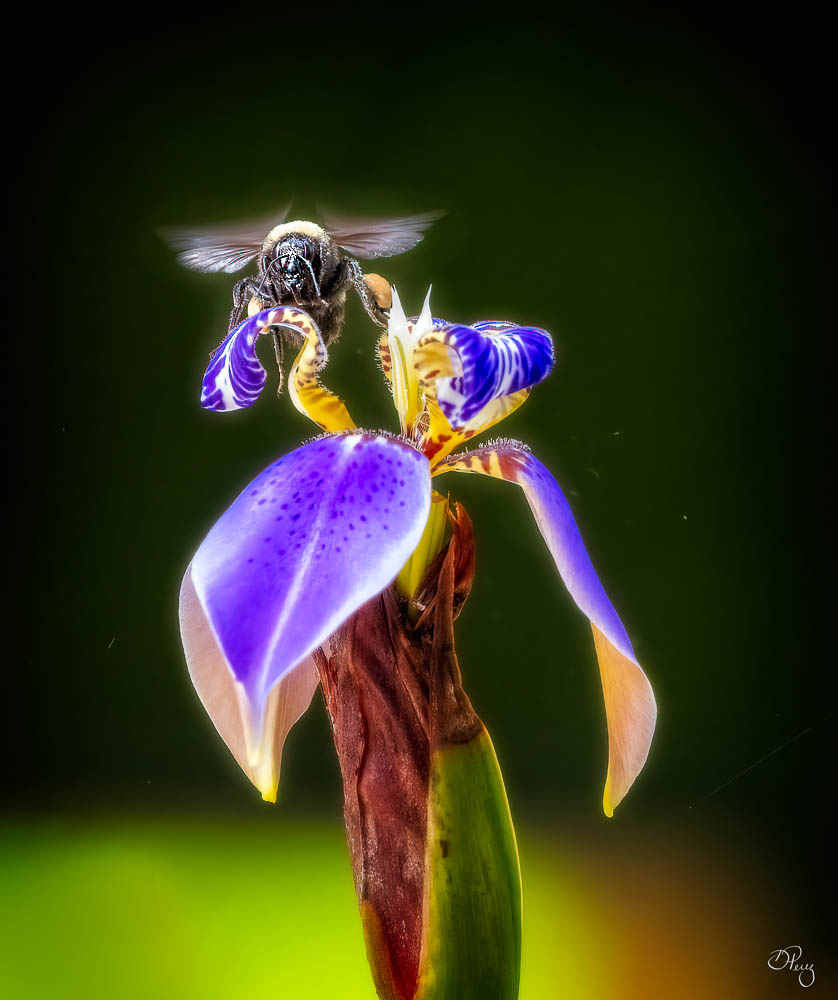
A magnificent bug. The detail is amazing. I looked at all three and I think I prefer the one with the darker vignette. Curious as to what you shot this with. Well done! |
Mar 15th |
| 9 |
Mar 21 |
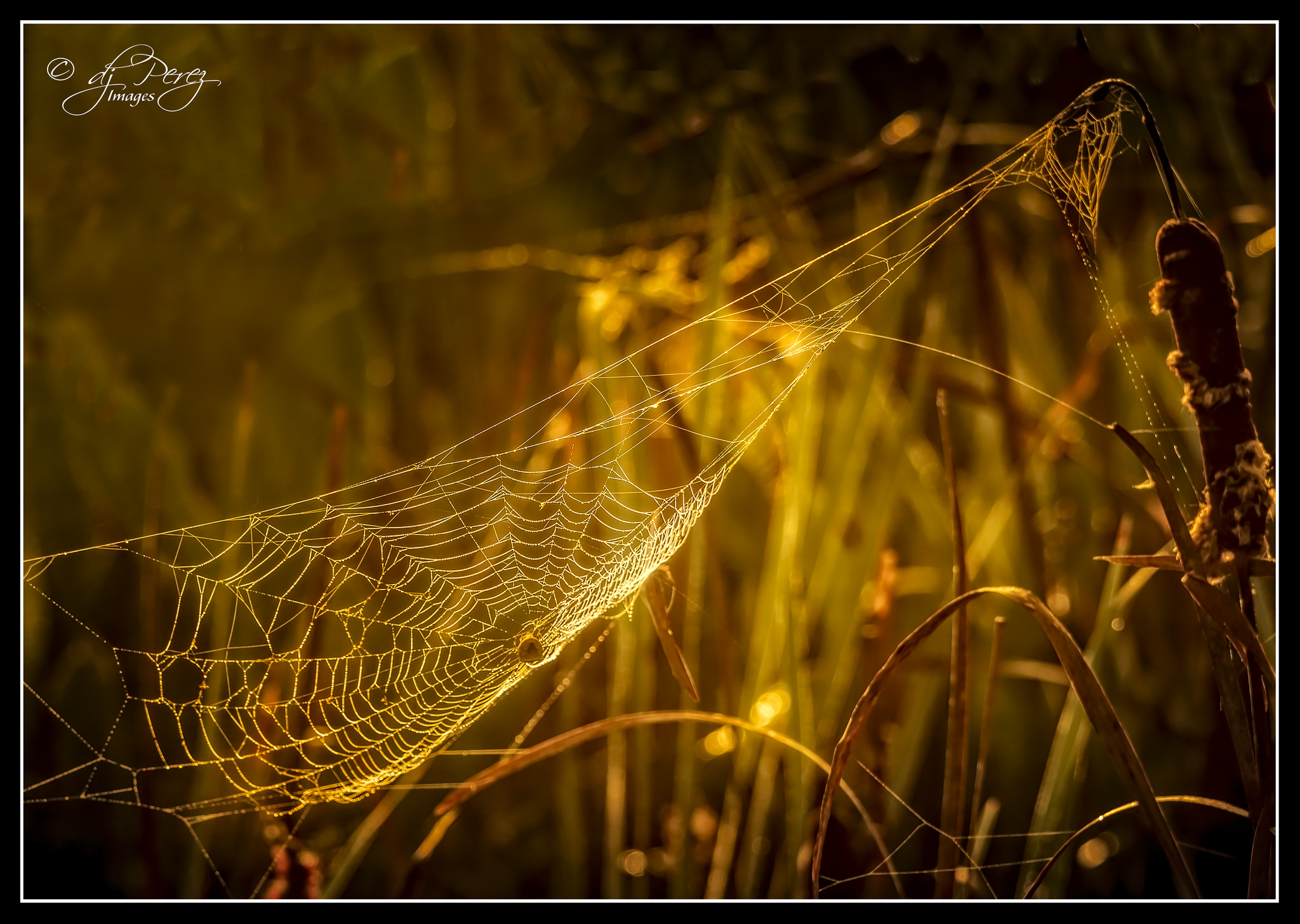
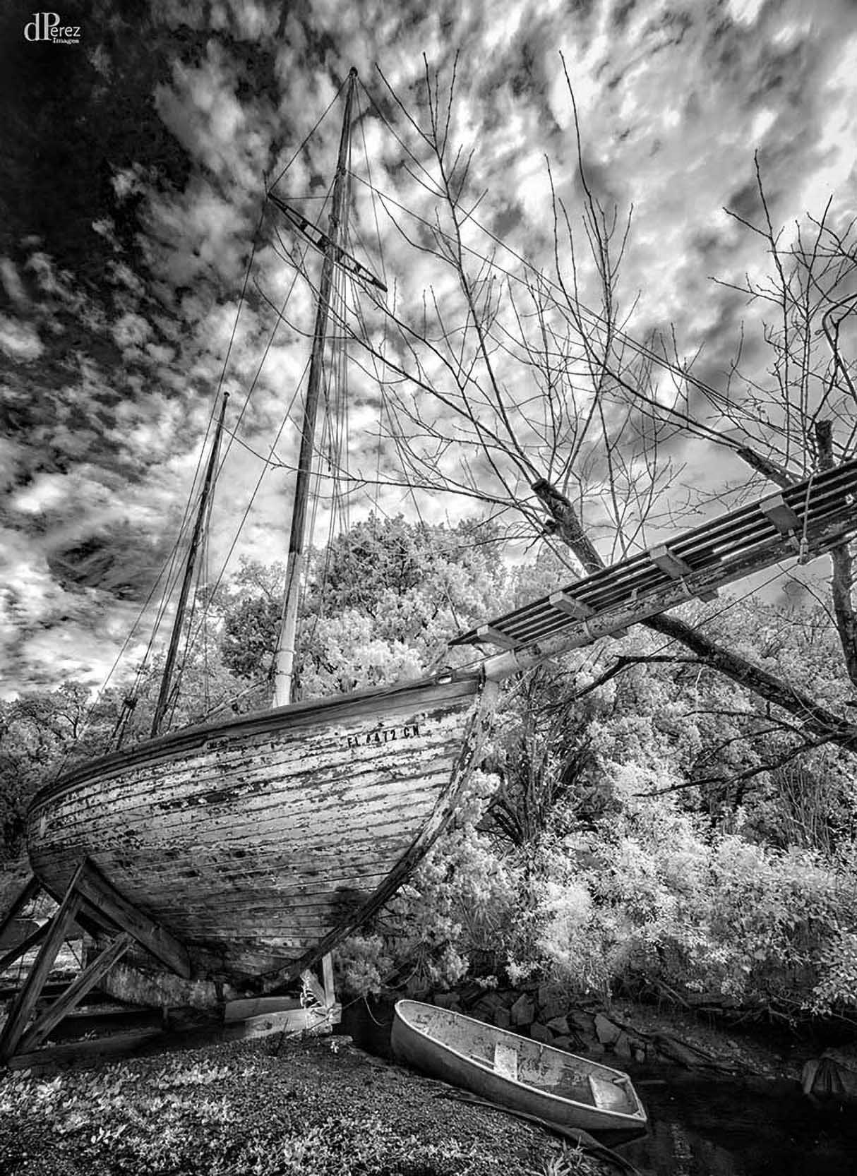
Comment |
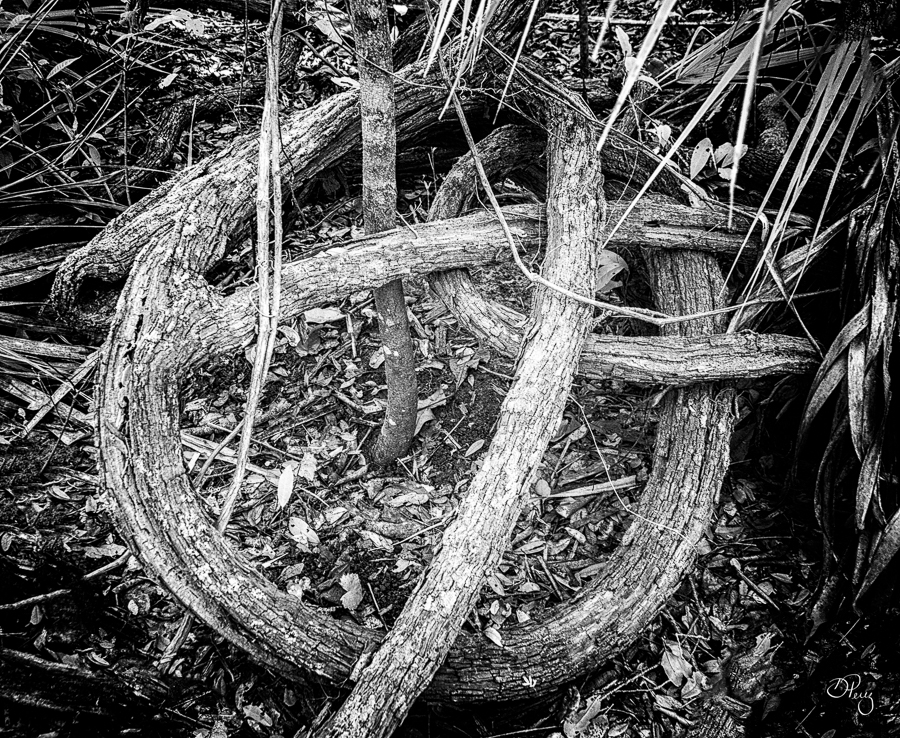
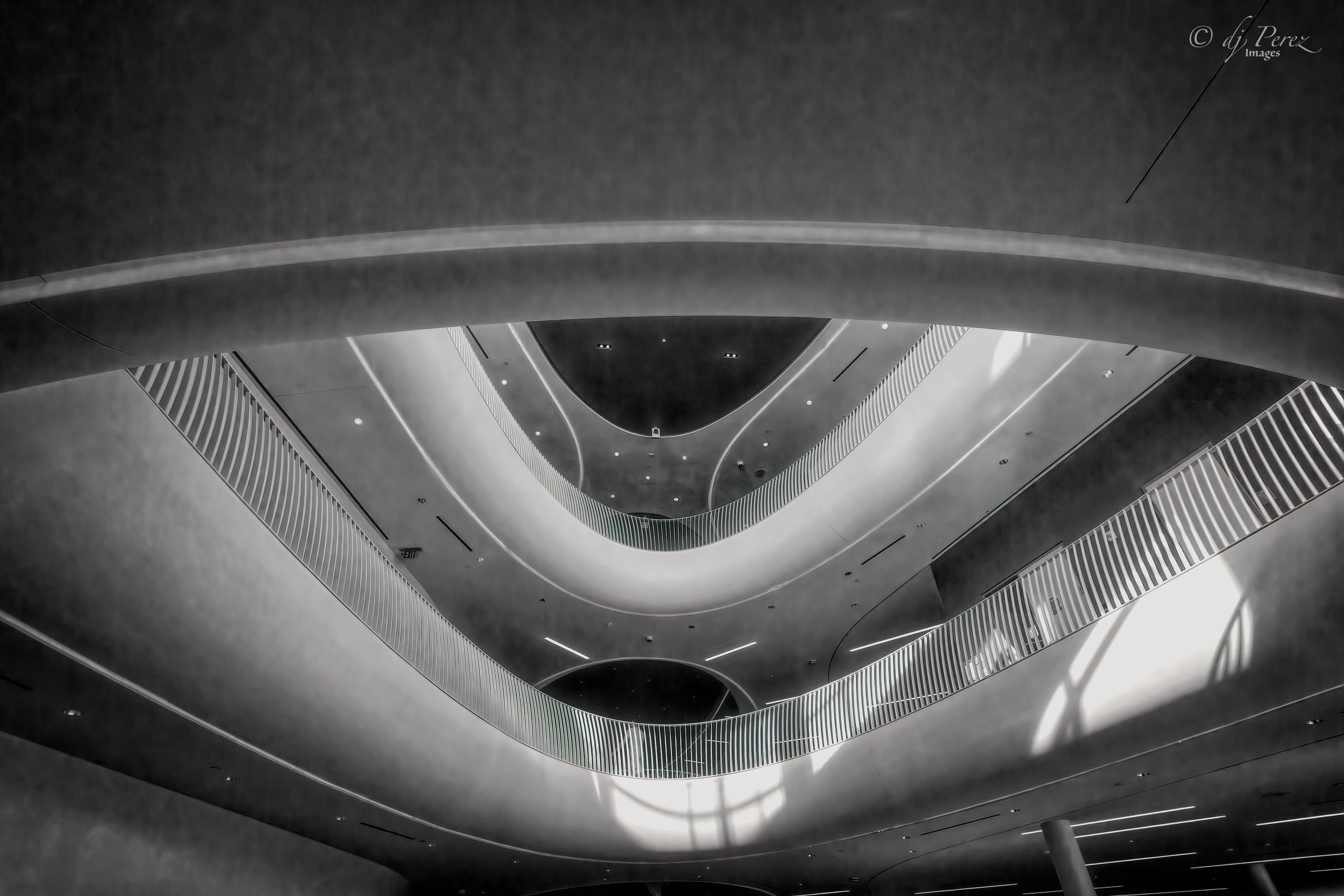
Love it!! I think you shot this geometry quite well. My eye could explore the lines and angles forever. I have to wonder if this would look good as a black and white as it is dynamic and it might yield a wonderful look! Good job!! |
Mar 15th |
| 9 |
Mar 21 |
Comment |
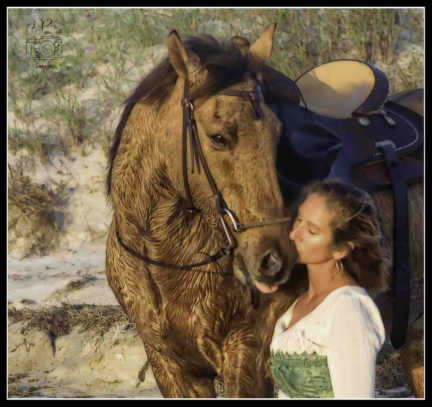
I love owls and Dr Hoo immediately drew me into the photo. Overall, I think this is an interesting photo. The only thing I wish is that the background wasn't so dark particularly where her arm holding Dr Hoo is. It just blends a bit too much for my eye. I do applaud you for working in the person. I never succeed at that because I only see the birds, lol!! |
Mar 15th |
| 9 |
Mar 21 |
Comment |
I love the tree!! It is magnificent. The sheep definitely add some interest. The only thing that bothers me is the snow seems extra crunchy! Now it could be that I don't have many snow experience to know what it looks like but the few I have had snow was 'softer'. I like the cloud as well. Overall, great job and again welcome! |
Mar 15th |
| 9 |
Mar 21 |
Comment |
Wow! Those are some big mountains!! I think I see two people in the foreground which gives great sense of scale. One thing that I might suggest would be to clone out the trees on the bottom edge. They really don't add. I think the mountains look a little soft but that may be due to the web (or my eyes). Nice job!! |
Mar 15th |
6 comments - 3 replies for Group 9
|
| 35 |
Mar 21 |
Reply |
Just to a look at your book, it is fantastic!! Really lovely examples of your talent!! |
Mar 17th |
| 35 |
Mar 21 |
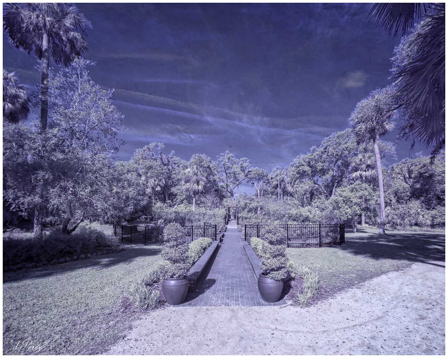
Comment |
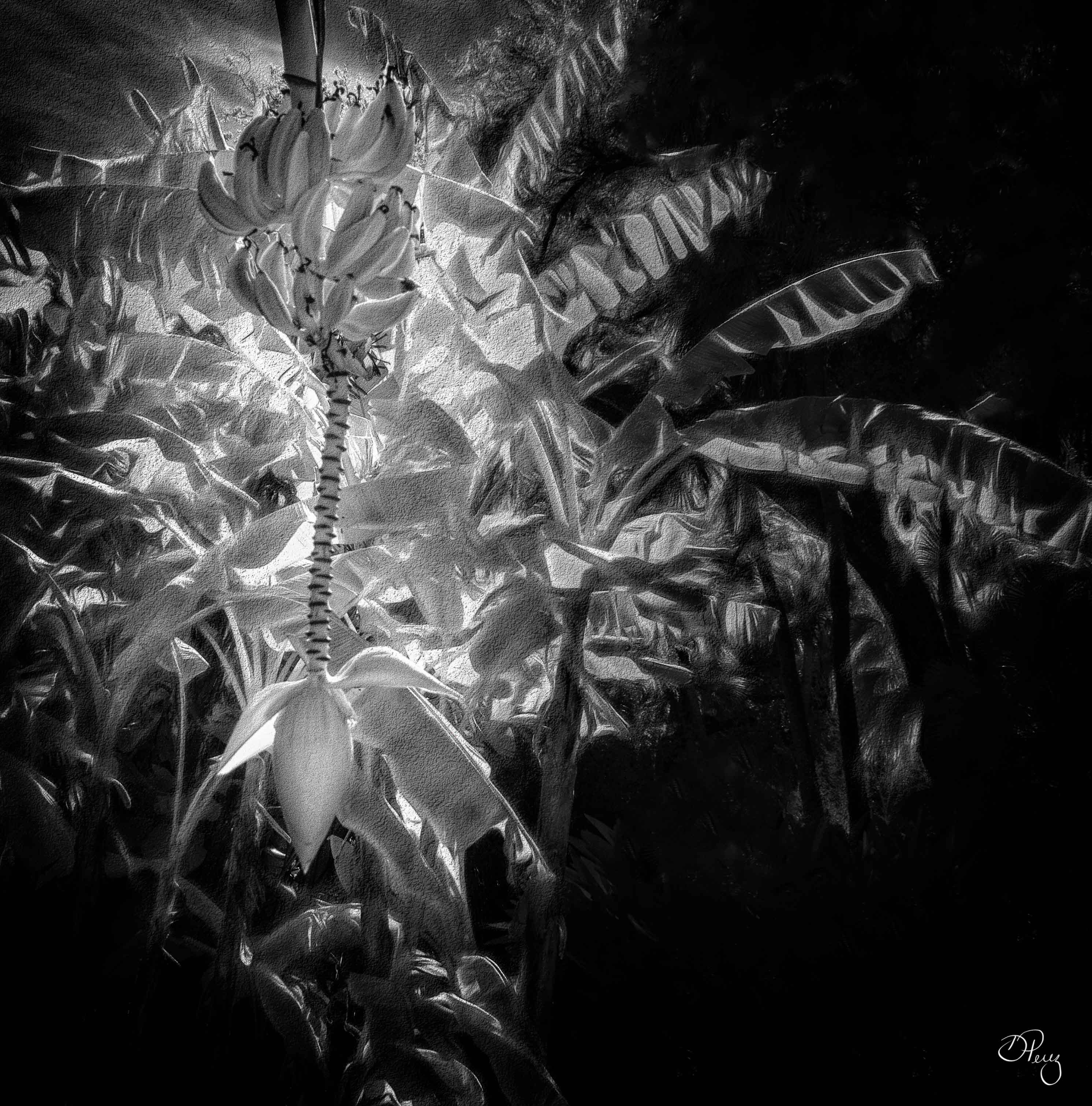
Oh boy, a new technique! The tree is great and I think it looks good with its greenery but I'm not sure if works on the rest of the foliage. Maybe trying some selective areas to break up the sameness of it all. I'm happy to report that I'm 42 days out from my last vaccine (had both) but variant are on the upswing here so I'm not taking any chances. |
Mar 16th |
| 35 |
Mar 21 |
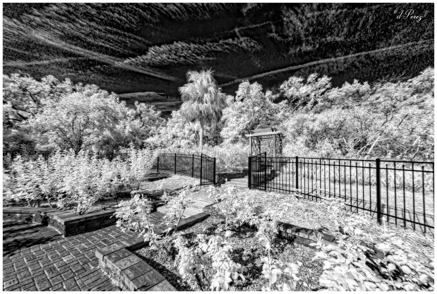
Comment |
Very nice scene! Think we all are having a hard time with new photos but revisiting some old photos isn't bad and we stay safe. Good luck with the vaccine, I have had mine but am variant wary. Agree with Julie on the out of focus leaves in the foreground but that could be easily cloned. |
Mar 16th |
| 35 |
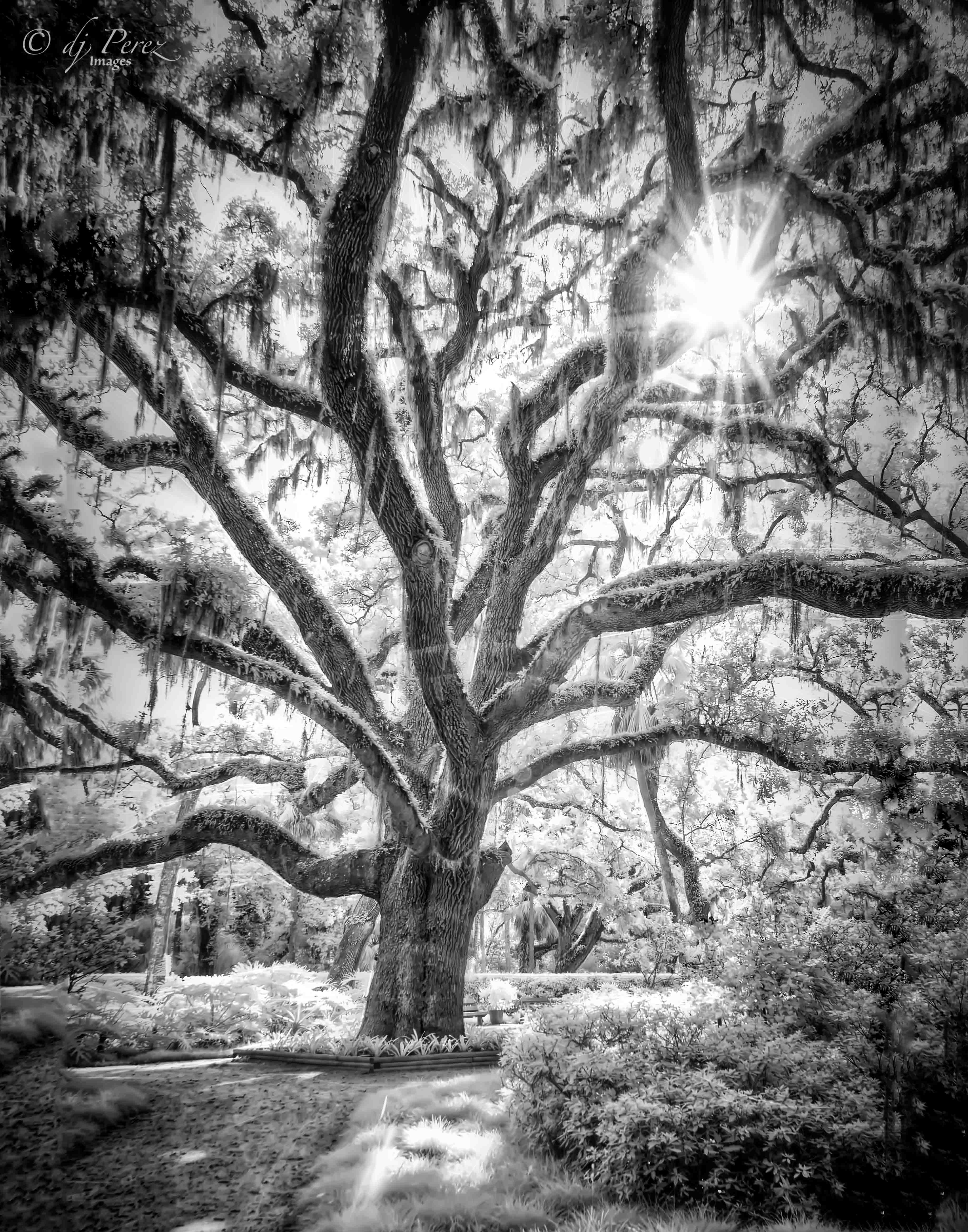
Mar 21 |
Comment |
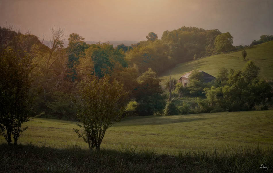
You certainly put a lot into this. I like how all the trees 'radiate'. I get a sense of being pulled into and up the frame. I do think I would bring a little more of the lightness back into it because you do have some beautiful highlights. That might not be the mood you were going for but it could work as an option. Good job getting rid of that power line as it certainly a distraction. |
Mar 15th |
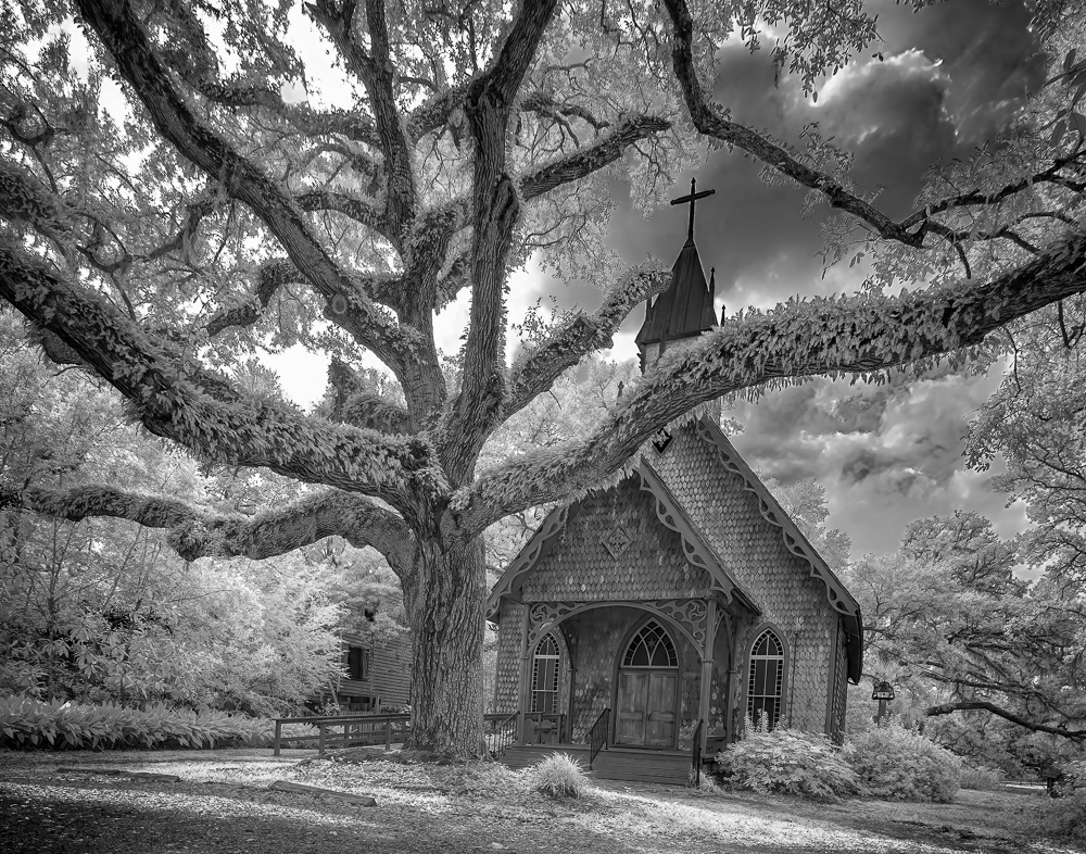
| 35 |
Mar 21 |
Comment |
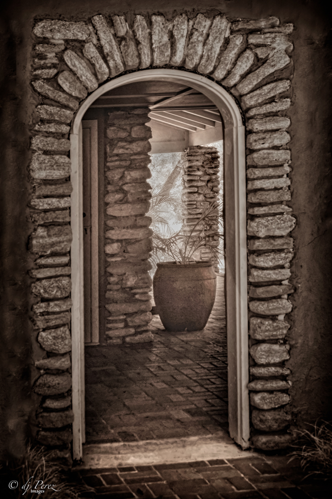
This looks like a vintage postcard and I think it is great!! I love the borders and sepia tones. Not one thing would I change. I think it give a bit of mystery to the church and I really like it! |
Mar 15th |
| 35 |
Mar 21 |
Comment |
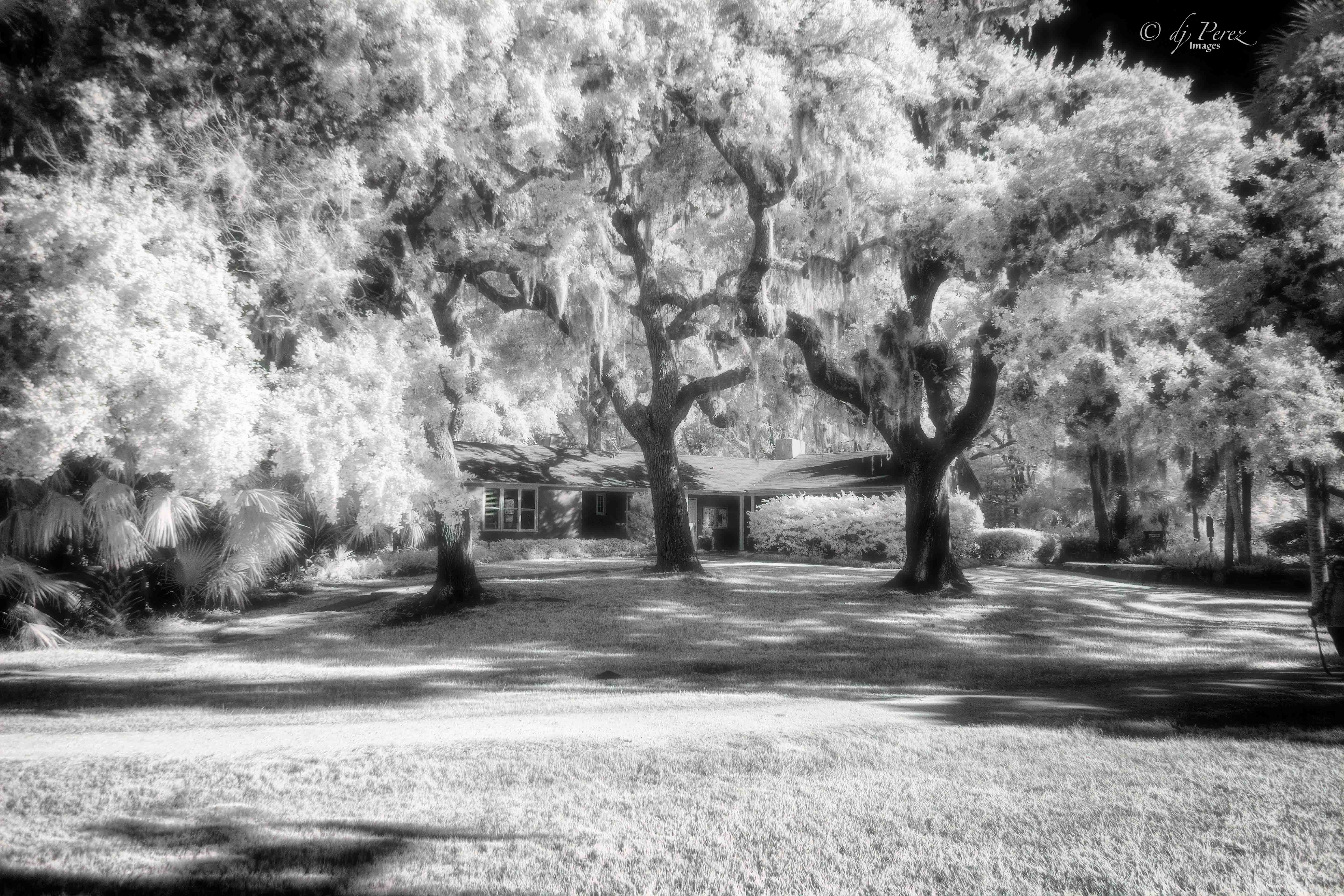
Nice job adding the sky. At first I didn't see how you managed to pull out those clouds. That is something I will have to try. Interesting house and nice scene. The only thing I might try is a crop off the viewer's right and a bit off the top to bring the house in a tad closer and somewhat off center. Other than that NICE!! |
Mar 15th |
| 35 |
Mar 21 |
Comment |
I think you have handled this beautifully. One thing that might add to it is "Edges" in Topaz Studio. I wouldn't alter the glow but adding edges selectively give a little more mysteriousness to it. I see it fading but it might not work, who knows. I like Terry's idea of a bit more sky. The original is very nice. Well done!
|
Mar 15th |
6 comments - 1 reply for Group 35
|
12 comments - 4 replies Total
|