|
| Group |
Round |
C/R |
Comment |
Date |
Image |
| 9 |
Nov 20 |
Comment |
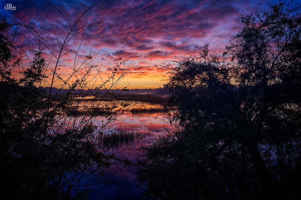
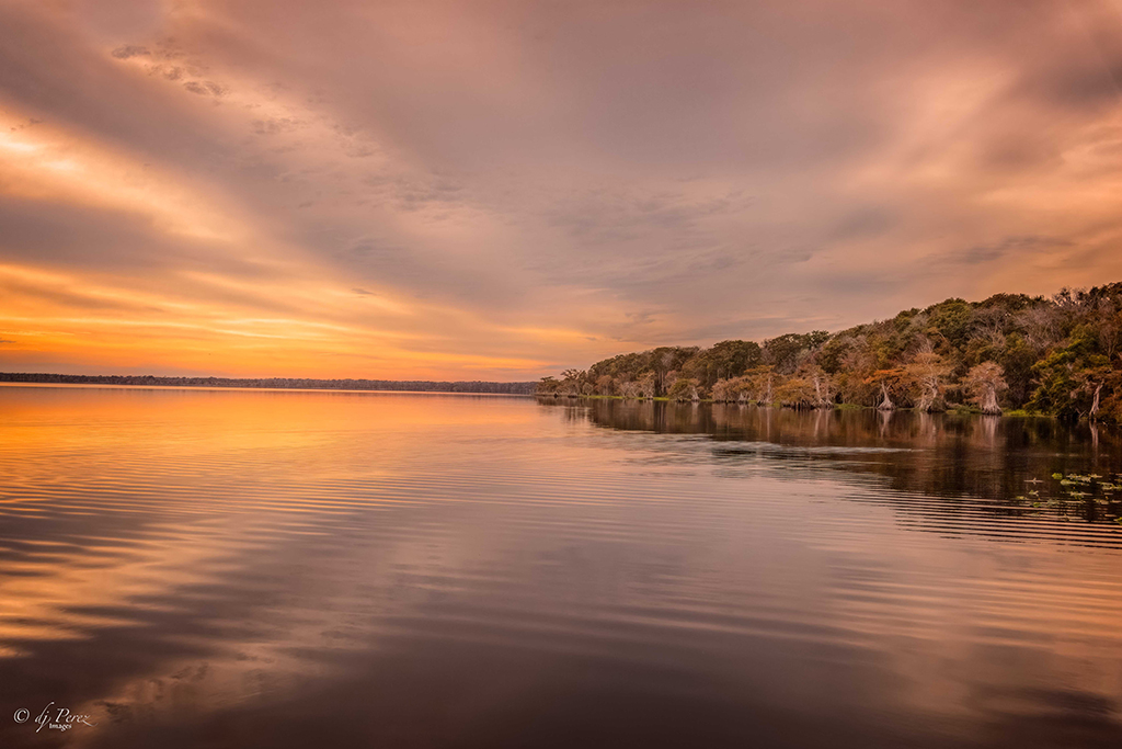
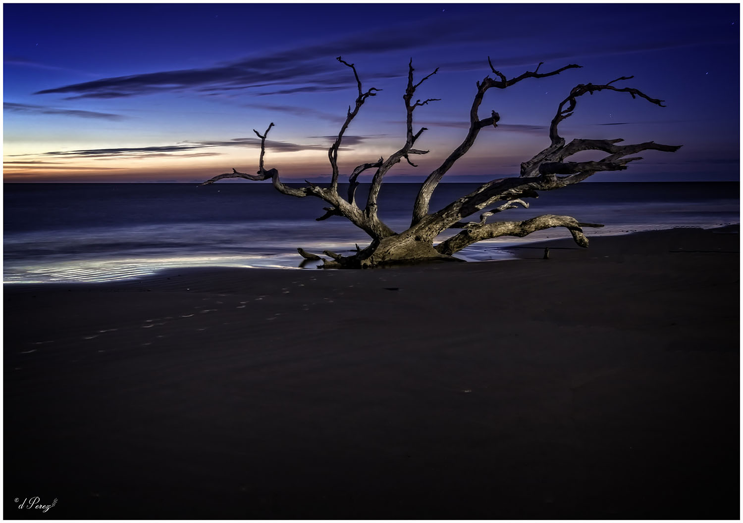
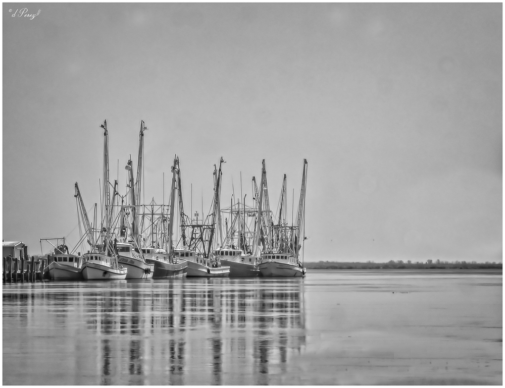
Beautiful colors! Love the reflections on the water and how the pier is pretty much in silhouette. My only suggest would be to straighten the horizon. |
Nov 16th |
| 9 |
Nov 20 |
Comment |
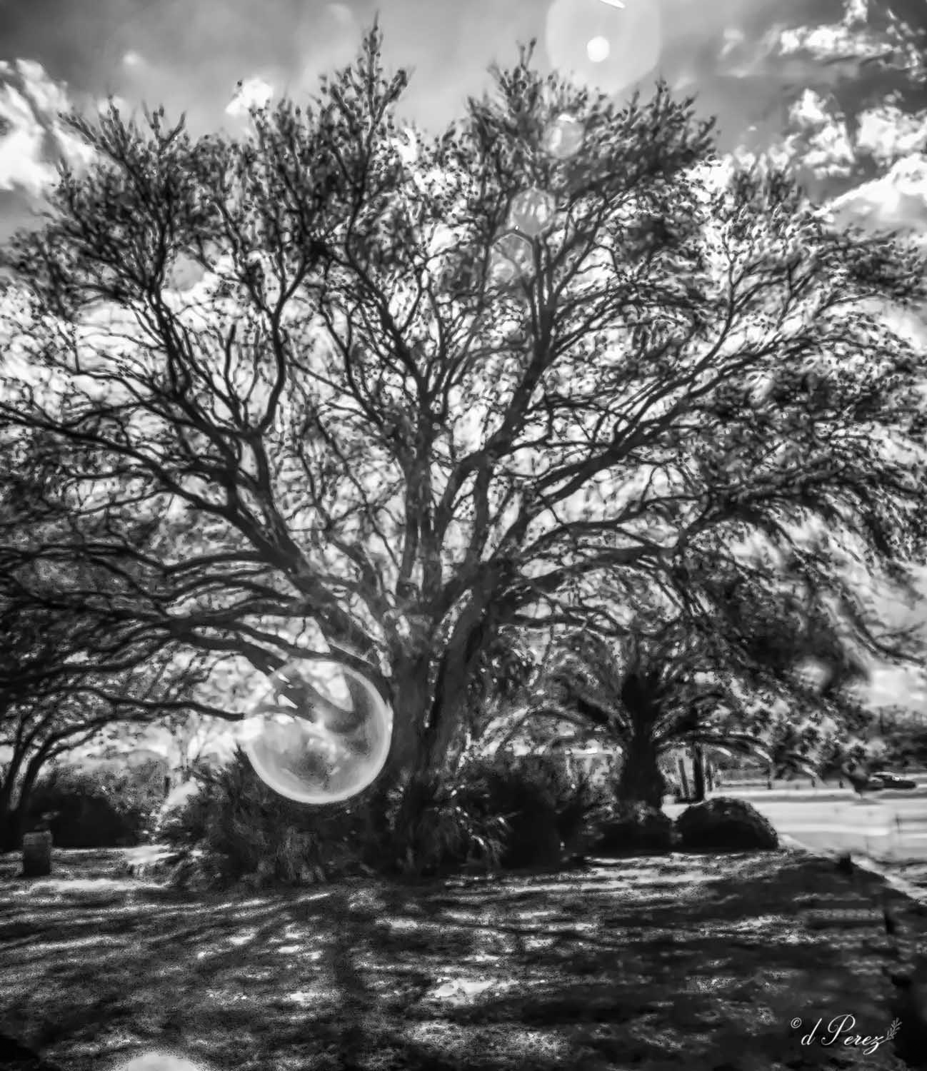
Nicely done! The kitty looks quite good. The white object you cloned out has created a bit of ghosting on the viewer's right, you could consider a vignette to perhaps deflect from it. |
Nov 16th |
| 9 |
Nov 20 |
Comment |
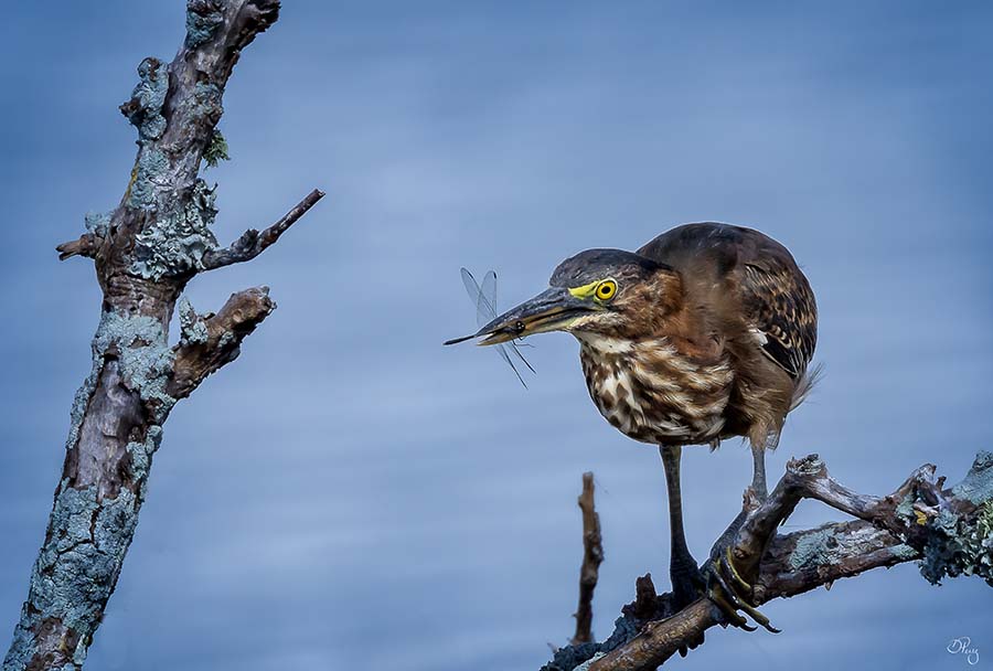
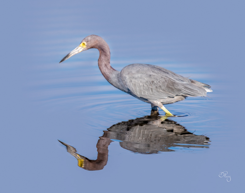
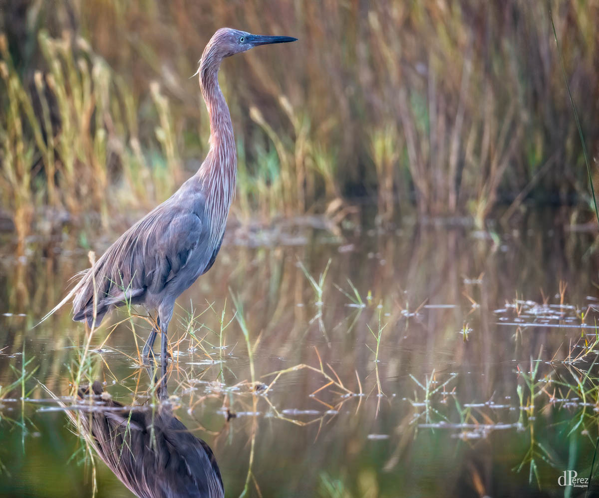
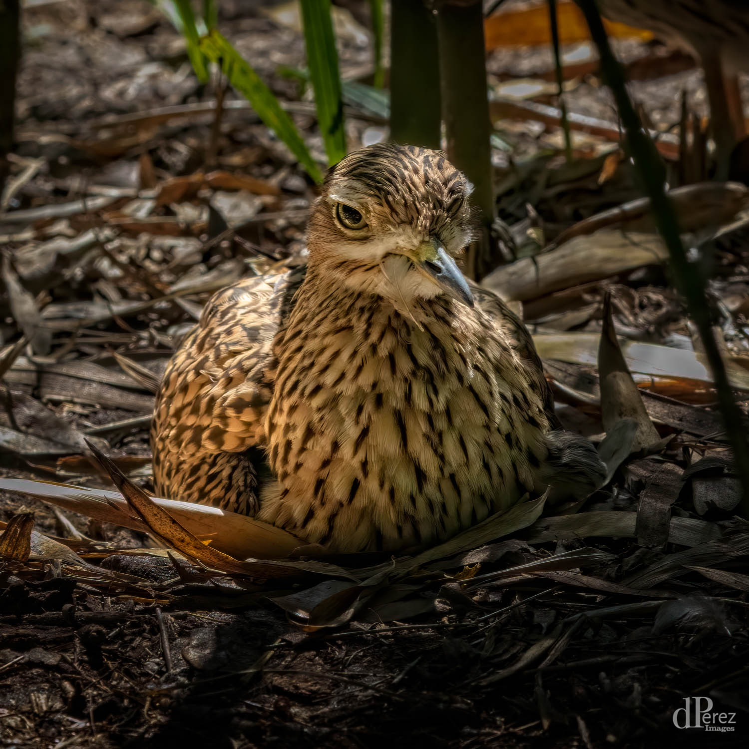
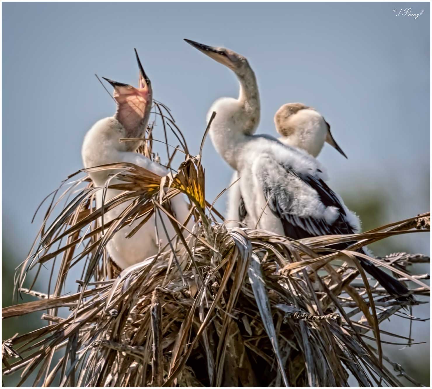
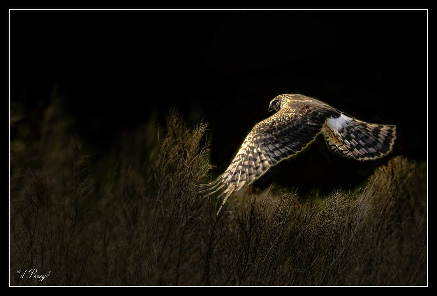
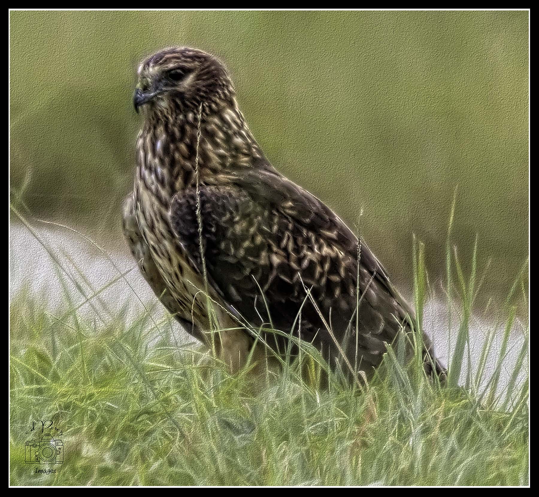
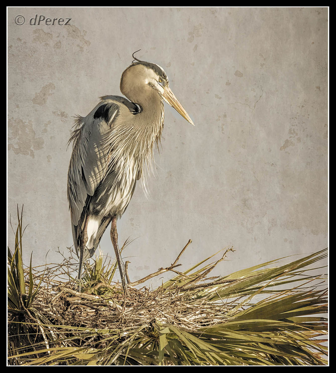
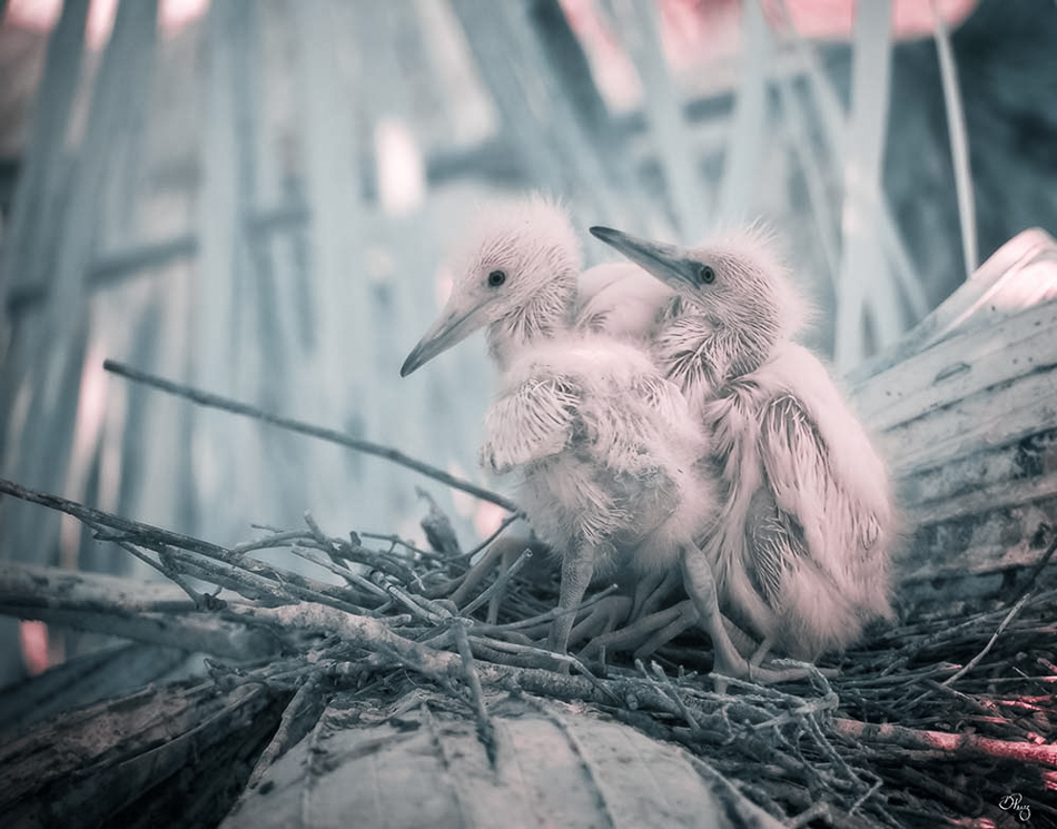
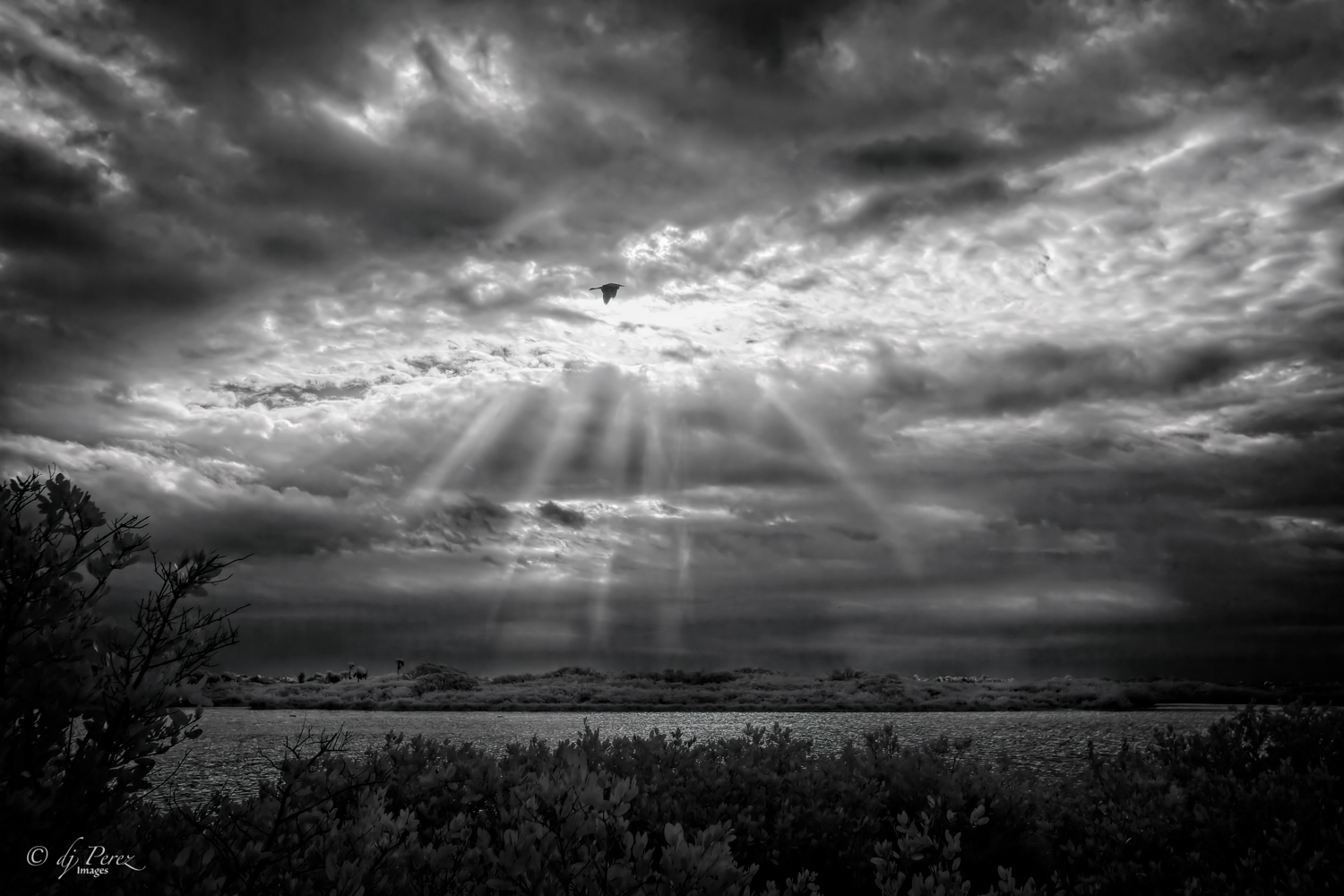
I looked at his and immediately thought of a heron on the hunt! For the grasses and foliage just added to image my mind was creating. Well done and it goes to show that the best camera is the one you have with you!! Really like this!! |
Nov 16th |
| 9 |
Nov 20 |
Comment |
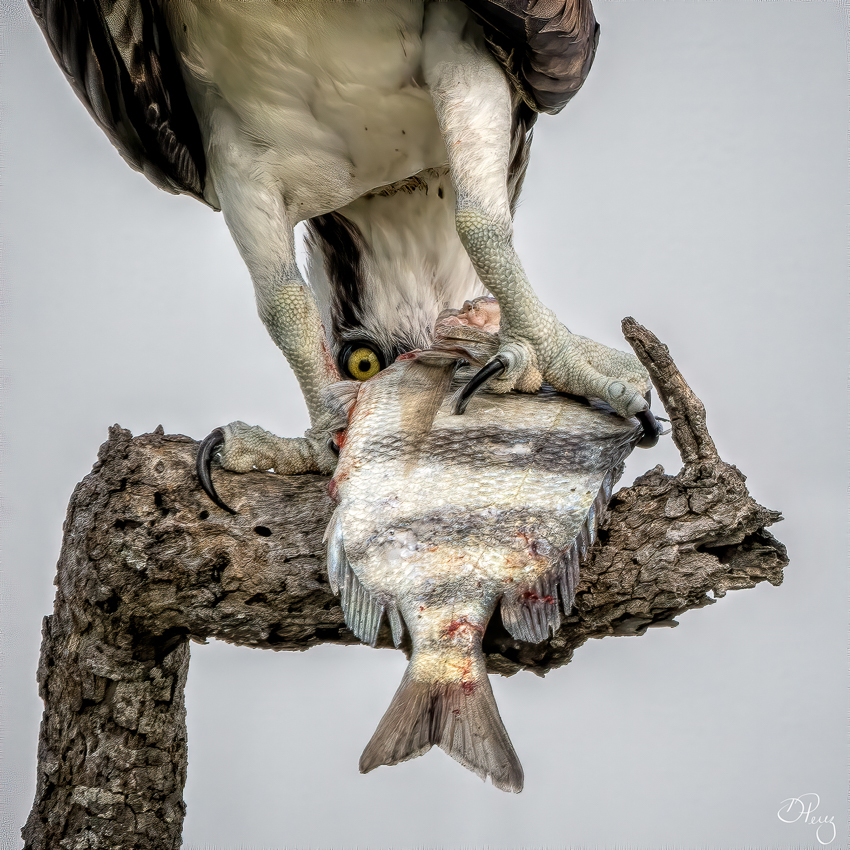
What perfect Halloween picture! I can't think of anything that would improve but I hope Jimmy is better and will be feature in more of your photos! |
Nov 16th |
| 9 |
Nov 20 |
Comment |
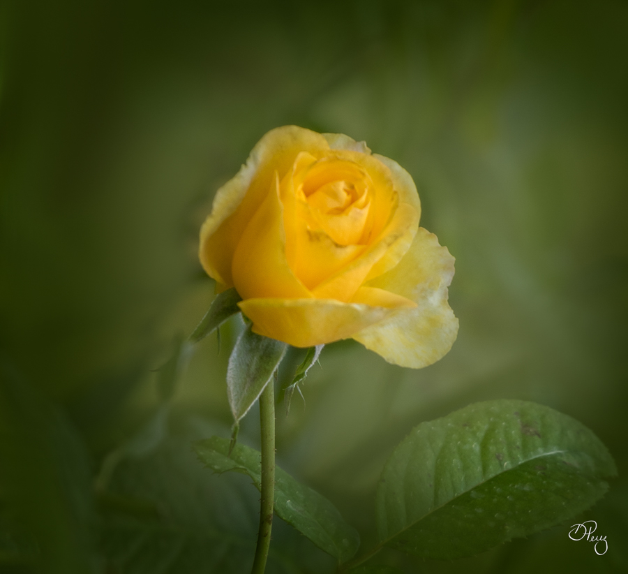
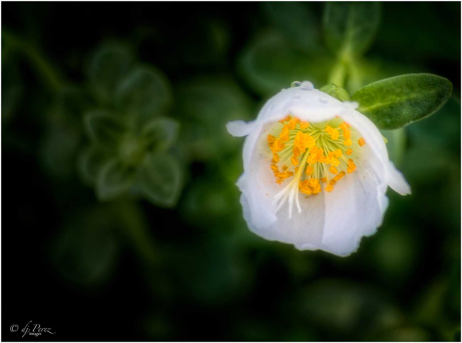
I like this reflection and think the colors are lovely. I think you could also create a beautiful abstract by cropping this from the bottom and some from each side to focus in on the golds, yellows, orange and greens. Mother Nature does such lovely painting and you captured it nicely! |
Nov 16th |
5 comments - 0 replies for Group 9
|
| 35 |
Nov 20 |
Reply |
Glad you enjoyed! I enjoy processing photos but this one was a very different approach from what I usually do. |
Nov 16th |
| 35 |
Nov 20 |
Reply |
Thank you, I wasn't sure if subtle would work and it is a big departure from my usual processing. Appreciate your kind words.
|
Nov 16th |
| 35 |
Nov 20 |
Reply |
Thanks, I could not for the life me think of a suitable title. I'm still very surprised at how it turned out. |
Nov 16th |
| 35 |
Nov 20 |
Comment |
First, the scene is wonderful and your processing is fabulous. I have yet to get colors that I really like with CLir (but I am getting some great BW from it). I do think you could crop the tree on the left out, too. There is a metal pipe peeking over the wall on the right that I would clone out as well. The only thing that I could suggest that might be adding more structure to the brick of the building (Topaz Detail or Viveza both could do it) so that it has the same level of detail as the wall leading to it. |
Nov 16th |
| 35 |
Nov 20 |
Comment |
Such a pleasant scene! It must be a wonderful place to walk. Very nice separation in your tones and overall balance. I like this composition as I find myself traveling through the scene, up and over the bridge. Looks like a good place to photograph! |
Nov 16th |
| 35 |
Nov 20 |
Comment |
I zoomed in to take a better look (I work on a 15" laptop) and there is a lot of beautiful textural detail that I did not initially see. I really like the cracks and dings on the stucco. I agree with Julie's assessment of removing the cactus on the left and the spike tips. I suspect there might be some detail in the mountain area but because of my screen, all I see is a large white zone which pulls me away from the cacti rather quickly. Looking at your original, there are elements that I wished you had kept because it makes the the Mission more of main focus. |
Nov 16th |
| 35 |
Nov 20 |
Comment |
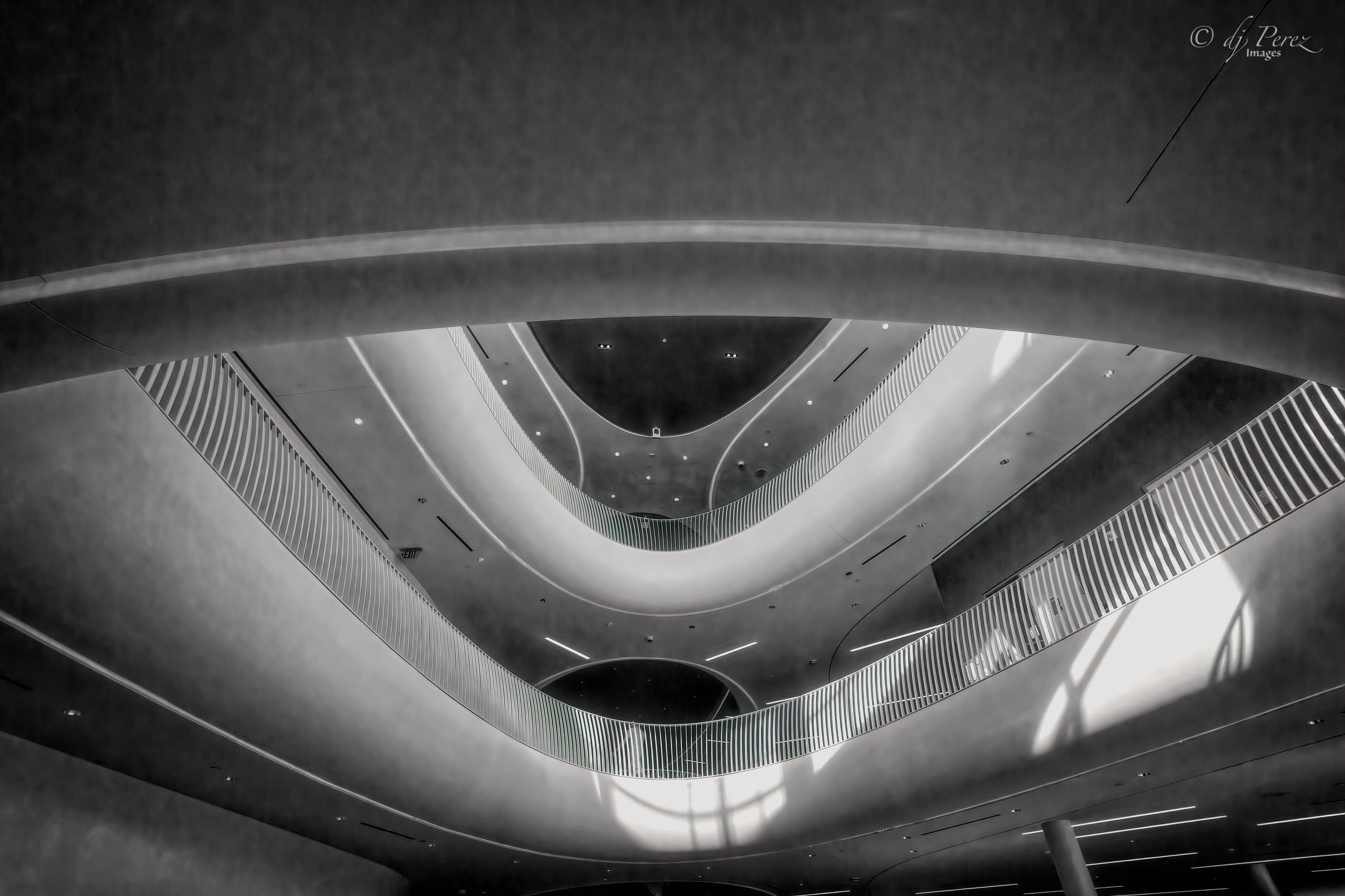
This is so fascinating! I could spend hours just looking at this windmill with all its details and I think the bird on the upper blade is just so awesome. For me, the other elements in the photo are just supporting 'actors' because my eye just locks on the windmill. You could clone out the various poles on the left but they really don't create a distraction for me. Your processing is well though out and I think you made great choices in your crop and cloning. Love it. |
Nov 16th |
| 35 |
Nov 20 |
Comment |
Wow, this is so cool. I love the sense of scale that the middle ground brings to the mountains. There is such a wonderful array of elements here. The fence helps ground me and I can see the vastness of your scene. I think it is wonderful. Well done!! |
Nov 16th |
| 35 |
Nov 20 |
Comment |
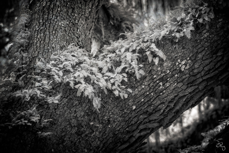
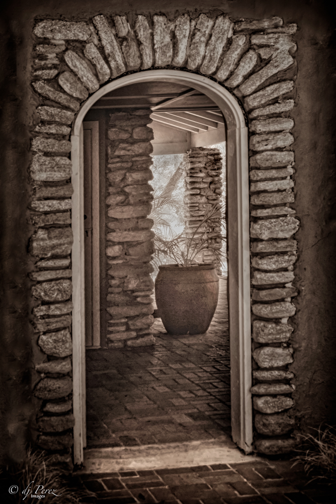
Lovely place and I love how the stones steps bring you into the lushness. I don't mind the golden tress but do feel that the lighter areas have a bit too much brightness which dampens the detail of some of the ferns. Maybe adding a bit of structure to those areas would help balance. |
Nov 16th |
6 comments - 3 replies for Group 35
|
11 comments - 3 replies Total
|