|
| Group |
Round |
C/R |
Comment |
Date |
Image |
| 9 |
Aug 20 |
Comment |
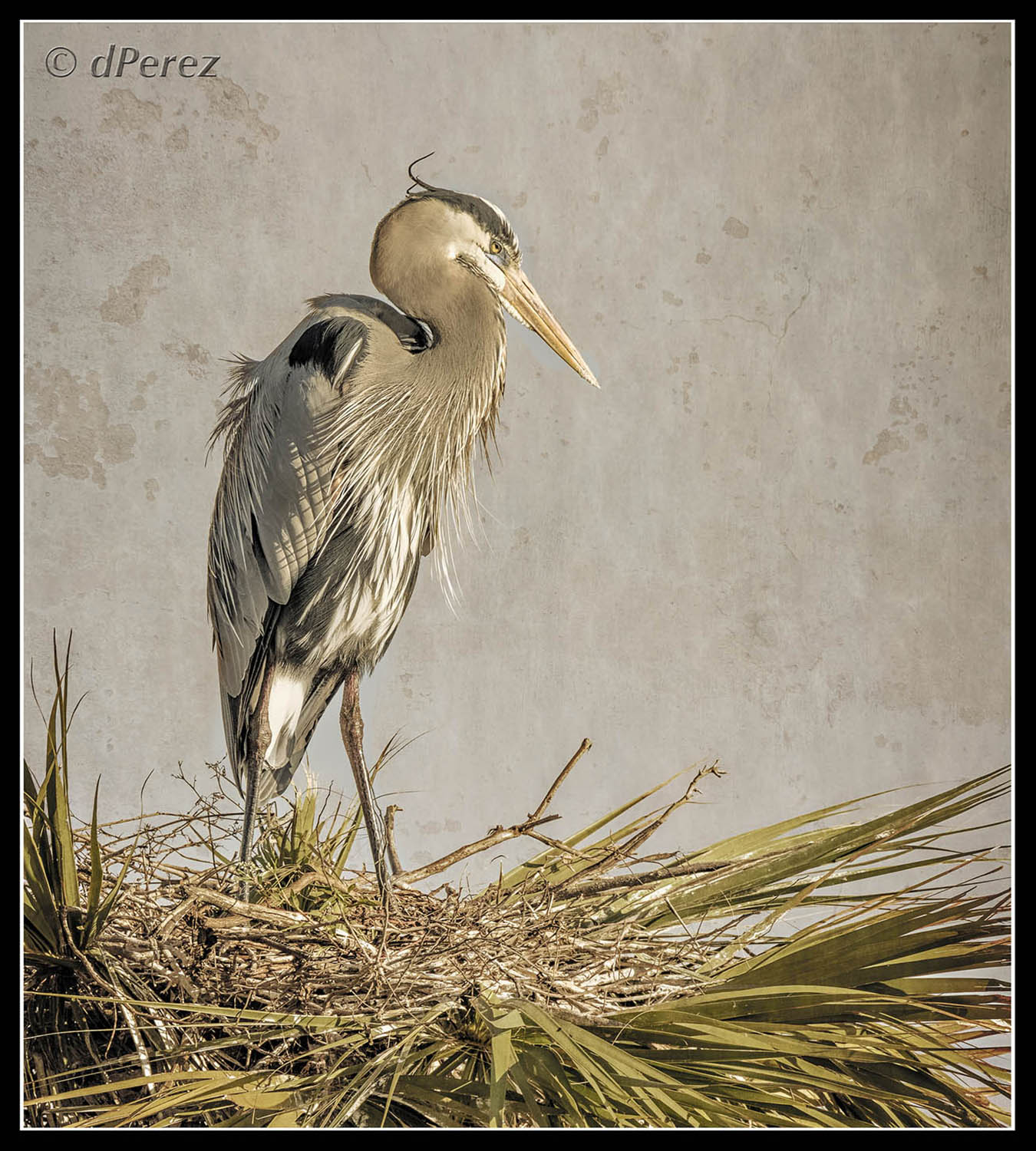
Nice warbler in his breeding finery. Knowing this is a small bird, I think you did a great job on the focus. Agree with David on getting rid of the blurred stick. Could open up the shadow detail on the branch so the feet and toes aren't lost so much. Colors are beautiful and think you did quite well! |
Aug 24th |
| 9 |
Aug 20 |
Reply |
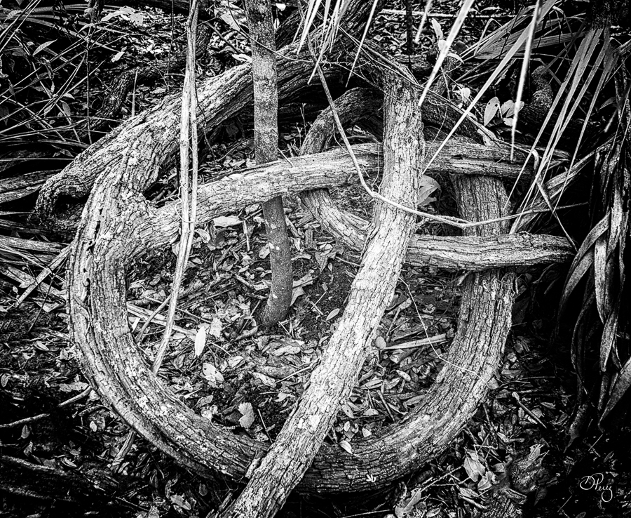
Well, F3C can be quite a fickle group, have had photos that do exceptional well between the 4 camera clubs locally (with national known judges), send it to them and NOPE. Forget creative, nothing but a stroke which doesn't take a whole lot of skill, imo. Then put in a so so and boom, it's winner. I still think it's great. Great lines and spirals! |
Aug 18th |
| 9 |
Aug 20 |
Comment |
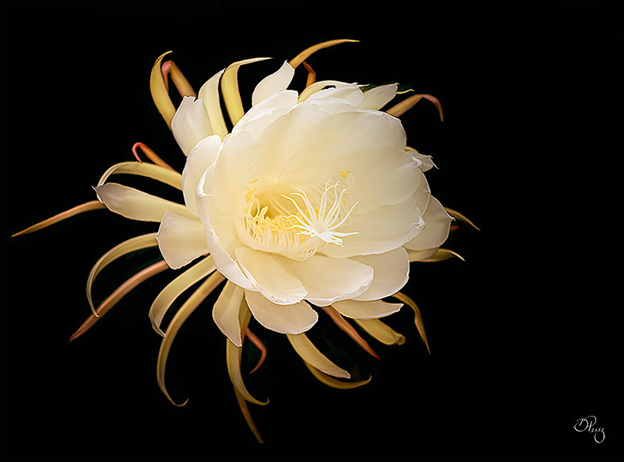
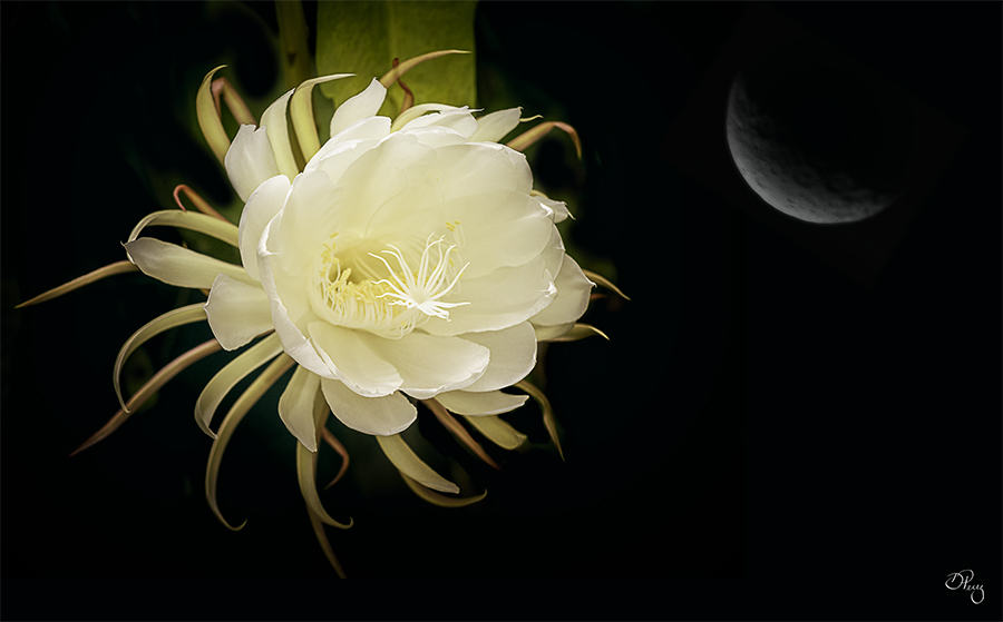
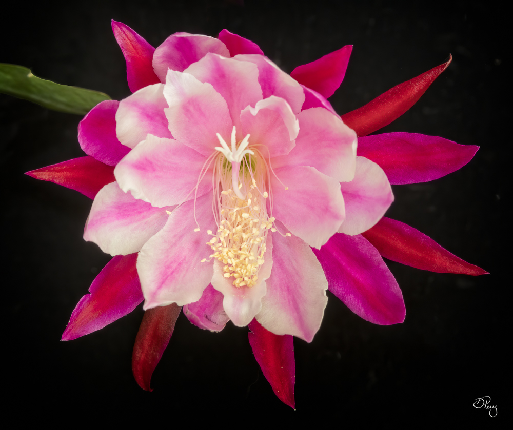
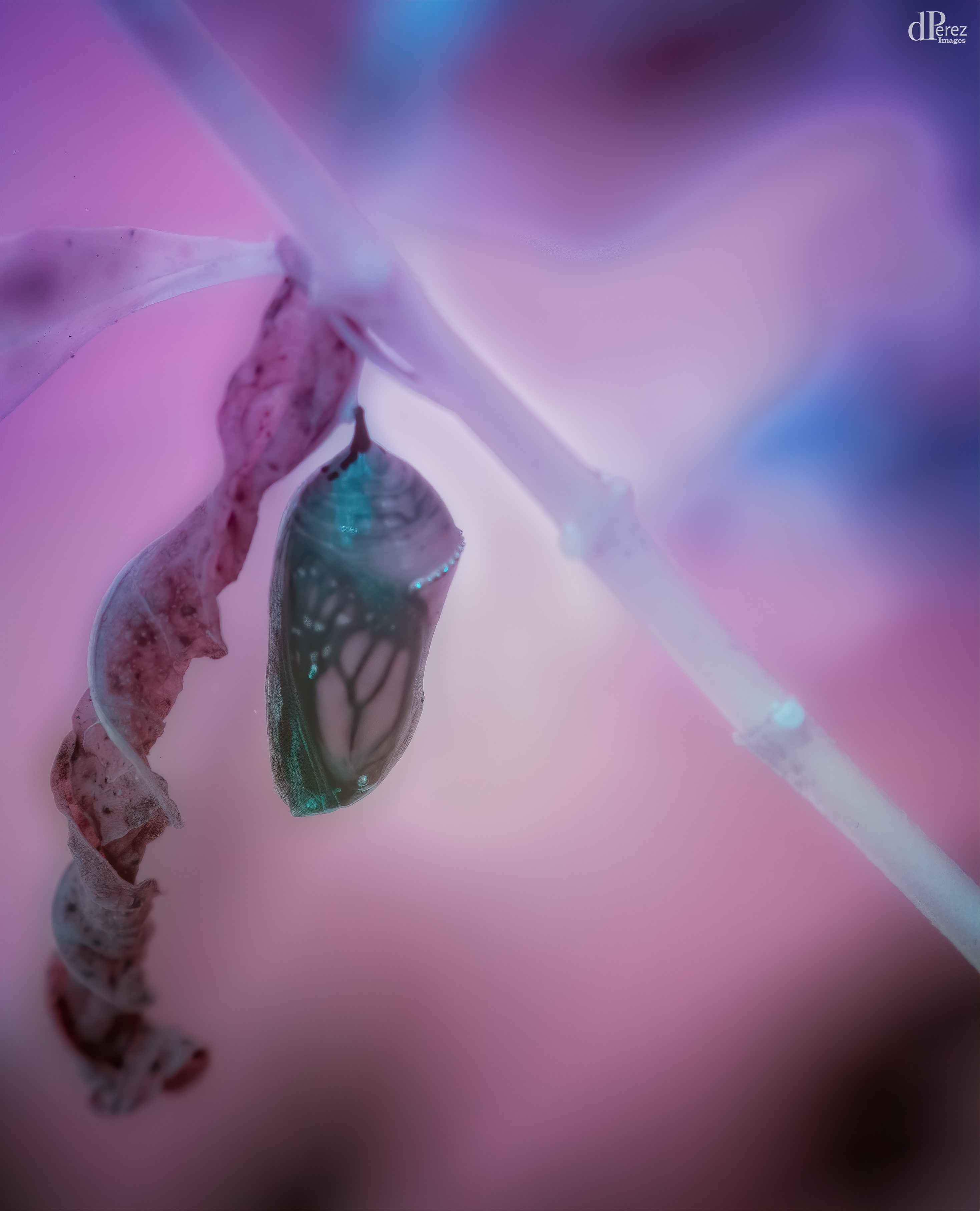
Thanks, this is an epiphyllum like moss or air plants. I would like to put some in the palm bracts but haven't rooted any. My sister grows all sorts of orchids, this thing is fairly lowly maintenance so I haven't killed it, thankfully! |
Aug 13th |
| 9 |
Aug 20 |
Comment |
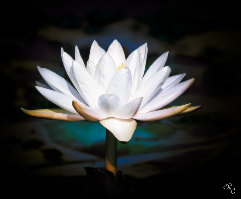
This is so wicked!!! But it in completion, it is a winner!! Well done!! |
Aug 13th |
| 9 |
Aug 20 |
Comment |
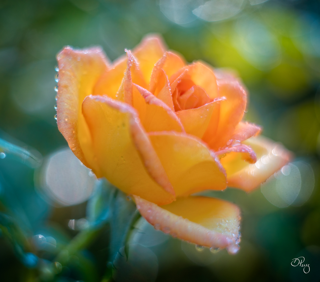
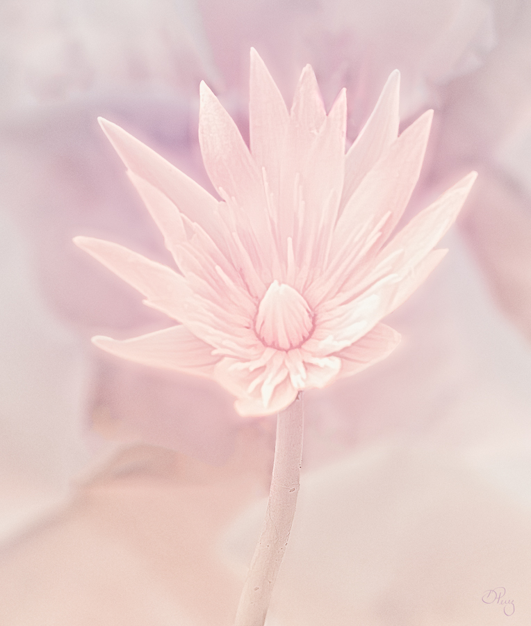
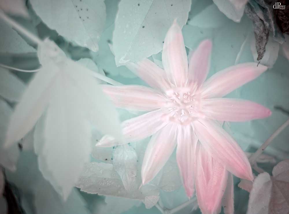
Beautiful! I often will intentionally soften a flower to make it look delicate. Don't know if you did but I think the softness enhances the flower and the light is gorgeous. Well done! |
Aug 13th |
| 9 |
Aug 20 |
Comment |
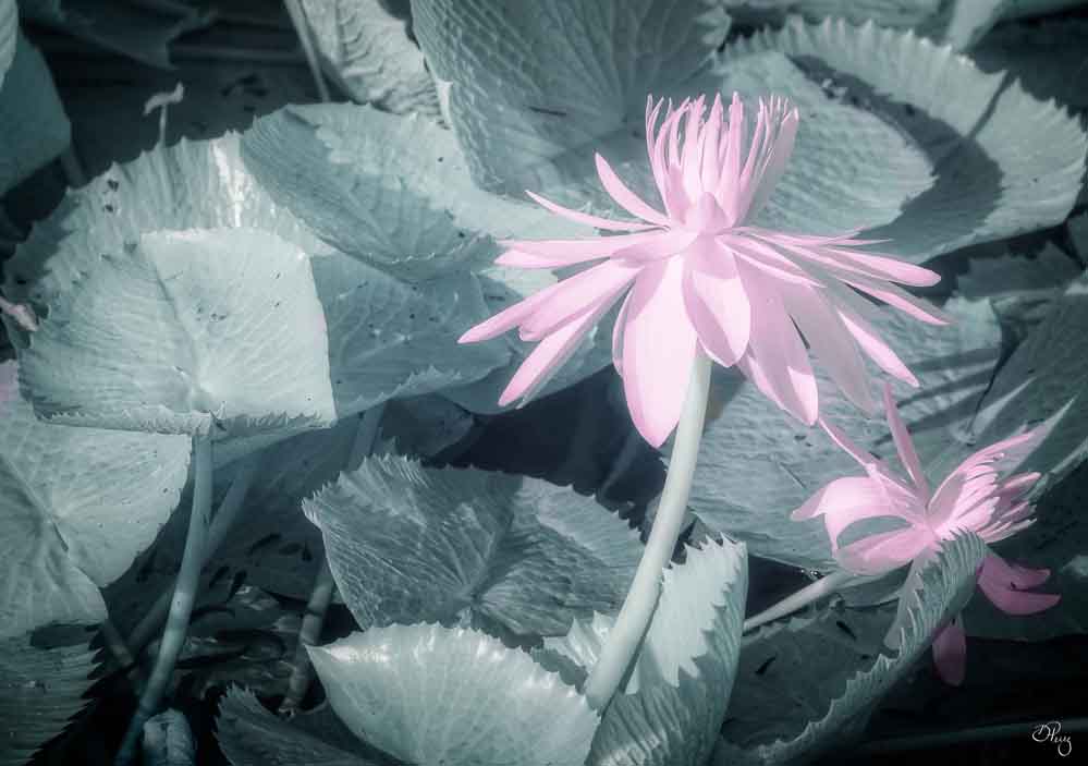
I like what you have done with the flower! I don't know anything about Elements but if it's anything like LR a/o PS, you should be able to modify the preset to your heart's content. I might use some sort of preset as a starting point put when I'm done, there is a strong chance that it is well integrated into my photo. Will say I have seen photos where the preset was obvious and that's all that was done. I don't think that's the case here. Have fun enjoying and exploring textures! |
Aug 13th |
| 9 |
Aug 20 |
Comment |
Sorry to hear you're hurting, hope you mend quickly. This photo sort of messes with my mind, the background is askew but the girl is straight. Definitely remove the wires and it might be better if you had a different f-stop. Her arms and hands are soft. Think a bit more light on her face would help, too. |
Aug 13th |
| 9 |
Aug 20 |
Comment |
Great job on the processing! You really brought out some beautiful detail. Agree with Jesse on the three boards. Hope you got some close ups on the water wheel, it looks really interesting. |
Aug 13th |
| 9 |
Aug 20 |
Reply |
See it and here is your composite of the Queen's dance! |
Aug 13th |
 |
7 comments - 2 replies for Group 9
|
| 35 |
Aug 20 |
Reply |
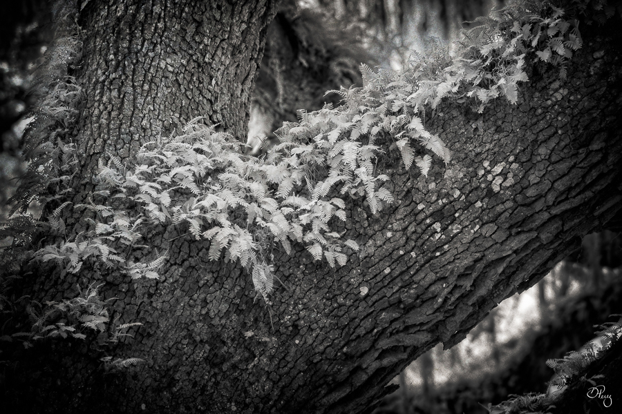
The ferns were pretty high up in the tree so I don't think I could get closer. I do have a bigger lens but I don't have IR filters that would fit it. Yes, I will darken down more of the background areas...... |
Aug 13th |
| 35 |
Aug 20 |
Reply |
It's good to channel Jamie, lol!! See the bright spot now. Thought I had dampened it down but my computer crashed and this was a recovery file so I might have lost those points, who knows any more.......... |
Aug 13th |
| 35 |
Aug 20 |
Comment |
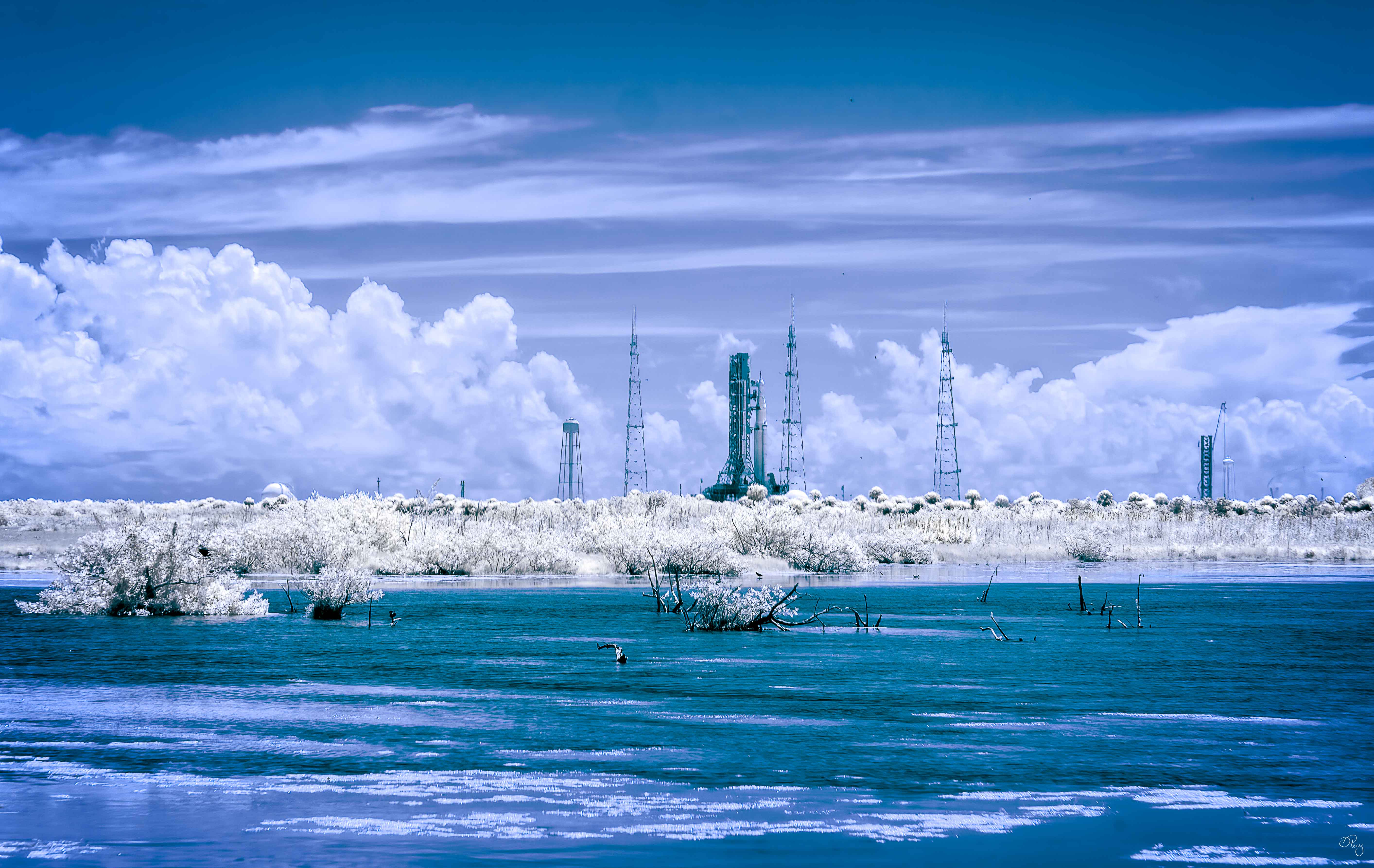
I like it and I learned something. Didn't know there was a Foggy lights!! Your coloration is always so wonderful and this does not disappoint. Don't know if you use Nik but it now has a Perspective Efex module that is really great. Will say you could easily straighten the tower without much to do. Good job! |
Aug 13th |
| 35 |
Aug 20 |
Comment |
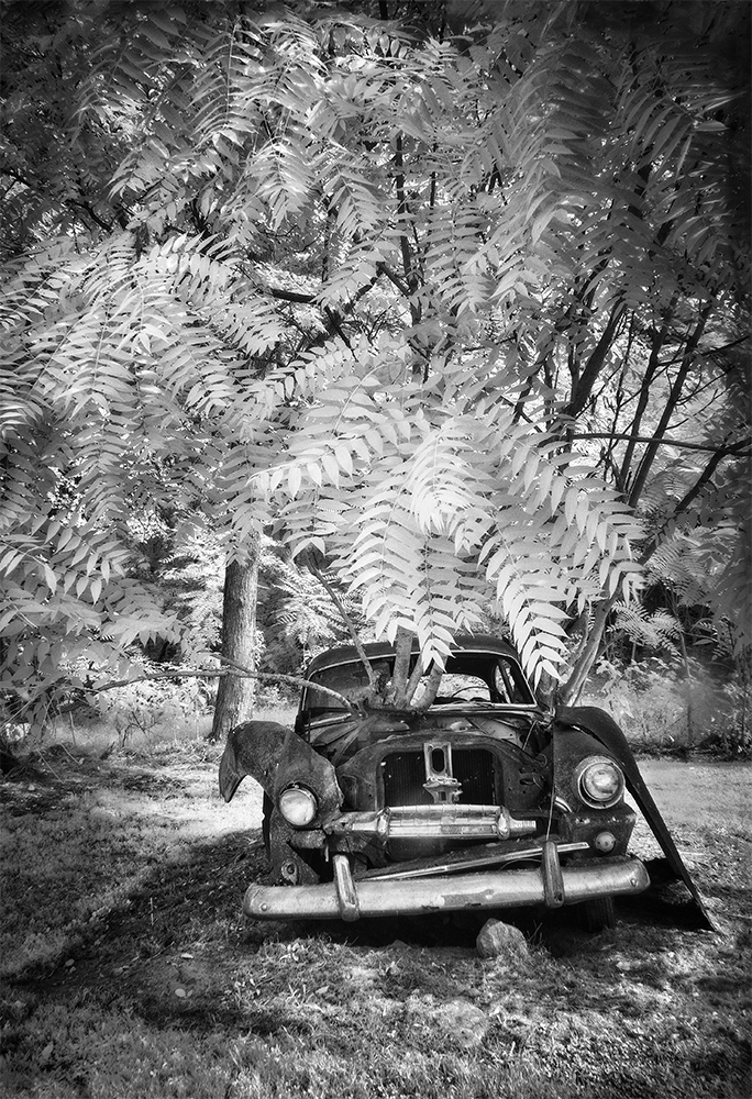
I keep looking at all three of the images and am impressed! I did a close look at your original, and the car is bright and shiny. Then a close look at the final and your use of texture is fabulous. You gave the car a lot more character and the B&W seems very fitting. Well done!
|
Aug 13th |
| 35 |
Aug 20 |
Comment |
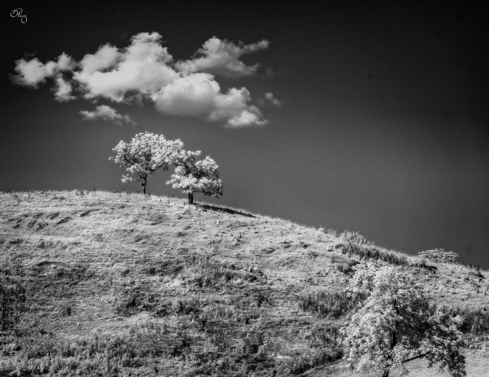
What a sweet little barn! I think your composition makes it feel small and alone in a big world! The sky looks like it is ready to come down on it. Do wish I could see the details of the barn but that would make for a different story. The few quilt barns I seen weren't in good condition. Nice to see one that looks like it is cared for. |
Aug 13th |
| 35 |
Aug 20 |
Comment |
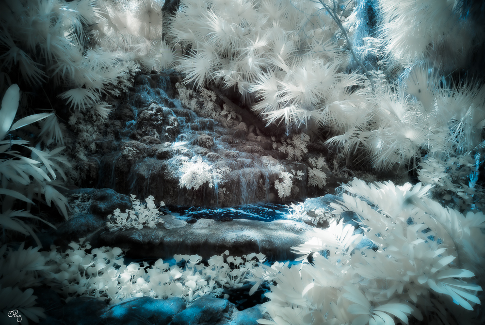
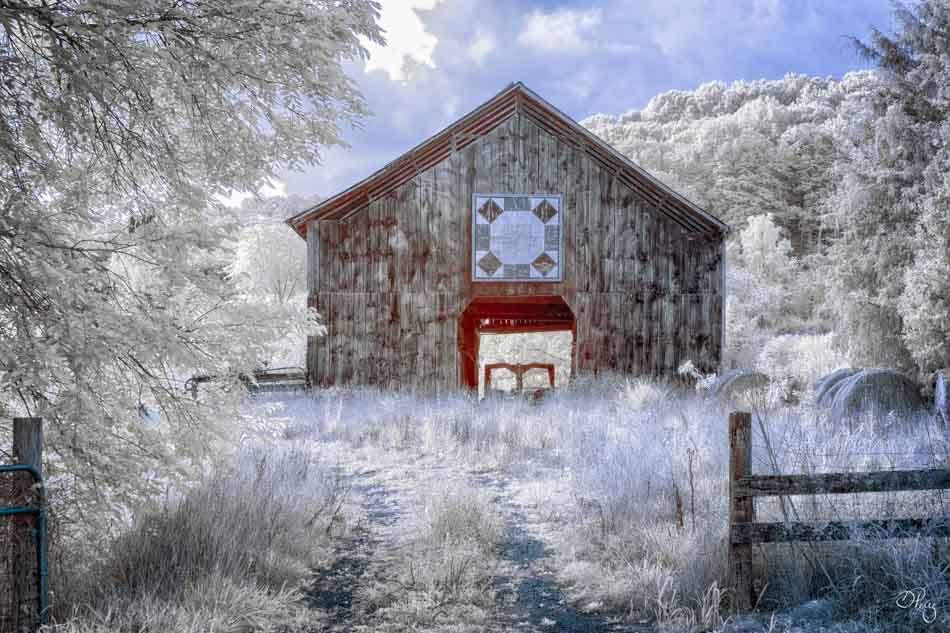
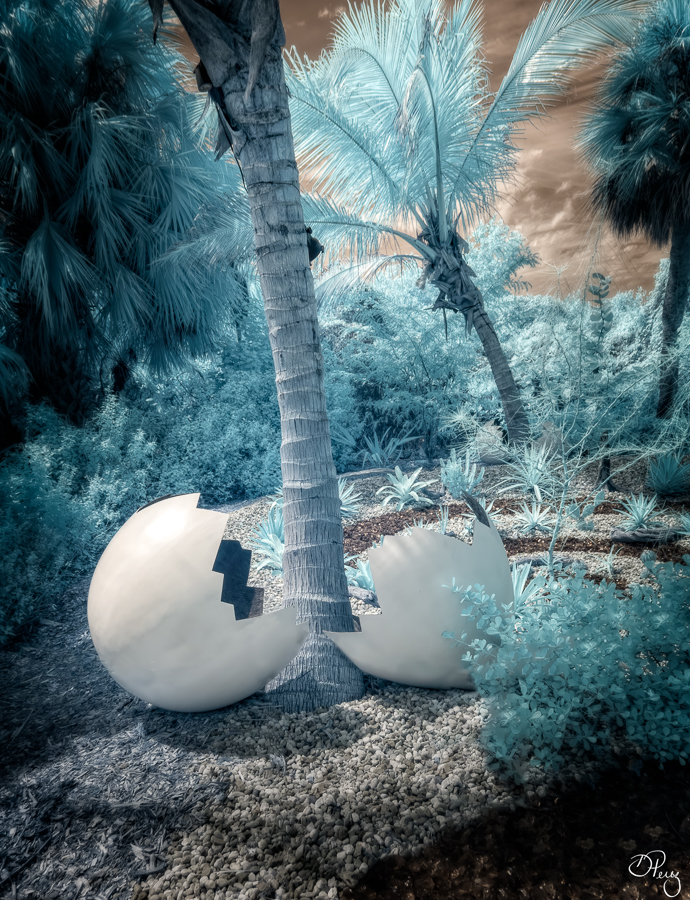
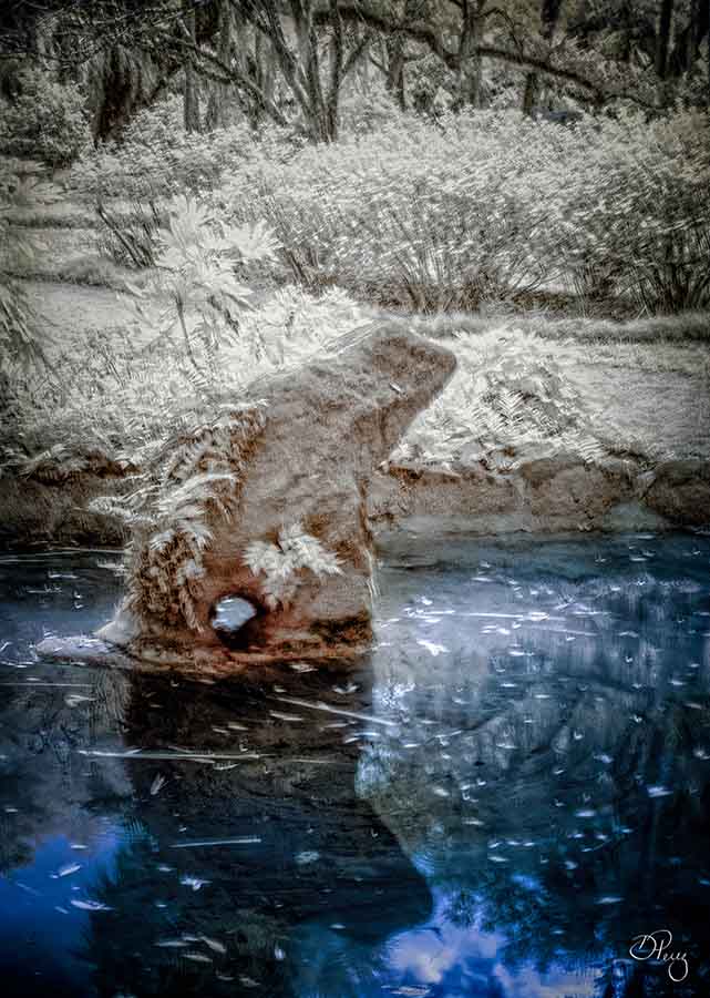
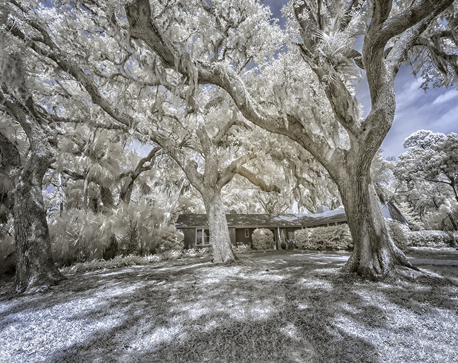
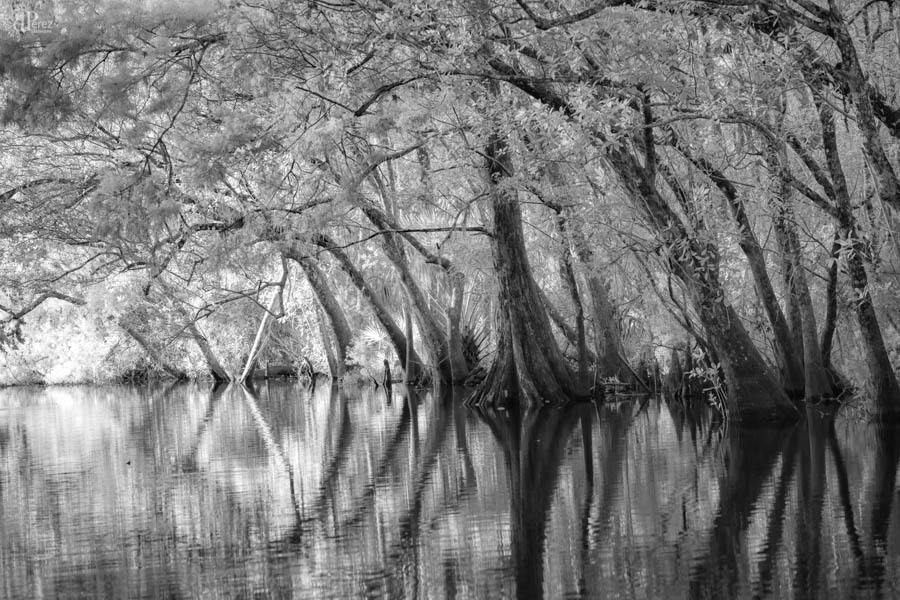
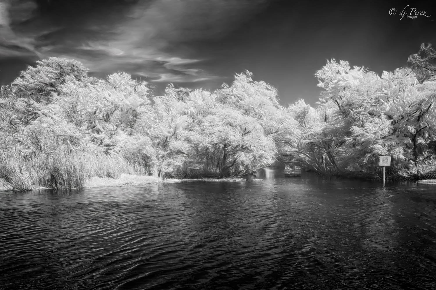
Very creative!!! At first glance, I thought this was a winter scene with a frozen stream. The original IR seems to have more detail than your color version, wonder if blend modes might have allow for a bit more detail to shine. There are a couple of areas where the blue color seems a bit unnatural like on the viewer's left side of the building and the trim around the door. Overall, I think this is fun and may need to experiment myself!! |
Aug 13th |
| 35 |
Aug 20 |
Comment |
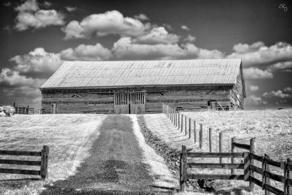
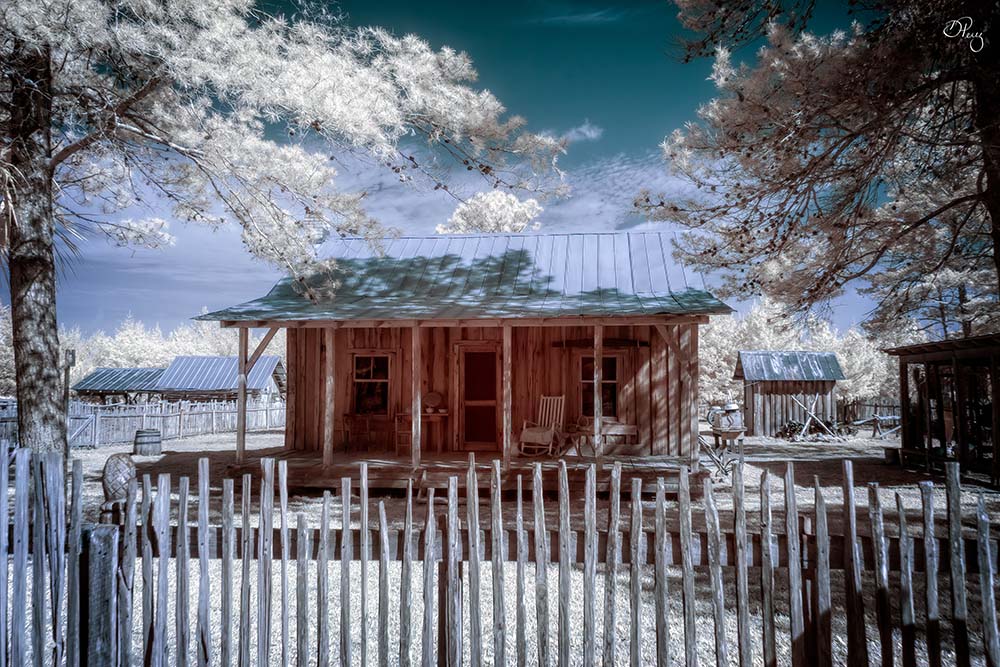
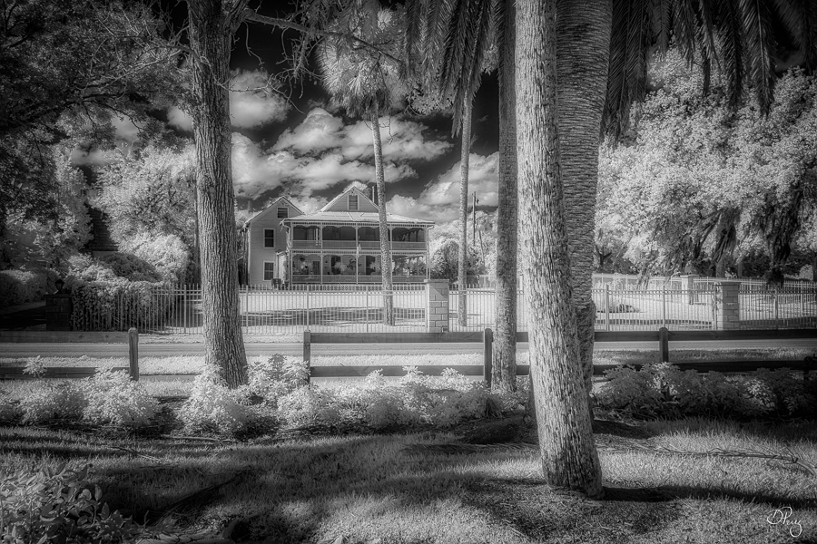
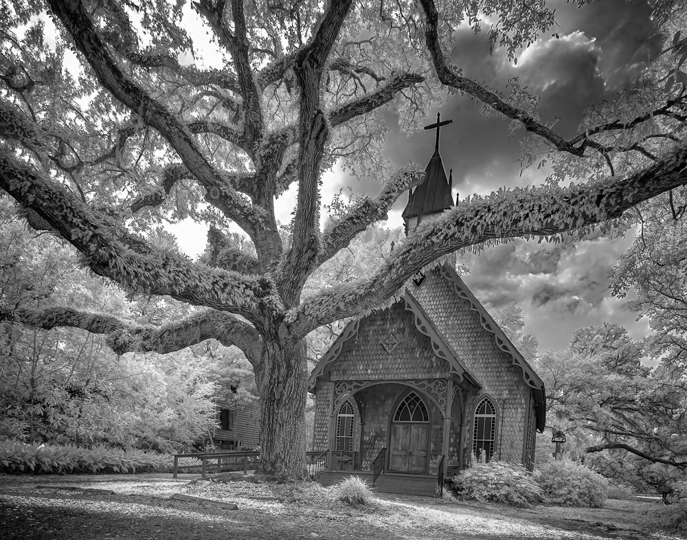
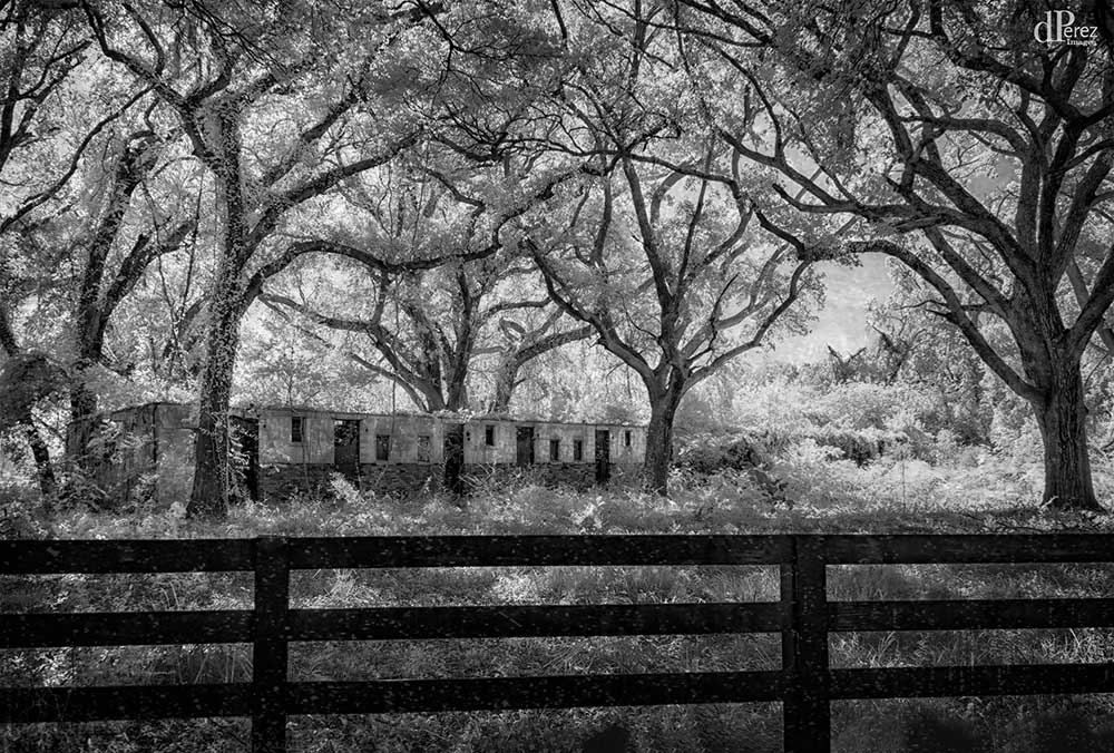
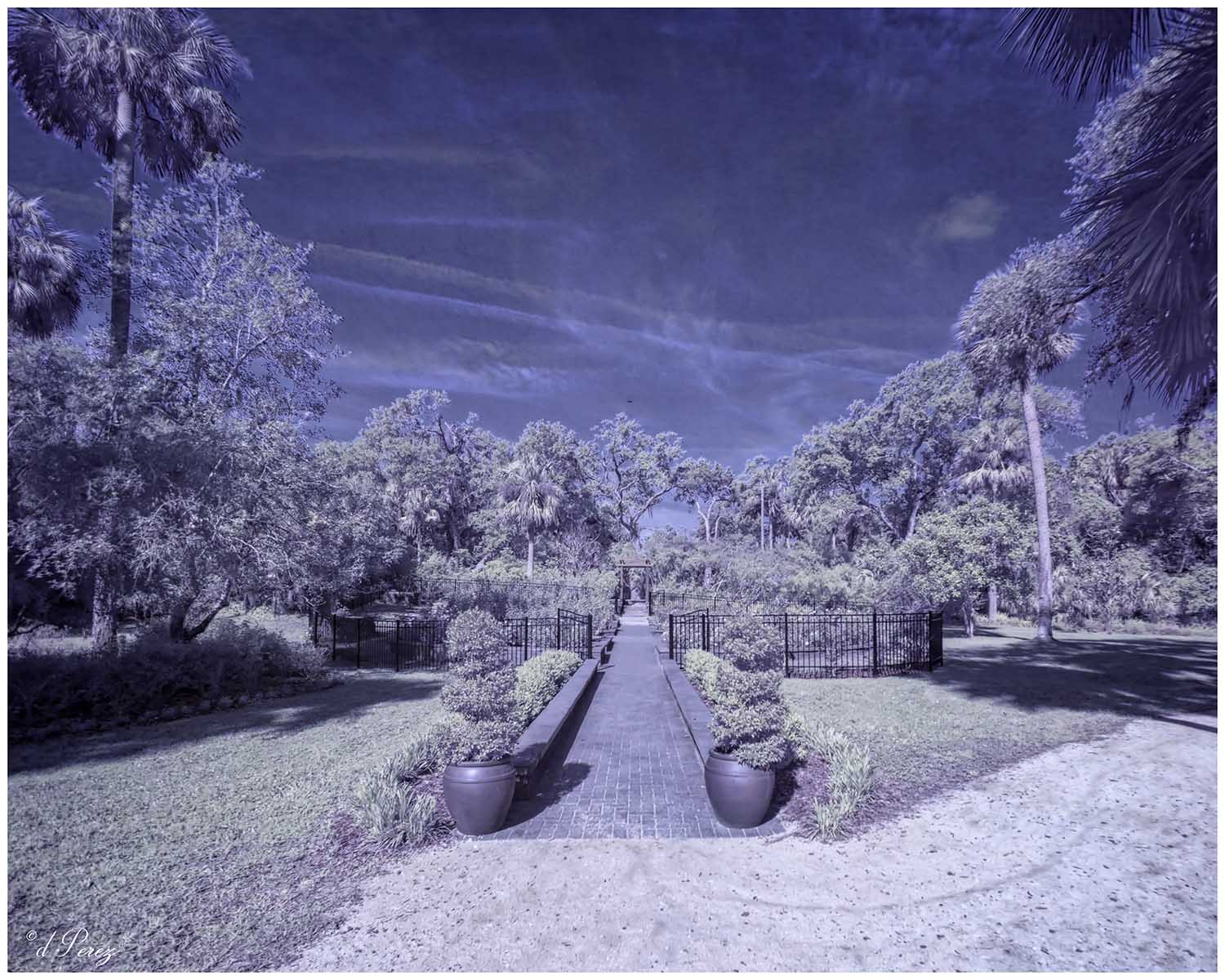
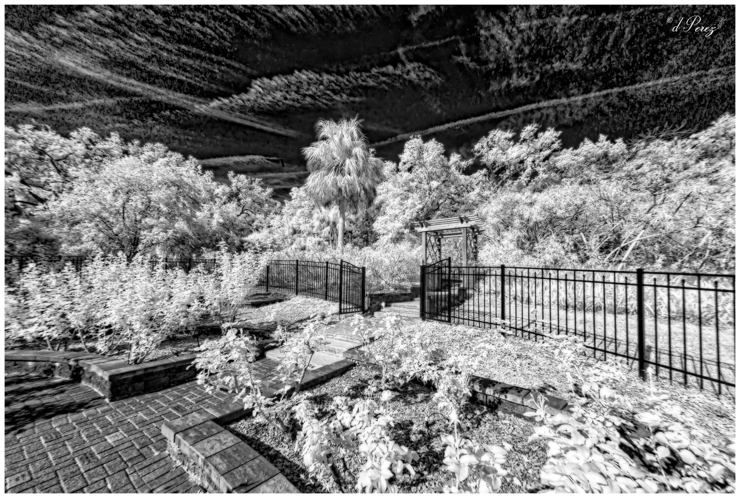
Interesting place with such great possibilities. Hope you can go back with the IR for more photos. I like you color choices and I think they help with a bit of the mood. I do think having a way to draw the viewer more into the photo by either darkening the foreground or burning it and then dodging some areas to highlight them would be a good choice. I would love to see more of the details of the old building. I could spend hours exploring this scene!! |
Aug 13th |
| 35 |
Aug 20 |
Comment |
Great little building and you made a wonderful choice removing the building in the background. Agree with toning down the background trees. You have shown the charm of this quite nicely! Well done! |
Aug 13th |
6 comments - 2 replies for Group 35
|
13 comments - 4 replies Total
|