|
| Group |
Round |
C/R |
Comment |
Date |
Image |
| 9 |
May 20 |
Reply |
I'm a camera junkie, I have two IRs and two "regular" cameras plus a hot mirror filter for one of the IRs. You don't want to know about the lenses............... my vice and I intend to enjoy every second of it. |
May 22nd |
| 9 |
May 20 |
Comment |
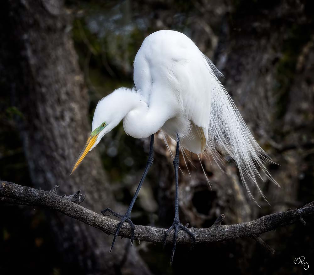
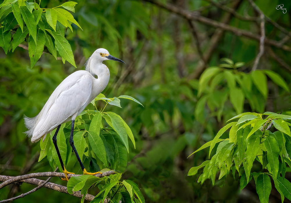
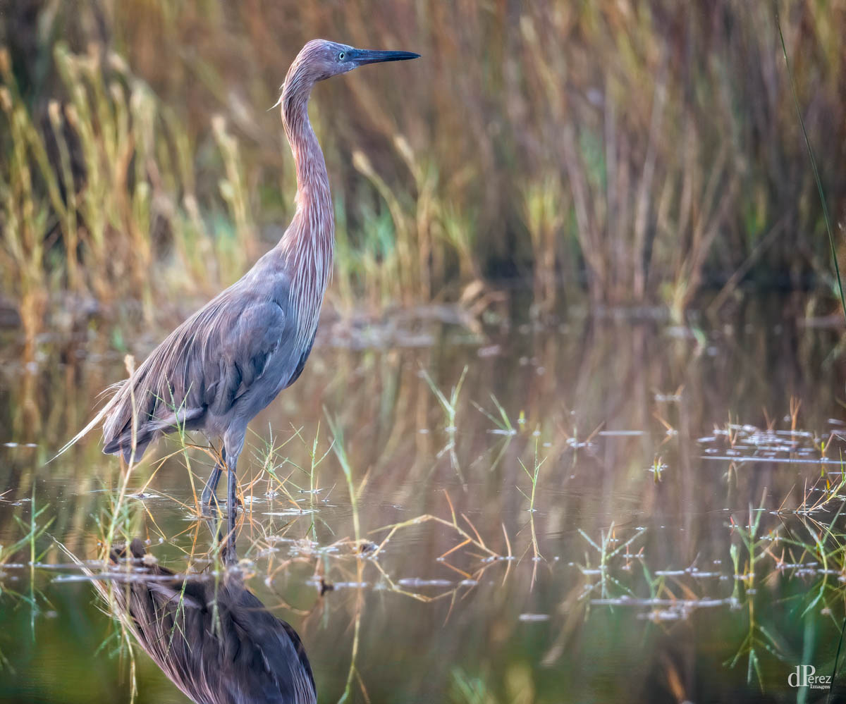
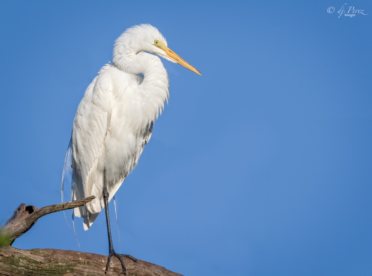
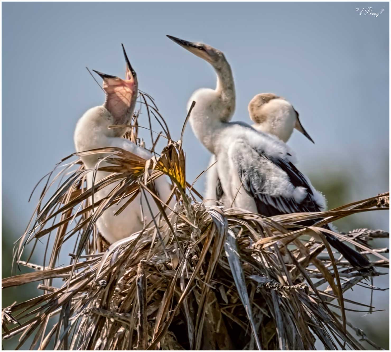
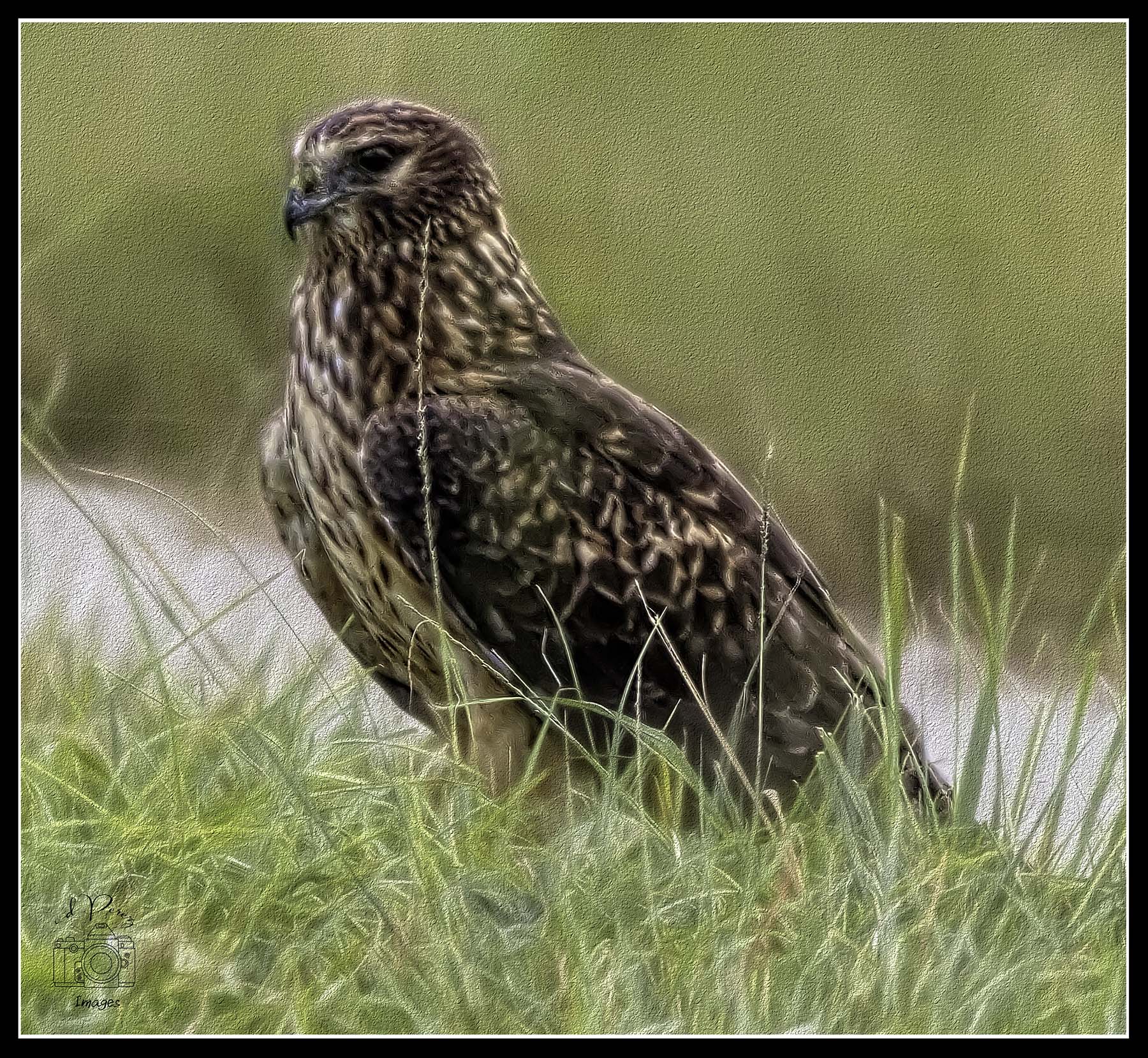
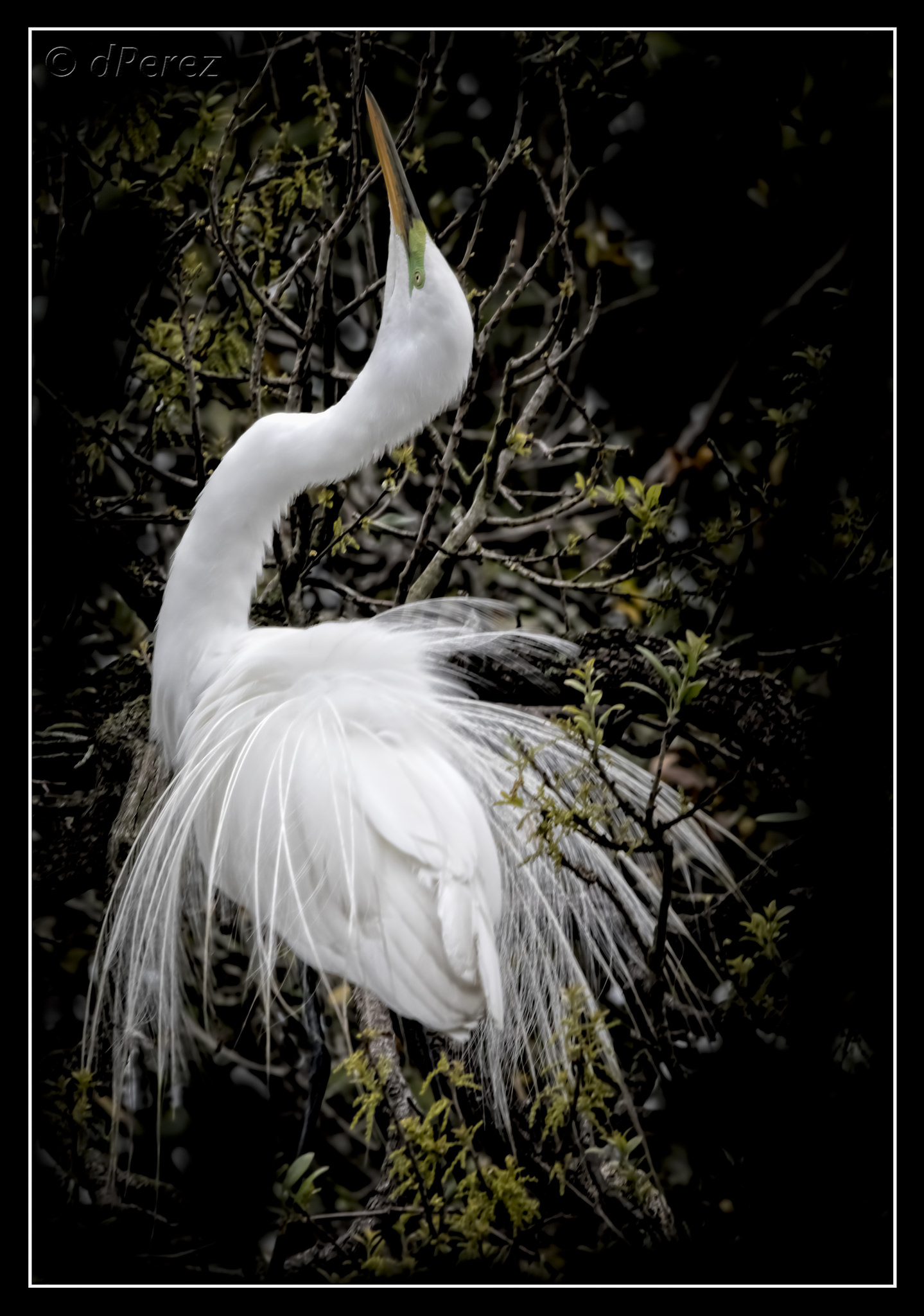
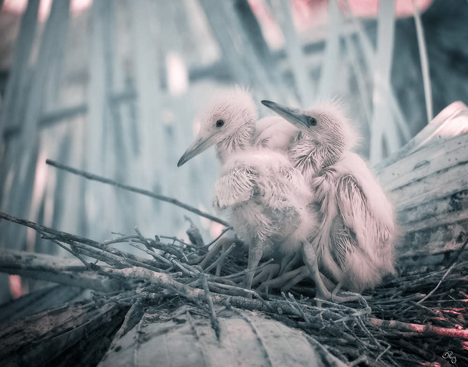
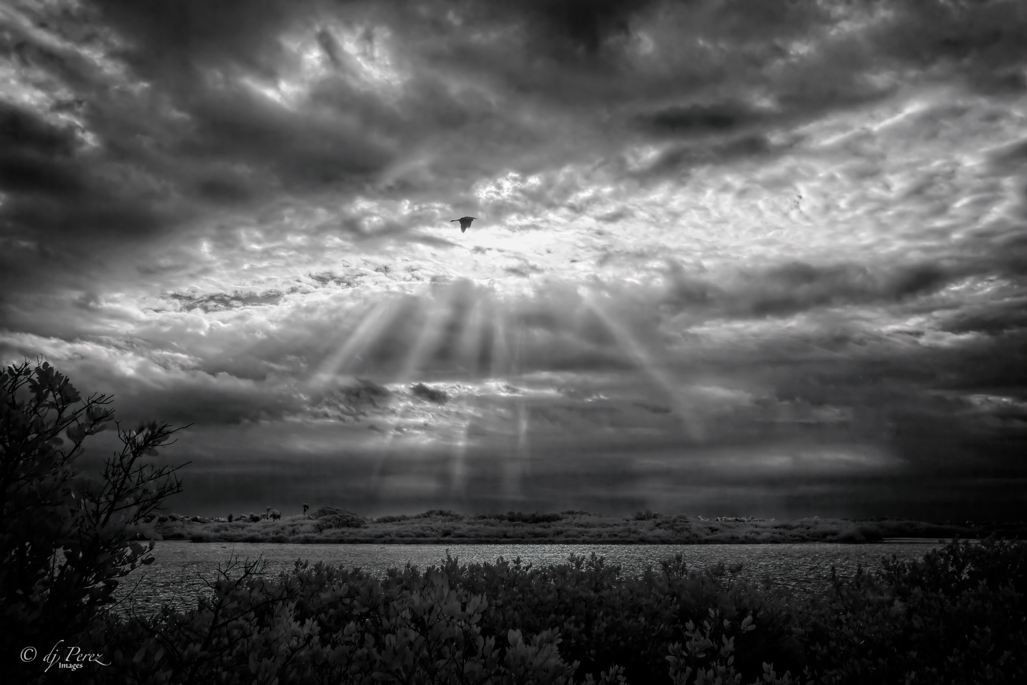
Oh, I am so missing these scenes! Hope we can get to days like this. A fine egret displaying in all his breeding plumage. Hope he attracted a mate! Well done! |
May 18th |
| 9 |
May 20 |
Comment |
I like what you did here. I had to really pay attention to your original to see this photo but think the monochrome really works well. The color version is very busy and here we focus on just a few of the players with the emphasis on the player in the bright white uniform. Like the expressions on the faces we see. Well done! |
May 18th |
| 9 |
May 20 |
Comment |
I like the photograph and think it has a lot of potential. I think you use Elements and I don't know too much about it. I think Luminar might have some presets that could pop the orange glow in the mountain area. I would push down my highlights and bring up the shadows in the sky and add a grad filter to it. Use temp and tint to add more color to the background. If you can mask out your background, use an adjustment layer to bring out the color and contrast of your foreground. There is detail there and right now it is hard to see it. You need to balance the a richer background to a brighter foreground but it is doable. If you are using DXO Photolab 2, you can probably get the same sort of effects with the U points. |
May 18th |
| 9 |
May 20 |
Comment |
Like how you soften most of the background and agree about removing distractions that are in the water. Might look at brightening the birds a bit since the background is light and I think it might give more detail the geese if they were brighter. I'm not a fan of borders or edges but yours doesn't distract and offers a bit of balance so I'm okay with it. |
May 18th |
| 9 |
May 20 |
Comment |
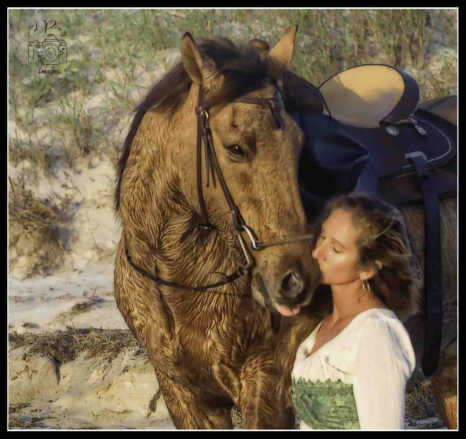
Wonder if she has some sort of template to do her eyebrows......... Her makeup is well done, like the side light that give a little glow to the side of her face and agree with David, get rid of the blue edge . |
May 18th |
| 9 |
May 20 |
Comment |
Fantastic colors! Hard shot to make and because of the movement the photo looks soft. My suggestion would be to try either Topaz or the "painting" filters in PS to make it more painterly. I still see little bits of the power lines but think there still is a lot you can pull from this photo! |
May 18th |
| 9 |
May 20 |
Reply |
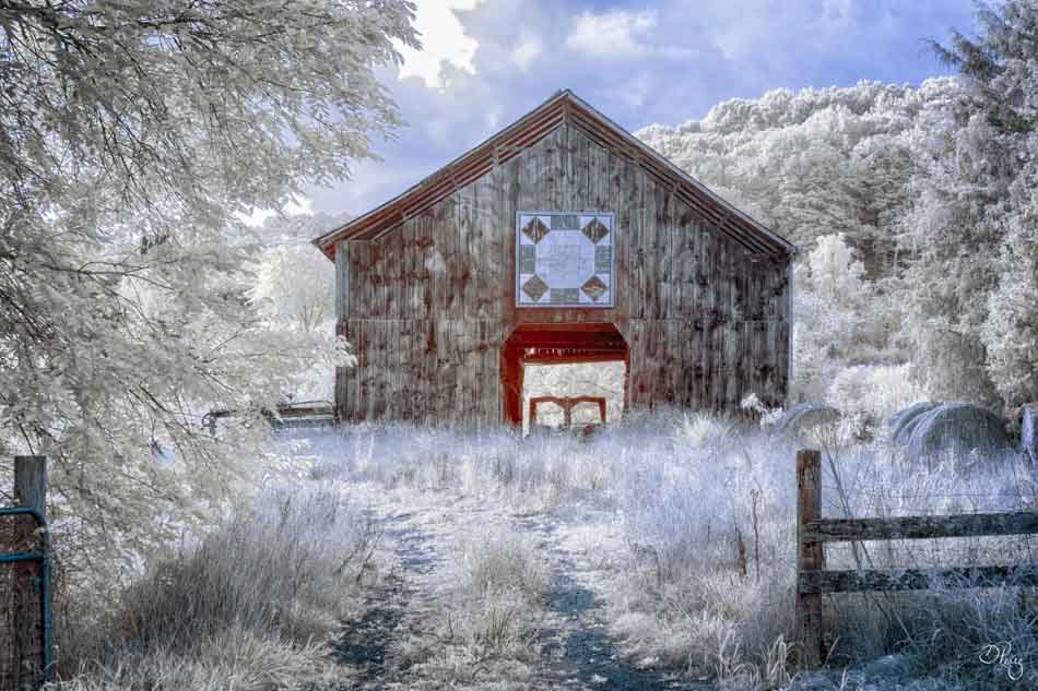
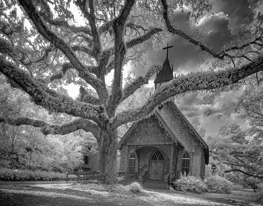
The building actually sags because the ground is very uneven. Look at the window of the house in the background, it isn't even a rectangle any more, lol!! The tree is straighter than any of the structures. |
May 15th |
6 comments - 2 replies for Group 9
|
| 35 |
May 20 |
Reply |
I typically meter through, it really is one of my least favorite filters. I shoot a lot with Lensbabies and I can get a sweet spot and diffusion, Tony's filter is 100% diffusion BUT I will often take a shot with the filter and the same shot without then blend the two shots. It is a lot of work because I can get almost the same result using software.
|
May 18th |
| 35 |
May 20 |
Reply |
Oh, no I play clicked the button a great deal with CliR. I don't know why it doesn't stick with me.
|
May 18th |
| 35 |
May 20 |
Comment |
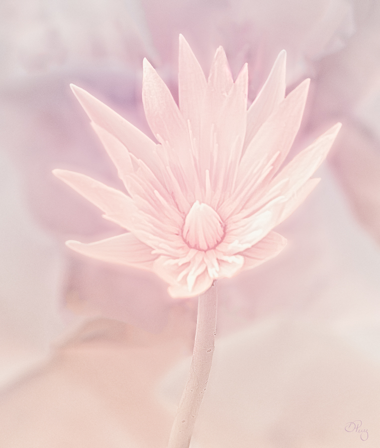
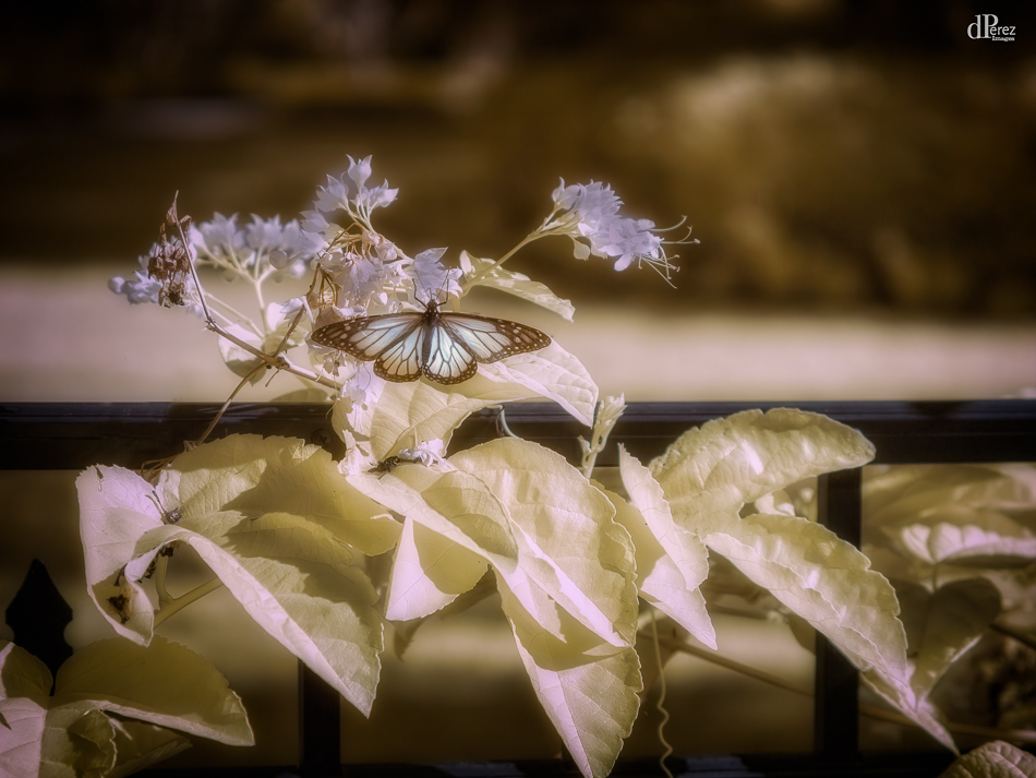
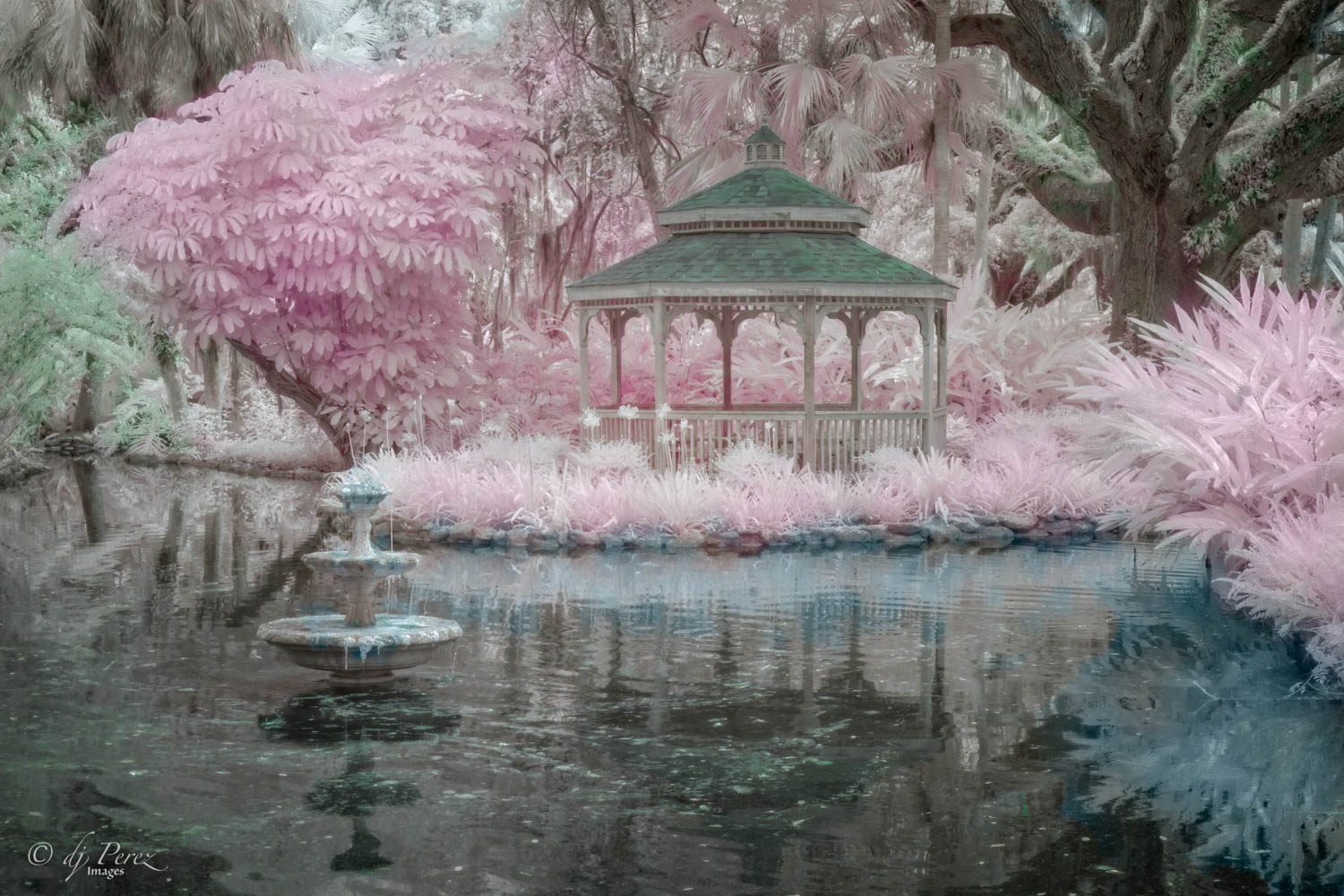
When I sit down to write comments, yours is the last one on the list for me and I'm always excited to see it. You don't disappoint (nobody does on this group) but I know I will see another fairy tale creation. I love the coloration! I don't get this when I click through CLiR. Initially, I threw myself into it and did all sorts of work using it BUT because I photograph using a regular camera more often than IR, I don't remember what I did in CLiR when I come back around so I use the method you described. Click, nope, maybe, delete, oh no, delete, what, delete, try again, maybe until there is something I can live with. Yes, you can crop a bit on the right and agree with Sharon there is composition within composition here. I love the pink reflection in the still part of the water so I might remove some of the bottom. Lovely work!! |
May 18th |
| 35 |
May 20 |
Comment |
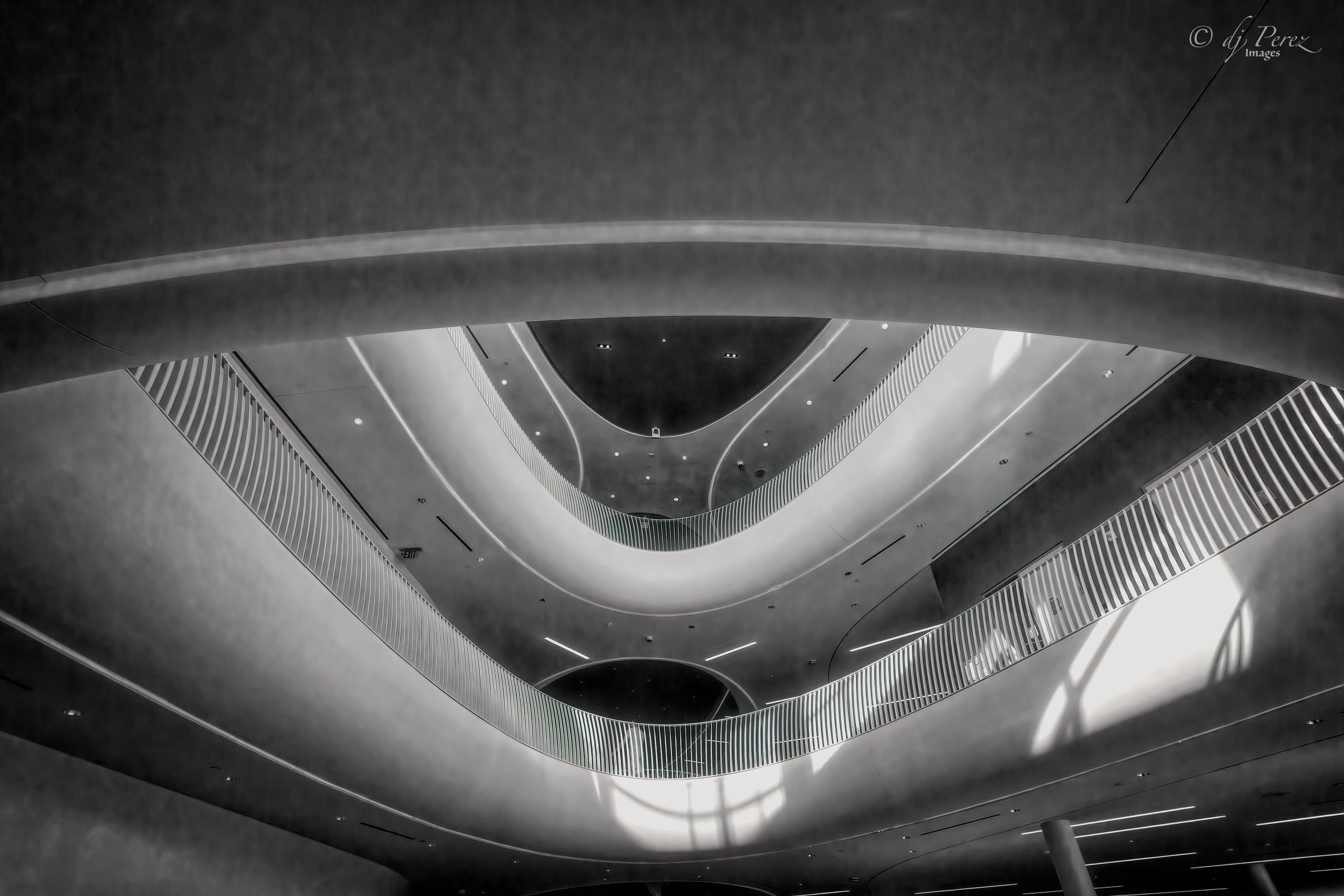
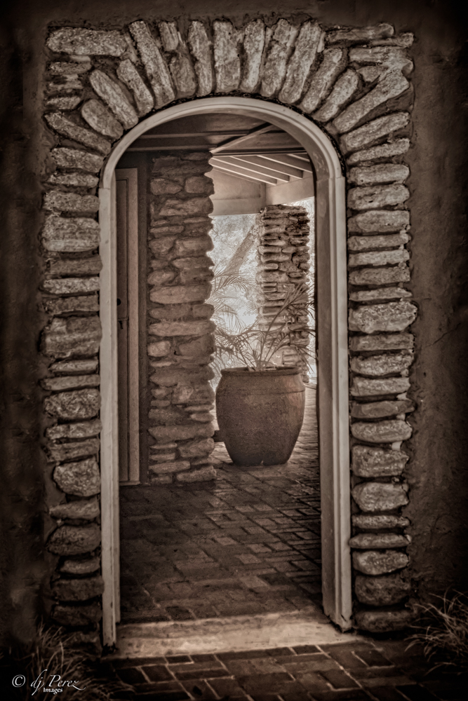
Wonderful structure. Personally , I like the crop and the person was so small that I didn't notice him until you mentioned removing him. I do find the shadows to be a bit heavy and suggest that you open them up if you want to keep them as an element. Nice work!! |
May 18th |
| 35 |
May 20 |
Reply |
It was great fun meeting at that workshop!! Hope we can all meet at future workshops!!
|
May 18th |
| 35 |
May 20 |
Comment |
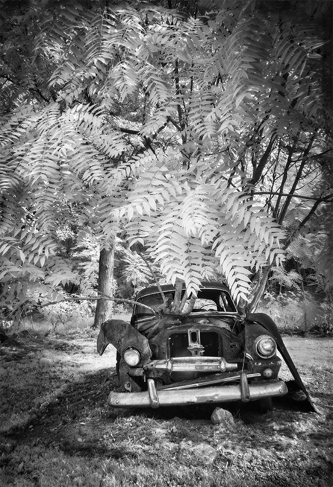
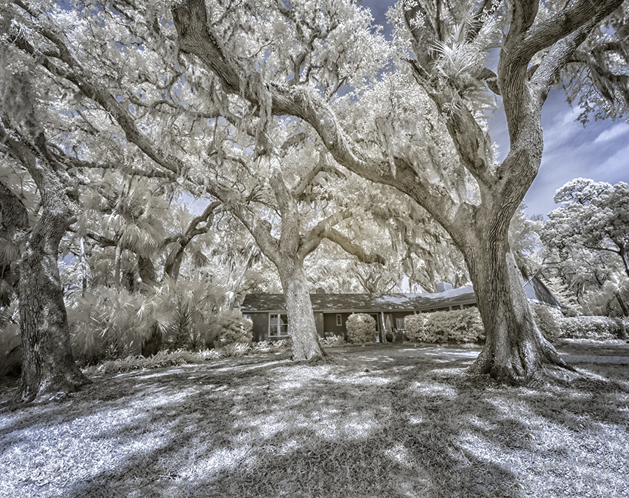
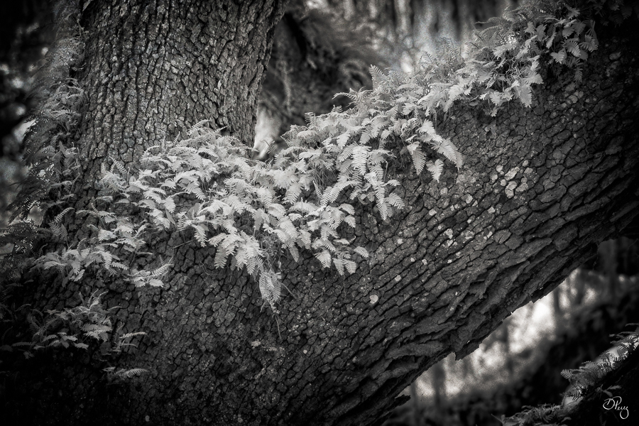
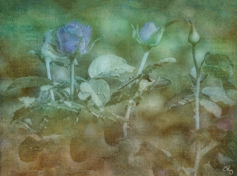
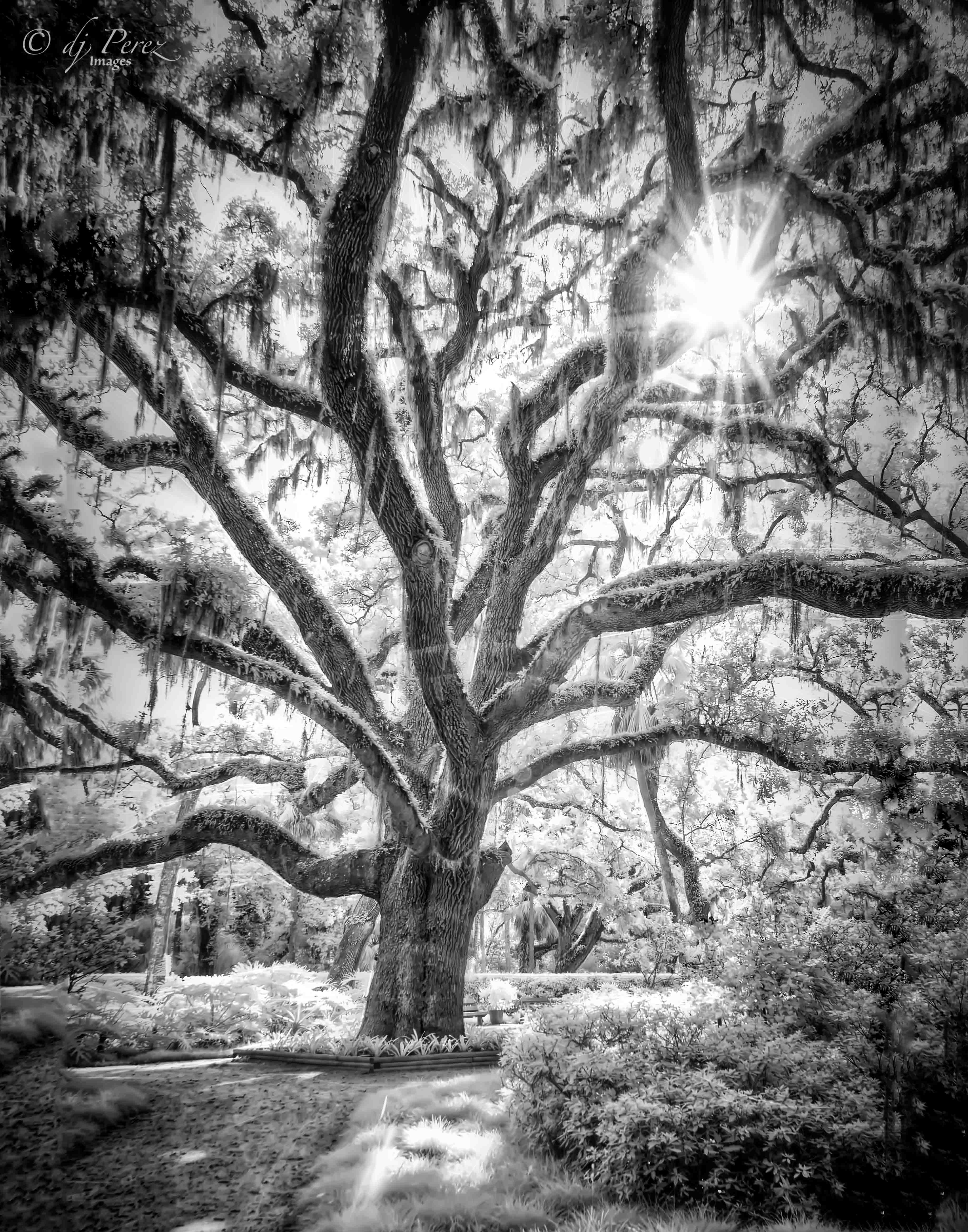
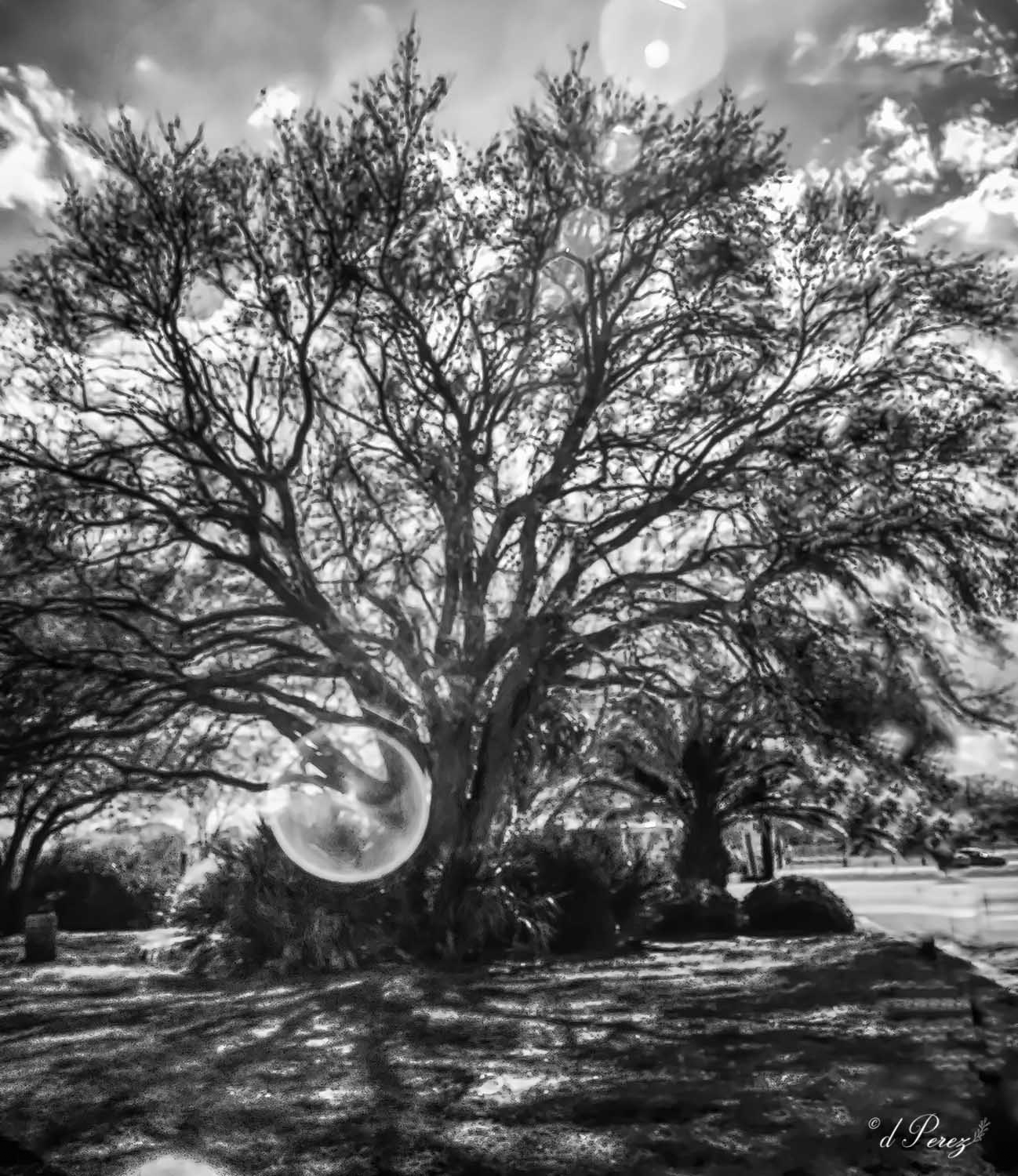
I love old oaks with resurrection ferns. Have a great many down here in FL. This looks almost like a sketch and I like the idea of softening it by using some sort of "glow". I have Tony Sweet's diffusion filter and IMO makes everything very soft, I can do soft in software and have much better control. Will do an IR with it and post it one of these days and you can see what you think. If I'm printing, I will go with a pearl metallic if I want a glow and that gives a nice pop. If I want stark B&W, I will use a baryta. |
May 18th |
| 35 |
May 20 |
Comment |
This thing is just fascinating, I lived in "coal" country when I was in Virginia but have never seen a structure like this. It is wickedly cool and I love how you processed it using the sepia. One item that you might consider is opening the shadows a bit on the structure while pulling back on the blacks. I think it might bring out more of the detail of the pit head and it could rally made it pop. Another idea would be if you have Topaz studio, use Edges in the dark mode to really add to the linearity. Well done!!! |
May 18th |
| 35 |
May 20 |
Comment |
It is a sweet scene and I'm surprised that it isn't sharper. I do agree that more contrast and sharpening would help. If you do use Nik, don't be afraid to work with the sliders if the presets aren't quite where you want them to be. You can get some great effects. I think this has a lot of potential! |
May 18th |
| 35 |
May 20 |
Comment |
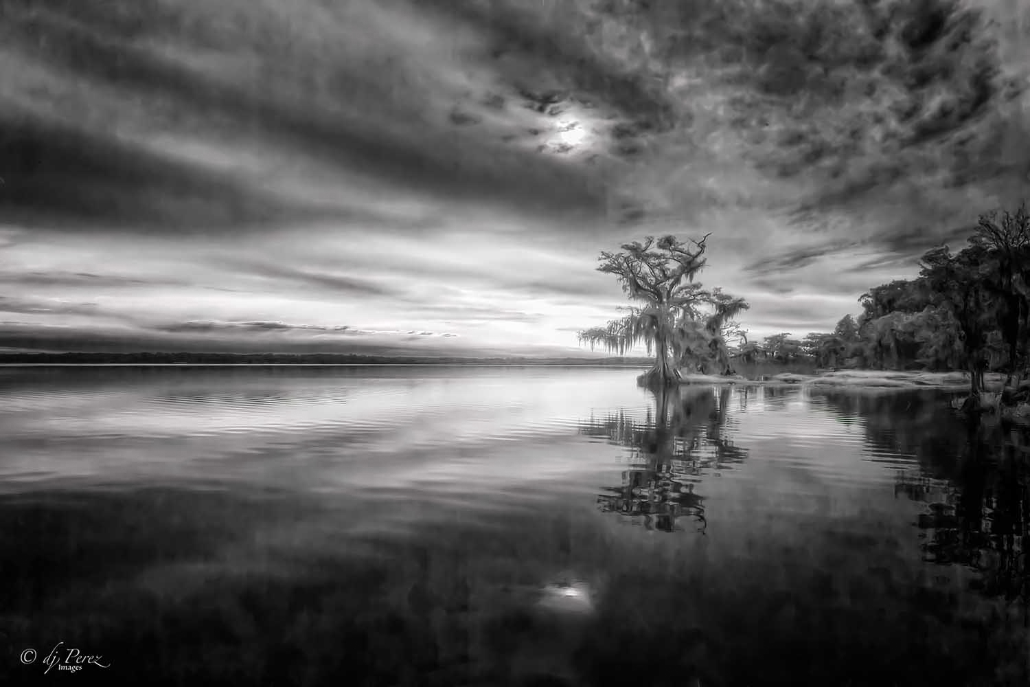
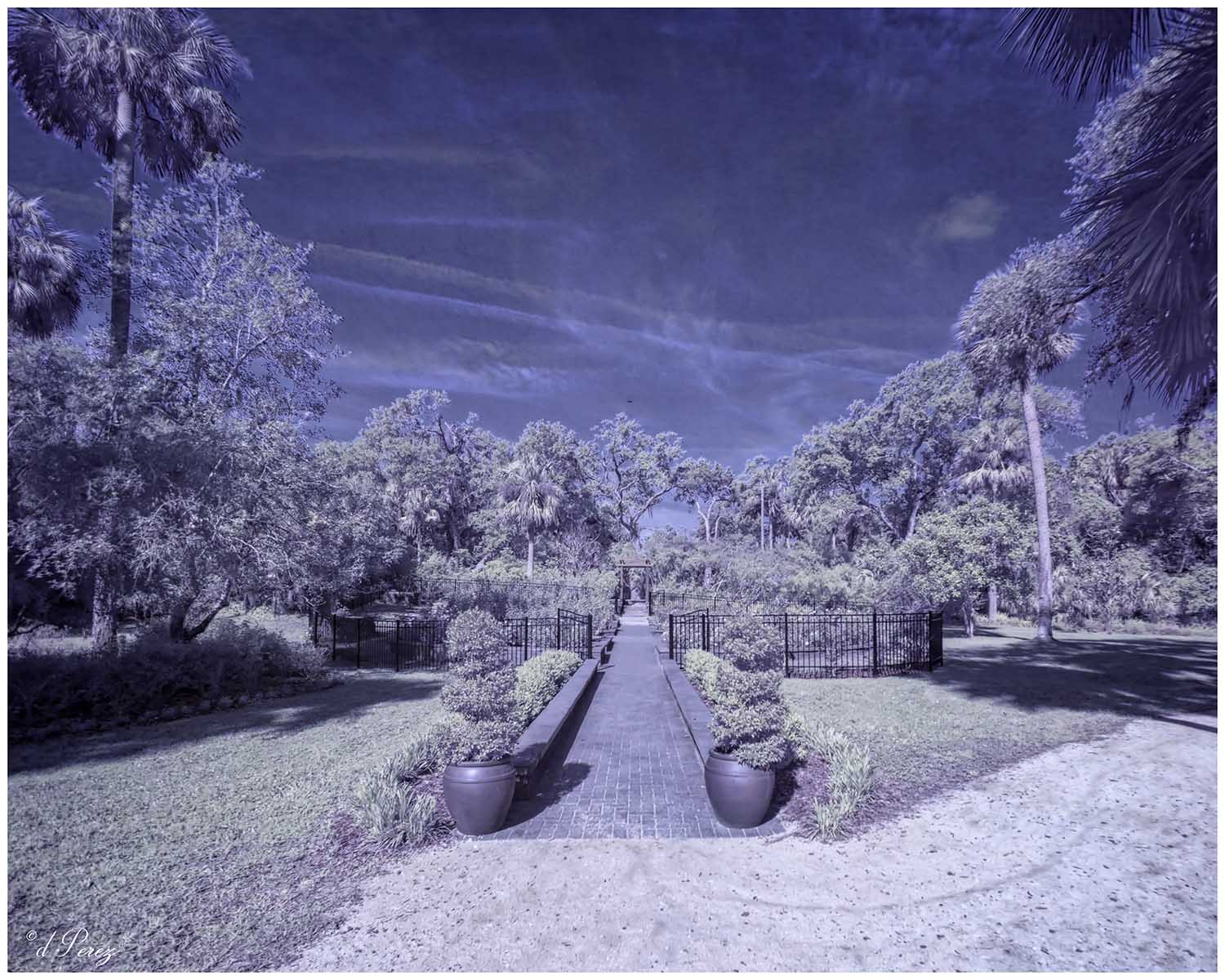
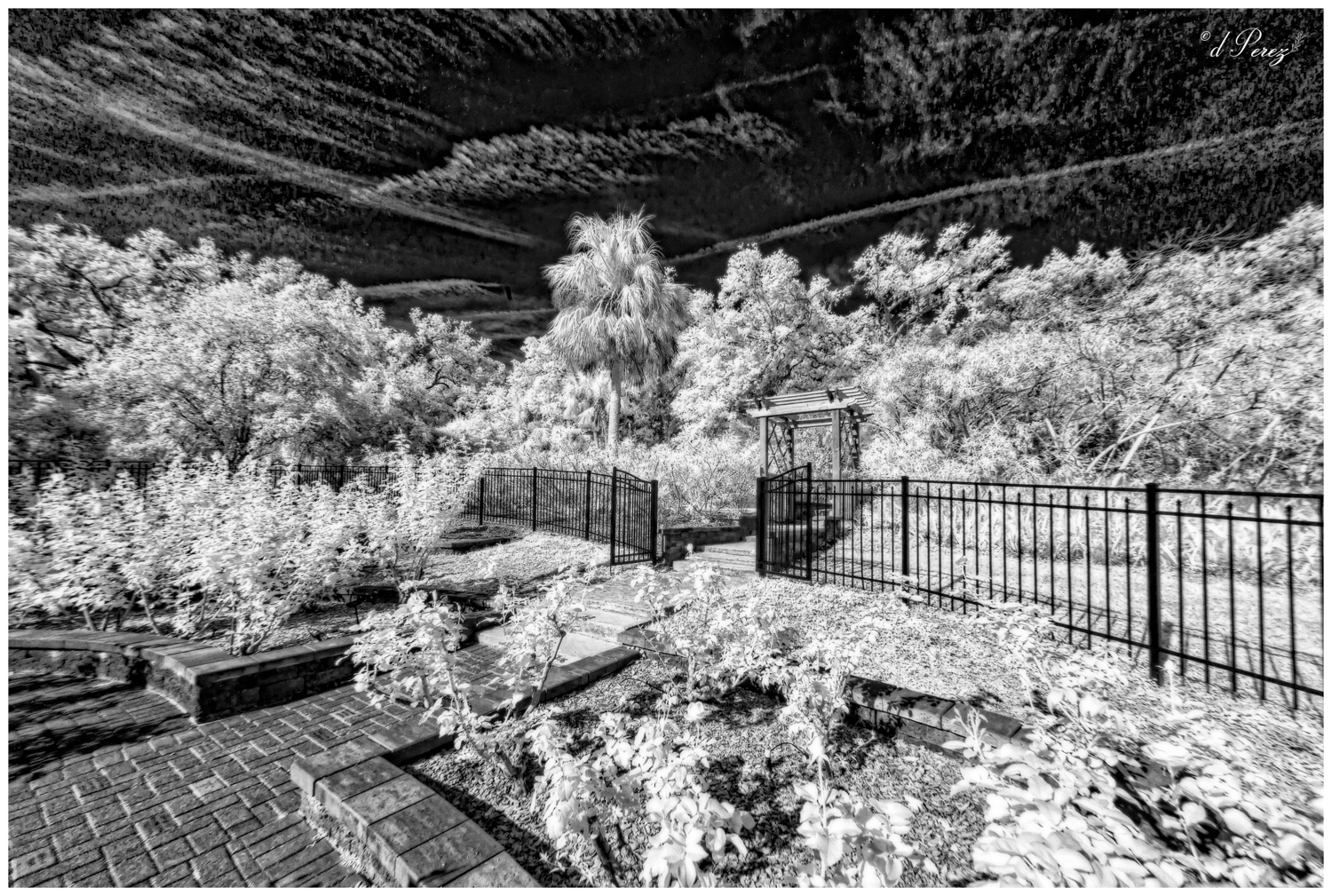
You find the best subjects to photograph! I really like the yellows and browns in your processing and as I scrolled down to post comments I noticed that I liked the photo even more as the top disappeared. As Stuart said you don't need to see the tops of the trees so play with cropping it down towards the boardwalk which is really and extending more of the foreground you cropped initially. |
May 18th |
| 35 |
May 20 |
Reply |
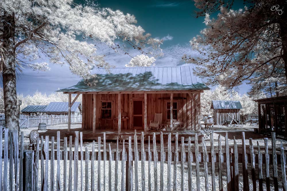
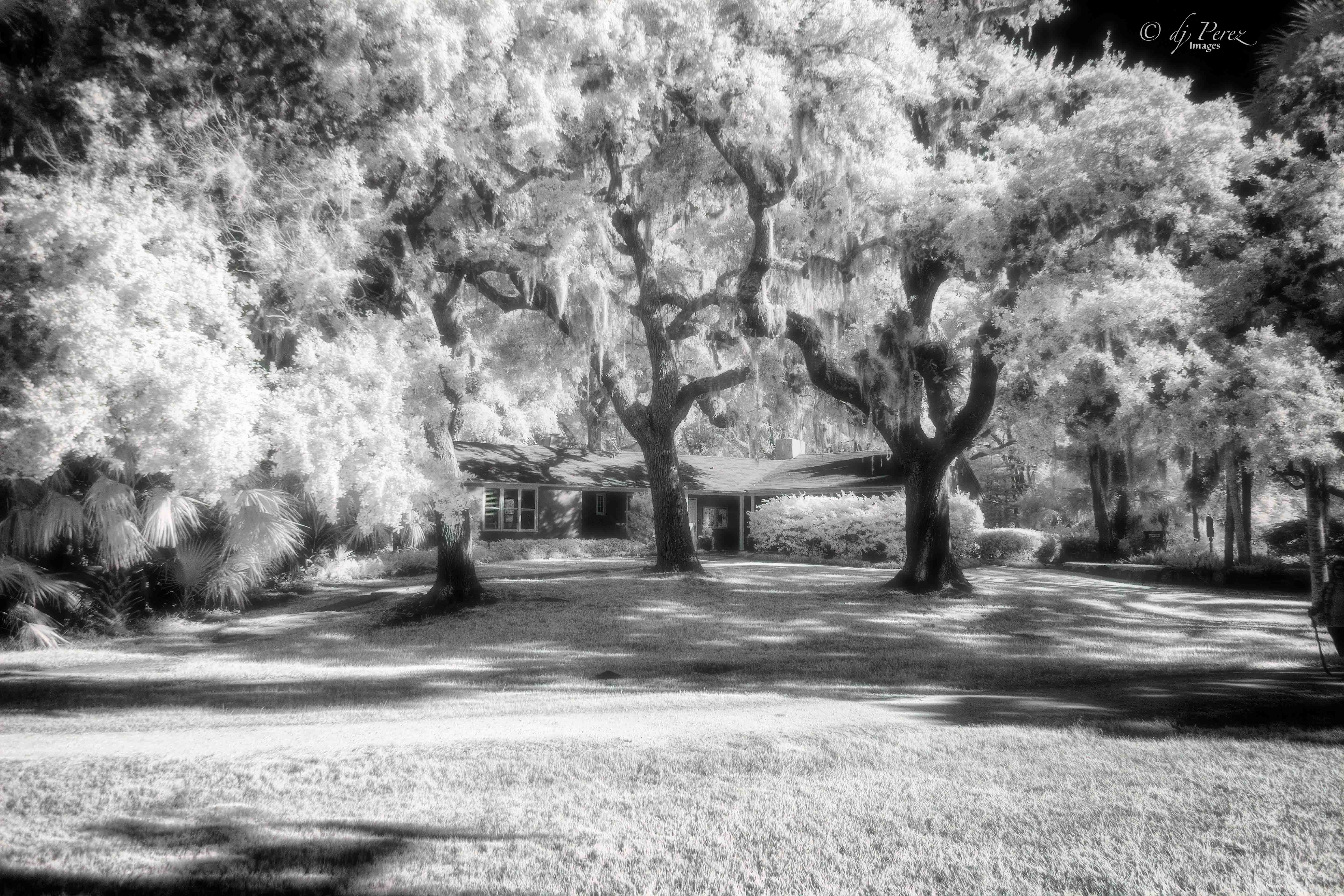
The tree is extremely close to the church. No way to take a photo of one or the other. I was on my knees crouched to the ground for this shot and only risked that because there were people around to help me if I couldn't get up, lol!! The area was filled with sagging structures because there was a lot of ground moisture. Other positions didn't work as I want to capture the cross "framed by the limbs and wanted to see the resurrection ferns on the limbs of the old oak. When I moved to the left, the wheelchair ramp seemed dominate and I lost the azaleas. It's a pretty little chapel cradled by a big old oak to me. |
May 16th |
| 35 |
May 20 |
Reply |
Actually, the buildings in this area all sagged and I suspect the beautiful oak hasn't helped the building. For me, I love the tree with all the glorious resurrection ferns. The tree is extremely close to the little chapel. I didn't use a "retro" effect in CLiR, I just used the BW adjustment. |
May 16th |
6 comments - 5 replies for Group 35
|
12 comments - 7 replies Total
|