|
| Group |
Round |
C/R |
Comment |
Date |
Image |
| 5 |
Mar 22 |
Reply |
Many thanks for your kind words. I'm very encouraged by all the responses I've had on this, gives me confidence to move ahead with my FRPS in Visual Art - architectural abstracts. |
Mar 22nd |
| 5 |
Mar 22 |
Reply |
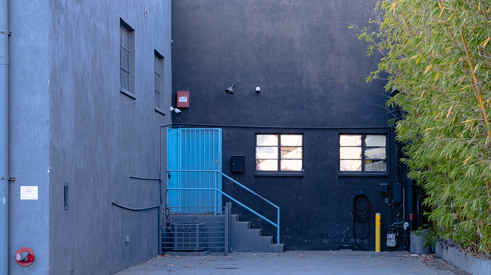
David - here is the original - if I have the system right. I didn't do much with it..... |
Mar 22nd |
 |
| 5 |
Mar 22 |
Reply |
Hello Lance
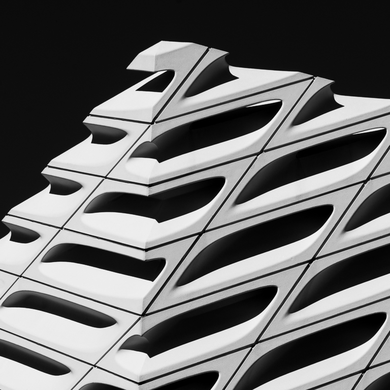
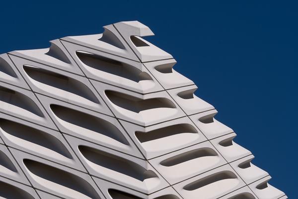
Thank you for your very kind comment. This was taken outdoors in LA, the building is The Broad which is the art gallery next to the Disney Centre (Frank Gehry). I am actually preparing a Fellowship panel for the RPS in BW architectural abstracts. I'm in search of a mentor - and I see you are one - so if you would be willing to look at my work so far, I would be thrilled. My direct email is candia.peterson@gmail.com |
Mar 17th |
| 5 |
Mar 22 |
Reply |
Thank you Barbara. I was hoping for positive comments to boost my confidence of submitting the panel of which this is to be a part. |
Mar 13th |
| 5 |
Mar 22 |
Reply |
Thanks so much! |
Mar 13th |
| 5 |
Mar 22 |
Reply |
Hi Donna - apologies for the late reply, I've been away. It was taken in full sun around 11am. |
Mar 13th |
| 5 |
Mar 22 |
Reply |
Thank you. I was looking for super contrasty but it is to be part of a panel that still needs a lot of work and I'll take this on board when I get back to it. |
Mar 13th |
| 5 |
Mar 22 |
Comment |
Very sweet and a lovely image. If it were possible with the orignal frame, I'd have given the boy a little bit more space behind his bottom, the right side of the frame feels a tiny bit tight but that is very minor. |
Mar 13th |
| 5 |
Mar 22 |
Comment |
I can't disagree with anything already said. A brilliant capture and excellent treatment from Mark. I'd love to know if you publish your illustrated story books for kids. |
Mar 13th |
| 5 |
Mar 22 |
Comment |
I love this image as you've shown it and I prefer it to any of the suggestions above. The colours are superb and I think the composition works really well. I really like this kind of intimate landscape and I would change nothing. |
Mar 13th |
| 5 |
Mar 22 |
Comment |
I very much like the overall flavour of the image and I think Mark's crop works really well. The problem I have with your original crop is that you seem to have lost the Buddha's top knot and his head looks weirdly flattened against the green. |
Mar 13th |
| 5 |
Mar 22 |
Comment |
A strong scene with plenty of drama. You show how you've straightened the horizon but I wonder if it doesn't still have a slight tilt to the left? I agree with the further dehaze on the sky. There are a few little details that catch my eye which I think I'd have eliminated. One is the car on the left (the two on the right don't bother me as much). There are a couple of birds around the lighthouse which are too small to do anything for the image and small enough to be mistaken for dust spots. I would also have lost the three small upright posts which distract from the main vertical of the lighthouse. |
Mar 13th |
| 5 |
Mar 22 |
Comment |
Just as a generic comment - I apologise for tardy responses this month. I have been away.
This is a very imaginative image and I like the treatment. I agree with all the crop comments above and in answer to Barbara's question to David's response, I'm not convinced the shadow works - in fact I was planning on saying this - as it doesn't appear to be a sharp or accurate shadow of the rider so, to my mind, loosing it would be an improvement. |
Mar 13th |
6 comments - 7 replies for Group 5
|
6 comments - 7 replies Total
|