|
| Group |
Round |
C/R |
Comment |
Date |
Image |
| 5 |
Nov 21 |
Comment |
Thanks Oliver. I wasn't too sure about the comments until I sure your version of it and I agree my guy does stand out a little better with the darker window - though it hadn't particularly occurred to me as an issue.
I don't have a clue how you moved him back - I don't know how to and would never particularly want to manipulate images in that way and I'm less keen on that. For me, part of the point was his head meeting the model's lips and I prefer the more exhausted feel of the dog trailing further behind. The title "In Pursuit of Yesterday" against the slogan on the window was intended to evoke two slightly tired lives..... It is in a camera club competition with judging tomorrow so I'm looking forward to seeing if the comments of the judge echo yours.
|
Nov 18th |
| 5 |
Nov 21 |
Comment |
Thanks Oliver. I wasn't too sure about the comments until I sure your version of it and I agree my guy does stand out a little better with the darker window - though it hadn't particularly occurred to me as an issue.
I don't have a clue how you moved him back - I don't know how to and would never particularly want to manipulate images in that way and I'm less keen on that. For me, part of the point was his head meeting the model's lips and I prefer the more exhausted feel of the dog trailing further behind. The title "In Pursuit of Yesterday" against the slogan on the window was intended to evoke two slightly tired lives..... It is in a camera club competition with judging tomorrow so I'm looking forward to seeing if the comments of the judge echo yours.
|
Nov 17th |
| 5 |
Nov 21 |
Comment |
I'm afraid this isn't one for me. I echo the others on the technical aspects but I also feel that she is far too tight in the frame - and I'm not sure I see the point of the exercise. Hands' up, I'm the first to admit (and I think I have done so before) I have a big personal downer on portraiture in general and posed model shots in particular so my weakness but it would need to be really special to light my fire and sadly this doesn't. Sorry! |
Nov 3rd |
| 5 |
Nov 21 |
Comment |
A nicely composed landscape with a good leading line in the path. I agree about the magenta haze but I feel it is a little flat without that pop of colour. I think if anything I would have saturated it a little more and increased the contrast a little. Possibly a vignette would help to direct the eye into the bright spot in the middle. |
Nov 3rd |
| 5 |
Nov 21 |
Comment |
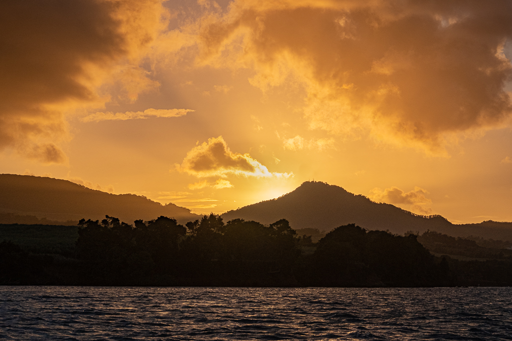
Lovely image. As some others have said, it is a little too saturated for my taste and possibly a little too warm in the white balance and I'm always a little uncertain about a blown-out sun. But great capture of a memorable moment. |
Nov 3rd |
| 5 |
Nov 21 |
Comment |
Fun. Reminds me of the Cottingley Fairies of 1917. |
Nov 3rd |
| 5 |
Nov 21 |
Comment |
I like the image and the Topax clean up has worked well.
It has colour and character and I can see why it's a keeper for you. |
Nov 3rd |
7 comments - 0 replies for Group 5
|
7 comments - 0 replies Total
|