|
| Group |
Round |
C/R |
Comment |
Date |
Image |
| 5 |
Sep 21 |
Reply |
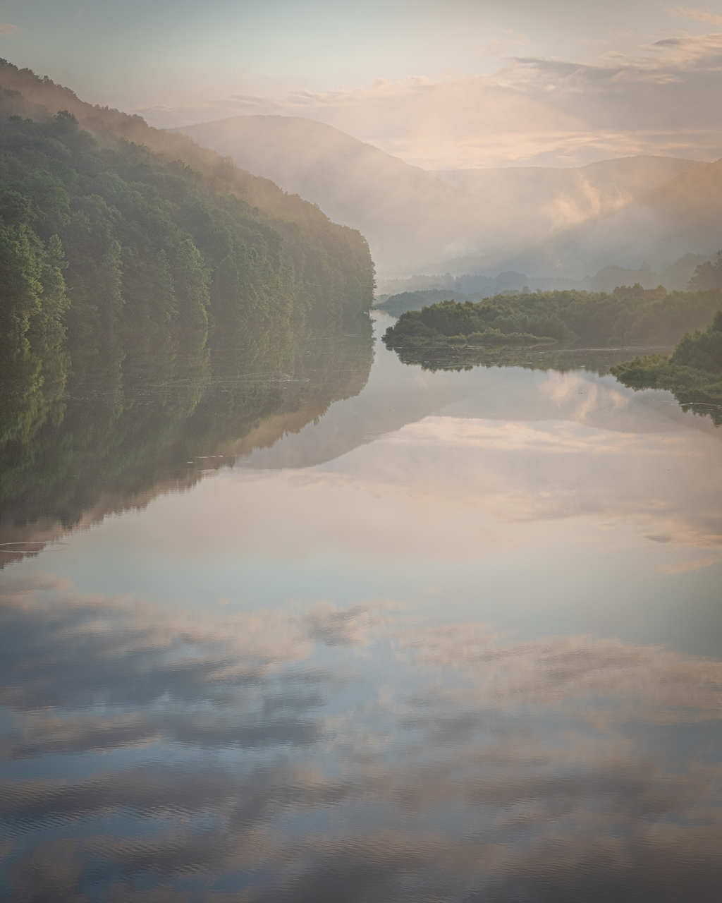
Thanks Barbara, I appreciate that. It is one of my favourite landscapes of the summer so far. |
Sep 8th |
| 5 |
Sep 21 |
Reply |
A nice version. Yours has more of a golden hour feel to it than my misty coolness. I think the trees feel a bit too autumnal in yours but I like the colours in the sky.
|
Sep 8th |
| 5 |
Sep 21 |
Reply |
Thanks Richard, square makes a good alternative crop. I also have a version that I took in landscape which works well. |
Sep 8th |
| 5 |
Sep 21 |
Comment |
A very pretty image of a beautiful garden in Cherry Blossom Season. I don't particularly agree with the 16/9 crops above as I very much like the textures of and reflections in the water and think they are absolutely key. I do think the white balance is a little off and there are some pink artifacts to the lower right of the frame which I think I would try to deal with. However, a lovely composition which evokes Japan. |
Sep 8th |
| 5 |
Sep 21 |
Comment |
It's fun and creative and I guess a camera was involved in the detritus but this doesn't fall within the bounds of my idea of photography and I'm afraid I can't grasp the point of the exercise. Clearly though, you have great skill at whatever it is you do and I have to appreciate that even if I don't get it at all. Soz!! |
Sep 8th |
| 5 |
Sep 21 |
Comment |
I'm very keen on micro landscapes and I definitely think you have made a great success of what you set out to achieve. This is an image that works really well for me and apart, perhaps, for a little more saturation on the greens, I wouldn't change anything. |
Sep 8th |
| 5 |
Sep 21 |
Comment |
I think I prefer the black and white version in the other group. I do like your crop but I'm not keen on the sky particularly (even less the redder one). I think I have said in the past that I'm a real luddite when it comes to sky replacement and seldom see one I approve one - so put that down to my taste but I do think the sky you've chosen has the sun in the wrong place for the light on the barn. I like the textures you have achieved but I definitely think it is better suited to BW, again very much a matter of personal taste. |
Sep 8th |
| 5 |
Sep 21 |
Comment |
A lovely street portrait and perfect in BW. I'm not a fan of studio portraiture or portraits where the subject is actively engaged with the camera so his gaze past the lens particularly appeals to me. I think you have captured the texture of his hands and face very well. A couple of people have mentioned the padlock and I have to say it doesn't bother me at all, in fact I think it adds to rather than detracts from the background. Definitely the case in the BW version though I can see that it is more of a bother in the colour version. |
Sep 8th |
| 5 |
Sep 21 |
Comment |
Hi Barbara
I like this still life. The saturated reds don't bother me particularly but then I appreciate the more subtle tones produced by David's edit. The bit that doesn't work for me completely is the upturned corner to top left of the blanket. I think I would have preferred to have seen it flat or, perhaps better, artfully crumpled across the surface. |
Sep 8th |
6 comments - 3 replies for Group 5
|
6 comments - 3 replies Total
|