|
| Group |
Round |
C/R |
Comment |
Date |
Image |
| 86 |
Jun 22 |
Reply |
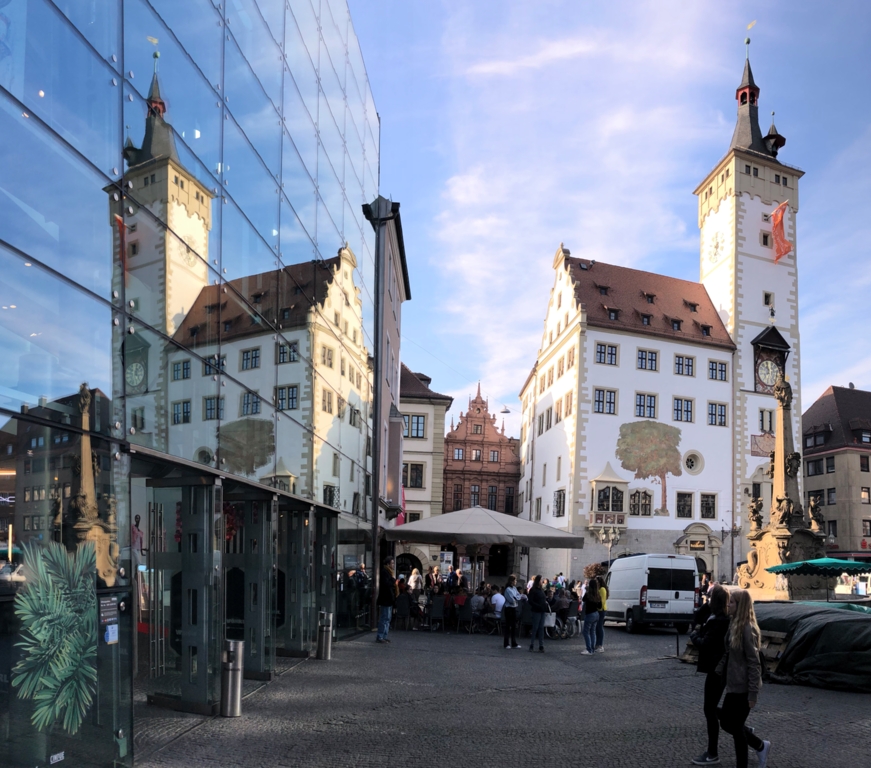
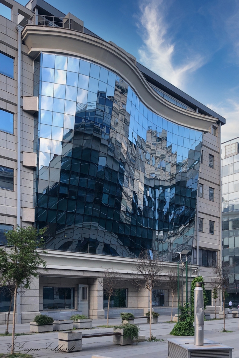
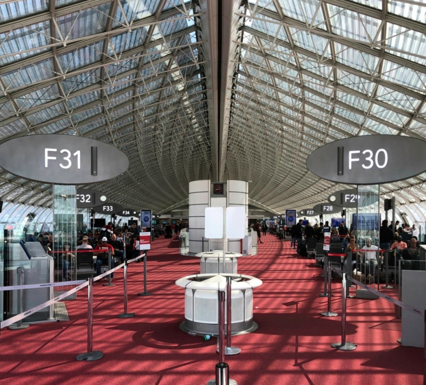
Thanks for your comments. I like your imagination. But I prefer to remain rooted in man made architecture. I agree that the shadows on the carpet make it busy. However, it would seem surreal for a photo of a glass building, on a sunny day, to have no shadows? I appreciate your comments because they always give me something to think about and reconsider the image. |
Jun 21st |
| 86 |
Jun 22 |
Reply |
Could be. Taken in 2019. First trip out of Europe through CDG. I usually go through Amsterdam, and Frankfurt only if I have to. |
Jun 21st |
| 86 |
Jun 22 |
Comment |
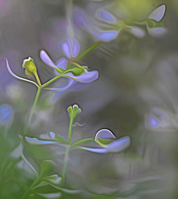
I find the image interesting, but I am not sure that I like it? Except for the swirl, it seems too close to my natural eyesight. Camera movement is an interesting art form, which I have only practiced by accident. I like the colors, subjects, and composition. I think I would have enjoyed the "normal" image. That said, I admire your creativity and willingness to explore and share other photo genres. |
Jun 14th |
| 86 |
Jun 22 |
Comment |
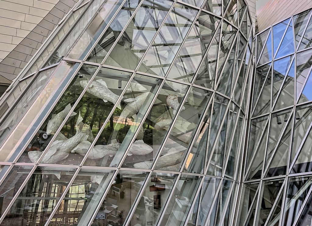
I also REALLY like this shot! Agree with Jack regarding saturation - the colors are pastel and the fabric appears "soft", which goes well together. This is an image I would consider for competition and would explore a slight boost in contrast/structure to define the fabric and increase depth. Although I like the strong blue sky, it seems to detract or overpower the sculpture a little. I generally do not like images without perspective correction (vertical here), but I think it works well with the image. Nicely done. |
Jun 14th |
| 86 |
Jun 22 |
Comment |
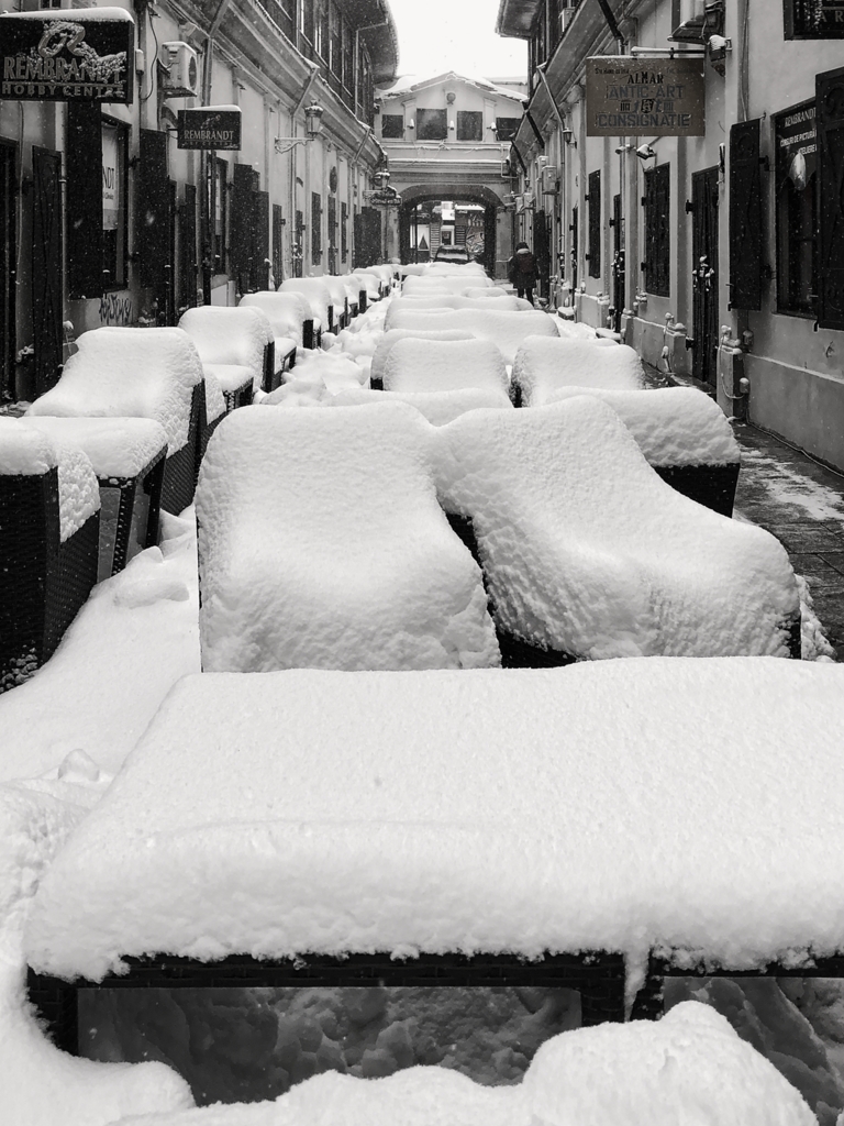
I like your creativity. I, too, do not get a night feel. I like the way that most of the image is morphed. However, I agree with Belinda that "eliminating" the sun also eliminates the shadows (which I really like) which become plantings or stepping stones. I prefer the original image. |
Jun 14th |
| 86 |
Jun 22 |
Comment |
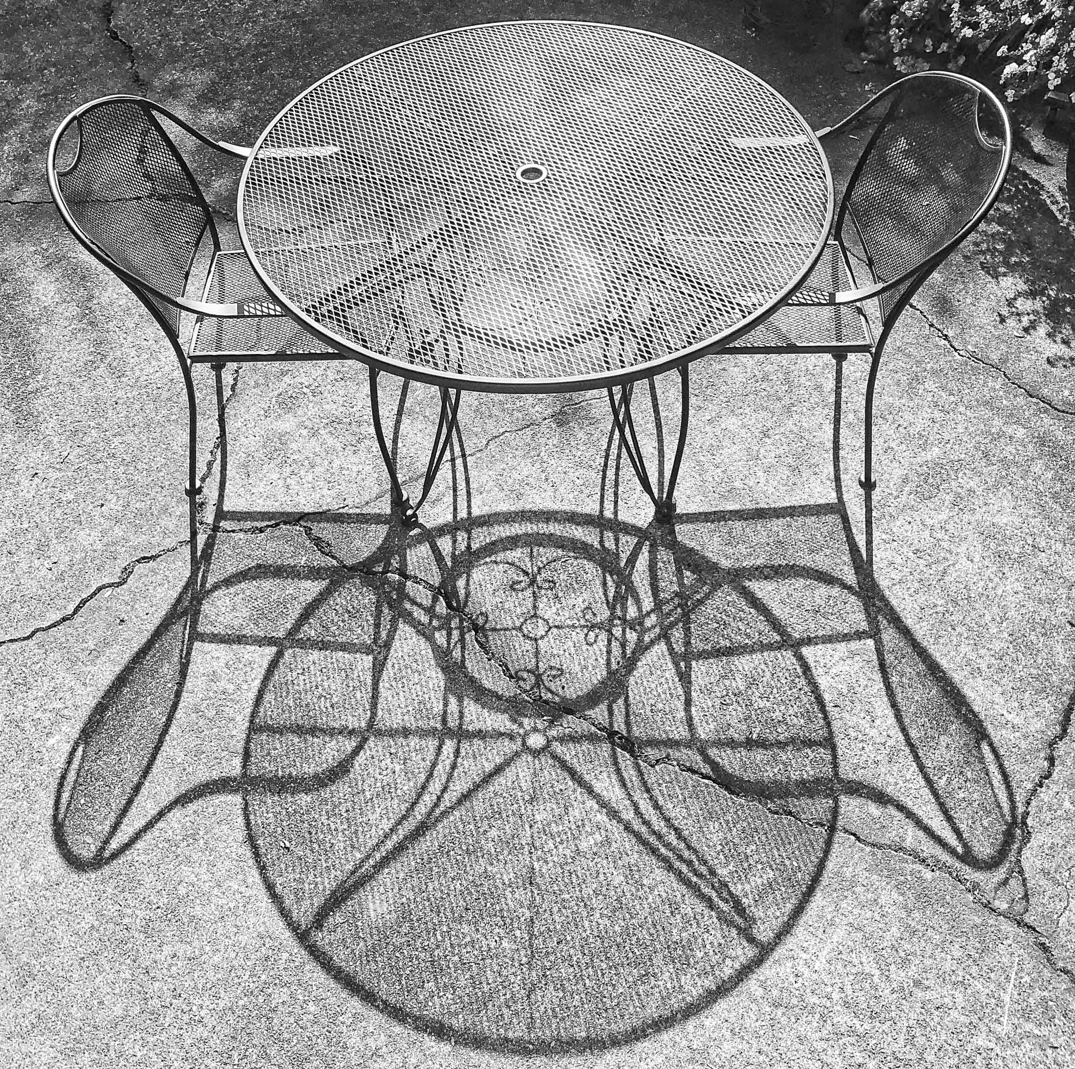
Jack, like this a lot. BW is perfect. You could "straighten things" with a little perspective / clone work (attached rough example) but, to my eye, that cancels the "abstract" nature of the image. Prefer as is. Suggest that you crop just a small part of the bottom to eliminate the bottom sliver of white form. |
Jun 14th |
 |
| 86 |
Jun 22 |
Comment |
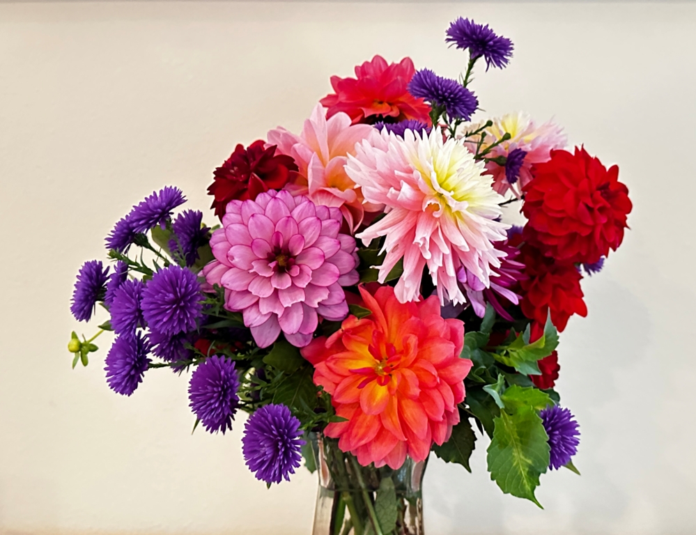
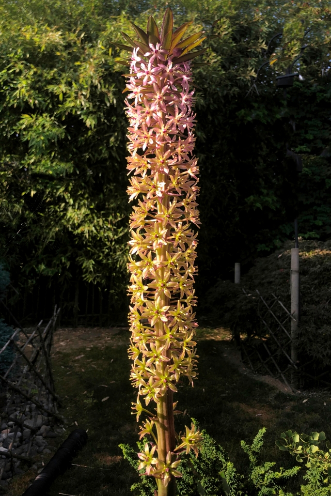
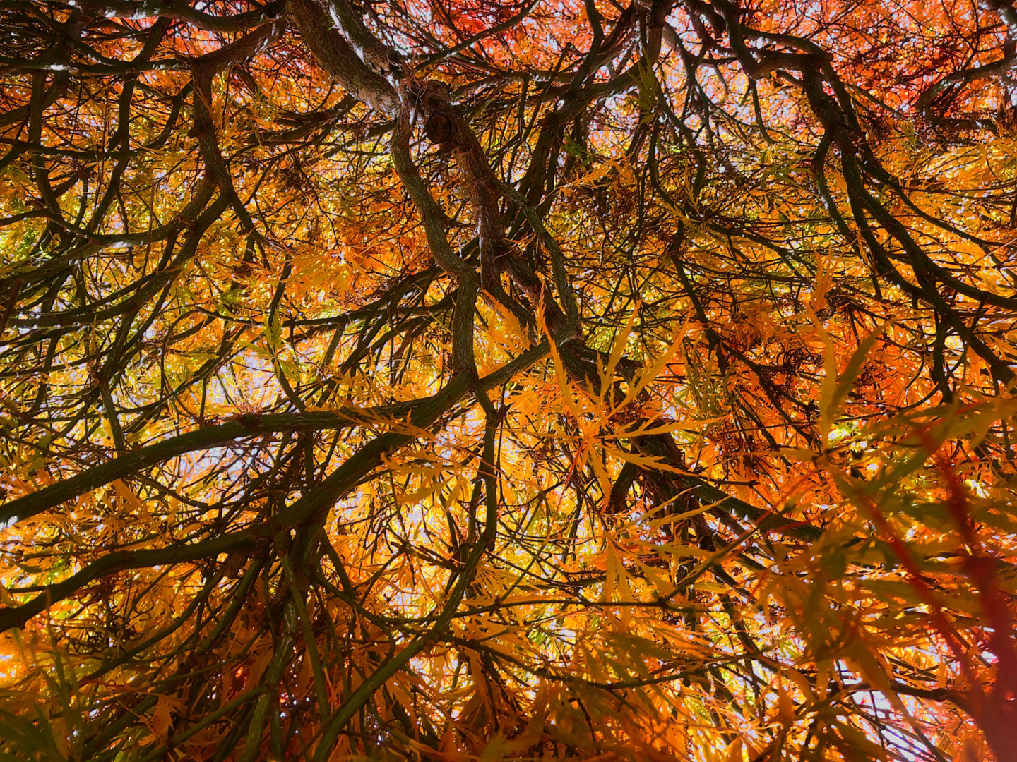
Very nice. The flower is nicely framed, sharp in the center that extends to edges. The yellow contrasts well with the green background. A very slight darkening / blur of the background might give a little extra POP. Also, suggest that you crop just a little off the top and bottom for a square format. Well done. |
Jun 14th |
| 86 |
Jun 22 |
Comment |
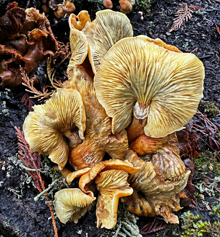
I like the subject and intent. An innovative approach. The part that is in focus gives a glimpse of the potential of the entire image in focus. For my taste, there is too much out of focus. The small lens (I think ~28 mm) results in a very short DOF. Suggest backing away a bit to increase DOF, use focus lock on the center of the depth, and then crop to increase the increase the image size. |
Jun 14th |
6 comments - 2 replies for Group 86
|
6 comments - 2 replies Total
|