|
| Group |
Round |
C/R |
Comment |
Date |
Image |
| 86 |
Feb 22 |
Comment |
Love it! This is the first time I've seen a bird (as primary subject) photo on the phone. The focal length creates a nice soft background. The image appears sharp throughout. Nice catchlight in eye. Sharpening might clean up the eye / beak area a little bit. |
Feb 8th |
| 86 |
Feb 22 |
Comment |
A beautiful harbinger of spring. Nice color contrast between the bright green grass / pink blossoms with dark / barren trees. I find the yellow bush to the left of the tree trunk a bit distracting and would try to clone it out. |
Feb 8th |
| 86 |
Feb 22 |
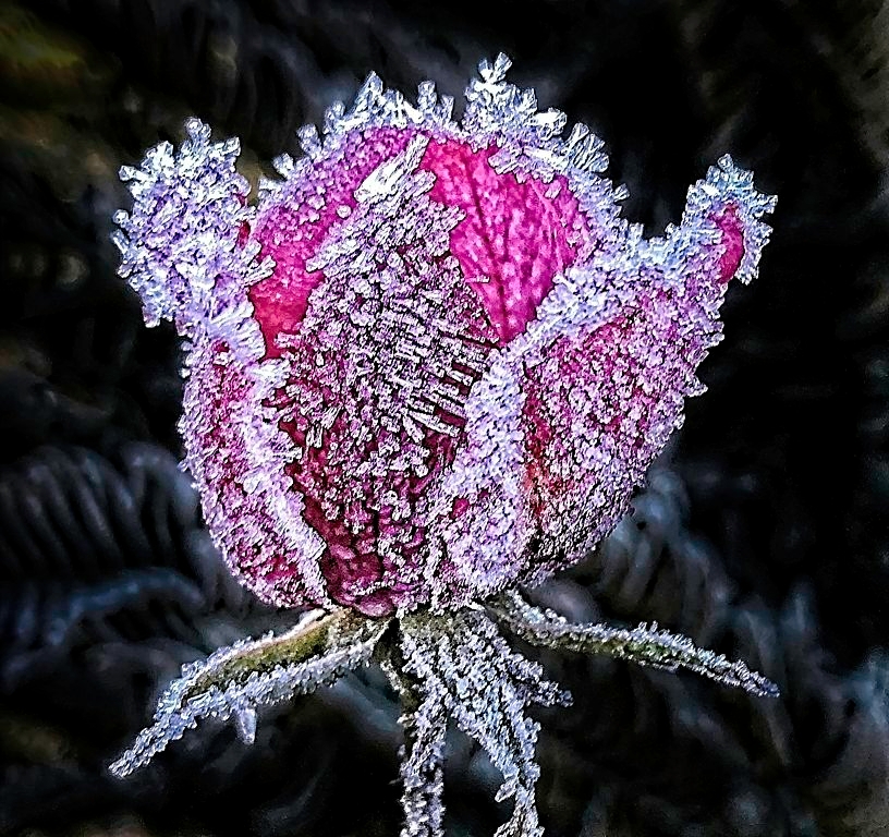
Comment |
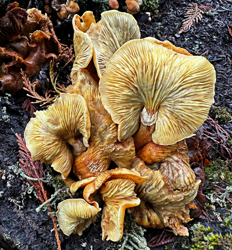
Very nice composition, light, texture, detail, and color. My eye gets "stuck" on the bright spot in the lower left. It may be possible to tone that area down (maybe a couple of other hot spots) to balance the tone. I think this would be stunning in the kitchen. I have a photo of apples. |
Feb 8th |
| 86 |
Feb 22 |
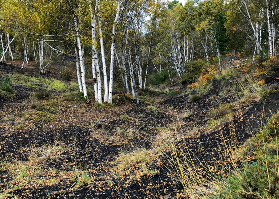
Comment |
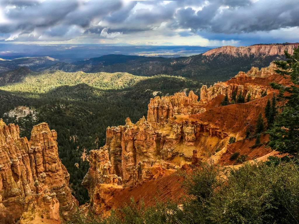
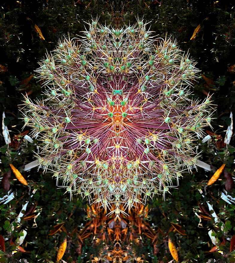
Nice shot! Do not think I would have "seen" this. It showcases the "tiny" in the vast setting. Great detail and texture in the log, which draws my eye to the right, the flower shadow and then to the flower. Nice blur in the background. |
Feb 8th |
| 86 |
Feb 22 |
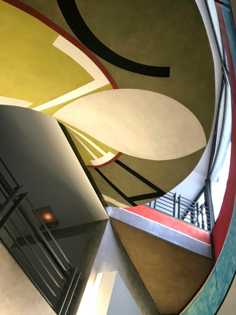
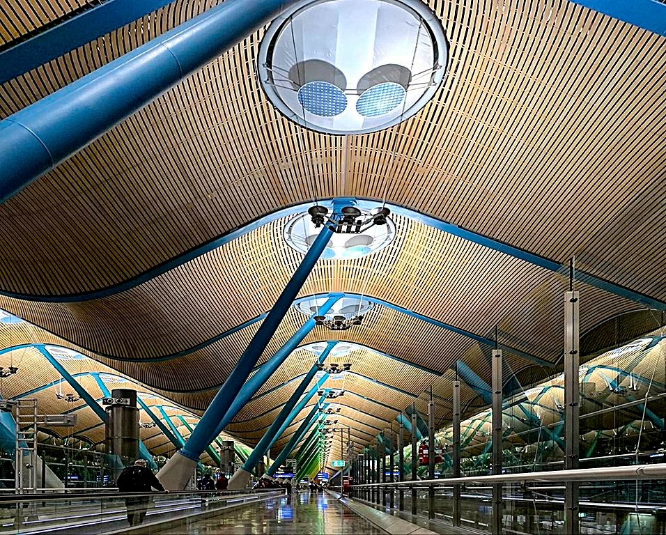
Comment |
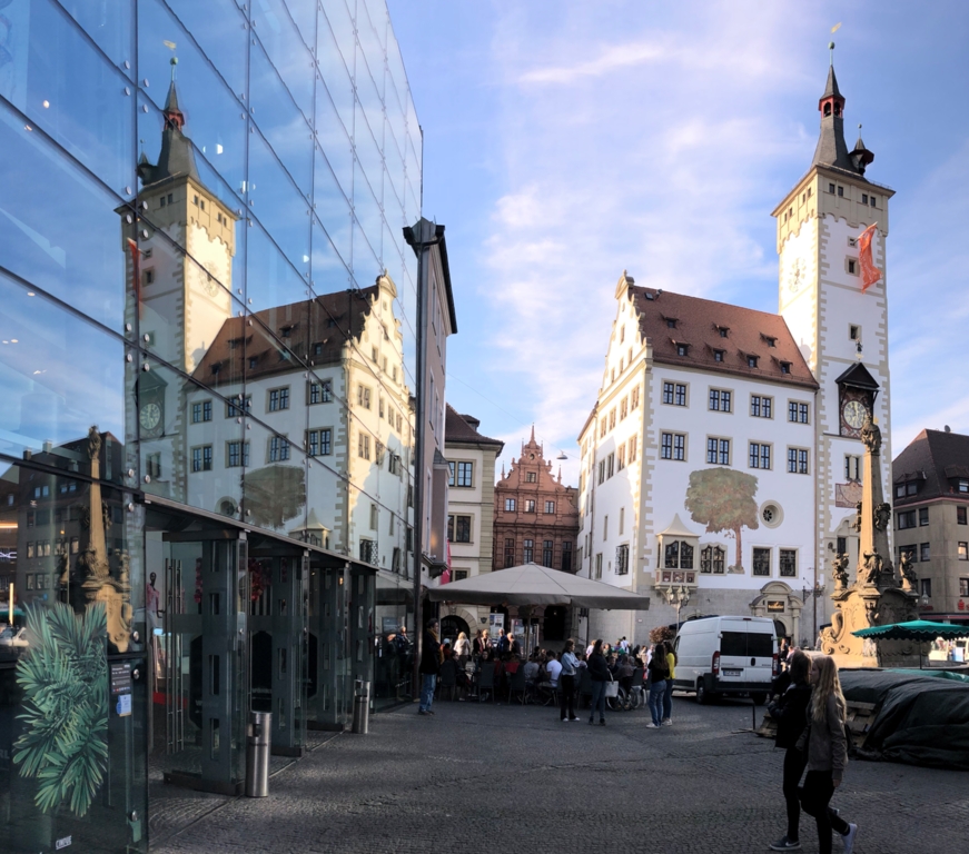
Very nice. Love the lines, textures and colors. European APs are amazing photo subjects, especially Madrid, with its bright colors. I prefer the perspective correction, but also confess perspective is a pet peeve, partly because it is so easy to correct. However, I agree with Jack that it is appropriate to forgo perspective correction for artistic reasons. I think the corrected perspective creates a greater sense of depth. Attached copy shows the On1 Tonal Enhancer Filter, Tonal Contrast adjustment highlights color and sharpness contrast. |
Feb 8th |
 |
5 comments - 0 replies for Group 86
|
5 comments - 0 replies Total
|