|
| Group |
Round |
C/R |
Comment |
Date |
Image |
| 86 |
Jul 21 |
Reply |
Thank you. Good suggestion to name. Perhaps, in a nod to the Bard, The Tempest? See Reply to Belinda. |
Jul 21st |
| 86 |
Jul 21 |
Reply |
Thank you. See Reply to Belinda. |
Jul 21st |
| 86 |
Jul 21 |
Reply |
Thank you. See Reply to Belinda. |
Jul 21st |
| 86 |
Jul 21 |
Reply |
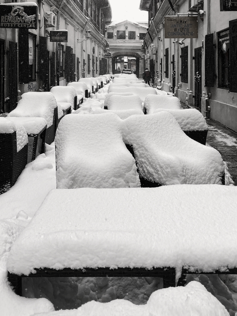
Thank you. It is unanimous! Crop out the foreground harbor for panorama format. All good suggestions, which I did before with three different versions, all panorama format. I like them all for different reasons. For this image, I increased the FG harbor and boats on the left to get a more traditional landscape format, introduce a sense of depth / space, and attempted High-Key style. The image is a too dark for true High-Key and a bit too much positive space. |
Jul 21st |
| 86 |
Jul 21 |
Reply |
Thank you. See Reply to Belinda. |
Jul 21st |
| 86 |
Jul 21 |
Comment |
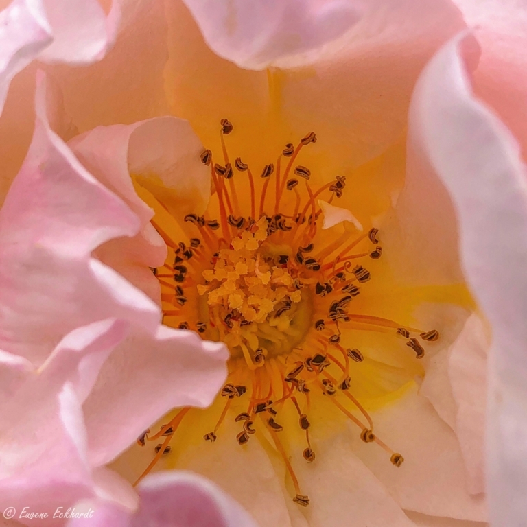
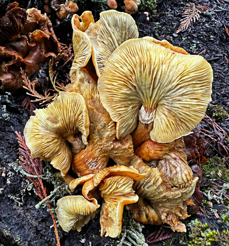
The framing is excellent! The original BG Is distracting. Your idea to clone was a good one, but I do not think there is not enough material to work with. There are large areas of contrast and thin leaves. Processed image, to my eye is distracted by the background: straight-line changes in tone, texture, and shape; strong black outlines on the exterior petals, and bright spots. The subject is bright compared to the BG. I suggest you try using curves to darken shadows and midtones. Cleanup with brush (darken). |
Jul 21st |
| 86 |
Jul 21 |
Comment |
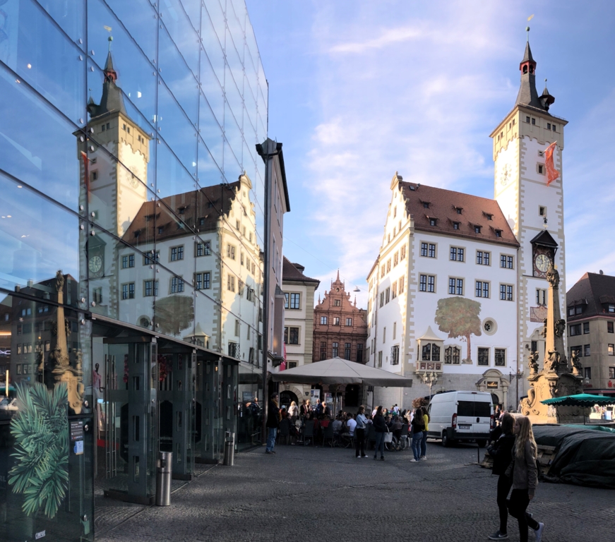
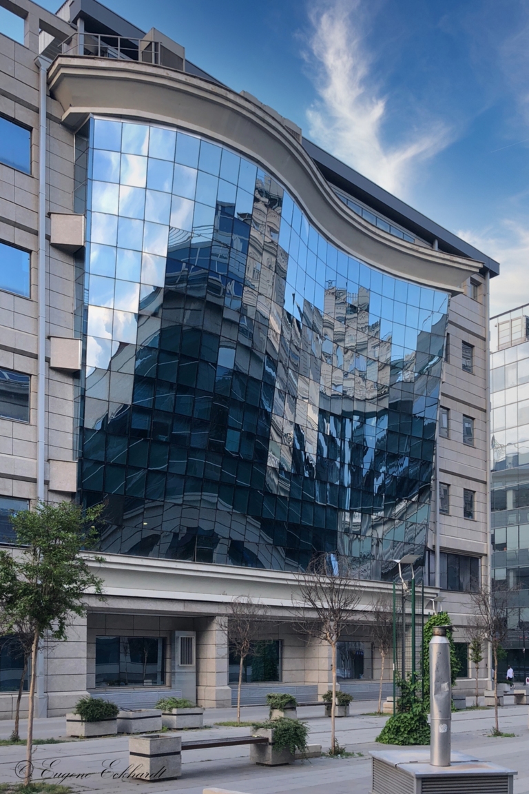
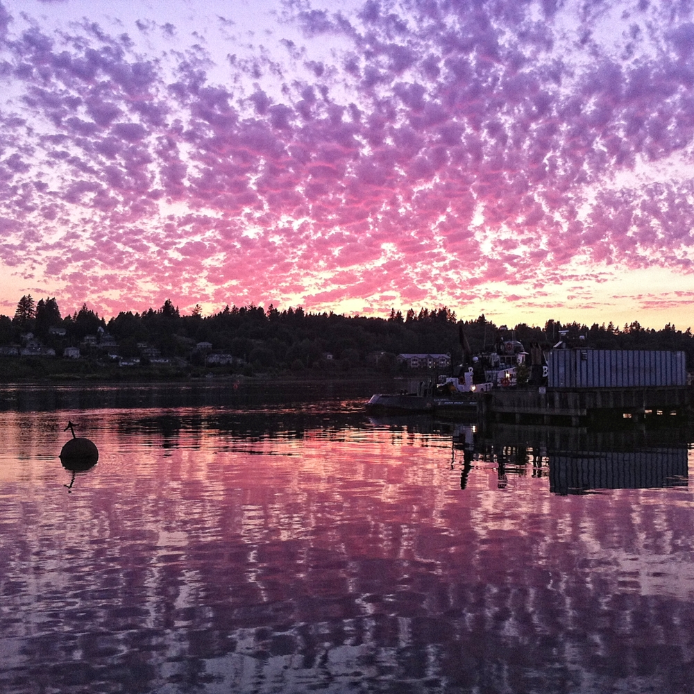
Lovely image. Soft curves in the building and the concentric curves in the path/wall. Great contrast in the textures: smooth water, puffy clouds, soft path and wall, and rough building walls. Nice color and leading line. Although this is a "known place," I think flipping it horizontally creates a stronger image and leading lines. |
Jul 21st |
| 86 |
Jul 21 |
Comment |
Nice catch! Macros are really tough on sharpness and DOF! The soft background blur and color creates contrast and focus on the snail. Sharpness may be improved by increasing contrast, structure, or haze. I agree the lower ¼ is distracting. However, cropping will leave a much smaller image and the snail will sit at, or near the edge. Before cropping, I suggest you try cloning the flowers. Soft, curved lines, make changes in color and contrast less obvious, straight lines will highlight those changes. |
Jul 21st |
| 86 |
Jul 21 |
Comment |
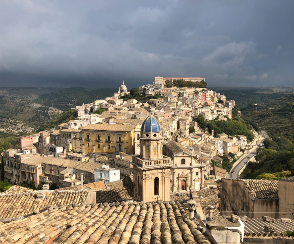
Very Nice. The low setting sun creates warm, rich tones and contrast in color and texture; a soft glow in the sea, misty air, clouds, and hills on the left; highlights the top of the buildings, reflects onto the shadow-side of other buildings, and creates deep shadows A jumble of architectural shapes, sizes, and patterns. Strong leading line. I think it would be a stronger image flipped horizontally. RE Road: Do not really notice it as the buildings lead my eye past it. Ideally, better not there. However, I would not crop because it would eliminate a good junk of the village in the distance and direct link to the hills in the BG. |
Jul 21st |
4 comments - 5 replies for Group 86
|
4 comments - 5 replies Total
|