|
| Group |
Round |
C/R |
Comment |
Date |
Image |
| 14 |
Mar 26 |
Reply |
Thanks, Karen. Unfortunately, the original would have been too much of a panorama composition for my taste, but I see what you mean about the shadow. I'll try some more editing to eliminate that issue.:) |
Mar 15th |
| 14 |
Mar 26 |
Comment |
Thanks, Tom. I worked diligently to remove the artifacts caused by cutting down the space between the birds, but I do see what you are referring to.... back to Photoshop! |
Mar 14th |
| 14 |
Mar 26 |
Reply |
Thanks, Darcy! |
Mar 14th |
| 14 |
Mar 26 |
Reply |
Thanks, Kamal! I appreciate your comments. |
Mar 14th |
| 14 |
Mar 26 |
Reply |
Thanks, Jackie. I see what you are pointing out around the gull's feet, and now that I look closely, I also notice a halo effect on the legs. I'll work on that! |
Mar 14th |
| 14 |
Mar 26 |
Reply |
Thanks, Greg! |
Mar 14th |
| 14 |
Mar 26 |
Comment |
Hi Kamal. The detail in the textures and designs on this building are amazing and you have captured them very well. I like the point of view you have selected and it really shows off the grandeur of this structure. I noticed the artifacts in the sky, but there is still a line showing in your edit that I'm sure you can eliminate. This building would also present some great architectural close up images! |
Mar 14th |
| 14 |
Mar 26 |
Comment |
Hi Jackie and WELCOME! This is a great group and I hope you enjoy your participation. This is a very dramatic scene and the black and white treatment really enhances the effect. My initial impression was that the sky needed a bit more texture and drama, and I think Tom's edit is very effective. I love the bison standing in the middle front and he really adds interest and context. The others seem to disappear into the bushes, and I think that's fine. They don't detract or add to the success of the image. A bit of a vignette might help, but overall, you've captured a wonderful scene! |
Mar 14th |
| 14 |
Mar 26 |
Comment |
Hi Tom. This is a very effective minimalist image and the composition is definitely enhanced by the halo of the cloud around the architectural element. I really enjoyed your addition of the information on the design and architect. The only thing I might change would be to lessen the contrast/brightness of the spot of reflected light in the lower middle triangle so it doesn't draw quite as much attention. Otherwise, it IS a fantastic and unique image! |
Mar 14th |
| 14 |
Mar 26 |
Comment |
Hi Greg. I really like this. I can see the value in the others' comments, but this image gave me a "wow" factor when I first pulled it up, and I love the colors and variations of the texture you've applied. |
Mar 14th |
| 14 |
Mar 26 |
Comment |
Hi Darcy. The water droplets definitely make this image, but I do wish that they were a little sharper. It also might help to darken the background a tad. I tried running your image through Topaz AI sharpen, and brightened the yellow a bit, as well as darkening the background. Again, it may not be in line with your intent, but I was curious..... |
Mar 14th |
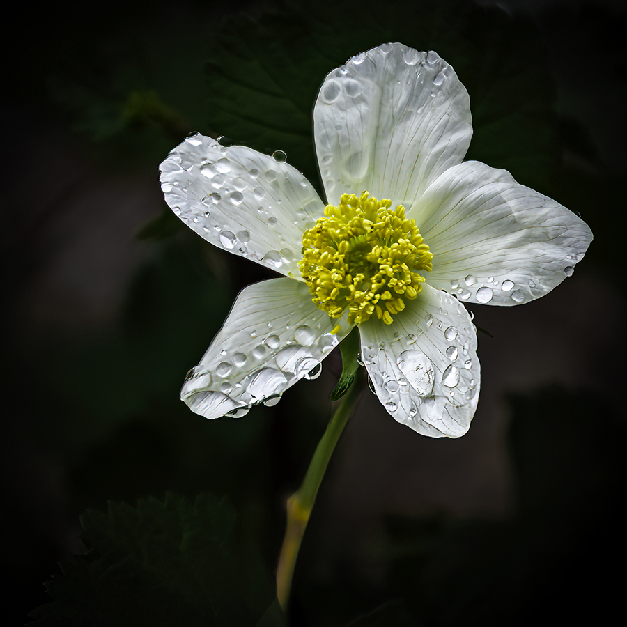 |
| 14 |
Mar 26 |
Comment |
Wow,Karen. What a fantastic find. The way you have composed the image is perfect and the black and white treatment really brings out the shapes and repetition. The only small nit I would suggest is to eliminate the larger white spot in the lower left corner. I doubt I'll ever be in St Augustine, Florida, but, if so, it will be first of my list of sites to see! |
Mar 14th |
7 comments - 5 replies for Group 14
|
| 80 |
Mar 26 |
Reply |
Thanks, Nadia. Definitely a weed here too, but important for the survival of Monarch butterflies. |
Mar 20th |
| 80 |
Mar 26 |
Reply |
Thanks, Nadia. Definitely a weed here too, but important for the survival of Monarch butterflies. |
Mar 20th |
| 80 |
Mar 26 |
Reply |
Thanks, Marti. Eenie minie mo….. |
Mar 18th |
| 80 |
Mar 26 |
Reply |
Thanks, Rich! Your comments make me cheerful :) |
Mar 18th |
| 80 |
Mar 26 |
Reply |
Thanks, Doug. Removing that leaf is a good idea. I can fix the over sharpening, so thanks for pointing it out! |
Mar 17th |
| 80 |
Mar 26 |
Reply |
Thanks, Doug. Removing that leaf is a good idea. I can fix the over sharpening, so thanks for pointing it out! |
Mar 17th |
| 80 |
Mar 26 |
Reply |
Thanks, Marti! A stroke is always a benefit, but because some of the places I enter my photos don't allow it, it's not always an automatic step for me… :) |
Mar 17th |
| 80 |
Mar 26 |
Reply |
Thanks, Bob! I appreciate your compliments! |
Mar 17th |
| 80 |
Mar 26 |
Comment |
Hi Rich. This is a great image and it was interesting to hear how it was created. Once mentioned, I see the issue of the straight lines at the edges, but probably wouldn't have noticed it without prompting. I also really like your first Original, especially if you eliminated the white line down the middle. What a beautiful plant! |
Mar 15th |
| 80 |
Mar 26 |
Comment |
Hi Kamal. This is a great capture of a bee at work. I know how difficult it can be to find a bee in just the right position where it can be separated from the background, but you have accomplished that well. Because it is in the sharpest focus, the viewer's eye is drawn directly to head and legs of the bee. The fact that the rest of the flower is in softer focus does not detract, in my opinion. The color of the background is a perfect complement to the subject. Also, your composition utilizes a subtle diagonal arrangement, which is very effective. |
Mar 15th |
| 80 |
Mar 26 |
Comment |
Hi Doug. I'm jealous that you were able to participate in a Kathleen Clemons class! I went to Charleston SC with her years ago, and it was a very fun and productive experience. I love your image and have nothing to suggest. :) |
Mar 15th |
| 80 |
Mar 26 |
Comment |
Hi Nadia. This is a beautiful Dahlia, but your post-processing strategy has really enhanced the viewer experience. Leaving a hint of the background was a great choice. The placement of the flower in the frame, as well as its slight angle, rather than dead on, makes this a more interesting and unique composition. Thank you for sparking some ideas I might try to utilize in my own work! |
Mar 15th |
| 80 |
Mar 26 |
Comment |
Hi Marti. I love the glow in this image and the way you have eliminated all of the leaves, but left the two bottom leaves as an anchor. I am not familiar with this flower, so it had an added impact for me. My only thought would be to eliminate the bright 'string' coming out of the right side of the bloom, a minor suggestion to say the least! |
Mar 15th |
| 80 |
Mar 26 |
Comment |
Hi Bob! I LOVE this! I agree with Marti about removing the brighter leaves in the lower corners, but the mood, light and colors in this image are beautiful and whimsical. I'll have to check out the Swirly Strokes in Topaz! |
Mar 15th |
6 comments - 8 replies for Group 80
|
13 comments - 13 replies Total
|


