|
| Group |
Round |
C/R |
Comment |
Date |
Image |
| 14 |
Jan 26 |
Reply |
Thanks, Karen! I appreciate your comments. Happy New Year! |
Jan 24th |
| 14 |
Jan 26 |
Comment |
Thanks, Greg. I appreciate your compliments and I will try your suggestions just to see the effects. Happy New Year! |
Jan 19th |
| 14 |
Jan 26 |
Reply |
Tom, Thanks so much for visiting our group and taking the time to comment on my image. I sincerely appreciate your compliments! |
Jan 19th |
| 14 |
Jan 26 |
Reply |
Thanks, Darcy. You're right, we are very lucky to have such beauty all around us! |
Jan 19th |
| 14 |
Jan 26 |
Reply |
Thanks, Tom. I tried using a gradient to reduce the brightness of the clouds, but it also darkened the blue sky, an effect I didn't like. So, I tried just selecting the sky and darkening the highlights and that seemed to do the trick. I think it is an improvement! |
Jan 19th |
| 14 |
Jan 26 |
Reply |
Thanks for taking the time to play with my image composition, Kamal. That's a tough one, especially since I'm getting conflicting thoughts. I'll get the opinion of some of my local friends by showing them both versions and see what they say. Thanks, again. |
Jan 19th |
| 14 |
Jan 26 |
Comment |
Hi Kamal. The lighting on this building against the dark sky has created a very dramatic image with great impact. The people on the stairs are a great addition, demonstrating scale but also giving the building a human context. I agree about the small structure on the left and the yellow blob on the stairs, but they are only minor distractions and do not override the effectiveness of this image. Thanks for taking us to Indonesia with you! |
Jan 18th |
| 14 |
Jan 26 |
Comment |
Hi Tom. I, too, have been out to see whales (my trip was off of Alaska), and this capture is wonderfully fortuitous and well done. I love the angle that this young whale is creating in the frame, the detail of his eye and the wonderful splashing of the water. I agree that the white fin on the left would be improved with a bit more visible detail, but the overall composition is perfect and this image has great impact and a lovely story to tell. I hope we'll see some more examples! |
Jan 18th |
| 14 |
Jan 26 |
Comment |
Hi Greg. This is a beautiful bird, and I love the intensity of the eye and the texture of his feathers. Flipping the composition was definitely the right decision. Although the background foliage is almost sharp, it is not distracting because of the color contrast, and makes this a nice environmental statement. The stump next to the bird mirrors his shape, which is a fun coincidence. I'm jealous of your opportunity to go on a bird photography tour in St. Martin, and I hope we'll see some more examples! |
Jan 18th |
| 14 |
Jan 26 |
Comment |
Hi Darcy. I love the diagonal line created by the line of bushes against the sky. Although the arch is right in the center, the dominant tree follows the rule of thirds and I think that makes the placement of the arch in the center just fine. I love the way the bright light is hitting the wall and arch and emphasizing their importance in the story. I know what you mean about a sky replacement being to busy and taking attention away from the main subject, and I agree that the plain blue is better. Even a single happy cloud in the upper left quadrant might draw too much attention. How far is this spot from the Denver area? |
Jan 18th |
| 14 |
Jan 26 |
Comment |
Hi Karen. This is a very interesting juxtaposition and your explanation/story definitely adds to its poignancy. Your positioning and the angle of your shot creates a great composition, which would not have been possible from another standpoint. The larger statue behind is just enough out of focus to keep the emphasis on the scale model. Although it might be better not to have cut off the left side of the model's base, that's minor point and I think you've done an excellent job of capturing this important scene. |
Jan 18th |
6 comments - 5 replies for Group 14
|
| 80 |
Jan 26 |
Reply |
Thanks, Nadia. I was very happy with the result on this image and appreciate your comments! |
Jan 20th |
| 80 |
Jan 26 |
Reply |
Thanks, Doug. I'll try a darker vignette. Not sure about enhancing the yellow, but I'll give it a try and see. Happy New Year! |
Jan 19th |
| 80 |
Jan 26 |
Reply |
Thanks, Bob. I didn't change the color on this one, though. |
Jan 19th |
| 80 |
Jan 26 |
Reply |
Thanks, Kamal! |
Jan 19th |
| 80 |
Jan 26 |
Reply |
All I did was create a hue/saturation layer in Photoshop and move the hue slider until I found the color combo that I liked. |
Jan 18th |
| 80 |
Jan 26 |
Comment |
Hi Rich. I'm very impressed with the set up required to make this image and I definitely think it was worth the effort. I love both the original and your final versions - two completely different effects, but both beautiful and creative. Now you just need a Latin name for these new varieties! |
Jan 18th |
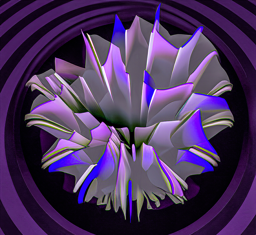
| 80 |
Jan 26 |
Comment |
Wow, Doug, that got my attention! Very unique, and as Nadia said - an interesting art deco presentation. Hard to believe it came from the original. Personally, I find the color palette a little bit harsh, but I love the concept and the techniques you have used. I tried changing the hue a bit to bring it closer to the original...just a thought. |
Jan 18th |
 |
| 80 |
Jan 26 |
Comment |
Hi Nadia. This IS beautiful and I love your handling of the background which gives it some depth. Your elimination of the extraneous stem and leaf is perfect and the detail on the iris is gorgeous. I think that some cropping on the top and left would benefit the overall impact of the image but that's a personal opinion of course :) |
Jan 18th |
| 80 |
Jan 26 |
Comment |
Hi Marti. I have to agree with the majority. This is a wonderful image and your sharpening in post really brings out the detail and the water droplets. I like the way you've left the leaves in the background to provide an environment. My only nit pick would be to darken the upper right corner somewhat to give those leaves less power. |
Jan 18th |
| 80 |
Jan 26 |
Comment |
Hi Bob. This flower really jumps off the screen and vibrates. The effect of combining the three slightly offset images is very unique and effective. I agree with Kamal that the stem is very strong and draws the eye away from the flower, but, although I might try to tone it down, I wouldn't do it as far as Kamal's edit. Overall, Bob, I love this image. Don't you love your Sony RX10iv! |
Jan 18th |
5 comments - 5 replies for Group 80
|
11 comments - 10 replies Total
|


