|
| Group |
Round |
C/R |
Comment |
Date |
Image |
| 14 |
Nov 25 |
Reply |
Thanks, Kamal! |
Nov 24th |
| 14 |
Nov 25 |
Reply |
Thanks, Karen. I always find the group's comments so helpful. Thanks for your corroboration about the placement and B&W edit. :) |
Nov 16th |
| 14 |
Nov 25 |
Reply |
Thanks, Darcy. I appreciate your thoughts. I agree about the placement in the composition. |
Nov 16th |
| 14 |
Nov 25 |
Reply |
Thanks, Greg. Your black and white edit is a great idea! Really emphasizes the mood I was trying to create by replacing the sky. |
Nov 16th |
| 14 |
Nov 25 |
Reply |
Thanks, Tom. An more off-center presentation is a great idea! |
Nov 16th |
| 14 |
Nov 25 |
Comment |
Hi Kamal. What a handsome fellow. Your post processing did a great job of bringing out the texture and richness in this scene. I agree that it would help to have a little more room above his head, and less behind him, but the diagonal composition is effective and the color palette is very pleasing. My only other suggestion would be to clone out the bright white spots, especially the one in front of the lizard. Thanks for introducing us to this guy! |
Nov 15th |
| 14 |
Nov 25 |
Comment |
Hi Tom. I'm very impressed that you were able to capture this much activity, so well defined against the sky. It's a wonderful composition and tells a great story, in addition to being a nice abstract composition if you didn't know the backstory. Excellent job! |
Nov 15th |
| 14 |
Nov 25 |
Comment |
Hi Greg. This is a beautiful scene and your treatment of the sky is outstanding. I like your crop and the elimination of the man blocking part of the vessel. I also like that you have made the remaining people into silhouette's. It's very effective. Personally, I wouldn't remove the child and the seated couple because they add to the story and balance the composition. I hope your dinner was commensurately delicious! |
Nov 15th |
| 14 |
Nov 25 |
Comment |
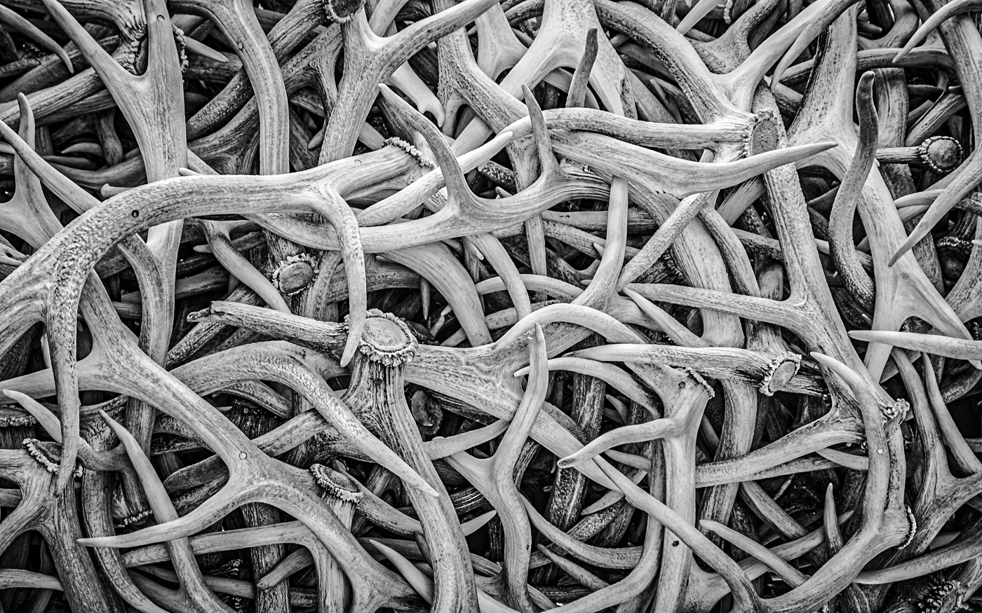
Hi Darcy. I love your subject and am partial to jumbled closeups, so this is a great image in my opinion!. I like Greg's interpretation which is quite dramatic, but I also like your more patterned presentation. My only suggestion would be to increase the texture slightly to add more depth to the antlers. |
Nov 15th |
 |
| 14 |
Nov 25 |
Comment |
Hi Karen. This is a wonderful image, and you have done a great job of capturing the moment and its emotion. The flower is a special touch. Hard to believe that 18 year olds participated in the Battle of the Bulge - this gentleman deserves tremendous respect. I think your decision to remove extra people in the background was definitely the right decision. My only suggestion would be to consider adding a slight vignette to draw the viewer's attention to the main subjects, although I understand PSA frowns on that. |
Nov 15th |
5 comments - 5 replies for Group 14
|
| 80 |
Nov 25 |
Reply |
Thanks, Nadia, but I think I'll add more space at the bottom anyway! |
Nov 24th |
| 80 |
Nov 25 |
Reply |
Thanks, Doug. How could I have missed the lack of space at the bottom, especially since I had complete control over the composition? At least it's unanimous! |
Nov 16th |
| 80 |
Nov 25 |
Reply |
Thanks, Kamal. I appreciate your compliments! |
Nov 15th |
| 80 |
Nov 25 |
Reply |
Thanks, Rich. Definitely agree about the breathing room on the bottom, and disappointed in my unforced error! |
Nov 15th |
| 80 |
Nov 25 |
Reply |
Thanks, Bob. Still coughing, but getting my energy back. Regarding Waldo, I just thought the little sunglasses outcropping looked like Waldo in a busy scene... |
Nov 15th |
| 80 |
Nov 25 |
Reply |
Thanks, Marti. I agree about the placement too close to the bottom and realized it as soon as I saw it posted! |
Nov 15th |
| 80 |
Nov 25 |
Comment |
HI Rich. This is a very dramatic image and I love the purple flower set against the golden orb. I think your new crop is effective, and really brings out the yellow detail in the center of the flower. Thanks for sharing! |
Nov 15th |
| 80 |
Nov 25 |
Comment |
Hi Kamal. I love this flower and the leaves around it. It's in perfect focus and very interesting because of its shape and the leaves. I also love the treatment you have achieved with the background, although I think removing the very light spots might be more effective. I like Marti's crop and flipping of the orientation, though, and it is worth your consideration. |
Nov 15th |
| 80 |
Nov 25 |
Comment |
Hi Doug. This is a amazing Wabi Sabi image, with fantastic texture and detail. The black background is VERY effective and I wouldn't change a thing! |
Nov 15th |
| 80 |
Nov 25 |
Comment |
Hi Nadia. I love that you have created a trio and placed the three blooms against a very pleasing texture. I agree that it would be worth the effort to edit the two identical flowers slightly so they are not so obviously identical, but overall, this is a beautiful presentation. They are certainly not orange, but beautiful all the same! |
Nov 15th |
| 80 |
Nov 25 |
Comment |
I love the way you have created this "Orb", Marti! The way you have achieved having the petals curve around the edges as a frame is masterful. This would make an excellent Easter notecard. I agree with Doug's thought on expanding the solid color on the sides and maybe at the top and bottom too. |
Nov 15th |
| 80 |
Nov 25 |
Comment |
Hi Bob. This is a very creative idea and you have definitely given this rose a unique experience. I think that Doug's brightening of the rose is beneficial. My only suggestion would be to crop the image so that the rose is not directly in the middle of the composition. The wetness of the rose is essential to making this believable, and I like it a lot! |
Nov 15th |
6 comments - 6 replies for Group 80
|
11 comments - 11 replies Total
|


