|
| Group |
Round |
C/R |
Comment |
Date |
Image |
| 14 |
Oct 25 |
Reply |
Thanks, Karrn! |
Oct 31st |
| 14 |
Oct 25 |
Reply |
Thanks, Kamal! |
Oct 31st |
| 14 |
Oct 25 |
Reply |
Thanks, Erin. I'm not sure about the vignette, but I've tried it a couple of ways. Ingrid |
Oct 31st |
| 14 |
Oct 25 |
Reply |
Thanks, Darcy! |
Oct 31st |
| 14 |
Oct 25 |
Comment |
Hi Kamal. This is a very interesting architectural structure and you have done a great job with the perspective and viewpoint, making sure that the verticals are vertical and using the leading lines of the aisles in the steps to lead the viewers' eye towards the brightly colored flower wreaths. I love the way the red circles of the wreaths are repeated in the large red circle of the structure, and the red is repeated again in the letters and berries on the left. This is a very effective photojournalistic presentation and I'd love to know more about the meaning of the language of martyrs 21st February of 1952. |
Oct 12th |
| 14 |
Oct 25 |
Comment |
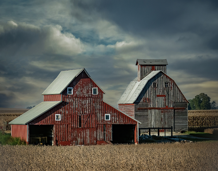
Hi Erin. This is a nice capture of a small farm operation and I love the windmill standing guard between the two buildings. I agree that the power lines are too prominent, but I would probably only remove the two diagonal ones in the top right corner. I like your point of view looking up at the buildings across the grass, and I think the line of lighter grasses at the bottom add a good frame. The rule of thirds has been used effectively. Tom's suggestion of a gradient from the bottom could be very helpful in bringing the viewer's eye towards the buildings. Although replacing the sky might also be beneficial, I think that selecting the sky and reducing the highlights and adding a touch of dehaze might create enough definition of the clouds that are already there. You could also try adding a vignette. Overall, well-seen and captured. |
Oct 12th |
| 14 |
Oct 25 |
Comment |
Hi Tom. What a fun opportunity in the midst of having to put up with a demolition and rebuild next door. Your light painting is very effective at capturing the shapes and textures of this piece of equipment, while also creating an interesting and foreboding atmosphere. It almost looks like a prehistoric creature. You did a great job of combining the images you took and disappearing the background. Well done! |
Oct 12th |
| 14 |
Oct 25 |
Comment |
Hi Greg. You have created another great rodeo scene that really brings the viewer into the action. Your crop and color enhancement are very effective at isolating the main figures and concentrating attention on the main drama. The cowboy seems to be a bit cartoonish to me, especially the light lines across his face, so it might be an improvement to reduce the contrast on those lines. My only other suggestion is to move the crop to right a bit so that the steer's tail does not go off the edge of the frame. Thanks for sharing this taste of the rodeo story. |
Oct 12th |
| 14 |
Oct 25 |
Comment |
Hi Darcy. That must have been an amazing field of iris and I think your decision to select a small grouping to show off the shape and colors of the selected Iris. I like Tom's suggestion and your reedited version does give more prominence to the main two Iris. My only additional suggestion would be to remove the darker grouping of buds in the bottom middle of the composition. I think they demand too much attention away from the full iris blooms. |
Oct 12th |
| 14 |
Oct 25 |
Comment |
Hi Karen. This is a lovely, peaceful autumn scene and the shore line of the lake creates a nice zigzag leading line through the composition. It is a bit soft, but the softness creates a painterly effect that I think is calming in a good way. My only suggestion would be to increase the saturation of the oranges, leaving the greens as they are, to emphasize the season captured. |
Oct 12th |
| 14 |
Oct 25 |
Reply |
Thanks for your comments, Greg. I see what you mean about the horizon in the middle. I didn't want to crop, because I need to keep the aspect ratio for my calendar. However, I played with the composition using the distort tool to bring the barns lower in the frame and then the content aware fill tool to add sky in the middle. I'd appreciate your thoughts on the end result. |
Oct 9th |
 |
6 comments - 5 replies for Group 14
|
| 25 |
Oct 25 |
Comment |
This is award winning image (in my opinion)!!! |
Oct 19th |
1 comment - 0 replies for Group 25
|
| 80 |
Oct 25 |
Reply |
Thanks, Kamal! |
Oct 31st |
| 80 |
Oct 25 |
Reply |
Thanks, Doug! |
Oct 31st |
| 80 |
Oct 25 |
Reply |
Thanks, Rich! |
Oct 31st |
| 80 |
Oct 25 |
Reply |
Thanks so much, Nadia! |
Oct 31st |
| 80 |
Oct 25 |
Reply |
Thanks, Jennie! |
Oct 31st |
| 80 |
Oct 25 |
Reply |
Thanks, Marti! |
Oct 31st |
| 80 |
Oct 25 |
Reply |
Thanks, Bob! |
Oct 31st |
| 80 |
Oct 25 |
Comment |
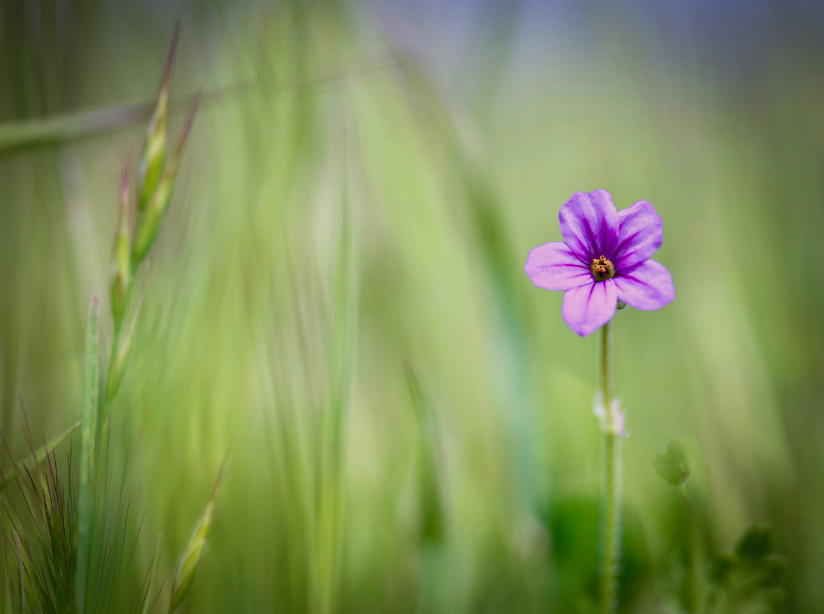
Hi Rich. This lonely little flower lives in a wonderful sea of green. Although you have blurred the background enough to set off the flower, I like the fact that some of the shapes of the grasses are still visible. My only suggestion would be to crop in closer, darken some of the lightest areas and add a vignette. You have done a great job of capturing the personality of this little flower. |
Oct 19th |
 |
| 80 |
Oct 25 |
Comment |
Hi Kamal. I love the story in this image, the color of the poppy, the placement of the happy bee leaving the scene and your lovely soft background. I agree with Marti about removing the second bee, only because it is so out of focus. I also agree that a square crop creates a more effective composition. It's a lovely image, Kamal! |
Oct 19th |
| 80 |
Oct 25 |
Comment |
Hi Doug - this is a beautiful flower and you have done an excellent job in capturing it's beauty - both from the front and the back. On your primary submission, the only (very picky) suggestions I would make are to eliminate the three small black dots in the middle area, and maybe to remove the spider web. Of your other alternatives, I really like the middle one the best. It almost looks art deco and is a very dramatic presentation. |
Oct 19th |
| 80 |
Oct 25 |
Comment |
Hi Nadia. I love this presentation the painterly treatment you have created. I also love your decision to make this a high key image. My only suggestion would be to darken the purple edge on the upper left petals slightly, just to give a little more separation from the background. Congratulations on an outstanding image! |
Oct 19th |
| 80 |
Oct 25 |
Comment |
Hi Marti. I like your composition with the red leafed plants framed by the cream colored leaves to create a nice diagonal composition. My suggestions would be to (1) darken the cream colored leaves so they do not draw the viewer's attention so strongly, (2) add a touch of vibrance to the red leaves to make them "pop" a bit more and (3) add a bit of space at the bottom edge so that the bottom leaves do not touch the edge of the frame. The third item may require a bit of reconstruction editing to finish off the tips of the leaves on the edge. This might make a very nice Christmas card! |
Oct 19th |
| 80 |
Oct 25 |
Comment |
Hi Bob. I agree with the others' comments and feel that the main flower is fantastic and the best presentation would be to eliminate the brighter flower. Looking at your original, the second flower is not even close to the main dahlia and could be easily eliminated before your zoom treatment with the content aware fill tool, remove tool or even the clone tool. Then, you could apply zoom motion filter which I think is very effective and makes the image unique. I love the main dahlia! |
Oct 19th |
6 comments - 7 replies for Group 80
|
| 83 |
Oct 25 |
Comment |
Hi Bill! This image has an amazing atmosphere. |
Oct 19th |
1 comment - 0 replies for Group 83
|
14 comments - 12 replies Total
|


