|
| Group |
Round |
C/R |
Comment |
Date |
Image |
| 14 |
Sep 24 |
Reply |
Thanks, Karen! |
Sep 24th |
| 14 |
Sep 24 |
Reply |
Thanks, Darcy. The black lines are the locking structure for the semi's doors. Couldn't avoid them and considered trying to clone them out, but concluded they were just part of the story (a story that noone can understand without the description, so oh well....) |
Sep 24th |
| 14 |
Sep 24 |
Reply |
Thanks, Greg. I guess I could say I didn't want you to be able to rest your eyes, but I understand your point. :) |
Sep 24th |
| 14 |
Sep 24 |
Reply |
Thanks, Tom! |
Sep 24th |
| 14 |
Sep 24 |
Comment |
Hi Kamal. Thanks so much for sharing this example of life in your part of the world. I think your selective focus really adds to the impact of your image. I agree about desaturating the pink area in the background. I also agree with Karen's comment about cropping out the element on the right to remove a strong distraction and making the boy less in the middle. I also think that you should try to convert this image to black and white. I think it would be a very strong candidate for that, as an alternative presentation. |
Sep 22nd |
| 14 |
Sep 24 |
Comment |
Hi Erin. This is beautiful capture and the color of the flowers really sets the butterfly off nicely. I agree that it would be an improvement to darken the bright areas on the leaves. I like your crop, although I might experiment with a closer crop, even square. I agree that the remaining blue flower is a little distracting and not necessary. But overall, this is a great image, the Monarch is in perfect focus and landed just right! |
Sep 22nd |
| 14 |
Sep 24 |
Comment |
Hi Tom. This is a tough one to critque. Without your description, I would have no idea what story this image is telling, probably because I'm not familiar with the plant species, so take my comment with a grain of salt. I also like the original. I'm impressed by the amount of work you put into this, combining 20-30 images. I like the square format. If you want it to be minimal, there probably should be more black space. I think the lighting is fine, but I agree with reducing the brightness of the hot spots. As another experiment, I'd try eliminating the upper almost monochrome element and make the image of just the colored sharp area in the bottom. Thanks for sharing this! |
Sep 22nd |
| 14 |
Sep 24 |
Comment |
WOW, Greg. What a wonderful image. Your post-processing is very effective in bringing out the vibrance of the scene. Your addition of the fish is genius and really changes the image for a good image to a great image. Congratulations! |
Sep 22nd |
| 14 |
Sep 24 |
Comment |
Hi Karen. This really is a great image and it has a wonderful feeling to it. I don't mind the bright spot Tom mentioned. I especially like the way you have handled the sky. It is dramatic and really adds to the scene. You might want to try a slight vignette, but I think the scene is memorable as is. All it needs is a little red truck on the road :) |
Sep 22nd |
5 comments - 4 replies for Group 14
|
| 80 |
Sep 24 |
Reply |
Thanks, Doug! |
Sep 24th |
| 80 |
Sep 24 |
Reply |
Thanks, Rich. I'll try a vignette and see if it helps. |
Sep 24th |
| 80 |
Sep 24 |
Reply |
Thanks for your kind comments, Nadia! |
Sep 24th |
| 80 |
Sep 24 |
Reply |
Thanks, Bob. I focused on the middle where the colors meet. |
Sep 24th |
| 80 |
Sep 24 |
Reply |
Thanks, Marti! |
Sep 24th |
| 80 |
Sep 24 |
Comment |
Hi Rich. This is very interesting and well executed. I love the placement of the leaf with the drop in front of the blurry daisy. I can imagine the difficulty of setting this up in your studio, and you have accomplished your goal for sure! |
Sep 17th |
| 80 |
Sep 24 |
Comment |
Hi Kamal. this is a beautiful lotus and you have captured it well. Personally, I like Nadia's crop, but would clone out the bright spots on the leaves, as well as the pink petal floating behind the stem. The image has a wonderful atmosphere of peace and serenity. |
Sep 17th |
| 80 |
Sep 24 |
Comment |
Ok, I LOVE this, and wouldn't suggest any changes. You have found a leaf with a great personality and interest. It reminds me of a dancer. Congratulations, Doug! |
Sep 17th |
| 80 |
Sep 24 |
Comment |
Hi Nadia. This is a beautiful image. I love the way the light
shines on the center, and your background treatment really complements the colors of the flower. I agree about darkening the light spot on the left. However, I have to say that I also love the colors of the original, and feel that keeping that brilliant color would also make a gorgeous alternative. |
Sep 17th |
| 80 |
Sep 24 |
Comment |
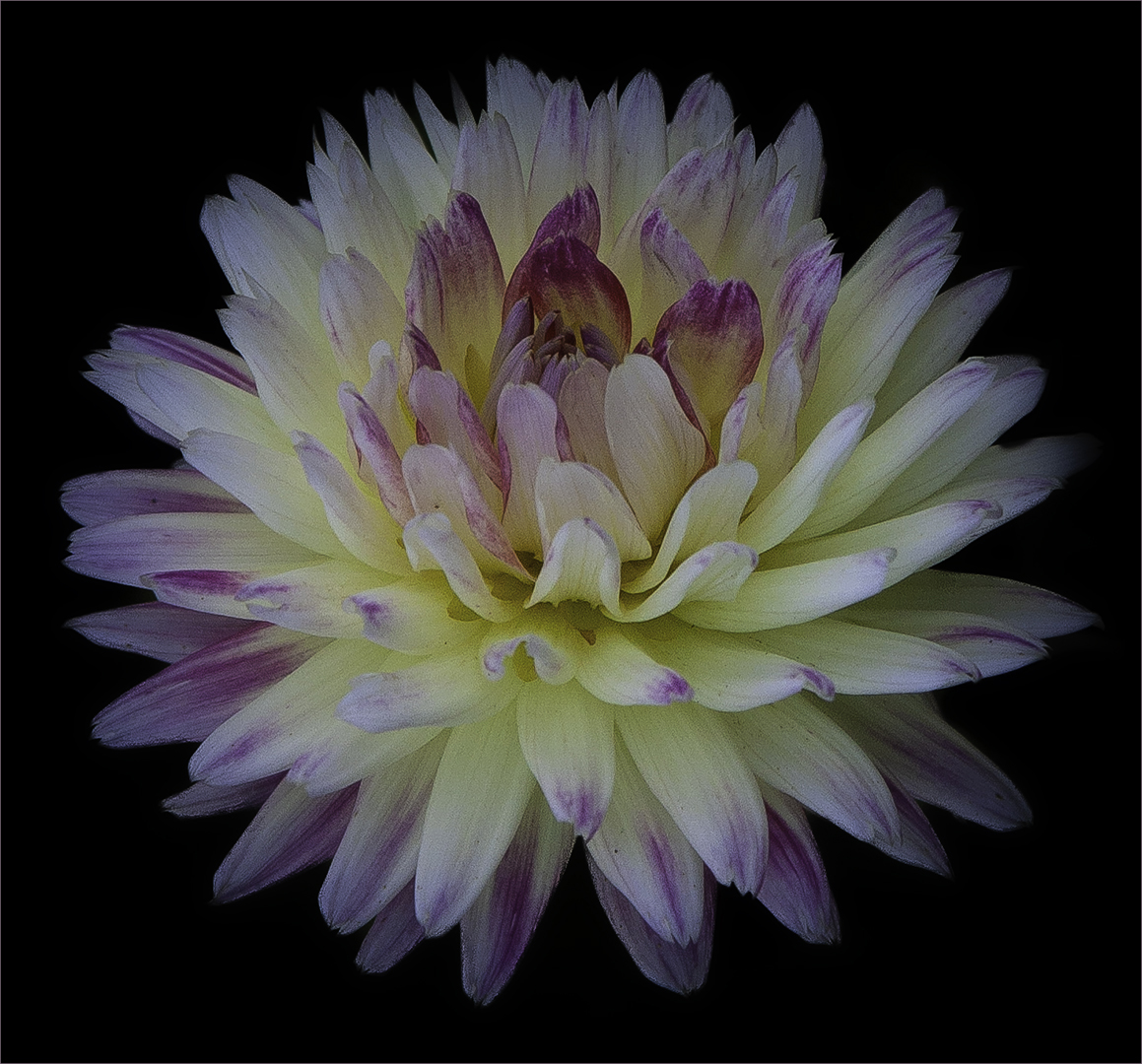
Hi Marti. This is a gorgeous dahlia and you have captured it well. I agree that the black background is effective at making the flower standout. As an alternative, I tried rotatomg the image 90 degrees counter clockwise to have the dark magenta center resting on the luminous supporting petals. It's less dynamic but creates a more serene image complementing the royal nature of the flower. Just a thought. |
Sep 17th |
 |
| 80 |
Sep 24 |
Comment |
Hi Bob. What a great dahlia to pick. I love the ed petals in the middle. I also like your treatment. It makes the flower appear other-worldly. I agree that a square center composition works best for this flower. Re crops, I think your last crop is the most effective. |
Sep 17th |
6 comments - 5 replies for Group 80
|
11 comments - 9 replies Total
|


