|
| Group |
Round |
C/R |
Comment |
Date |
Image |
| 14 |
Apr 24 |
Reply |
Thanks, Tom. I appreciate your perspective! |
Apr 15th |
| 14 |
Apr 24 |
Comment |
Hi Kamal. This is a great image, the composition, focus, exposure and subject are excellent. The texture of the water is amazing and I love the detail and clarity of the net, as well as the placement of the boat and fisherman in the composition. I have no suggestions for improvement - it's a wonderful capture. Congratulations! |
Apr 13th |
| 14 |
Apr 24 |
Comment |
Hi Erin. This a fantastic capture of Rocky. I love the sharp focus on his face and stick, the catch light in his eyes, and the slight softening of the other part of his body. There is just enough detail in the background to give the image a sense of place without detracting from Rocky. The only suggestion I would make is to clone out the dark spot on the wall behind the very tip of his tail. I can certainly understand why your friend would "rescue" such an adorable puppy as Rocky clearly is! |
Apr 13th |
| 14 |
Apr 24 |
Comment |
hi Tom. This is an amazing capture and well worth the effort to get up so early. I think the lighting is perfect as it is. The brightness of the dock lighting and the way it fades as over the foreground is very effective and poetic. I really appreciate the detail in the rock on the right, the reflection of the sky in the water and the lovely detail of the sand peaking through the shallow water of the pool. I also love the way the triangle of the rocks on the right is mirrored in the triangle of the clouds and shadows on the left. You've done an excellent job! |
Apr 13th |
| 14 |
Apr 24 |
Comment |
Hi Greg. The original was a great capture with special light, great focus and composition. Your application of the DAP has created a wonderful painterly effect, and I especially like how it has enhanced the texture in the sky and in the very front grasses. You could print this on canvas and "voila" kudos to the artist! |
Apr 13th |
| 14 |
Apr 24 |
Comment |
Hi Darcy. How fun to come across this wonderful group of wild horses. I also think your decision about converting the image to black and white was a good one, especially if the grasses were yellow. I agree that a closer crop would be beneficial. |
Apr 13th |
| 14 |
Apr 24 |
Comment |
Hi Karen. This a beautiful image and you have done a great job with exposure, making sure there are no hot spots and capturing the subtle blue of the sky. I love the dappled light on the road, and the leading line of the curve of the yellow no passing line on the road. Enhancing the green area in the composition would add some contrast, but I think it is great at it is! |
Apr 13th |
| 14 |
Apr 24 |
Reply |
Thanks, Greg. I will check the alignment - thanks for pointing that out! |
Apr 13th |
| 14 |
Apr 24 |
Reply |
Thanks again, Lance. The idea of using a higher ISO to gain more depth of field is a good suggestion and I will definitely try it. |
Apr 13th |
| 14 |
Apr 24 |
Comment |
Thanks for your comments, Lance. I appreciate your taking the time! The reason I used shutter priority is that I have a balance and mobility issue and use a fast shutter speed to compensate. And, in this case, I was not upset that the back wall was not sharp , feeling that it created a bit of depth. I know your response would be that I should use a tripod, but since I photography is a great source of pleasure for me, lugging a tripod would increase my instability and decrease my stamina, and erase some of the joy for me. I know, excuses, excuses, but your comments are very helpful if things weren't as they are for me. Tgsnjs, again!!! |
Apr 11th |
7 comments - 3 replies for Group 14
|
| 80 |
Apr 24 |
Reply |
Thanks, Rick. I also don't normally like to center a flower, but when I'm doing a close up like this on the center of the bloom, I find centering often works best. :) |
Apr 15th |
| 80 |
Apr 24 |
Comment |
Hi Rich. I'm impressed by the way you set this flower up for the capture, and you have definitely honed in on the essence of it. The stamin are in perfect focus and the blurred rest of the flower in the background is luxurious and rich. It's a wonderful macro image and very minimalist in composition. |
Apr 13th |
| 80 |
Apr 24 |
Comment |
Hi Kamal. We meet again! I love the water lily you have selected and the complementary colors of the pink surrounded by the green leaves. I agree with Marti and Bob about cropping slightly. I also think Marti's suggestion of eliminating the bright spots, and leaving the one water drop with is in great focus and exposure, is a good idea. But overall, this is a great capture of a beautiful flower with a wonderful reflection and is framed nicely with it the green leaves. |
Apr 13th |
| 80 |
Apr 24 |
Comment |
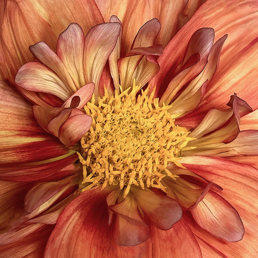
Hi Doug. This is a beautiful flower and you've captured it very well. I love the sharpness of the center of the flower and very slight softening in the rest of the flower. The subtle orangish tinge to the petals really adds depth and interest. I have no suggestions for improvment. |
Apr 13th |
| 80 |
Apr 24 |
Comment |
Hi Nadia. This is an amazing capture and I love your background texture and the fact that it's not completely opaque. Removing the dark spots, as Bob suggested, would probably be an improvement and easy to do. I have mixed feelings about the leaf which is separated from the flower. If it were my image, I'd probably make it fade into the background like the leaves on the right. Just a thought.... |
Apr 13th |
| 80 |
Apr 24 |
Comment |
Hi Marti. This is a lovely portrait of a water lily, and I like the way you have cropped to create your final composition. The complementary colors are perfect and the water lily is well focused. Normally, I might suggest trying to eliminate the remaining spots on the pink petals, but I actually think they had to the interest and realism of the presentation. |
Apr 13th |
| 80 |
Apr 24 |
Comment |
Hi Bob. I really like the way you've altered the background to create interest and showcase the zinnia you've chosen to highlight. My only suggestion would be to try cloning out the twirling zinnia which draws the viewer's eye away from the infocus zinnia, and replacing it with more of the blurry twirl.
It's definitely more interesting than replacing the background with a general blur. |
Apr 13th |
| 80 |
Apr 24 |
Reply |
thanks, Marti! |
Apr 13th |
| 80 |
Apr 24 |
Reply |
thanks for catching that, I can definitely fix that |
Apr 13th |
 |
6 comments - 3 replies for Group 80
|
13 comments - 6 replies Total
|


