|
| Group |
Round |
C/R |
Comment |
Date |
Image |
| 14 |
Oct 23 |
Comment |
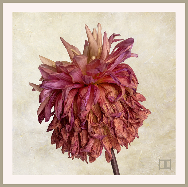
Thanks, Darcy. I think that having the flower pointing up is a definite improvement, and maybe it should be flipped to point to the right as well? I also like the crop suggestion and maybe with the distort tool, I could even turn it into a square composition which will go well with the rest of the dahlias in my September 2023 collection. |
Oct 18th |
| 14 |
Oct 23 |
Reply |
Thanks, Tom. I see what you mean about the edges and I'll work on that. :) |
Oct 18th |
| 14 |
Oct 23 |
Reply |
Thanks, Greg! I appreciate your thoughts. |
Oct 18th |
| 14 |
Oct 23 |
Reply |
Thanks, Erin. Enjoying dahlias throughout September was a special treat. I even found that the blooms were still beautiful even in decline |
Oct 18th |
 |
| 14 |
Oct 23 |
Reply |
Thanks, Karen. I'll try darkening the background. :) |
Oct 18th |
| 14 |
Oct 23 |
Comment |
I thought your image was amazing and dramatic and the color enhancement you did in post-processing really improved the effect. However, seeing your new edit, I love it even more. The panorama aspect ratio really emphasizes the line of camels while still capturing the essence of the desert surroundings. The placement of the sun is perfect!!! Thanks for sharing this, Kamal. |
Oct 18th |
| 14 |
Oct 23 |
Comment |
Hi Erin. I love the opportunity to capture fall colors with a starburst sun, and you have done an excellent job. I think Karen's suggestion of cropping some of the extra trees at the bottom might bring more emphasis on the main subject of the leaves and starburst, but I also think the trees and sky at the bottom give the image a nice sense of place. You might try a slight vignette to encourage the viewer's eye towards the middle. I grew up in the northeast and miss the gorgeous fall colors! |
Oct 18th |
| 14 |
Oct 23 |
Comment |
Hi Tom. Your color work on this image was very well handled, and I love the warmth of the final image. I also think I like the unflipped version better, but the overall composition, atmosphere, focus and tones are excellent. I'm impressed with how well the removal of the power lines worked, and I'll bet it did require quite a bit of time even with the improvements in Photoshop. Increasing the size of the farmhouse is noticeable and I think it is helpful to the composition. I've never seen a canola field either and will think of your image the next time I pull my bottle of canola oil out of the pantry! |
Oct 18th |
| 14 |
Oct 23 |
Comment |
Hi Greg. I REALLY like what you have done with this image. I think it is great just as it is. Eliminating all of the extra flower and leaves was important to create this striking image. It would cheer anyone who sees it! |
Oct 18th |
| 14 |
Oct 23 |
Comment |
I think you have definitely accomplished your goal, Darcy. This is an amazingly beautiful scene, and I hope you had the opportunity to take advantage of the zipline experience! Personally, I would only crop the left hand side to the edge of the leftmost tree, so that the trees become a frame, but the zipline lady is not too close to the edge. I think she adds a great deal to the composition and really adds an important dimension to the scene. I'd buy the postcard! |
Oct 18th |
| 14 |
Oct 23 |
Comment |
hi Karen. The lone tree cliche is something that I always appreciate, no matter how often. I especially like the little fence around its base The clouds you captured really enhance the scene. and you are right, the horses are an extra bonus. My only wish is that there was not so much space between the tree and the horses. I also like the idea of flipping the image. Just for my curiosity, I tried to eliminate some of the space in the middle in Photoshop and flipped the image. I did this fairly quickly so the transitions are not seamless, but I thought I share it with you to see what you think. Kentucky looks like a photographer's dream. |
Oct 18th |
 |
7 comments - 4 replies for Group 14
|
| 61 |
Oct 23 |
Reply |
Thanks, Angela. I appreciate your taking the time to check out my image! |
Oct 26th |
| 61 |
Oct 23 |
Reply |
Thanks, Shirley! I think of you everytime I add a border to an image. :) |
Oct 26th |
| 61 |
Oct 23 |
Reply |
I do like it! |
Oct 18th |
| 61 |
Oct 23 |
Reply |
Thanks, Stephen! I like to think of my 'initial logo' as a touch of a wood block and I appreciate your noticing it! |
Oct 18th |
| 61 |
Oct 23 |
Reply |
Thanks, Marty! |
Oct 18th |
| 61 |
Oct 23 |
Reply |
Thanks so much, David. No Topaz "look". I did run it through Topaz AI sharpening, but but my post processing was primarily done in Camera Raw and Photoshop. |
Oct 18th |
| 61 |
Oct 23 |
Comment |
Hi David. This is beautiful and have no suggestions for improvement. It's an award winner, in my opinion! |
Oct 18th |
| 61 |
Oct 23 |
Comment |
Hi Shirley. These are beautiful succulents and the viewpoint and light really create a nice composition. The only minor suggestion I would make would be to clone out the very tip of the plant on the left so that it doesn't not hit the edge of the frame. Excellent job! |
Oct 18th |
| 61 |
Oct 23 |
Comment |
Hi Marti. I agree with David's comments and I wish the right hand petal was not cut off. With the clone tool, it would be possible to recreate the end of that petal without the use of generative AI, although it would be a bit more time-consuming. It's a beautiful iris and the color is stunning. I think the black background and the purple border sets it off very nicely. |
Oct 18th |
| 61 |
Oct 23 |
Comment |
Hi Gene. Lovely bouquet and light. The only focus issue that bothers me is the red flower on the far right. but the other flowers are very well captured. Personally, I like your crop because it emphasizes the beautiful flowers and their expert arrangement. I agree that an added texture in the background might be an improvement, but this is an amazing bouquet you have captured it to enjoy for the future! |
Oct 18th |
4 comments - 6 replies for Group 61
|
11 comments - 10 replies Total
|


