|
| Group |
Round |
C/R |
Comment |
Date |
Image |
| 32 |
May 25 |
Reply |
Having just finished the free 30 days of Lr, I have started the similar 30 days of Ps. It's amazing what I should be able to do and have never heard of before! I used the adjustment layers which I'd not done before. |
May 14th |
| 32 |
May 25 |
Reply |
I only meant the two bits on the left like this. I opened in Ps and made an adjustment layer for exposure and then reduced the opacity so it had a minimal effect. |
May 13th |
 |
| 32 |
May 25 |
Reply |
Yes maybe because it was only the two light areas on the left which needed it. Maybe this is where masks would come in -try opening in RAW filter and just doing the trunks, or simply use a brush to darken. |
May 13th |
| 32 |
May 25 |
Reply |
Could you just have blurred the left side? I agree that the crinkles in the fabric would not have been good, especially with the complicated fabric on the right. One area is Ok but not two, so probably you were right to make it black. |
May 8th |
| 32 |
May 25 |
Comment |
I agree with Ed that the sky needs something done to it -either a gradient or a replacement sky. I'm sure you have some sky images which are very easy to add to the ones provided by Adobe. I've removed all theirs and put my own in instead.
If you don't want to fiddle with it, then the alternative is to crop off most of the top, just above the buildings, but that means you also lose the desert varnish on the smooth cliff to the right. Cropping does mean you look at the houses more. |
May 7th |
| 32 |
May 25 |
Comment |
Here is the mono one |
May 7th |
 |
| 32 |
May 25 |
Comment |
I liked the greeny patina as well so I went to your original and desaturated the background and darkened it. I think this should stay as a colourpopped image.
I also tried altering the mono, so that there was more texture to the lion -I increased the contrast and the saturation of yellow and green. Then I darkened the background a little.
I cropped the right so there was the same amount of space both sides and a small amount off the top.
So two alternatives for you. |
May 7th |
 |
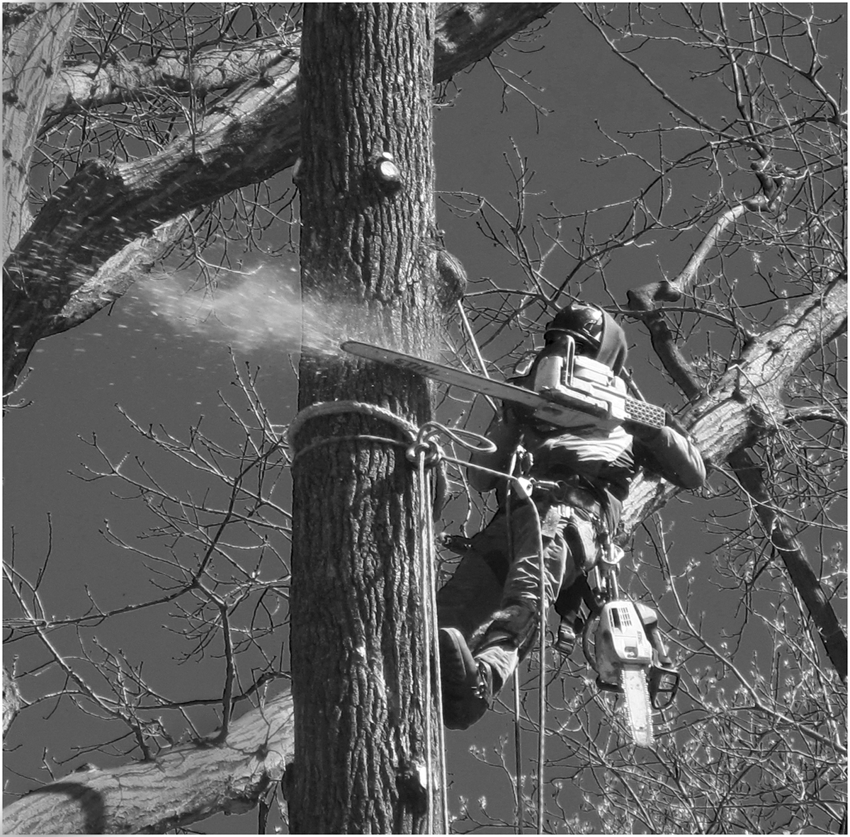
| 32 |
May 25 |
Comment |
I think yours is a good crop because it directs one's eye to the action. Congratulations on getting the spray of sawdust and commiserations on not getting the toppling bit. I wondered if you could darken the other tree trunk a bit -top left and bottom left as they are on the edge of the frame.
The guy seems to be well and truly protected against hurting himself so he almost looks like an alien invader!
Such a shame to chop down mature trees if they are causing no harm.
I like the infra red effect as it lightened the buds.
Good shot! |
May 7th |
| 32 |
May 25 |
Comment |
I'm always impressed at your conversions to mono. The distracting white on the left and the pink flowery drape on the right now don't take away from the woman's face. I like the shading of darkness to the right but maybe the black on the left is too much. Brian always dislikes faces when they've become harshly wrinkled so that the skin looks a bit leathery but I think it works with this face.
The square crop is good but you probably need a keyline round the edges. |
May 7th |
| 32 |
May 25 |
Comment |
I wondered how much you wanted to make the statue stand out from the background, so I tried opening the original in Camera Raw, then selecting the statue and lightening it. Then I hit inverse and darkened the whole of the background. The slabs still showed up so I selected them and used curves to darken them and reduce their contrast. There were still some much lighter lines along their edges showing through so I cloned them out. I also cropped a small amount off the top.
Maybe I went too far, but the statue does now stand out very clearly and one's eye doesn't wander off onto the background! |
May 7th |
 |
| 32 |
May 25 |
Reply |
Thanks - the soft blur was what I was after. I am trying to make more use of Lr but I still find Ps much easier because I have used it longer, but the masks in Lr are very useful. I haven't seen the Muse plug in before. |
May 7th |
| 32 |
May 25 |
Reply |
I did wonder about lightening the eyes, but I'm not sure about the square crop. I quite like the negative space to the right, for him to be looking in to.
Do other people think the square is better? |
May 5th |
6 comments - 6 replies for Group 32
|
6 comments - 6 replies Total
|


