|
| Group |
Round |
C/R |
Comment |
Date |
Image |
| 32 |
Dec 24 |
Reply |
But sometimes those messes work or all they need is a little more tweaking. |
Dec 23rd |
| 32 |
Dec 24 |
Reply |
I know!
Happy Christmas! |
Dec 22nd |
| 32 |
Dec 24 |
Reply |
OK - it is always down to the photographer and what they prefer. It was just a suggestion! |
Dec 22nd |
| 32 |
Dec 24 |
Comment |
You've done a brilliant job of removing the distractions in the background and sharpening her.
You've had one similar to this in the past. i agree that landing is often better than takeoff or what usually happens with me- a floating horizontal horse apparently sitting in midair above the jump. The slight diagonal helps. |
Dec 22nd |
| 32 |
Dec 24 |
Comment |
|
Dec 22nd |
 |
| 32 |
Dec 24 |
Comment |
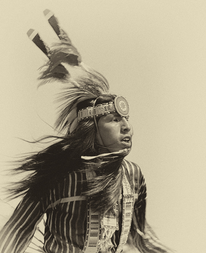
Interesting sepia conversion. I've had problems with Indian head dresses -they stick up so far that the figure appears to be too low in the frame so you have to include more at the bottom or put the top of the headgear very close to the top edge.
I didn't like the apparent amputation of the hand on the left side and he seems to be looking out of the picture. Try a more severe crop and rotate so he is going L to R. See what you think. I was trying to make it square but could only do that if I took some of the headgear and that didn't look right. |
Dec 22nd |
| 32 |
Dec 24 |
Comment |
Those expressions are super! I looked at the original and wondered if the orange should be left in -perhaps nudged closer to the child - because she looks as if she is not very happy with her dessert choice -why did the other girl get the more exciting pudding?
Try darkening the background even more as it does distract from the girls.
Keep taking this sort of photo-it is wonderful at Christmas and they'll love it when they are older. |
Dec 22nd |
| 32 |
Dec 24 |
Comment |
I think Tom's crop is good it produces a pictorial image with the tree growing in a twisted way upwards and taking the eye up with it.
If you want to keep the whole facade then you need to make it symmetrical -either none of the white on each side or an equal amount.
I thought the white areas were a bit muddy looking so try dodging and burning or using levels to tweak the whole image. |
Dec 22nd |
| 32 |
Dec 24 |
Comment |
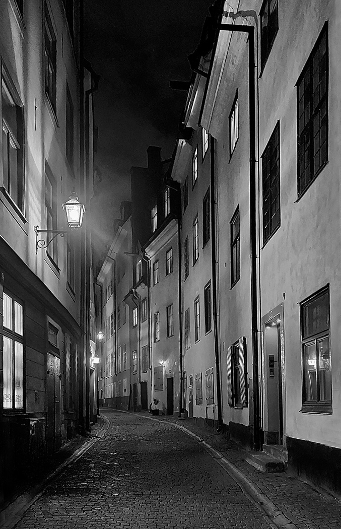
I'm happy with the range of tones and I like the reversal which Tom did. However unlike Steve, I would like a person or a dog or a slinking cat as a focal point somewhere to the back of the street. I have pictures like this but they are usually full of shoppers and don't give that eerie feeling of slight danger.
I wondered whether you need to do a bit of warping as the left side appears to tilt to the right slightly. I've skewed it a little but maybe it could have a bit more. |
Dec 22nd |
 |
| 32 |
Dec 24 |
Comment |
Wow! The symmetry is so good.The others have commented on the ripples and I can't decide whether it is better with them across the hair or not-so it has to be your choice in the end. I like the way that the join in the backdrop/floor has been slightly altered to make a triangle mirroring the shape she created.
I would tidy up the hair bits which stick out at the top of her head -you've already removed the messy bits.
When you start to do blending of photos , it does take time until you realise what is and isn't going to work. However I always say that I still need to be in a creative mood to be successful. |
Dec 22nd |
| 32 |
Dec 24 |
Reply |
It is called Printable greeting cards glossy from Photopaperdirect.com . The bar code is XOOOXUUOSN. We do the A5 folds to A6. I know you have a different size in America from us for what we call A4. This may not be a worldwide company either. |
Dec 17th |
| 32 |
Dec 24 |
Reply |
I think that's why I didn't notice it. It was when we printed it that the hand came out darker. I decided to use this for my Christmas card this year, because it suggested peace and goodwill. So far no-one only one recipient has commented on it and she thought it was lovely ( and so clever) but she is not a photographer! |
Dec 16th |
| 32 |
Dec 24 |
Comment |
I have since noticed that her hand is much darker than her face. I think this is a shadow effect but before I use it again, I ought to lighten the hand. Do you agree? |
Dec 15th |
| 32 |
Dec 24 |
Reply |
I am not an expert at blending at all but I like 'playing' with images and sometimes they work well and I'm surprised. The difficulty is often finding a background or a texture which fits with the foreground. Then it may just be trying different blend modes to see what happens. For this one, I had already used the mountains in another shot which was very creatively altered so I knew they worked well and so it was just a question of keeping the low key element to match the foreground. |
Dec 10th |
| 32 |
Dec 24 |
Reply |
OK I hadn't thought of that and it does work well. Thanks |
Dec 9th |
| 32 |
Dec 24 |
Reply |
I have improved her skin and added a little more detail to the dove's feathers but can't think how to improve them a lot except by going back to the original. |
Dec 8th |
| 32 |
Dec 24 |
Comment |
I could easily remove the marks on her cheeks and chin. I suspect these were brought out in the processing. I should have noticed and done it before. Thanks. |
Dec 7th |
9 comments - 8 replies for Group 32
|
9 comments - 8 replies Total
|


