|
| Group |
Round |
C/R |
Comment |
Date |
Image |
| 32 |
Jan 24 |
Reply |
Thanks! I need to be told sometimes that it is completely wrong! |
Jan 31st |
| 32 |
Jan 24 |
Reply |
The question is -do my increases in contrast make a better final image or am I destroying what the photographer intended? |
Jan 31st |
| 32 |
Jan 24 |
Comment |
Many thanks for all your thoughts. Consensus seems to be it is OK for use, as is, but adding a background feature probably would make it even better. |
Jan 31st |
| 32 |
Jan 24 |
Reply |
Thanks. The stained glass was done quickly for a comp but I will try different ideas , including your suggestion. The lighting problem is always difficult in montage. |
Jan 17th |
| 32 |
Jan 24 |
Reply |
I have tried already with a stained glass window, also in mono. |
Jan 17th |
| 32 |
Jan 24 |
Reply |
Yes and they are both interesting shapes. |
Jan 11th |
| 32 |
Jan 24 |
Reply |
It isn't a restriction made by salon organisers but it is something which my conscience throws up when I know I've done very little input. For a competition, I will probably think of something to go in the negative space to the left which will balance the portrait. Any ideas? |
Jan 11th |
| 32 |
Jan 24 |
Reply |
Yes, I try not to read what anyone else has said before I think of my critique, but sometimes it happens and then you don't know what to say because everyone else will have seen the same problems and good points. |
Jan 11th |
| 32 |
Jan 24 |
Comment |
So what happens when they get wet? I would find them fascinating but then I am a geographer. I love the ripples created as they dry out. What is the greatest concentration of chemicals in these salts? Is it sodium? Did they use them for salt for eating? Not sure I would have enjoyed the camping there.
Good pattern picture with great depth of field. |
Jan 10th |
| 32 |
Jan 24 |
Comment |
You've done well to keep your own reflection out of the frame. It is still a very busy scene and I wondered if a crop off the left would help, but it made a very thin upright shape which didn't work and it was impossible to crop the bottom because of the items there. So you've probably done the best you could and it is better in mono than in colour. It would do well in a sequence of pictures to illustrate the way people lived. |
Jan 10th |
| 32 |
Jan 24 |
Comment |
This is the second half. I think I prefer this one but both have great shapes. |
Jan 10th |
 |
| 32 |
Jan 24 |
Comment |
I think you have 2 pictures here. I tried cropping in half and making two as well as increasing the contrast so that the ice looked whiter. I think the bottom edge is too dominant -it is fighting for attention because it is too busy so definitely needs removing. However when I cropped the bottom and then a bit off the top, the format looked wrong and that's when I decided your picture was too much in two halves, hence the drastic division into two! |
Jan 10th |
 |
| 32 |
Jan 24 |
Comment |
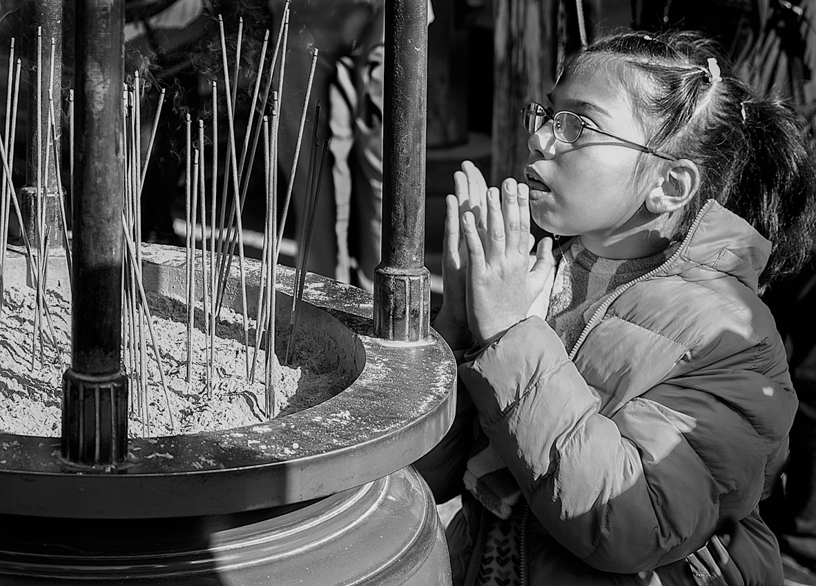
I'm finding the background too intrusive despite going in to mono. I had the same problem when I took people at shrines sin HK. So I've tried cropping to remove most of the man behind the girl and some off the top to remove the light jackets on the left. Then I cloned the top of the light spill on the ma's jacket and darkened the rest a bit- it could do with more probably. I think this has given prominence to the child and her focus on the incense sticks rather than letting one's eye wander round the whole area. |
Jan 10th |
 |
| 32 |
Jan 24 |
Comment |
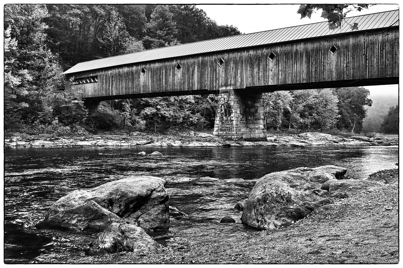
i agree that it does look quite ordinary probably because of the lack of good lighting. I tried various ideas but nothing really improved it. However, simply increasing the contrast by darkening the dark areas a little but holding the whites as they are, seemed to have a bit of an effect.
Did it look better in colour? Was it a red bridge? |
Jan 10th |
 |
| 32 |
Jan 24 |
Comment |
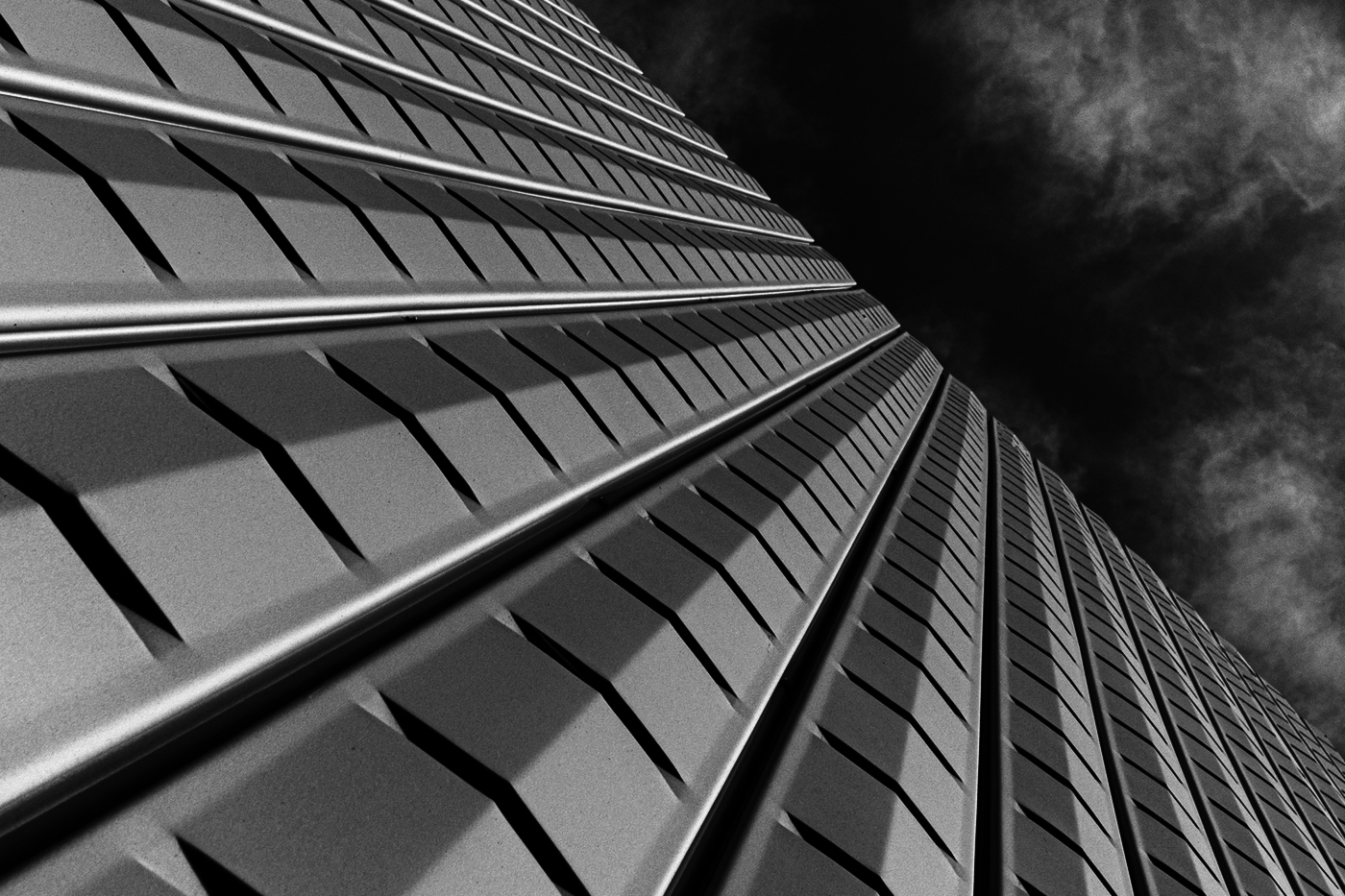
It is much more interesting at the angle you chose. The only thing I would do is go for even more contrast. I opened yours and went to Ps for levels and brought the right hand slider in to the end of the histogram as you were losing the white end. Then I closed and opened in curves and again brightened the lights a little bit and darkened the darks (ie produced a small S curve). This gave a more contrasty image where the lines became more prominent , while retaining the sky effect at the top. |
Jan 10th |
 |
| 32 |
Jan 24 |
Reply |
As I said, so did everyone else. I can get someone else to pose like this but I'd have to invest in a long grey wig and a drab coat to get the same sort of shot. The lighting was actually very easy. |
Jan 10th |
8 comments - 8 replies for Group 32
|
8 comments - 8 replies Total
|