|
| Group |
Round |
C/R |
Comment |
Date |
Image |
| 32 |
Mar 23 |
Reply |
Yes I particularly liked the effect this had produced -I might try it on some of my flower photos to see if I can get the same ethereal effect. |
Mar 26th |
| 32 |
Mar 23 |
Reply |
It really is a photo suitable for both in our club as we accept urban, sea, sky and landscapes, so manmade objects are acceptable. A seascape could include wind turbines/ships etc, an urban could have cars and people in the streets and sky could have an interesting base of beach or buildings so a landscape can have quite large manmade objects. In the end it probably depends on what the picture is up against in that specific competition. I've just used this in our club and although the judge was quite complimentary, it didn't come into the top three placings. He didn't like the burnt out white sky. |
Mar 26th |
| 32 |
Mar 23 |
Reply |
|
Mar 16th |
 |
| 32 |
Mar 23 |
Reply |
I have done two versions. The first is as I suggested initially and the second is even more draconian as well as lightening the central figure to help her stand out. Sorry Nan, I have demolished your original image! |
Mar 16th |
 |
| 32 |
Mar 23 |
Reply |
But maybe photography is a blend of art and science. The latter may have changed from chemicals in darkrooms to IT technology but we still need an appreciation of pictorialism and a facility with a computer to bring out what we envisaged when we snapped the shot. |
Mar 15th |
| 32 |
Mar 23 |
Reply |
I admit the sky replacement was badly done! However I was trying to make the stark white area less eye catching. |
Mar 13th |
| 32 |
Mar 23 |
Reply |
Interesting that you'd get rid of the pole as Steve and I thought it was better left in. Record is any factual photo which has not been materially altered and in our club is usually paired with architecture and can incorporate buildings of any size so a barn would fit. Maybe it is possible to use in either. |
Mar 13th |
| 32 |
Mar 23 |
Comment |
We've been having discussions about backdrops after having a lecture on how to create textures to enhance images. The speaker was excellent but raised the problem of what could be used as a texture. Taking a photo of wallpaper for example is not allowed because that patter will be copyrighted by the designer, so how far can you go with bought backdrops? An old coloured sheet makes a neutral one but what if it has a pattern? I thought about this when I saw Wes' great backdrop to this man. Obviously it is a good one for this shot but is it someone else's copyrighted sheet? Our speaker makes her own textures using concrete, gravy granules, rust etc but can one use printed fabrics? Is it OK if one is not selling the finished image but only using in salons or interclub competitions? |
Mar 13th |
| 32 |
Mar 23 |
Comment |
With the sky replaced. |
Mar 13th |
 |
| 32 |
Mar 23 |
Comment |
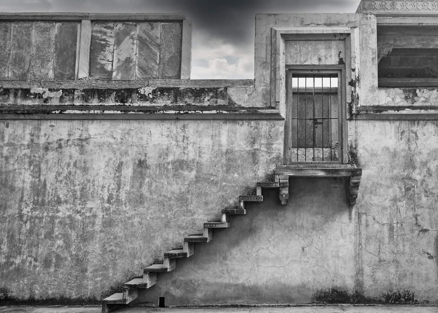
I agree that the white bits on the edges are not good. I would crop off the right to remove both bits. I tried cropping the top but you can't do this without cutting through important other parts. However I might clone out the small triangular area top left which shows a pattern-once seen it becomes an annoying distraction. I wondered whether the shadows were too heavy under the stairs?
I've tried lightening the shadows and straightening the base line but unfortunately that put the bottom of the stairs right on the frame edge so that would need a canvas extension. I also thought that maybe the white sky needed filling in so I did a sky replacement with one of my own cloud pictures but I think I've gone too dark! However, the idea remains a good one even if I did it badly.
Some suggestions only.! |
Mar 13th |
 |
| 32 |
Mar 23 |
Comment |
I agree. I think the stem should show more. I also found it hard to see the noise at this size and my attempts didn't do much, hence the complete creative alterations I did. |
Mar 13th |
| 32 |
Mar 23 |
Reply |
Thanks. I will have a go again. |
Mar 13th |
| 32 |
Mar 23 |
Reply |
Thanks Steve. I also left the spike in because it balanced the barn ones. I felt the dark sky was needed to hold the top in, otherwise the white areas would bleed out of the frame. |
Mar 11th |
| 32 |
Mar 23 |
Reply |
It could be used in either comp but this week it is the landscape one. I hadn't decided on a title yet but I take your point. Thanks. |
Mar 10th |
| 32 |
Mar 23 |
Reply |
Thanks. I am thinking of using it for a landscape competition but Brian thinks it is better for a record competition? Who is right? |
Mar 10th |
| 32 |
Mar 23 |
Reply |
Thanks. That is interesting. It's a good photo even without the explanation but having the words as well makes it better still! |
Mar 10th |
| 32 |
Mar 23 |
Comment |
OK Wes,
I want more information for this shot! Was he a professional model/ was he in front of a special backdrop or have you placed him there? What is the backdrop? How was it processed?
I think it is a very powerful image and although he looks a bit posed, it is very good.
Why is it called 'gone are the people'? As a Brit I don't know who or what he is! |
Mar 9th |
| 32 |
Mar 23 |
Comment |
This one had the same texture- a bubbling mud pool turned to mono- but then I used 'subtract' and then adjusted using curves at the white end but leaving the black where it was. I prefer the other creative one myself but both make yours totally different! |
Mar 9th |
 |
| 32 |
Mar 23 |
Comment |
This one was put on a texture with blending mode lighten and no other alterations. |
Mar 9th |
 |
| 32 |
Mar 23 |
Comment |
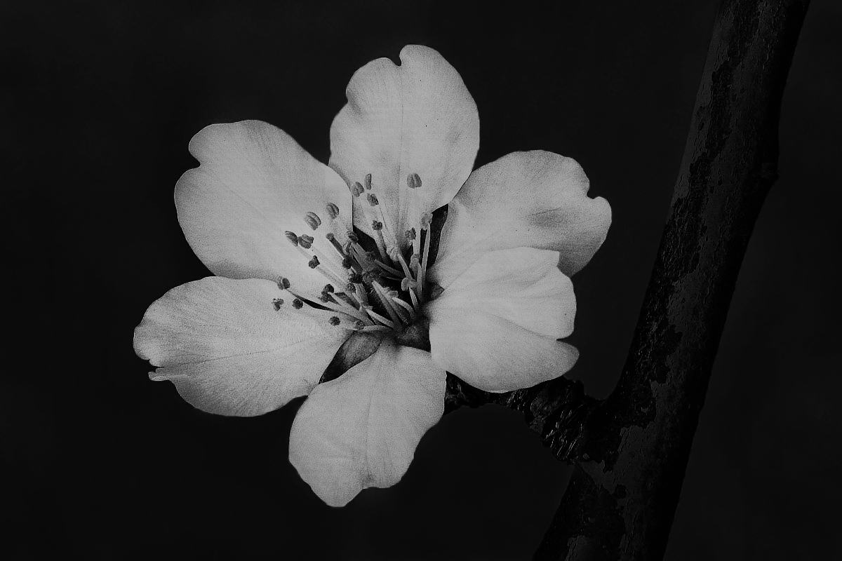
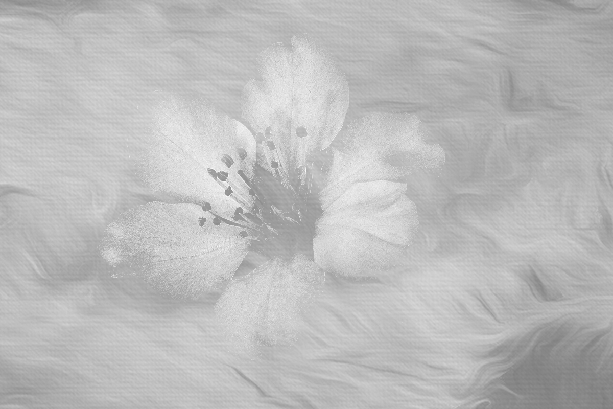
The petals are a bit noisy but perhaps you could make a feature of this-why not go for a truly creative image by adding a texture over the whole but reducing the effect a bit just over the petals. I agree that the branch is a bit dominant probably because it is so dark. You need it there to hold up the flower, but was it lighter originally and therefore should it be more obvious in the final image? |
Mar 9th |
| 32 |
Mar 23 |
Comment |
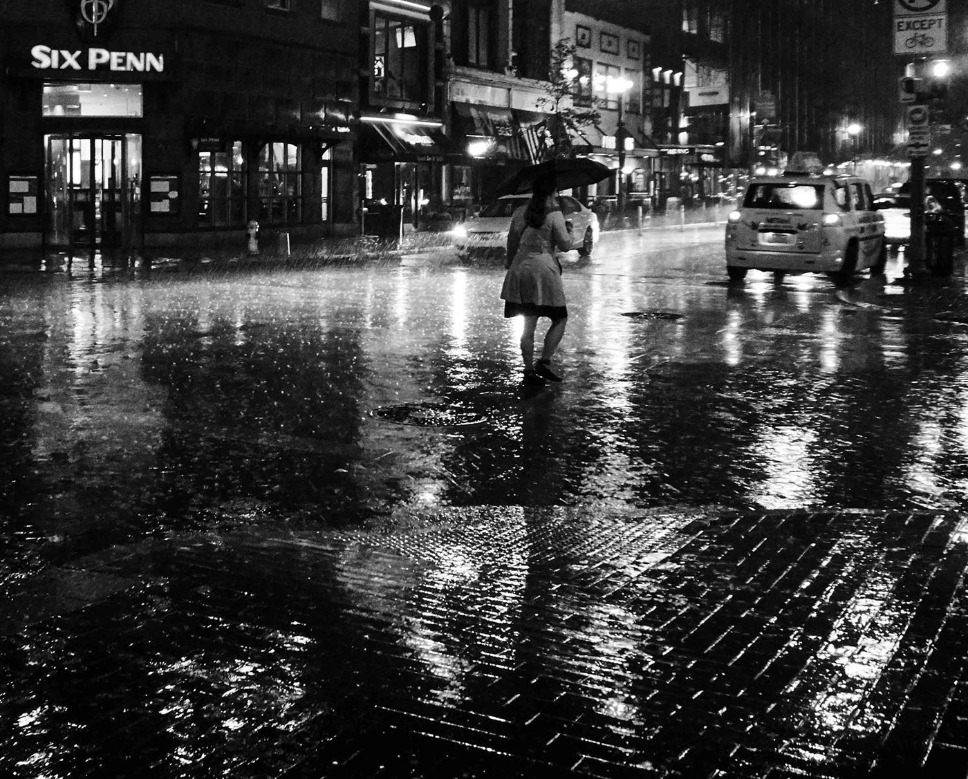
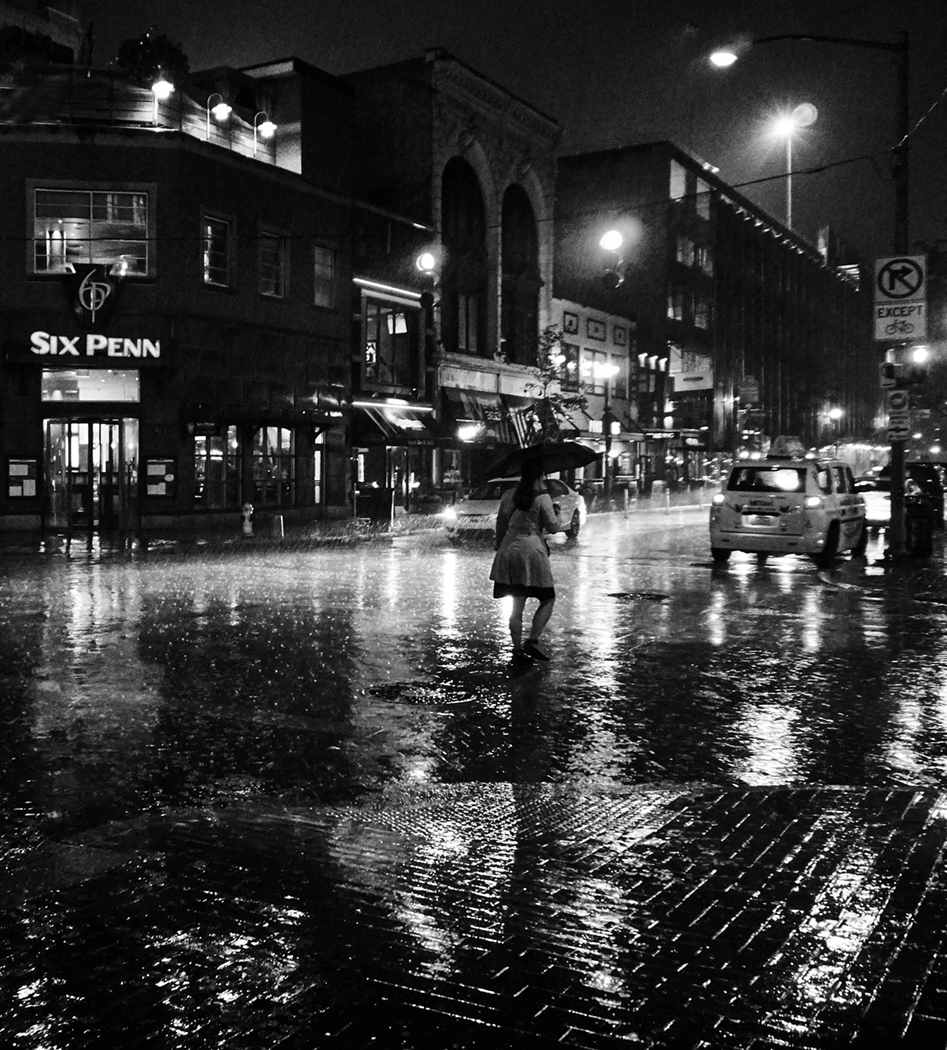
I still prefer night shots in colour because I like the reflections which show up so well on the wet street. I started wondering which would be a better crop and in the end, I thought your crop was still too busy so I decided a massive crop off the left side so that the words Six Penn are retained as this then emphasises the person with the umbrella and creates a triangle between the sign, the person and the car. I felt the left side was rather uninteresting, although the original shows a man running and he might have been a feature if he'd been a bit further into the frame. |
Mar 9th |
| 32 |
Mar 23 |
Comment |
I love the misty conditions and would have been right there beside you with my camera. However, it does lack a centre of interest, although my eye did keep coming back to the rays of light crossing the trees but I also kept looking at the two small trees right on the edge at the right. They are beautifully rim lit with the mist behind them.
I think you've cropped it well. Can you increase the detail in the centre dark foliage which seems blocked up on my monitor. (I've just calibrated the monitor so it should be showing the detail as seen.) |
Mar 9th |
| 32 |
Mar 23 |
Comment |
What an interesting thing to take up! I never thought of that -I went for doing all the macro work which I had been vaguely thinking about and never getting round to. With all the time available and with a Presidential talk to give when we started the new season, I managed to cross off quite a lot of new ideas and the Internet gave me lots more suggestions, some of which were very successful and some were complete failures!
I do like your hedgehog and I think the mono is much better than the colour original. I agree with Lance-you do need to retake with all of the front foot included. I wondered whether a more punchy lighting would bring out the 'spines' better. Could you try a variety of lighting-from the side, from on top, from right in front etc to see which shows it to full advantage. |
Mar 9th |
11 comments - 12 replies for Group 32
|
11 comments - 12 replies Total
|


