|
| Group |
Round |
C/R |
Comment |
Date |
Image |
| 32 |
Dec 22 |
Reply |
OK those are both good suggestions and easily done. Thanks. |
Dec 26th |
| 32 |
Dec 22 |
Reply |
Ok that's an easy thing to do. Thanks
|
Dec 12th |
| 32 |
Dec 22 |
Comment |
Actually I find that I like the colour version more than the mono and I think it's because there is so much red which draws the eye. I also prefer the blue sky because in the mono it has gone white and therefore boring and too bright! For some reason as well the guy's face seems to show better in the colour. I understand that the original would have been in mono but now we have colour! Why was it scandalous? |
Dec 11th |
| 32 |
Dec 22 |
Comment |
This is very good, both in colour and mono. You've got the lighting level just right -and the conversion is right for this. Well done with the candle light. |
Dec 11th |
| 32 |
Dec 22 |
Comment |
We seem to be all going for patterns this month. I always feel that mono is well suited to abstract images. I wanted a bit of space above the chair backs because you've cut through them and it may be an optical illusion, but the whole stack appears to be tilting towards the right. Then I wondered whether an even tighter crop on all sides would work so that it becomes impossible to work out quite what you are looking at -just the crinkly topped bits and no edges to the chairs? |
Dec 11th |
| 32 |
Dec 22 |
Comment |
I agree with Wes -I'd like all the teeth to be in sharp focus and then it would be even more like a set of shark's teeth. If the plant is there all year, then you can go and try again using focus stacking if need be. I like the conversion-it really makes it stark and into a pure pattern picture. It helps to have the little bit of detail on the left as if it is the interior of the mouth. |
Dec 11th |
| 32 |
Dec 22 |
Comment |
I'm happy with the leaves showing but you could also make a very different image by going for full black around the flower. What does bother me is that the stamens are just out of focus as you've concentrated on the central area of dark colour for the point of focus-the problem of using a long lens. Having the leaves showing does mean the image is rather busy so maybe trying for a darker surround would be better. |
Dec 11th |
| 32 |
Dec 22 |
Comment |
I agree! Both colour and mono work well. It's surprising that everything looks so red in the colour. The church stands out more in the mono I think so there is a focus for the eyes. I like the trees a as backdrop, especially in the colour because they are different from the building shapes, although even those have a red tinge. The more I look, the more I see and the more I find different parts look good in each one, but I didn't see the yellow car till Lynne pointed it out.. |
Dec 11th |
| 32 |
Dec 22 |
Reply |
I didn't use a wide angle lens because I don't actually own one. |
Dec 3rd |
| 32 |
Dec 22 |
Reply |
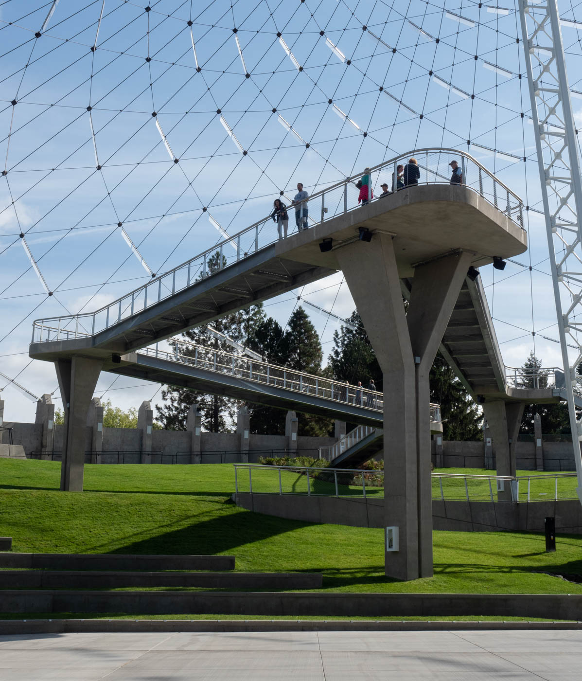
Maybe it got angled a bit when I took it to make sure the top was in, but having gone through the pictures I took at the same time, there is a definite tilt to the walkways as you can see here. |
Dec 2nd |
 |
| 32 |
Dec 22 |
Reply |
No it's not vertical -that angle is the way it is. |
Dec 1st |
6 comments - 5 replies for Group 32
|
6 comments - 5 replies Total
|