|
| Group |
Round |
C/R |
Comment |
Date |
Image |
| 32 |
Nov 22 |
Reply |
I didn't actually replace the sky. Original 1 is in fact a second photo, not the original of the mono, and by the time I took the original 2, the clouds had moved on. That means that the effect on the clouds is purely down to moving the blue slider a long way to the left to darken the sky dramatically. |
Nov 19th |
| 32 |
Nov 22 |
Reply |
Yes a different title can work wonders. No right turn could be the start of a title suggesting no-one should go elsewhere for their haircuts. |
Nov 16th |
| 32 |
Nov 22 |
Reply |
You know me-I like darker based images. I find the higher key ones very hard to make look right. So increased contrast is my usual look, |
Nov 15th |
| 32 |
Nov 22 |
Reply |
What a great idea and I'm sure the owners would be delighted to have a shot for their walls. |
Nov 15th |
| 32 |
Nov 22 |
Comment |
I've never thought about moonbows. i would have assumed from the image that it was a normal rainbow, though the 'noise' in the sky should have given it away. The white arc just looks to me like an area of water splash and I judged it as that before looking at the colour version. Personally, I like the colour because I like rainbows and I think the stars show up better so it becomes clear that this is either a moonbow or a very cleverly lit rainbow. The mono doesn't work well for me. I tried cropping off the sky completely, leaving the waterfall and splash as the important part. |
Nov 15th |
| 32 |
Nov 22 |
Comment |
this is the second version. |
Nov 15th |
 |
| 32 |
Nov 22 |
Comment |
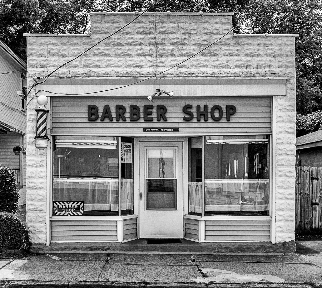
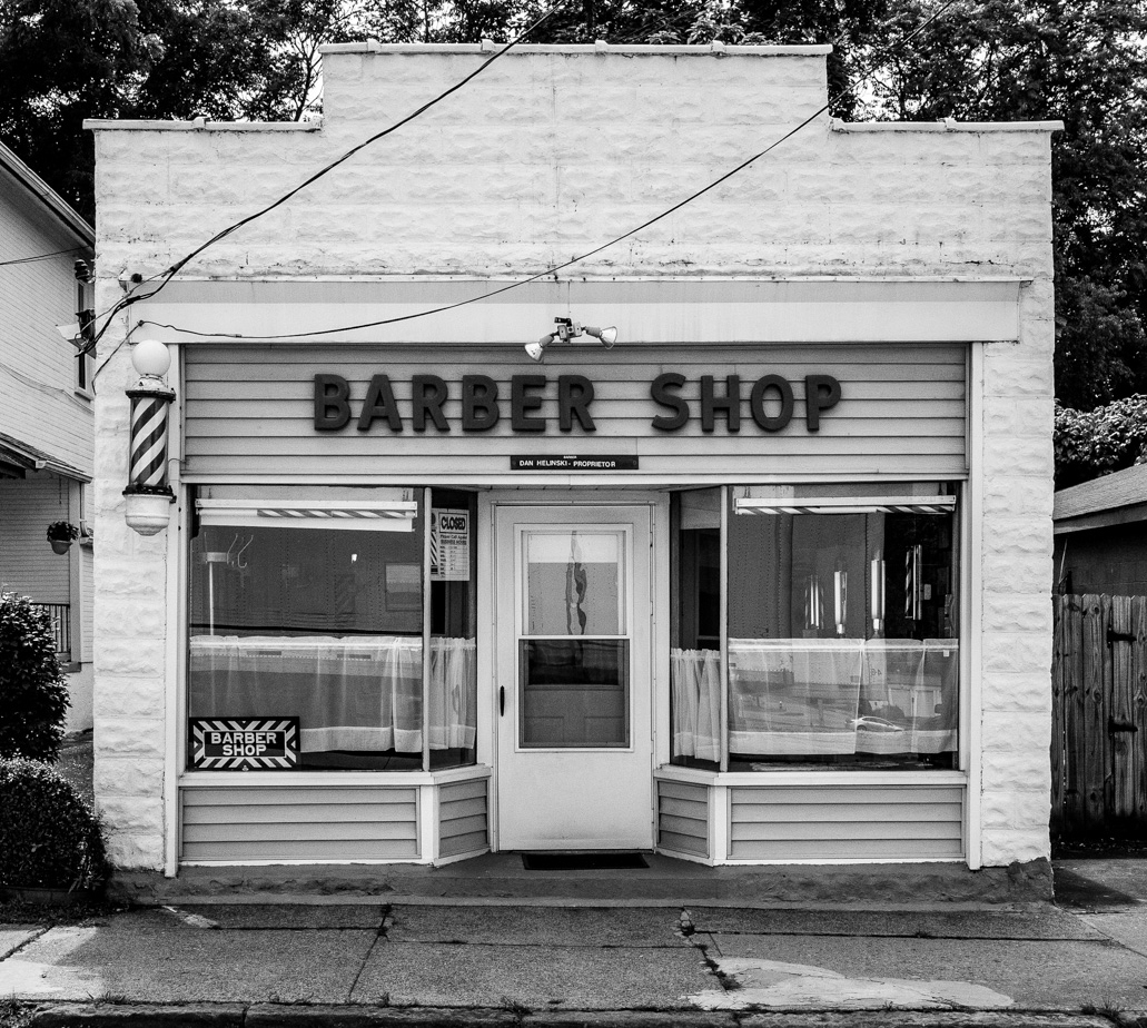
I liked the cropping you've done at the bottom -the road didn't add anything to the picture, but I wondered why you'd kept in the large notice on the right. It does draw the eye away from the shop itself. I tried cropping it off making the space each side of the shop symmetrical, and I also took off most of the blank sky because it wasn't good to have so much white at the top. This means the shop becomes the most important part. I tried adding some increased structure so that the detail in the white areas showed up more so you have two versions to compare. |
Nov 15th |
 |
| 32 |
Nov 22 |
Reply |
That is a good description, but I would also add that mono is best when there are effects of light and shade. Very often when I am judging , I find that the ones which don't work are those where there isn't the full range of tones from pure black to pure white, unless someone is aiming for either high key or low key effects. So a good colour image often does not convert well to mono. You have to 'see' the variations of tone, not colour. |
Nov 15th |
| 32 |
Nov 22 |
Reply |
Ok thanks for the comment on the lower left bit. It's interesting that you like the colour version. I find that just representational whereas the mono shows something that I've added to it and I much prefer the mono. |
Nov 12th |
| 32 |
Nov 22 |
Reply |
My only concern is whether I am simply copying someone else's artwork, although I have altered it as well. What would the artist think about what I've done? Would he object or be pleased that I liked the work enough to photograph it and highlight its elements? |
Nov 9th |
| 32 |
Nov 22 |
Reply |
It is surprising what a difference it makes, |
Nov 8th |
| 32 |
Nov 22 |
Comment |
|
Nov 8th |
 |
| 32 |
Nov 22 |
Comment |
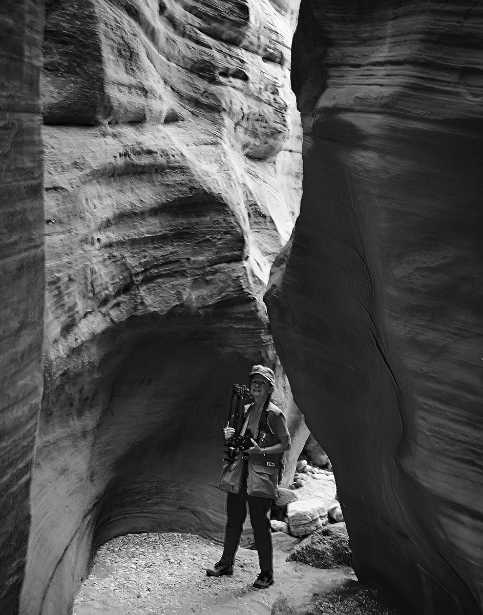
We visited Antelope canyon the first time we visited the USA, back when I was taking film, so everything I took was a guess that it might work. I had a slide film at the time but I have since scanned the half dozen which came out reasonably well and printed one at A3+ size, and framed it and it hangs in our living room. I wish I had known about focus stacking then and had been more careful with the exposure. We didn't have long in the canyon and I had borrowed a tripod from the organisers which was useless as my camera fell off twice, so I was struggling.
I wondered whether yours could do with a bit of increased contrast to emphasise the difference between the two sides of the canyon. I tried it using curves just from the mono image. For me this has a better rendition than the paler one and my memory of the canyon was that it was dark except where the light fell. |
Nov 8th |
 |
| 32 |
Nov 22 |
Reply |
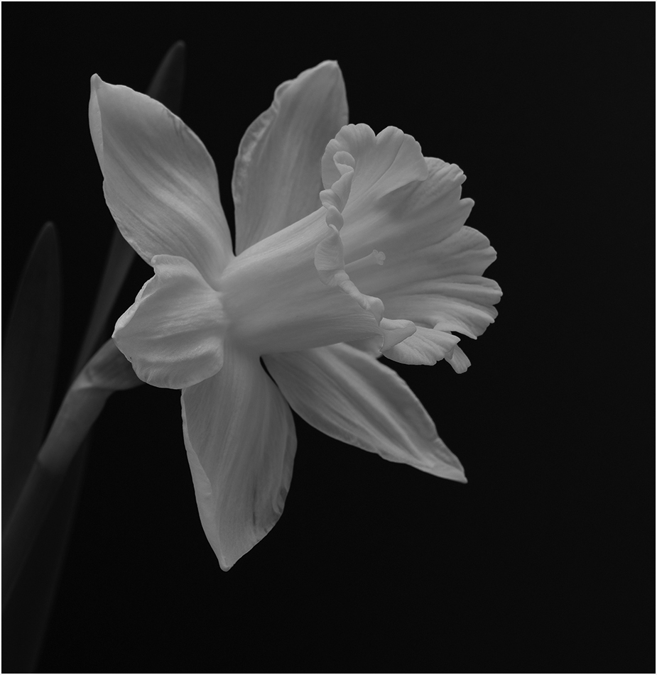
I disagree. I prefer the first one that Steve did where the trumpet of the daffodil is a different tone from the open petals. My suggestion would be to flip the flower so we have the left to right look. I know it is a 'rule' made to be broken but it often does seem to work better. Your flowerhead is nearly central in the frame, but again would it help to crop a small sliver from the top to raise it slightly overall?
What a lovely thought, to upload a Spring flower when we are just going into the dark of Winter! It's chucking it down with rain here and feels very cold so I needed something to make me remember the warmer seasons! |
Nov 8th |
| 32 |
Nov 22 |
Comment |
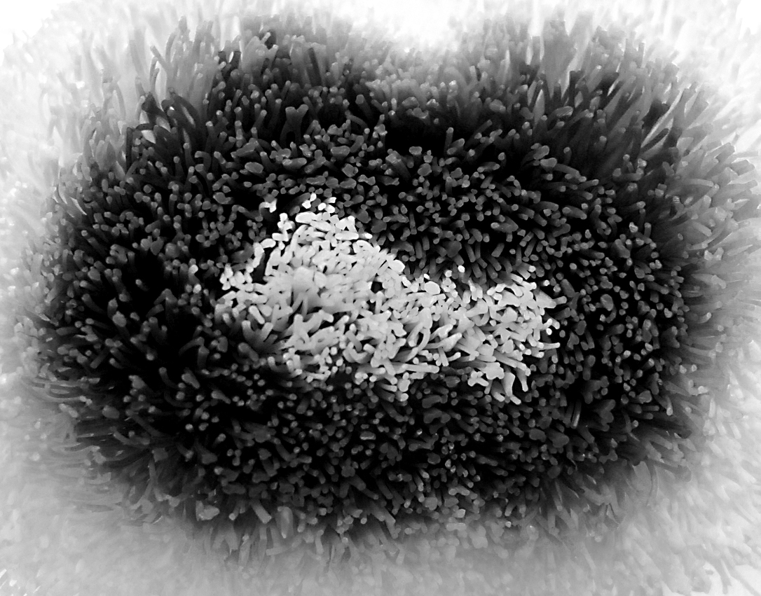
The mono image looks so like a sea anemone that it is quite eerie. How you decided to take the picture in the first place, I'm not sure! The parts I'm not happy about are the corners where you can see the background and I'm not sure whether you can crop them off without impinging on the brush head itself. Why did you decide to go for the infra red effect? Did it not look good as a normal b&w conversion, where the tones would be much darker?
I tried a straight conversion but it doesn't look as good as your IR . I also tried cropping each side but again there's not much improvement, so you were right with your version! |
Nov 8th |
 |
| 32 |
Nov 22 |
Comment |
I found this very interesting because I tried something similar a couple of years ago but went for the opposite effect-low key - to make my shot look threatening, but it didn't really work . Maybe I'll revisit my picture and try your high key effect.
I think this works well with the repeating pattern of arches and the perspective view down the centre, which draws one's eye through. I like the smoothness of the water because it doesn't detract from the bridge pattern and the water balances the sky. This definitely works well. |
Nov 8th |
7 comments - 9 replies for Group 32
|
7 comments - 9 replies Total
|


