|
| Group |
Round |
C/R |
Comment |
Date |
Image |
| 32 |
Jul 22 |
Reply |
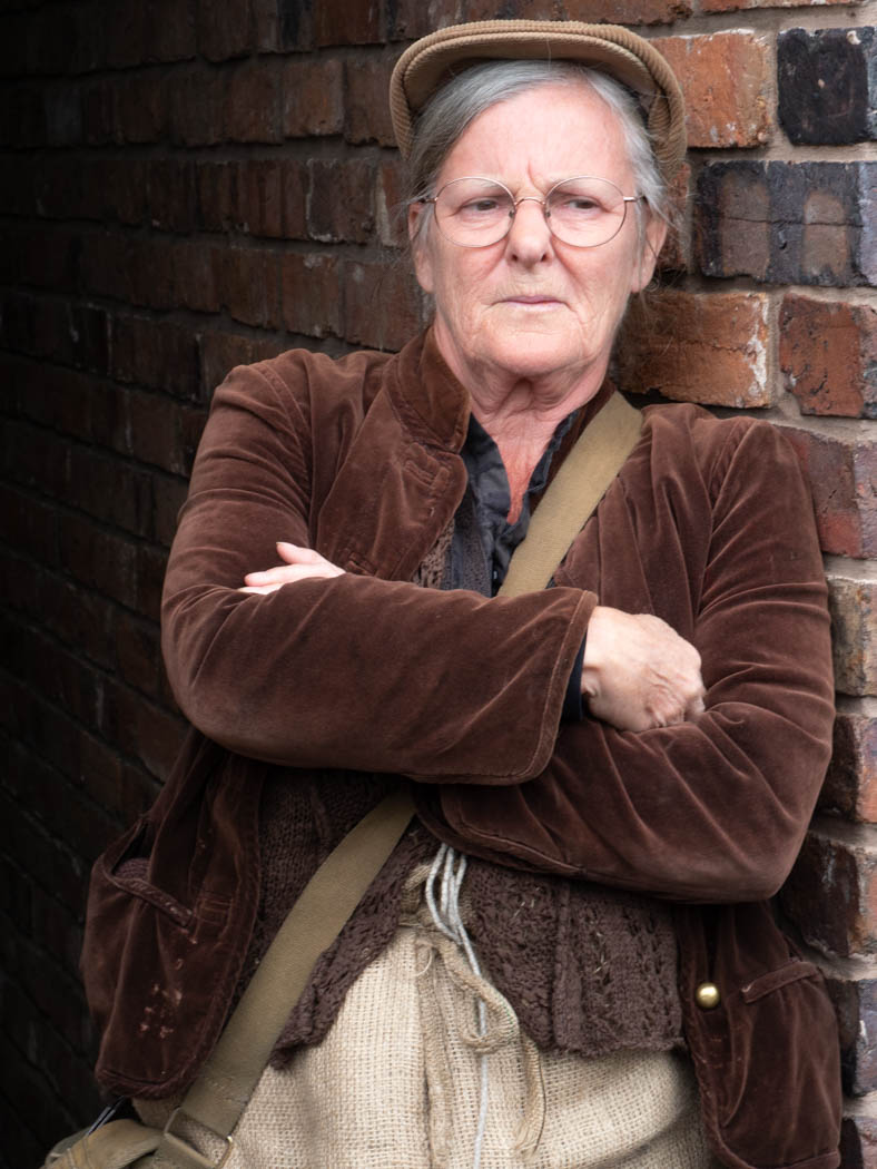
I think the cords were part of her costume-she was wearing a rough waistcoat so maybe they were tying it together. Yes, i should have darkened them down as well as the white mark on the wall. Others have suggested the hand is a bit bright as well. I'm not a portrait person either so these are usually candid shots though I do ask people to move into shade and change their pose, though I often get it wrong. |
Jul 21st |
| 32 |
Jul 22 |
Reply |
Could you send me the original raw version so I can see how it looked? I'm finding the colour still OTT to my British eyes! |
Jul 18th |
| 32 |
Jul 22 |
Comment |
We aim to please-but also to help see possibilities. I've been looking at some old pictures of mine and wishing I had the skills to improve them. I see Youtube vidoes which take boring looking pictures and produce good final images. I need better processing skills as well as the vision. |
Jul 17th |
| 32 |
Jul 22 |
Reply |
Hi Ian, thanks for your critique. Your comment means a lot to me since I know your portraiture is good. |
Jul 17th |
| 32 |
Jul 22 |
Reply |
Thanks. I'm glad you have included the whole pose in the colour version. I hadn't realised your shot was only a small part of the original dancer. |
Jul 14th |
| 32 |
Jul 22 |
Comment |
I agree with all the comments already made. I have imported my own clouds into the replacement file and only ever use those. It was very easy! I think the colour is better and although you all as Americans recognise this location, I didn't, so you could use it in colour in International competitions without people being bored! It doesn't work in mono for me at all -it comes over as all the same tones. |
Jul 13th |
| 32 |
Jul 22 |
Comment |
I love the whiskers! I think mono is right for this but I would like more of the background to disappear into darkness. I can't do it in Ps at the moment as I keep having problems despite it being a new computer. I need to go back to an older version of Ps. You could try burning in or cloning out the larger white streaks or blur them sufficiently to reduce them. |
Jul 13th |
| 32 |
Jul 22 |
Comment |
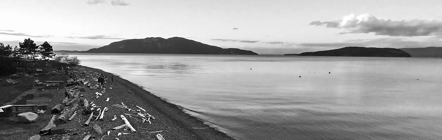
I tried a dramatic crop -first of the sky which was a bit bland and also some off the bottom. I also used dodge and burn to increase the contrast so the beach showed more of the lighter wood more clearly and the water had greater variation in it. I don't mind either way for the scene. The people need a bit of help to make them stand out as a focal point. I wondered if there was an optical illusion that the horizon wasn't straight so I tilted it a fraction. |
Jul 13th |
 |
| 32 |
Jul 22 |
Comment |
the third one |
Jul 13th |
 |
| 32 |
Jul 22 |
Comment |
another version |
Jul 13th |
 |
| 32 |
Jul 22 |
Comment |
I find the shell fills too much of the frame so the point of the shell is hard up against the edge whereas it could be more towards the golden ratio position, especially as this is a shell which probably shows the spiralling effect anyway. I actually did a couple of dramatic crops to make the whole image more abstract and try to produce a better placing for the shell peak. I'm not convinced about the muddy brown tone and I turned one of my versions to black and white which instantly increased the contrast which seemed better. I'll try to upload all these versions. |
Jul 13th |
 |
| 32 |
Jul 22 |
Comment |
I hardly noticed the waterfall because the trees and rocks have so much interesting texture. The dark sky is fine but I also find the bottom snow a distraction especially as it has an upward slant towards the right. However without it as a base, the whole photo looks flat and wrong so a very small area is needed at the bottom or else a much larger area. Could you straighten the 'horizon' of the snow without making the waterfall look wrong? |
Jul 13th |
| 32 |
Jul 22 |
Comment |
I think I agree with some of what has already been said. I find the floating right side hand a bit odd without an arm. The left side hand is slightly awkwardly posed because the third finger has disappeared-I spent some time trying to get my fingers in the exact same shape and it is very awkward. So, i like the concept and the lighting but I'm not sure about the actual pose. I hope you tried lots of different poses. I agree that a white line would help as well. |
Jul 13th |
| 32 |
Jul 22 |
Reply |
I could work on her face to produce some variations in tone and add the catchlight if you thought it was worth it. |
Jul 13th |
| 32 |
Jul 22 |
Reply |
I'm not good at portraits or street photography. We've just been to a steam punk weekend-expect some photos soon- but it was so bright and sunny that after the first two shots, everyone got asked to move into the shade and I used an on camera small flash. I didn't feel the need for a shadow on Grumpy because it was meant to look more like a candid grab shot as if she'd just stood there and that was her normal expression, although in fact she is a person who dresses up as a TV character and stands there, happy for you to take her photo at special events. No money changes hands -these people do it for fun. |
Jul 11th |
| 32 |
Jul 22 |
Reply |
Actually it was virtually unchanged from the original. I'd asked her to stand in the alleyway which was in shadow so there were no shadows from sunshine. |
Jul 10th |
 |
9 comments - 7 replies for Group 32
|
9 comments - 7 replies Total
|


