|
| Group |
Round |
C/R |
Comment |
Date |
Image |
| 5 |
Feb 22 |
Comment |
What a great photo. We don't have pelicans here though we do have cormorants, but I've never seen an interaction like this before.
I have put instructions on group 32 bulletin board for the twirl and bubble making that I used in my photo this month. Have fun playing! |
Feb 14th |
1 comment - 0 replies for Group 5
|
| 32 |
Feb 22 |
Reply |
True! |
Feb 20th |
| 32 |
Feb 22 |
Reply |
Well, it's a change from straightforward conversion to mono isn't it? |
Feb 20th |
| 32 |
Feb 22 |
Reply |
Great! |
Feb 20th |
| 32 |
Feb 22 |
Reply |
I do like all the extra information you have provided. I am not worried about the writing since I didn't try to read it and since it is American I assumed it was like that from the word go. It is only Americans who would stop to complain about it! |
Feb 20th |
| 32 |
Feb 22 |
Comment |
I appreciate that this is called space so the effect must show space, but I found the area without anything was too big especially as it was a central are. I do like the 'jellyfish' approaching -as it it could be a UFO. The bottom right orb doesn't look solid so I am left wondering how it can stay together, so perhaps it needs a dark grey in the spaces between the framework. The 'moon' is much more like a real one so it gives the feel of an actual space shot. I love the fact that you did this with marbles and I immediately started thinking along the same lines. Are they marbles with the same colour inside or are they different? How did you light them? I want details! Great idea and I think you should carry on refining this technique. |
Feb 20th |
| 32 |
Feb 22 |
Reply |
I'm impressed that your cats are happy to model for you. Mine closes his eyes or looks away and he certainly wouldn't sit anywhere I'd put him. He probably doesn't like the camera obscuring my face.
I agree with later comments that you'd need rim lighting and I think that would be really nice. I remember seeing a photo done by a friend who put a spotlight on his cat from a 60 degree angle from above - it made a very striking portrait, with a hint of contrejour, against a dark background - no shadow though! |
Feb 20th |
| 32 |
Feb 22 |
Reply |
I have added an instruction on the bulletin board on how to do both the original twirl and then the bubbles |
Feb 14th |
| 32 |
Feb 22 |
Reply |
Thanks! Glad you liked it. I will be sending the instructions to Lynne at some stage so I can let you know when they are there. I haven't worked out where to put them yet since they are a bit long for uploading here. |
Feb 14th |
| 32 |
Feb 22 |
Reply |
When our visitor has gone I will email you on how I did it. |
Feb 12th |
| 32 |
Feb 22 |
Reply |
Yes, please do and then show us if the interior has been faithful to its origins. |
Feb 6th |
| 32 |
Feb 22 |
Comment |
I think the sepia doesn't work as it looks a bit muddy and the softfocus is too obvious. However, the vignetting emphasises the central area and the softness seems to be less noticeable as the feeling is of an old picture which our brains tell us might very well be soft. I think this works very well. Sepia is accepted as mono but in this case is not the best choice. |
Feb 6th |
| 32 |
Feb 22 |
Comment |
Steve took the words right out of my mouth! I think this is beautiful! I'm glad the owners saved it and I'd love to stay in such a palatial mansion. People must have had so much money to be able to build on such a scale. Except that the foliage is normal, I almost felt this had a look of infrared. Does it work in such a conversion. I thought Carol would have used her infrared camera here to good effect. |
Feb 6th |
| 32 |
Feb 22 |
Comment |
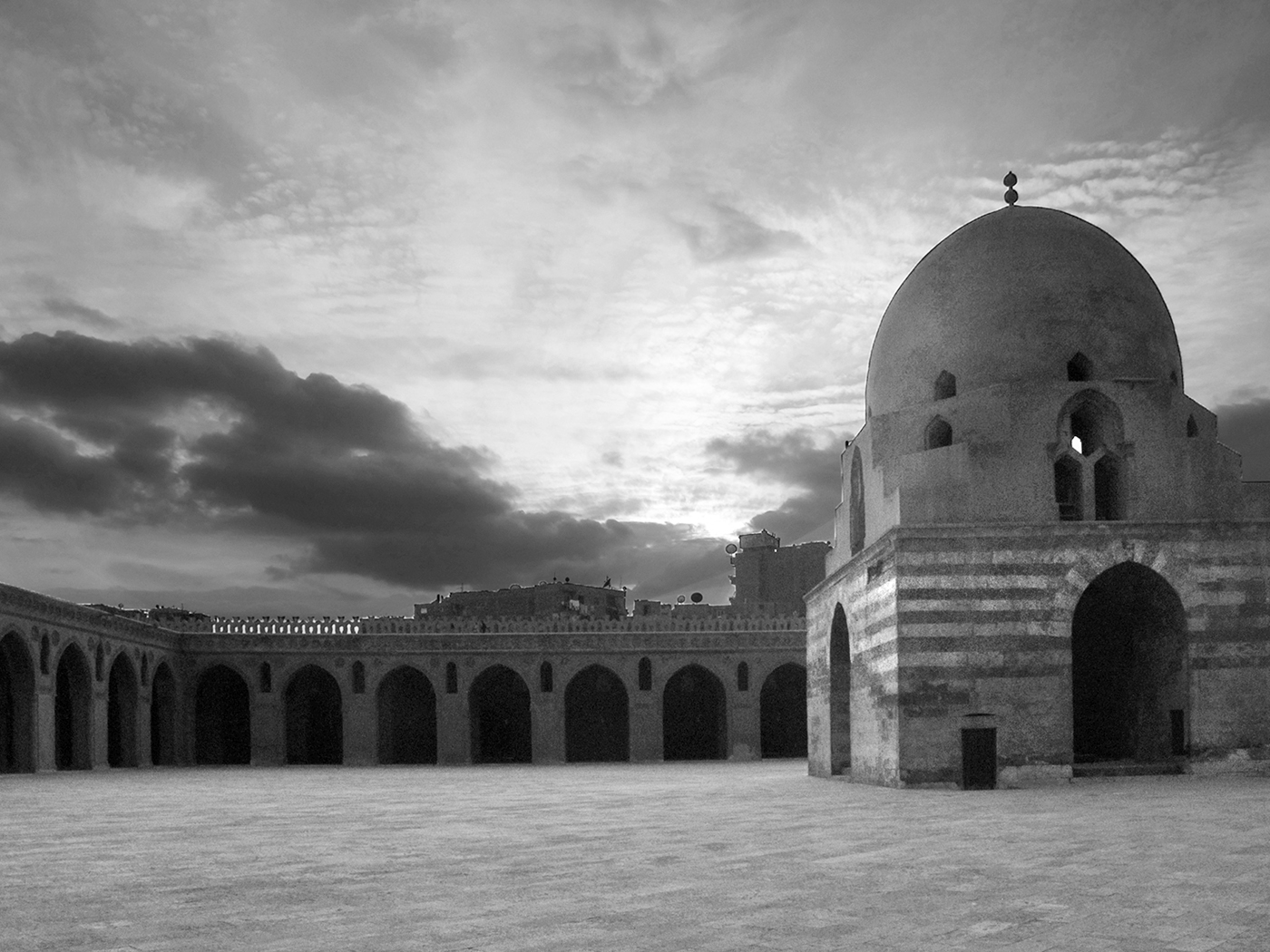
I'm amazed that you were able to retrieve so much detail from the dark areas of the image so well done there! I think I would like you to straighten the perspective as the verticals are leaning in on both sides. I have had a go at the perspective and I also lightened the base more while retaining the density of tone in the sky. I worked on the colour original and then converted to mono. Then I used dodge to lighten the mosque stripes even more to make them more of a feature. Is this to your liking? |
Feb 6th |
 |
| 32 |
Feb 22 |
Comment |
I agree with Steve that the base of the stand is distracting and I was going to suggest either a crop or a crop followed by an extension of the canvas with just the pole bit. Your cat looks extremely displeased! I found the harsh shadow a bit overdark and it pulled my eye away from the cat portrait. I think I would prefer him/her to be in front of a more interesting background though I can see what you were trying to achieve. How about really giving yourself some nightmares and try taking the photo in front of a dark background? The black cat in the coalhole idea? |
Feb 6th |
| 32 |
Feb 22 |
Comment |
Thanks for the comment, Steve. I felt the colour version was too stark and therefore looked like a composite whereas the mono looked more embedded and so more the finished article. The straight horizon was definitely the bit which I didn't like! I do enjoy the spirals and the colour and the fact that it looked like I had a shadow from the incoming spaceships, but I still think the mono is an improvement. Each to his own! |
Feb 6th |
6 comments - 9 replies for Group 32
|
7 comments - 9 replies Total
|


