|
| Group |
Round |
C/R |
Comment |
Date |
Image |
| 32 |
Oct 21 |
Reply |
Very true! Maybe I will try it out again. |
Oct 26th |
| 32 |
Oct 21 |
Reply |
Thanks, so do I, but the judges don't. |
Oct 26th |
| 32 |
Oct 21 |
Reply |
So that will depend on what the comp title is. |
Oct 26th |
| 32 |
Oct 21 |
Comment |
Here is the undoctored original |
Oct 26th |
 |
| 32 |
Oct 21 |
Reply |
Thanks Bev-it is a function of the quality of the comments initially started so members then respond to that. Also, we have people making good suggestions about what could be done and even trying them out and that initiates further discussion. I have a good group! |
Oct 19th |
| 32 |
Oct 21 |
Comment |
What an interesting fence construction. It is different from anything we build here. I appreciate the mono conversion with the black sky, but I feel there actually isn't a focal point for the eye to settle on. It is a pleasant scene with great detail in all the elements but my eye keeps wandering round. In fact the yellow aspens are to either side of the green foliage ones in the middle so I swap from one area to the other. Not sure how to solve that problem. I like the lighting on the fence posts in the colour version but find the vividness of the colour a bit OTT for my British sight! I seem to be out of kilter with everyone else's comments here. |
Oct 12th |
| 32 |
Oct 21 |
Comment |
I agree. The clarity is lovely and it looks like metal. I would have been taking these gears too. Whether it will get anywhere in comps is another matter. |
Oct 12th |
| 32 |
Oct 21 |
Comment |
Yes - a different family shot. I hope he never gets embarrassed at the fact that he did ballet when younger. It should keep him in good stead as he gets older if he carries on with some of the exercises. We tried to be gender neutral with our children, but sometimes, friends and situations impinge and they become much more fixed in their outlook. Our daughter can do all sorts of things perfectly well but since she doesn't enjoy some of them, she manages to manipulate male friends to do them for her. She learnt that technique from her Mum and Grandma! I like the way you can see his face under the arm and it is much better without the reflection on the floor. I am not sure whether it is better without the floor/mirror line. Maybe you could tone it down so it isn't quite so stark black? |
Oct 12th |
| 32 |
Oct 21 |
Comment |
Good luck with the exhibition. I agree with what has been said-the images stand out as graphic art and are beautiful. I prefer the mono in this instance because it is so high key and delicate. i shall have to look at Harold Davis. Is he online? |
Oct 12th |
| 32 |
Oct 21 |
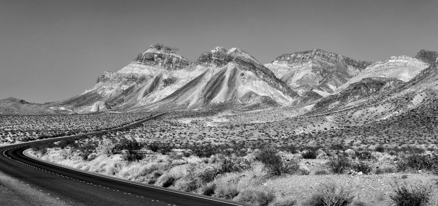
Comment |
i agree about the crop-it is too tight-and I'm not a fan of the road in the bottom left. The hills are beautifully streaked, but because the lighting is so flat, I think you need to increase the contrast just on them, to bring out the contrast in the rocks and the valleys between the hills. I had a go at changing the contrast just on the hills and more on the front ones with less change on the back ones. i also tried a crop off the bottom but maybe too much. I did like the more letterbox shape though. |
Oct 12th |
 |
| 32 |
Oct 21 |
Comment |
I also have this camera on my display bookshelf. We have a still life comp this season and I've taken some of the camera already but hadn't thought of superimposing it on an old photo, but I might copy your idea as well! There are several finishes which could be applied and I hadn't decided which to use yet. A good texture would also work.
I agree with Stephen. There needs to be more detail in the bellows. |
Oct 12th |
| 32 |
Oct 21 |
Reply |
OK thanks. I think doing mono is always going to be taking a step away from the original scene/capture. Sometimes I have an end product in mind but sometimes it is the feel of the image which suggests a response. Here I liked the original fade of the scene so I wanted to emphasise it as well as suggest an olde worlde effect. As I said, I thought I'd done that quite well but clearly judges don't agree. |
Oct 10th |
| 32 |
Oct 21 |
Reply |
Thanks for reminding me that my forte seems to be the contrasty images. perhaps I should have gone for an even mistier feel with less dark areas -my preferences are still showing through. Looking at it again, it appears 'muddy' in the darker parts. Maybe I shall start again and try for a more high key effect. |
Oct 7th |
| 32 |
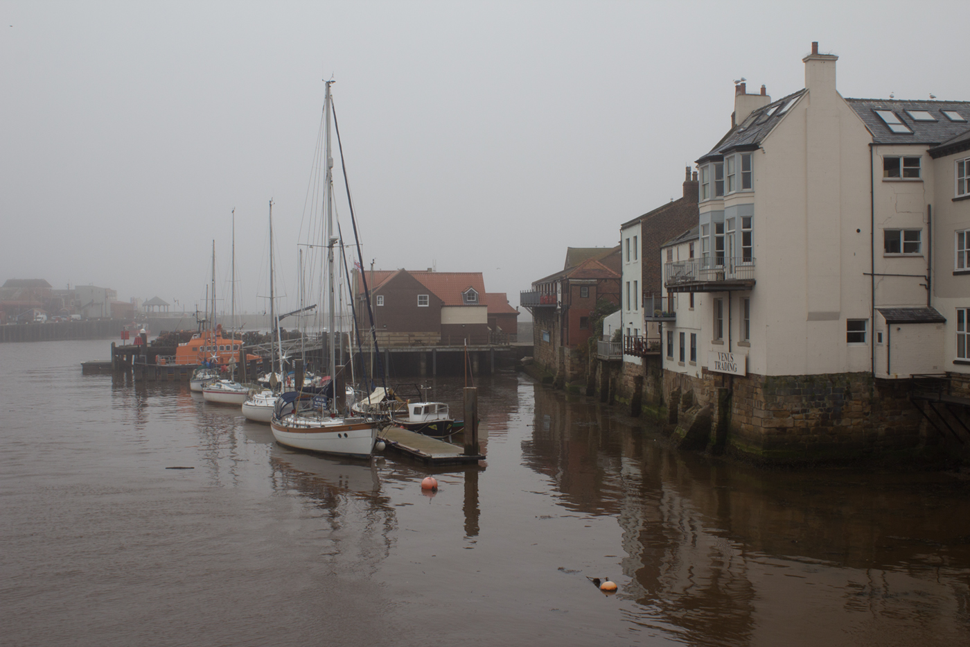
Oct 21 |
Comment |
OK I'm happy to reverse it. Maybe you are right and one's eyes do go back and forth from buildings to boats, but I thought the channel between them helped to draw the eye inwards. Do you think white vignettes work or not? I've never had much success when I have used them and I wondered if they let the eyes wander out of the picture? |
Oct 5th |
8 comments - 6 replies for Group 32
|
8 comments - 6 replies Total
|


