|
| Group |
Round |
C/R |
Comment |
Date |
Image |
| 31 |
Jul 21 |
Comment |
Even though I dislike motor bikes, you've done a good job with this one, especially not getting burn out on the chrome. Good tight crop-it makes a great pattern picture. |
Jul 16th |
1 comment - 0 replies for Group 31
|
| 32 |
Jul 21 |
Reply |
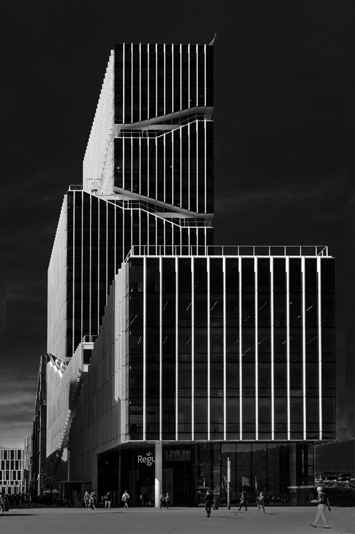
Thanks Ian. Love the suggested title. I should have had more on the right-I suppose I could extend the canvas some more but I'm not good at that. |
Jul 16th |
| 32 |
Jul 21 |
Reply |
I think both the slight converging one and the totally straightened one are acceptable and I really don't know which to choose. i shall try entering in comps and see if either get accepted or neither. Judges will probably throw them both out though a similar mono of buildings I did some time ago did get accepted. |
Jul 15th |
| 32 |
Jul 21 |
Comment |
Lovely detail of the spores and I like both versions. I can see that just using one frond keeps it simple, but I wonder if there is too much white canvas. However I am thinking that this shot would be great as part of a triptych of fern fronds, with two side panels leading in to a central square one which could have three upward pointing fronds. Please do some more gardening and try it! |
Jul 12th |
| 32 |
Jul 21 |
Comment |
I wish we had such lovely little babies coming to our gardens! |
Jul 12th |
| 32 |
Jul 21 |
Comment |
I have a problem with this one. I like the delicacy of the colour image and i think some of that is lost in all the conversions to mono. It is not suitable for nature comps because of the pipe, but it is not very pictorial either because of the heavy black pipe. The feather detail is very good. I like Steve's dappling effect kept in the background, but I don't think it will be right for comps. |
Jul 12th |
| 32 |
Jul 21 |
Comment |
|
Jul 7th |
 |
| 32 |
Jul 21 |
Reply |
I have tried my best to extend the canvas byt copy/paste methods and then cloned the bits which didn't work. I am really not good at this! Does anyone have a sure-fire way of extending a canvas to make it look good.
So, now the building is not so tight on the right and I've removed the left hand one.
I also straightened the perspective a bit more.
Does this work better? |
Jul 7th |
| 32 |
Jul 21 |
Reply |
Yes it is much better without the building. I will do so. |
Jul 6th |
| 32 |
Jul 21 |
Reply |
I actually don't mind the slanting road and since most people won't know it should be straight, I'll probably leave it as it is. I could not get the convergence out on the right without getting too close to the edge of the building, which is why I left it there. Does it matter? |
Jul 6th |
| 32 |
Jul 21 |
Reply |
I'll try it. |
Jul 6th |
| 32 |
Jul 21 |
Comment |
I have reloaded several times and this one worked. Sorry about that!
I like this a lot. It has a feel of being way out in the countryside with the horse wondering why it is abandoned there. I like the slightly soft look to the whole picture and how the trees fade into the snow in the distance.
Lovely ethereal quality. |
Jul 5th |
| 32 |
Jul 21 |
Comment |
In some ways the colour is better because the sofa stands out from the wall. I didn't see why it was called closed for a while as the sign doesn't show up well in the mono-it is much more obvious in the colour. So I suggest going over the sign to lighten the light letters. I would also darken the horizontal white lines on the shutters behind and the diagonal white lines on the right edge of the frame. My husband wanted to crop off the vegetation at the bottom but I think it adds to the overall feeling of dilapidation.
This is the sort of photo I take! |
Jul 5th |
| 32 |
Jul 21 |
Comment |
I like the haziness of the colour one because it makes the mountain look far away. When we were in Seattle it rained, so it wasn't visible, but then we drove up to it and got some very good views.
My suggestion for the clouds is either use dodge and burn on a separate layer to lighten the clouds, or create a new layer of 50% grey and then use a brush with low opacity to darken and lighten different areas.
Both techniques work well and are simple and if you don't like the effects, then delete the layer.
I felt the tones were too overall grey so I wanted to increase the contrast with curves so here's my version. |
Jul 5th |
 |
| 32 |
Jul 21 |
Comment |
Yes this is a hard one. i tried upping the exposure before doing anything so the owlet was lighter and then I lightened the shadows before converting to mono and this seemed to work. The sliders were then used to desaturate the greens a bit. however working on a small image meant the pixelation was too great so it didn't look good. So you've probably done the best you could with this one. How annoying not to have a really long lens available. |
Jul 5th |
| 32 |
Jul 21 |
Reply |
I started off with a less contrasty image but finished up with my version and I still prefer it. However it is always a question of whether the judges will like it since these images are produced with exhibitions in mind. Did you notice the base had developed a slant? Do you think that matters? |
Jul 5th |
8 comments - 7 replies for Group 32
|
9 comments - 7 replies Total
|


