|
| Group |
Round |
C/R |
Comment |
Date |
Image |
| 32 |
May 21 |
Comment |
This has illustrated the whole problem with peppers and tomatoes-they are so shiny that you always end up with bright highlights. I tried some macro work with these using stacked shots to give me the depth of field but couldn't work out the best lighting to eliminate the bright bits. |
May 31st |
| 32 |
May 21 |
Reply |
I think we are so used to black clouds with our weather that we accept them as just storm clouds and get ourselves under cover because it is going to rain soon! |
May 31st |
| 32 |
May 21 |
Comment |
I don't think it was distressed at all. It was just in its inside area and eating as far as I remember. However if the effect is to project the emotion of sadness then that is fine by me since rhinos are vulnerable and need preserving. |
May 31st |
| 32 |
May 21 |
Reply |
Yes it does make it look rather sad. |
May 23rd |
| 32 |
May 21 |
Reply |
That is a lovely coloured bud and the open flower looks so like an ordinary iris -the sort we grow here in GB. The garden variety are this colour whereas the wild flag iris are just yellow.
I think the real stem would compete with the smooth lines of the bud, so cheating by extending the stem is probably a better idea. It means only using it for PIDM competitions, but I do think if you extended, tilted and toned down the heavy vignette, then it has a chance, because you've then made it much more pictorial.
Good luck! |
May 20th |
| 32 |
May 21 |
Reply |
You should know me by now-I like contrasty, dark skies with white clouds! I accept they are not everyone's cup of tea. |
May 10th |
| 32 |
May 21 |
Reply |
Thanks. I wasn't sure whether the ground at the end of his nose had gone too dark so he appeared to be floating. |
May 10th |
| 32 |
May 21 |
Comment |
A good shot of a bid actually doing something. Judges won't like the blank white background nor the cut off stump-too much hand of man, so this probably is no good for Nature. So, why not replace the sky and enter it in an Open comp? I would also flip it horizontally -reading form left to right -and give it a bit more space in front of the beak. In GB we always like more space!
The detail has been well handled on the feathers, so it is worth persevering with this shot -I know you have little free time but worth it! |
May 10th |
| 32 |
May 21 |
Comment |
I didn't know some iris flowers lasted such a short time. We have flag iris which certainly last for longer. What colour is the bud and flower?
I think the arrangement of the bud is not very pictorial, as it is so upright and there is very little stem to support it. Could you try taking more, and angle the stem diagonally, even if the bud then hangs down a little, which will depend on how heavy it is. The bud is outlined well against the lighter part of the background, but the vignette is rather heavy.
I do like the water drop and you could have sprayed it so there were more as they provide a focal point.
Would this be better if it was a lighter, less contrasty image?
I'm not sure if it would ever get anywhere in competitions. |
May 10th |
| 32 |
May 21 |
Comment |
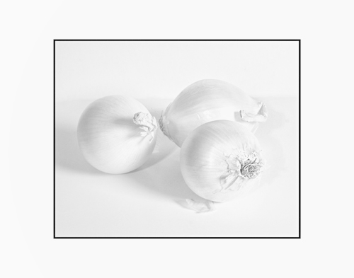
I agree that the shadows look wrong. Why not go with a single light source but use a reflector to put light into the shadowed areas? Table top is very hard to get right. The original version does have subtle colours, but there are also some burnt out highlights on the tops. I have found fruit and veg are very difficult to light properly without getting these.I gave up entirely on damsons last Autumn -hundreds of overbright bits.
I thought the subtley of the colour would convert well into a high key mono so I took your colour into Nik and used the preset High key but on the two right hand onions I used two control points to increase the structure and contrast quite a lot as they were disappearing into the background. I like this effect and it did deal with the shadows effectively. |
May 9th |
 |
| 32 |
May 21 |
Comment |
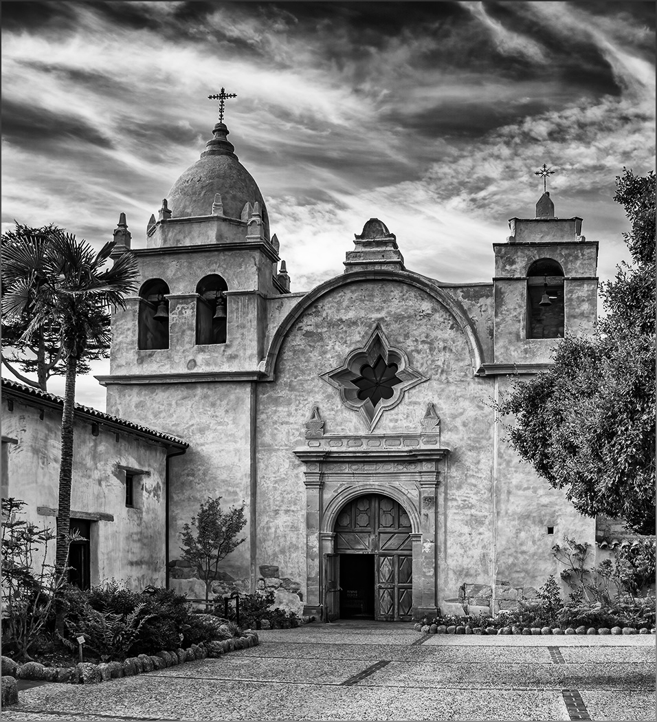
I agree. You have done a good conversion job. I like the mono much more than the colour even if it was improved. However I went one further, adding a ND graduated filter at the top, but maintaining the towers as they were so really only the sky went much more contrasty. |
May 9th |
 |
| 32 |
May 21 |
Comment |
I think everyone has already commented well on this image. Good perspective, too tight at the top, and needs a more dramatic sky. Nothing else to add Steve! |
May 9th |
| 32 |
May 21 |
Reply |
Yes, Ps may supply skies but they should never be used in a competition photo. I'm sure we all have a folder of skies and they can supply all eventualities-light coming from whatever direction you need, clouds/no clouds, storms sunsets etc. |
May 9th |
| 32 |
May 21 |
Comment |
I found this a bit odd with the glasses on the hat and I wondered whether it would be better-different if they had simply been on the table. With them on the hat it was a bit like the invisible man scenario. The reflection is good and the contrast much improved in Tom's version. I'm afraid I don't play cards so I can't comment on how good or bad the hand is. |
May 9th |
8 comments - 6 replies for Group 32
|
| 83 |
May 21 |
Comment |
Just visiting! One of our group -32-has a single bud entered this month as well.
I agree with Lance that you need to crop dramatically so the bud becomes the real centre of interest, but you have a nice diagonal line where is appears past the leaf. I am happy with the rain drops on the leaf but it is a pity that this leaf is so bitingly sharp, as it competes with the bud for attention.
The detail on the bud is lovely. |
May 17th |
1 comment - 0 replies for Group 83
|
9 comments - 6 replies Total
|


