|
| Group |
Round |
C/R |
Comment |
Date |
Image |
| 32 |
Nov 20 |
Reply |
No as far as I remember I didn't add structure though I sometimes do a touch in RAW when starting the processing. I don't like the effect that adding structure has. However if I am using Nik software which I frequently do for my mono, then I do like the high structure smooth setting for architectural images, butt hen I use the control points to reduce or otherwise alter sections. It is rare that a Nik conversion is left the way it comes up. I agree that the over sharpening effect from too much structure is dreadful.
Thanks for visiting! |
Nov 18th |
| 32 |
Nov 20 |
Reply |
Yes they are! I'm watching the sky now out of my study window and hoping that it will turn pink, but the chance of rain is rather high so it is unlikely. |
Nov 16th |
| 32 |
Nov 20 |
Comment |
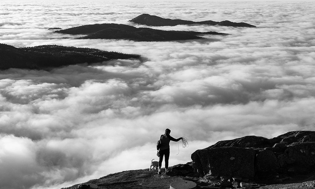
Agree about the cable car! get rid of it. However, I really like the sea of fog and the other mountains appearing through it, and it works very well in Mono. I wasn't so sure I like the sky as it was quite a bit lighter than the rest, so I cropped it off and felt that brought the eye down to the mountains more. I removed the cable car at the same time. |
Nov 16th |
 |
| 32 |
Nov 20 |
Comment |
The conversion to mono really works for me and the rotation helped enormously. The yellowing is a nice touch and that preset puts a suitable border on as well. I like the heaviness of the tones and I found Jennifer's a bit too light. A good image and the sort of picture I take as well. |
Nov 16th |
| 32 |
Nov 20 |
Comment |
I'm completely out of line here-I much prefer the colour image and feel it is a waste of such beautiful colour to change it to mono! It's a lovely tranquil scene and I'd enjoy sitting there and watching the sun sink quietly down to the horizon and watching the colour changes as it did so, but I'd never turn it mono. Sorry! |
Nov 16th |
| 32 |
Nov 20 |
Comment |
I have never seen such a brilliantly coloured bird! It is beautiful, so I actually think it should stay in colour. I also like the background in the original because there is some differentiation apparent which has disappeared in the mono. I prefer a blotchy backdrop to a one tone one as that looks so artificial. I found the fork not a problem in the colour but more noticeable in the mono. This is a gorgeous bird. |
Nov 16th |
| 32 |
Nov 20 |
Comment |
I agree that the two versions look different after not much tweaking. i think in the end it has to be down to the author which one they prefer. I think I like the slightly darker one which Jennifer did, but I rarely do such high key images. As said, the background definitely needed to go. |
Nov 16th |
| 32 |
Nov 20 |
Reply |
Your comment made me laugh! I am a judge and I'm frequently saying to entrants-'there's not enough contrast here! You haven't got all the tones in between.' Some clubs still keep asking me back in subsequent years and they remember what I say, which is good.
It is also amazing how different people can bring out different things from a basic digital capture. |
Nov 14th |
| 32 |
Nov 20 |
Reply |
You are right. Ancient ruins do make for brilliant mono images.
|
Nov 11th |
| 32 |
Nov 20 |
Reply |
Thanks for the comment on October's. I have quite a lot of others and they are going to appear from time to time, though some are better in colour than mono.
Re the lighter steps version, I agree that the shadows are a bit heavy. i hadn't thought of using Nik HDR. |
Nov 10th |
| 32 |
Nov 20 |
Reply |
Again thanks. I still like the curves too! |
Nov 8th |
| 32 |
Nov 20 |
Reply |
Thanks for that. I thought the contrast was Ok as well but one never knows what the calibration is like on the judge's monitor and these days, all judging is done on computers because real life meetings and projection are very unlikely. |
Nov 8th |
5 comments - 7 replies for Group 32
|
5 comments - 7 replies Total
|


