|
| Group |
Round |
C/R |
Comment |
Date |
Image |
| 32 |
Sep 20 |
Reply |
I think you've cracked it! The sky is darker and the bridge stands out from it. |
Sep 28th |
| 32 |
Sep 20 |
Reply |
I still find it a bit grey, but I always want more differentiation between tones so I would go for much darker skies and lighter bridge. |
Sep 27th |
| 32 |
Sep 20 |
Reply |
I have an Olympus 4/3 camera and I do stacking in camera. It is incredibly easy though it looked difficult the first time, but now I have it set up as an action and all I have to do is alter the number of images or the distance between them depending on how big the object is I'm taking. It is brilliant. |
Sep 27th |
| 32 |
Sep 20 |
Comment |
Again everyone has mentioned that car which is annoying though it isn't as noticeable in the mono as in the colour. My only other suggestion is to crop off the white bits along the track, just to the right of the tree. That removes a distraction and also puts the house offcentre. If you are not going to use it for PT, then the car and the telegraph pole could be removed. This reminds me of beautiful weather in Norway and how dramatic the landscape can be. |
Sep 13th |
| 32 |
Sep 20 |
Comment |
I like the way you've treated this and I think the tones are right for giving the impression of age, even though we know it can't actually be that old a photo. Good cropping and removal of distracting bits and pieces. |
Sep 13th |
| 32 |
Sep 20 |
Comment |
Everyone has said what needs doing. My husband hates normal bridges so I would be the one driving here! I find this exciting! I've experienced some of the Norwegian bridges but I have to say that Icelandic ones are even worse! They frequently don't have a good surface and then they go into unlit tunnels which are one car wide. They terrify me! back to the photo-I think Tom's suggestions are good and although I liked the darkness of Stephen's increased contrast, the clouds had lost all detail so somehow you need to retain this. |
Sep 13th |
| 32 |
Sep 20 |
Reply |
I'm presuming Lynne couldn't get over the fence in the foreground which is a pity because it would have been good to see the base of the barn. |
Sep 13th |
| 32 |
Sep 20 |
Reply |
Now that is a completely different image altogether. Shame the cow was facing away from those skylights. I want to flip him horizontally. |
Sep 13th |
| 32 |
Sep 20 |
Comment |
I think the sky is absolutely fine as it balances the 'boulders' in the foreground-they are both rather lumpy. However I found the large area of vegetation on the foreground slope occupied a bit too much of the photo so a small crop off the bottom might be the answer. Other than that perhaps you could darken the base a bit so that the eye is drawn up to the mountains and the clouds. Take off the smallest 'boulder' at the base. I know they are much too large to be called boulders but I'm not sure what to call them. It's a fantastic landscape. |
Sep 13th |
| 32 |
Sep 20 |
Reply |
This does seem to have produced quite a lot of different feelings. I like Tom's starkness and the pure black background is good. I'm not sure whether the other drops are distracting or not, and I can't tell what is reflected in the ones which are on the feather, except I can see the LED lamp. The dust certainly needs to be cleaned up. Thanks for all the help folks! |
Sep 9th |
| 32 |
Sep 20 |
Reply |
Yes, the time taken is enormous and then it is very annoying when something like a light showing up, spoils the image. I shall take it out. For some of my other shots, I used a white box and shone a flash upwards inside it so there was just soft even lighting, but the LED provides more directional and harsher light which was what i was after with this feather. |
Sep 7th |
| 32 |
Sep 20 |
Reply |
I used a tripod! |
Sep 6th |
| 32 |
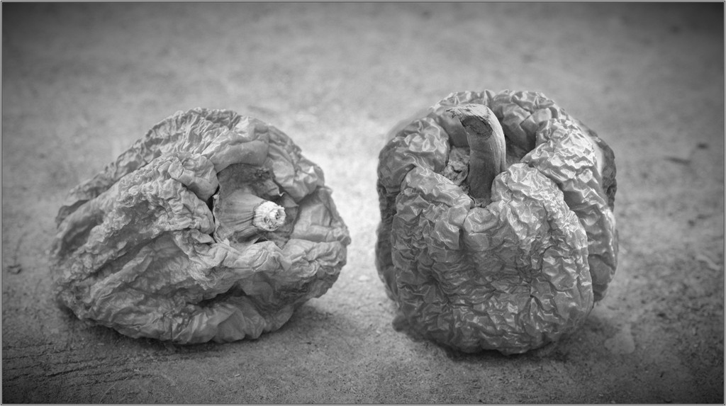
Sep 20 |
Reply |
As I said -not the best way! Because the peppers were completely separate, I decided a quick way would be to quick select the right hand one, make it a smart object, flip it horizontally and then tidy up any bits which were sticking out the edges, if any were. It worked although I can see there are bits around it appearing from the one behind. So, not the best way to do it-just a very quick indication of what it would look like and therefore whether it was worth doing properly. |
Sep 6th |
| 32 |
Sep 20 |
Comment |
I fprgot to add the version I did so here it is. |
Sep 5th |
| 32 |
Sep 20 |
Reply |
Do you like the pepper reversed. i did it quickly and it could be done much better but it gives you an idea. |
Sep 5th |
 |
| 32 |
Sep 20 |
Reply |
Yes the dust needs to go. What do you think about the reflection of the light in the front left droplet? |
Sep 4th |
| 32 |
Sep 20 |
Reply |
Stephen, you are right -the shaft did get blown out as I increased the contrast and i couldn't work out how to get the pure black I wanted around the feather without losing the whites. I probably should have masked it somehow. I still prefer the starkness of the surrounds on mine but the feather is better on yours! |
Sep 4th |
5 comments - 12 replies for Group 32
|
5 comments - 12 replies Total
|


