|
| Group |
Round |
C/R |
Comment |
Date |
Image |
| 32 |
Aug 20 |
Reply |
OK so I did try. Rotating to the right looked pretty good but to the left looked totally wrong. is this better? |
Aug 28th |
 |
| 32 |
Aug 20 |
Reply |
You are right that the shiny bits seem to have increased in the mono. I'm beginning to get the feeling that this is much better as the colour. Thanks everyone! |
Aug 16th |
| 32 |
Aug 20 |
Reply |
That is so interesting. i don't think we grow cranberries commercially here. I've only seen them on moorland and never thought about how they might be farmed. Thanks for enlightening me. |
Aug 16th |
| 32 |
Aug 20 |
Reply |
I like the red door as well. In fact I prefer the colour image or the one Tom did rather than the mono. |
Aug 16th |
| 32 |
Aug 20 |
Reply |
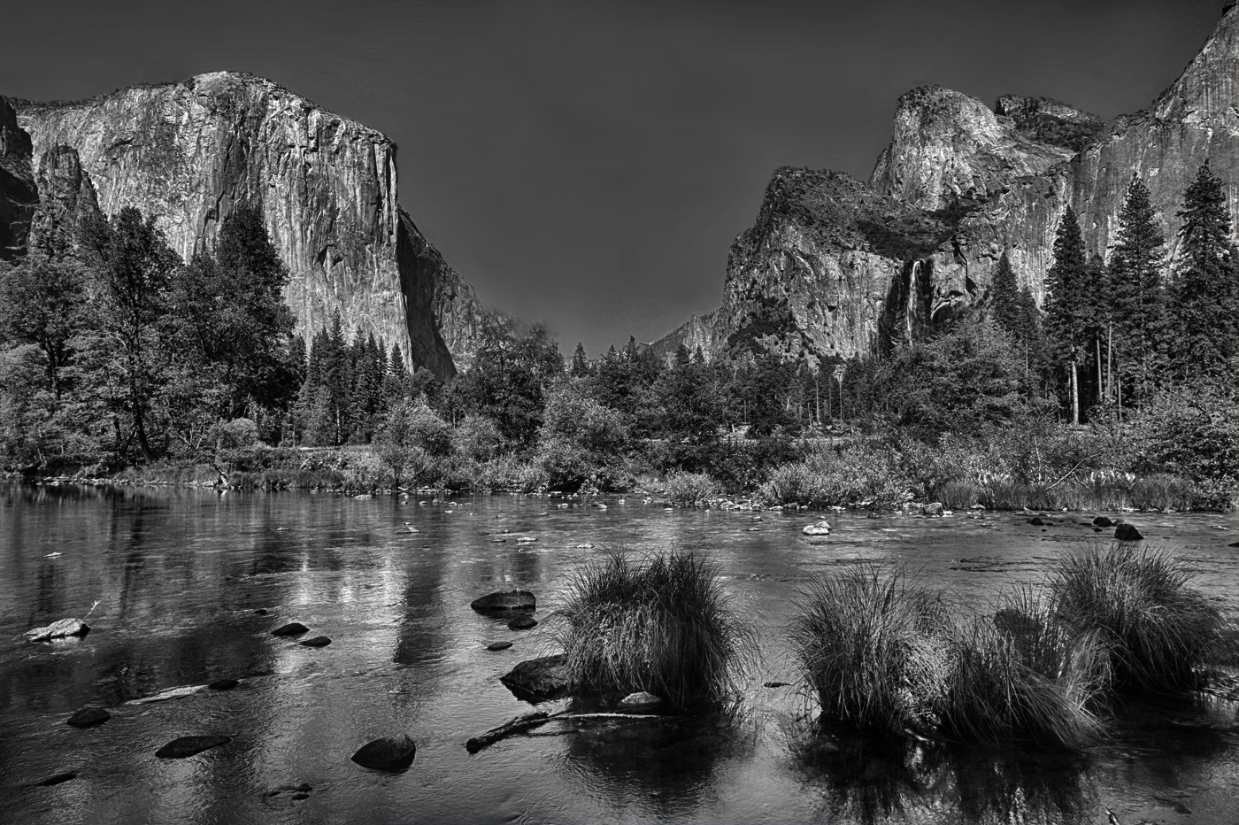
Now you've put me on the spot. When I say contrasty I usually mean a greater difference between pure black and pure white but this also includes -for me- a darker image altogether. i like the full black to appear somewhere and in this instance, I prefer the sky to be dark. However to prevent the whole image looking too sombre all over then it needs the light areas as well, so Stephen's change to brightness works to do this. I think I am using the term contrast rather loosely, when I actually mean making sure the blacks are black. However, just making the image brighter leaves it too pale. To achieve my changes, I frequently use the multiply action because it provides the range of tones but sometimes I will use curves to get the same effect. Not sure whether I've answered your question properly! |
Aug 13th |
| 32 |
Aug 20 |
Reply |
You all know I tend to go for more contrasty pictures! |
Aug 12th |
| 32 |
Aug 20 |
Reply |
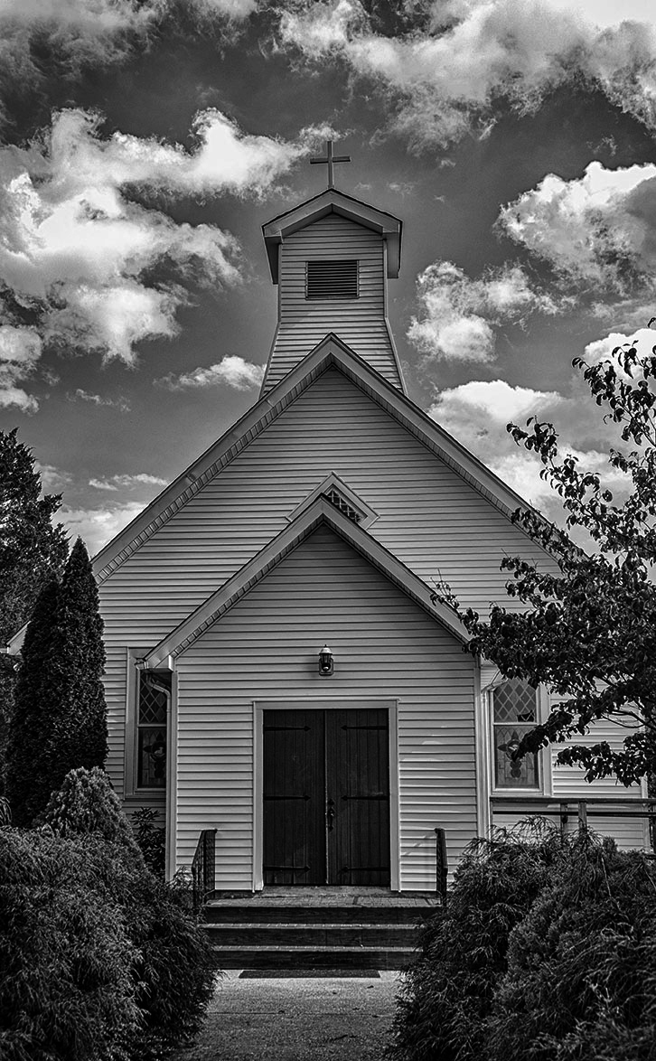
I think you couldn't step back because the foliage on both sides overlaps the church front. I felt that this shot lacked the vibrance in the same way that Jennifer's landscape did, so I applied the same technique-duplicate,and change to multiply and reduce opacity. Lynne, you talked about the red door so can we see the original, please? What are the cranberry bogs? Cranberries grow here on moorland. |
Aug 10th |
 |
| 32 |
Aug 20 |
Reply |
I opened in Ps and duplicated the layer and then changed to multiply and reduced the opacity till it looked OK. Is this darker version better? |
Aug 10th |
 |
| 32 |
Aug 20 |
Reply |
I assumed it was a massive advert on a hoarding since it was on the turnpike. One question, -how did Gloria stop on a turnpike? |
Aug 10th |
| 32 |
Aug 20 |
Comment |
There's no problem with that -enter into non American comps but actually I think American judges favour American subjects because they recognise them! |
Aug 7th |
| 32 |
Aug 20 |
Reply |
Yes I didn't do the improvements to the background carefully enough. Sorry! |
Aug 7th |
| 32 |
Aug 20 |
Reply |
I think being able to see into the hut is an improvement but what a shame that she had a plastic container there! Could you remove it? |
Aug 6th |
| 32 |
Aug 20 |
Reply |
I have just entered the colour version in a comp and I intend to use the mono soon. i will let you know how they do. |
Aug 6th |
| 32 |
Aug 20 |
Comment |
I think this is a good crop. You need the right hand wall to create a stopper in the same way as the wall on the left stops the eye from drifting out. The shoes had to come off as they were much too bright. The only thing is, I like the colour version because the headscarf pops off the screen and it doesn't in the mono. The dark area in the house is more dominant in the mono and it isn't very interesting but in the colour, I barely noticed it because I looked at her all the time. |
Aug 6th |
| 32 |
Aug 20 |
Comment |
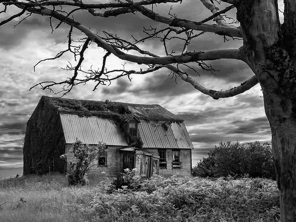
I thought that the contrast needed changing so I went back to your original and tweaked the colour sliders even more so the clouds went darker and the grass lighter. Then since it still needed greater difference between the darks and lights, I used dodge and burn to make the barn front and the veg in front much lighter and the dark bits of cloud much darker. Is this a step better ? |
Aug 6th |
 |
| 32 |
Aug 20 |
Comment |
I think I prefer the colour image as the blue in the figure and the 'enrol' stands out well and this is lost in the mono version. I don't like the extra word LAMAR at the bottom in either of them as it distracts from the strength of the main message. I know it is an advert for Delaware tech but without those words, again the message is stronger. So photographically speaking, you need to forget the advertisement for DT. |
Aug 6th |
4 comments - 12 replies for Group 32
|
4 comments - 12 replies Total
|


