|
| Group |
Round |
C/R |
Comment |
Date |
Image |
| 32 |
Jul 20 |
Reply |
I like the undoctored image as well! |
Jul 28th |
| 32 |
Jul 20 |
Reply |
I'm glad you are happy that I changed it. I think it is important that we notice different aspects because we bring a different viewpoint to every picture. It might be that we change the ethos or the perspective and that might not be what the author intended but it is still valid. In the end, it is down to the author to decide what they like and to stick to it. This might be that the picture brings back some good memories or it might be that it is more suitable for an International competition. A lot of what I do is for the latter so that my pictures find an escape from my computer! |
Jul 19th |
| 32 |
Jul 20 |
Comment |
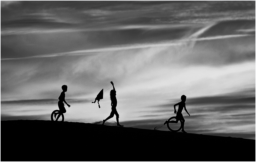
I agree with Tom that I like the main picture rather than the originals. however I felt there was too much of the hill at the bottom especially without a white defining line so I put one in as Stephen suggested -2 px only. However i also tried cropping in different ways. I took off some of the bottom, then a bit off the left to put the girl exactly in the middle but then I cropped more from the left to make the children look more as if they were running into and through and out the right side . This is the one I am showing here but I also liked the one I did with her in the middle but with less on the bottom because it made them look higher up. I increased the contrast using curves -pulling down the darker cloud tones but keeping the rest the same. |
Jul 17th |
 |
| 32 |
Jul 20 |
Comment |
The mono is so much better than the colour but obviously you weren't going to use it like that. It gave the increased detail to the mono version. I think it is too much for me-I've noticed that Americans like these sort of grunge pictures more than we do in GB. I find the car is OK but the sky is OTT, so could you reduce the opacity of the effect in the sky area by masking so the car becomes even more dominant? |
Jul 17th |
| 32 |
Jul 20 |
Comment |
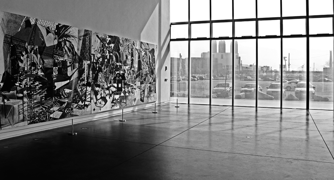
OK, I am out of sync again with everyone. As usual I felt this was a bit wishywashy and needed increased contrast and I didn't like the ceiling. So, I cropped it off and straightened the skew on the left and right sides so the mural was the starting point for the scene and led the eye into the frame. Then I used curves to darken the dark areas but pinned the light areas so they did not change. I much prfer the shape produced as it is more directional from the interior to the outside. |
Jul 17th |
 |
| 32 |
Jul 20 |
Comment |
I' too' think the Rick Cloran treatment is the way to go. I was reading through the comments and thinking I'd have to have a go at my usual increasing contrast tactic and I came to his comment and he did exactly what I was going to aim for.
I also like the colour version because of the wonderful reds so this could be used in either colour on mono comps. |
Jul 17th |
| 32 |
Jul 20 |
Comment |
I like this sort of photo as well. I was distracted by the light coloured leaf on the left of the frame. i think it has caught the sunlight, so I think maybe you could darken the foliage down to leave the metalwork as the only eye catching bit of the whole.
Good one! |
Jul 17th |
| 32 |
Jul 20 |
Reply |
Thanks. It does still look a bit complex despite his clear explanations. |
Jul 11th |
| 32 |
Jul 20 |
Reply |
What is the Triple play process please? |
Jul 11th |
| 32 |
Jul 20 |
Comment |
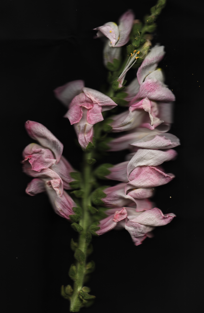
I hadn't thought of rose petals. I have roses growing in the garden so I could certainly try them. Thanks
|
Jul 8th |
| 32 |
Jul 20 |
Reply |
I like the colour one as well. I hadn't thought of dried flowers, done as we used to do when we were children, flattened between blotting paper until they were dry. Dried flowers nowadays are as bad as live ones as they have too much depth to them. I'm still on the lookout for new subjects to try. |
Jul 7th |
| 32 |
Jul 20 |
Reply |
Yes I used to show kids at school how to make 'photos' by placing different items on photo paper under the enlarger and they were very successful. This was sort of along the same lines. You are right that there is no depth of field. i tried it with flowers and they just looked squashed when I placed the fabric cover over them, even if it wasn't physically lying on them. |
Jul 5th |
 |
6 comments - 6 replies for Group 32
|
| 77 |
Jul 20 |
Comment |
Just visiting from group 32. I saw your dancing forks on the showcase and loved it. I have been doing macro work since lockdown and I was about to start on forks and reflections next. I promise not to plagarise but how did you get the ing patterns and various colours_
Anyway, very impressive! |
Jul 16th |
1 comment - 0 replies for Group 77
|
7 comments - 6 replies Total
|


