|
| Group |
Round |
C/R |
Comment |
Date |
Image |
| 32 |
Jun 20 |
Reply |
neither do I. It's just one of those ideas promulgated by judges and maybe they are just biased! |
Jun 29th |
| 32 |
Jun 20 |
Reply |
I started in the darkroom doing mono as well so dodge and burn were some of the first things I used digitally. They are much easier than hands and paper bits were . |
Jun 14th |
| 32 |
Jun 20 |
Reply |
However I have also noted in the past that judges complain if a fungus has damage-'you should have taken this before it got eaten' which annoys me because as soon as a fungus appears it gets eaten! I think there are two possibilities here-perfect blooms and ones on the way to death and they both have their fans. |
Jun 14th |
| 32 |
Jun 20 |
Reply |
I have just found Brandywine on a map showing the park.
I was looking for an address in Wilmington to check the postcode |
Jun 13th |
| 32 |
Jun 20 |
Reply |
Yes it simplifies the image, but the angles remain important. |
Jun 13th |
| 32 |
Jun 20 |
Reply |
Thanks Tom. It means I have to be more careful when I grab flowers to make sure there are no blemishes
|
Jun 13th |
| 32 |
Jun 20 |
Reply |
Sorry I thought I had attached my version. here it is. |
Jun 13th |
 |
| 32 |
Jun 20 |
Comment |
I think Steve probably has the right idea with his suggestion to go for more dramatic lighting and strong shadows. I rather liked the top half of the shot and I might have concentrated even more on this section, which would have simplified the whole image. It would have taken it down to a more abstract shot which becomes more pictorial and less an architectural image. Having said that, it is probably better kept for an architecture competition. Could you try printing it with much greater contrast? You know I like very dark dramatic skies. i have had a go but the one I was working on wasn't really big enough to get good results -it started to pixelate. I liked the square format I made within which is the strong vertical shape. All I did was use curves, making the whites remain reasonably light but the darks go much darker. What do you think? I'm sorry Jennifer if this completely destroys your vision of the building! |
Jun 9th |
 |
| 32 |
Jun 20 |
Reply |
Glad you approve! |
Jun 7th |
| 32 |
Jun 20 |
Reply |
True but sometimes I wonder why we take photos. We must have a reason in mind. Sometimes that is because we want a wall hanger and sometimes it is because the subject is beautiful although we would not want it on a wall. Sometimes it is just as a record or for identification, or to show a story. I also take photos as a technical exercise but I usually keep in mind that they might be suitable for competition, either locally or Internationally. This is especially true now when we can't get far from our own doorsteps. I still want to improve my technical skills and make good photos that other people will enjoy looking at. |
Jun 7th |
| 32 |
Jun 20 |
Reply |
I have absolutely no idea what they are. I can see a grey mark and a yellow mark but not a pink one. I went outside to find another flower to see if marks are common and most of the plants now have seeds. I did find 4 flowers left and one of them had an aphid on it which might account for the grey mark. The yellow could be pollen as I had trouble getting the flower to stay at the angle I wanted so it fell over a couple of times and pollen could have fallen off. A friend had lent me a clever little device to hold small delicate things and I wasn't used to using it. I probably should remove both from the mono but if I use the colour I might leave the yellow blob. |
Jun 7th |
| 32 |
Jun 20 |
Comment |
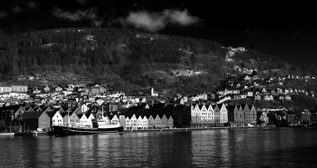
The rest of the group know me and my predilection for contrasty images so they won't be surprised that I tried changes in your image. I went back to the original,changed to black and white and then used the sliders toincrease the values for the red/yellow/green and reduce those for blue and cyan. That increased the contrast overall and darkened the sky a lot. Then I used dodge and burn to lighten the clouds and some of the houses high on the mountain side.. I cropped some of the top and bottom to give a feel of a greater sideways spread. I cloned out the one white cloud top left as it was cutting the frame edge.
Incidentally this brings back very fond memories of Bergen as we were there as Norway started their lockdown and there wasn't much to do except walk round the waterfront, so I have very similar pictures.
Welcome Asbjorn |
Jun 7th |
| 32 |
Jun 20 |
Comment |
I agree with everything that has been said. Carol used to have these kind of shots and I always liked them. So you are carrying on her interest. It always amuses me that the horses seem to have their legs crossed and their heads sideways and this one appears to have only 3 legs! The sepia has removed the background distractions, though I would darken the buildings some more. |
Jun 7th |
| 32 |
Jun 20 |
Comment |
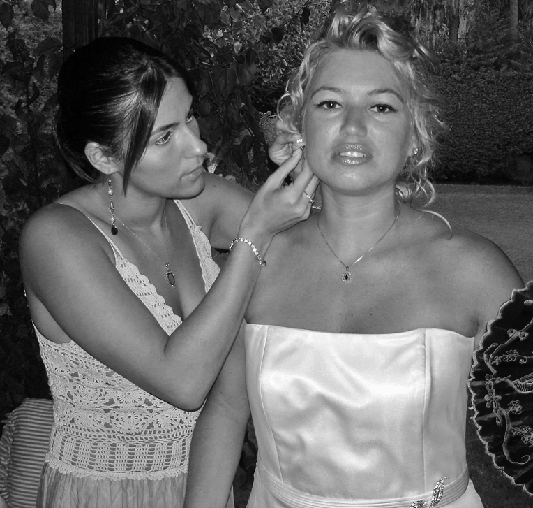
I think the bride will love this shot. I felt the white dress was a bit too bright so I darkened the highlights using shadow/highlight in Ps. I also darkened the right hand corner pattern on the fan as it detracted from the faces. I cropped to take out the highlights in the foliage behind her and the bottom corner and you were right to remove the ornament. |
Jun 7th |
 |
| 32 |
Jun 20 |
Comment |
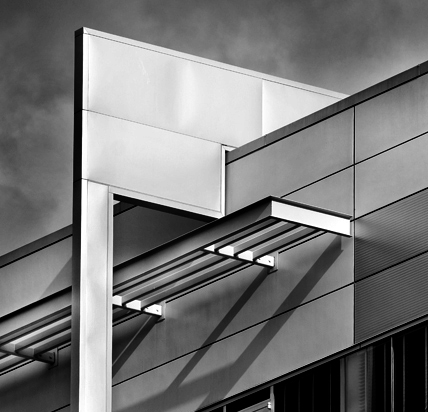
Steve is quite right -the diagonal does need to go through the top left corner. I have recently seen a similar picture of a gangsocket against a white background which did well somewhere. Yes they are clever but they are not beautiful images I want on my wall. Should you slightly darken the shadow of the wire as it goes across the wall? There is a black spot to the right as well. Should it be emphasised or cloned out? |
Jun 7th |
| 32 |
Jun 20 |
Comment |
I like the alterations done by Lynne. I thought the top right was very distracting so this newer version is much better. I am not sure the tighter crop is needed if the background is much darker. Interesting that we both went for flowers+is this what lockdown has forced us into doing and we've realised that flowers are actually good subjects. I like the leaf -usually people add droplets of water but this leaf looks good. I do prefer the mono to the colour version which is too busy with the jumbled leaves. I also think Steve's increased contrast helps, although you need to be careful not to lose the delicacy. |
Jun 7th |
| 32 |
Jun 20 |
Reply |
The blossom is actually quite small -only about an inch in height. |
Jun 6th |
| 32 |
Jun 20 |
Reply |
I wondered whether the black stem was too stark and I think on reflection I probably ought to lighten it so it is the same tone as the rest. |
Jun 6th |
| 32 |
Jun 20 |
Reply |
Now I tried various positions for the stem to enter, from just up from the corner to just away along the horizontal edge. Then I remembered what you have said in the past and made it come precisely from the corner! So I think I can't win! As Stephen says, what is the consensus opinion for the best entry point? |
Jun 6th |
6 comments - 13 replies for Group 32
|
| 83 |
Jun 20 |
Reply |
There seem to be as many ideas about the entry of the stem as there are people! I only made it come from the corner because of discussions our group have had in the past. I suspect I can't win on this one. |
Jun 10th |
| 83 |
Jun 20 |
Comment |
I have been directed to look at your mono flower image by one of my group (32) as I also produced a flower shot this month. I went for the high key look. The main point of argument has actually been about the entry point of the stem, which no-one has commented on for your shot. It is interesting that we have produced very dissimilar pictures. |
Jun 9th |
1 comment - 1 reply for Group 83
|
7 comments - 14 replies Total
|


