|
| Group |
Round |
C/R |
Comment |
Date |
Image |
| 32 |
May 20 |
Reply |
I have played with increasing saturation and might do this for some exhibitions where I suspect they like increased vibrance on colours. |
May 23rd |
| 32 |
May 20 |
Reply |
It is something to remember if you are entering Internationals. I usually select different pictures if I am entering American, European, Indian or British salons. Some images just don't do well in some parts of the World. |
May 21st |
| 32 |
May 20 |
Reply |
Thanks. I suspect it means I can use it for both mono and colour exhibitions and maybe it will achieve acceptances in both. We shall see! |
May 20th |
| 32 |
May 20 |
Reply |
Possibly but would have needed me to spend a lot longer on it, whereas I was just trying to show the effect. The sky actually looked better when it was black, rather than an indeterminate grey. |
May 20th |
| 32 |
May 20 |
Reply |
You are so right! It's like in nature shots, we always want the habitat and you folk want close up portraits. |
May 18th |
| 32 |
May 20 |
Reply |
I agree it doesn't work as well but I was trying what Stephen suggested. |
May 18th |
| 32 |
May 20 |
Reply |
It is easy for me as I download all the images onto my computer so I can then go back to them and play in Ps. However, if you click on the small image it will open on your screen and then you should be able to right click and 'save as' to your computer and then you can open in Ps and play. |
May 18th |
| 32 |
May 20 |
Comment |
I think I am out of phase with everyone else, because I want to see more of the scene so that I can tell it is a sand sculpture. I know there is good texture in the actual sculpture, but without his hands I can't tell that he is a sculptor at all -he might just be standing near something with an odd shape. The tones on his face and on the sand are very similar and the sky is very bright so I wanted some more differentiation between the greys and as Lynne suggested a darker sky. I'm sorry that I am being very negative on this one, but it wasn't my cup of tea! |
May 18th |
| 32 |
May 20 |
Comment |
I agree that the crop off the top is needed as Lynne did. I tried other minor crops but they took too much away from the busy scene. I, too, like the height suggested by the bamboo and also the white ladder. It is a photojournalism shot and as such, sometimes we can forgive slight imperfections like the lack of feet! Just remember next time -if there is ever a time when we can travel safely again. |
May 18th |
| 32 |
May 20 |
Comment |
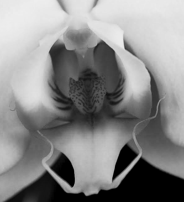
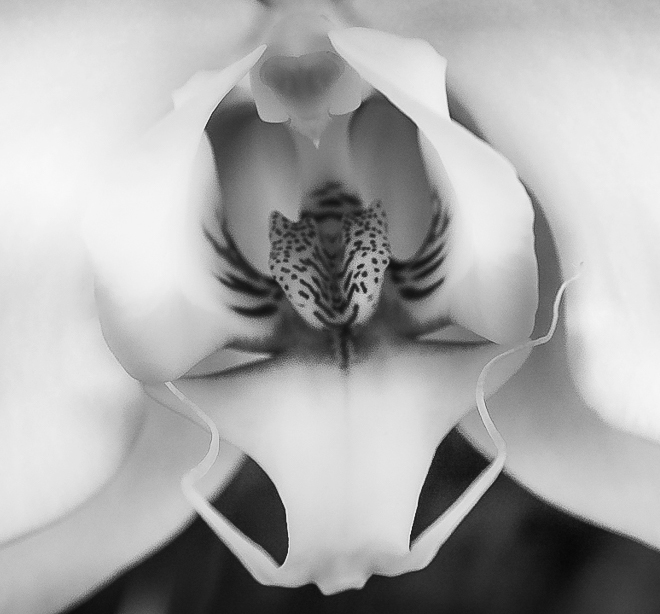
I'm still envious of your orchid as I have never managed to get any of the ones I've been given as presents to flower again. I have one from my sister and would love to have it again but no luck. I do prefer this one with the black background and the slight curve of the stem is more pictorial than the original straighter one. The lighting has been very well handled. Congratulations. |
May 18th |
| 32 |
May 20 |
Comment |
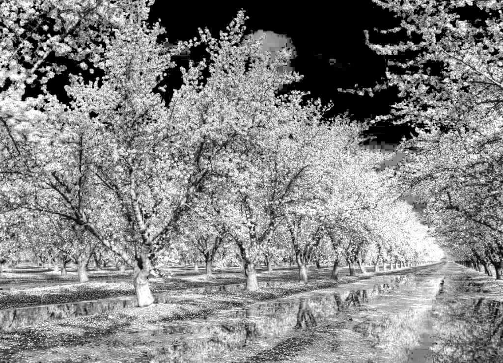
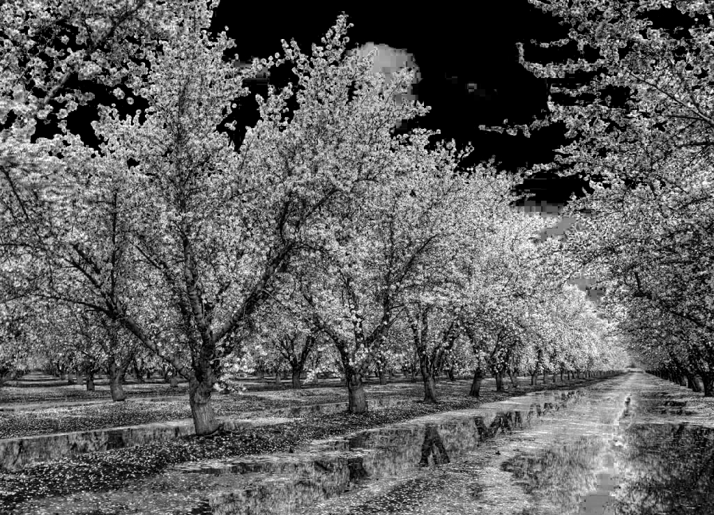
Here is the second more infra red one |
May 18th |
 |
| 32 |
May 20 |
Comment |
Ok that means I have to have a go. First of all I increased the saturation of the blue in the colour version then converted to black and white in Ps, and moved th4e sliders. the first one I moved the sliders for blue and cyan to minus 200 and the red about half way. the second, i moved the blue and cyan to minus 200 and the red I increased to half way -doing it by eye. i think this one looks more like an infra red shot. they would both need cleaning up especially in the sky but both techniques change the image somewhat! However, i actually like the delicate tones of the colour image and would probably stick with this one Jennifer. |
May 18th |
 |
| 32 |
May 20 |
Comment |
Here is the second one with yellow enhancement. |
May 18th |
 |
| 32 |
May 20 |
Comment |
I think this lacks contrast and begs to be cropped in more tightly, so I did both and I think it has more impact. I accept it is a delicate flower but I still think it needs more oomph. I first of all adjusted the mono one with curves to increase the contrast and cropped it. then I tried going back to the original colour and enhanced the yellow followed by a very small curves change and a crop, but I don't like this as much as the changed mono one. Do you think i have improved it at all? |
May 18th |
 |
| 32 |
May 20 |
Reply |
I hadn't thought of turning it round but I agree that it leads left to right on yours. The colours aren't pretty as you say but if I wanted to use it as a colour images then I could increase their saturation and make a feature of them ! I have used some of my other images taken then and the evening shots have worked well. |
May 6th |
| 32 |
May 20 |
Reply |
Unfortunately we weren't there during the growing season. Most of the pictures of The Palouse that I had seen before were taken in full growth or as the crops turned colour and looked wonderful. When we were there, everything looked drab and grey and needed a lot of tweaking to produce vibrant colous -and then with differential contrast they make good mono images. |
May 5th |
7 comments - 9 replies for Group 32
|
7 comments - 9 replies Total
|


