|
| Group |
Round |
C/R |
Comment |
Date |
Image |
| 32 |
Apr 20 |
Reply |
I don't think a tripod would have been a problem there because of so few people and we live 2 minutes from a train line where i could easily do moving trains, although not underground. I often use a monopod as it is so much lighter than a tripod and acts as a walking pole for me. What originally attracted me was the colours but then I chose to go monochrome! |
Apr 18th |
| 32 |
Apr 20 |
Reply |
Also the reflections or something below the table which are showing below the cheeseboard perhaps could be darkened these are minor imperfections though! |
Apr 12th |
| 32 |
Apr 20 |
Reply |
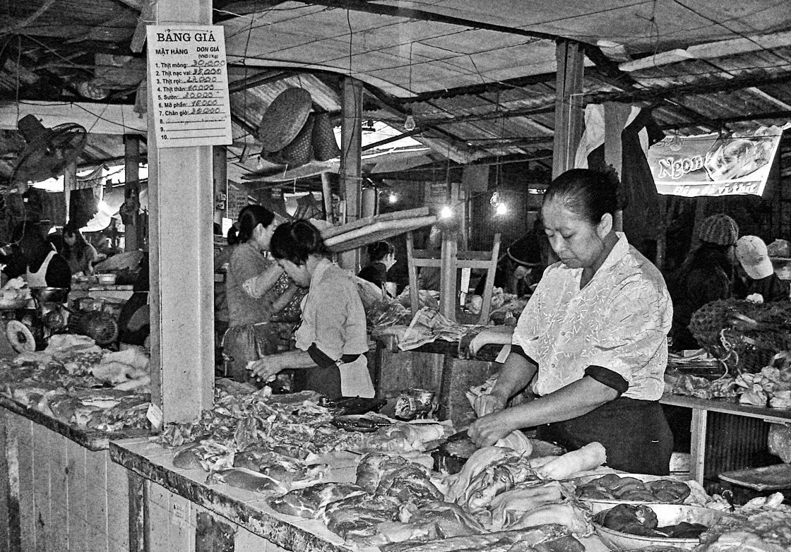
We are all used to sanitised food aren't we? Mostly we don't even see markets with open shelves of fish and meat. I'm not a vegan but perhaps if we saw more like it we would go that way. |
Apr 12th |
| 32 |
Apr 20 |
Reply |
That is very true. It isn't so much trying everything under the sun. but finding out which selections work best on the type of pictures you take and what makes them pop off the screen. |
Apr 12th |
| 32 |
Apr 20 |
Comment |
I agree that the feathers are lovely and the pose is good. I struggled to find the legs so perhaps you have other shots which don't have the legs obscured by the cactus. It is quite strange where the bird appears to be 'sitting' on one cactus leaf! The contrast is fine as far as I am concerned. The background is well out of focus so that is good too. What does the original colour look like? |
Apr 12th |
| 32 |
Apr 20 |
Comment |
I think it is good as well. I find close up images very hard because every little thing has to be thought about. You have done well with the background and the cut glass does indeed sparkle. Should the cheese knife have been completely on the board rather than coming in from the frame edge? |
Apr 12th |
| 32 |
Apr 20 |
Comment |
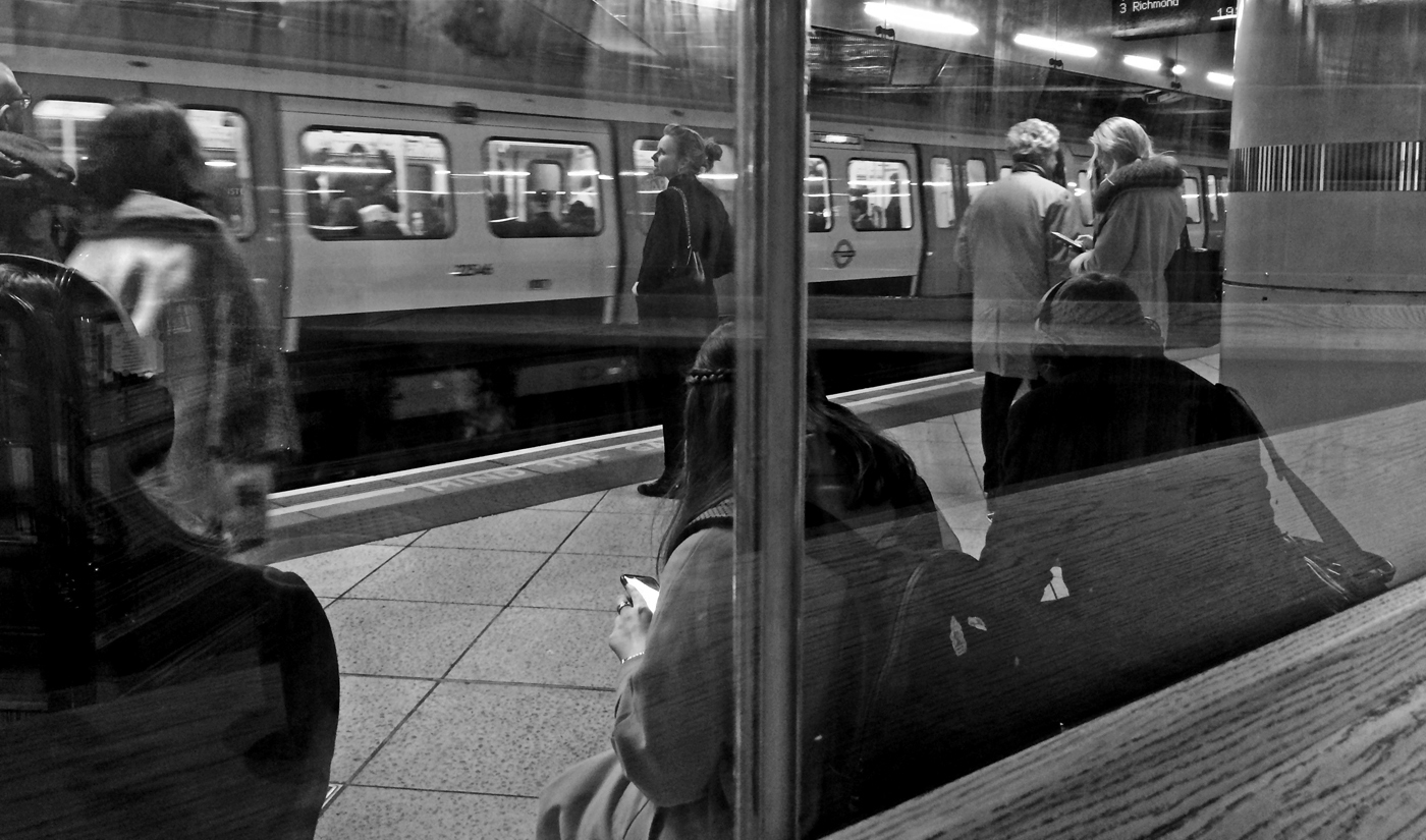
I found the central window frame a barrier to the photo and I think i would have preferred it to be to one side or the other. The view will vary every time you are there so you have the possibility of getting people in different positions, both inside and outside the window. That is going to be the key to which ones work and which don't. I like the train in the station and the passengers looking towards it but I found the left hand person's shoulder a bit overbearing. Would a crop off the top to remove the brightest areas of lights bring the eye down to the people? It might make it bottom heavy! |
Apr 5th |
 |
| 32 |
Apr 20 |
Comment |
I think if you want it to look old, then the silos should come off as they are clearly modern, so with the sepia toning, they shouldn't be there. However if you were thinking of using this in a PJ competition, then they need to be there as they give the weird combination of old and new which is such a feature of Amish farming. I managed to capture a similar shot but the team was driven by a man and he wasn't happy with having his photo taken. |
Apr 5th |
| 32 |
Apr 20 |
Comment |
I thought the image looked a bit 'muddy' so I tried various things. In the end I felt the best was putting the image into Nik and using my favourite 'Wet Rocks', because it upped the contrast and brought out the textures well. i did crop off the 2 lights on the left which meant a little bit had to come off the bottom to retain the best ratio. The bottom left corner had been a bit murky and the crop largely got rid of that as well. What do you think? |
Apr 5th |
 |
| 32 |
Apr 20 |
Comment |
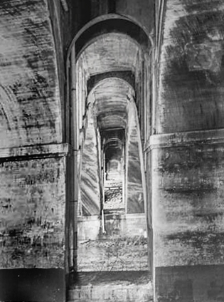
I agree with Stephen that the left hand side needs to be removed. I wondered whether you could change the perspective by altering the brightness-darkness of the arches. I had a go. I darkened the left side a lot and the right said a little, using burn tool. Then I used fill 50% grey on a second layer and again darkened the sides and lightened the central area. i decided the top could do with a crop to emphasise the receding arches and I thought they needed straightening, so what I actually did, was skew them by stretching the top corners up and sideways and the bottom left corner down and out. Now has it changed it for the better_ |
Apr 5th |
 |
| 32 |
Apr 20 |
Reply |
How odd! I know we read from left to right, but this has made a significant difference. It works as well because there are no words visible. Thanks! |
Apr 4th |
| 32 |
Apr 20 |
Reply |
OK. I'm still not very happy with my picture anyway. I think i should have used a much slower speed, but I was handholding, leaning up against the building on the left to try to stabilise myself, since i didn't have a tripod. I wanted the reasonable depth of field from F7 and trying the high ISO which usually gives huge grain which i thought would be appropriate for this type of image. In fact I am going to try adding grain as Stephen suggested. |
Apr 3rd |
| 32 |
Apr 20 |
Reply |
I liked the strong white streak along the platform which is why I left the people in the background, especially as it led straight to them. |
Apr 2nd |
| 32 |
Apr 20 |
Reply |
I think you are right -I do need to add some texture/grit to give a more desolate feel. i will try it. |
Apr 2nd |
6 comments - 8 replies for Group 32
|
6 comments - 8 replies Total
|


