|
| Group |
Round |
C/R |
Comment |
Date |
Image |
| 32 |
Mar 20 |
Reply |
We've been to Maine and visited Permaquid and I got a good photo which I have used in Internationals successfully. We did a lighthouse trip and again I got others as the weather was poor and the clouds good. Pigeon Point was particularly good. We keep meaning to visit the famous Anglesey one at Llanddwyn Island but that is definitely one which everyone else has taken and judges do compare when presented with it. |
Mar 29th |
| 32 |
Mar 20 |
Reply |
Now that is worth knowing as they are two a penny here. I shall try one of my storm pictures in a competition. |
Mar 28th |
| 32 |
Mar 20 |
Reply |
I'd like to think so! I do like the long exposure one like this, especially as I've never managed to get a decent one. The fact that I get asked back to clubs to judge more than once suggests they like my acerbic comments. |
Mar 27th |
| 32 |
Mar 20 |
Reply |
Yes, you've made the background fuzzier so the lighthouse stands out better. I tend not to use local pictures in local comps for the reason you've given although when I'm judging I like seeing what other people have done to a common view. If it is a good photo then it ought not to make a difference where it was taken. It is only bad judges who say they've seen it before so it isn't any good. We were told once that'99% of judges give the rest a bad name'. |
Mar 27th |
| 32 |
Mar 20 |
Reply |
when you say take off the right windmill, do you mean the crane on the frame edge or the turbine behind the lighthouse or the one on the right? When you said burn down the crane, I took it literally and then thought maybe you simply meant photoshop it down! i wasn't sure about removing all the elements of the dock scene. I agree -the colour sunset one is 'nice' but probably nothing more than that. The original colour, labelled as 1, is probably better than the mono. I liked the slight yellow tinge in the water, churned up by the active waves. Everyone living near here has photos of New Brighton in stormy conditions, as it is so accessible and safe. There were hundreds of people there, getting wet as the waves broke over the seawall and shrieking madly. Thanks for the critique. I may see you one day as under normal conditions, I am an L&CPU judge. |
Mar 27th |
| 32 |
Mar 20 |
Reply |
That's because we live on a peninsula between the River Mersey and the River Dee. This lighthouse is at the tip of the peninsula on the NE side so from the Wirral, we look across to the Liverpool docks area. Mostly they are no longer operational but further out towards the sea, they are still very much used. So you can see part of that area, part of the old docks with the city centre off to the right but not visible here. |
Mar 26th |
| 32 |
Mar 20 |
Reply |
Sorry you don't like the space I wanted! having seen what Bob did, I prefer it with the extra space, but as you said , it's all a matter of taste. |
Mar 21st |
| 32 |
Mar 20 |
Reply |
So you couldn't get them to look your way. Pity! Nice image anyway. |
Mar 19th |
| 32 |
Mar 20 |
Reply |
How annoying. If you aren't intending to use in PJ, then you could import a texture to fill the space. |
Mar 19th |
| 32 |
Mar 20 |
Comment |
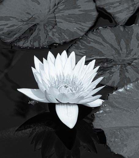
I also noticed the blue sheen probably most noticeable in the flower and Tom's doesn't show it. I would crop the top so the edge goes through the lily pads, making it a square format with the flower centrally placed. In fact I took off a little bit on the other 3 sides as well to place it exactly where I wanted it. |
Mar 19th |
 |
| 32 |
Mar 20 |
Comment |
What an interesting place! I would have been there taking lots of photos of the mannequins as well as the tattoos on people. They don't usually mind showing off their body work. I thin the folder in the mono image is fine-it does show up too much in the colour. I would darken down the bright highlights of the clutter behind the models. I noticed the dark line across the body but after a bit I didn't notice it so don't worry about it. I agree that cloning would be hard but if you have lots of time???? |
Mar 19th |
| 32 |
Mar 20 |
Comment |
I agree with Beverley that it needs a sky as otherwise the top part is just blank white. Skies are really easy as long as you can mask and then just paint in or out around the subject. I have a clouds folder for just this sort of image. i didn't like the head on the right and others seem to agree with me. I might try increasing the contrast of the lions as well to make them more dramatic. |
Mar 19th |
| 32 |
Mar 20 |
Comment |
I think you've done a sterling job with the conversion. maybe there is a slight falloff with the third cowboy but since he is the one right on the edge, I don't think it matters since the eye actually concentrates on the two slightly larger ones to the left. I would try darkening down the bright square of sunlight on the ground on the right and maybe the brightness of the third cowboy's boot. Other than that I like the image. |
Mar 19th |
| 32 |
Mar 20 |
Comment |
Sorry I haven't done my comments till now. I like this image, although I think i would have preferred a bit more space on the right and maybe we could have seen what they were staring at. I think the front dog simply has a bad hair day -looks as if he got it wet and/or dirty and owner hasn't taken the trouble to clean him up with a brush. The others look as if they have been brushed to give the silky effect. I like the mono conversion as I think the dogs stand out much better. |
Mar 19th |
| 32 |
Mar 20 |
Reply |
So the colour one is better because of the yellow in the wave, where it was churning up the sand. Thanks for visiting. |
Mar 16th |
| 32 |
Mar 20 |
Reply |
I think I agree with you both. The colour is better than the mono. |
Mar 3rd |
5 comments - 11 replies for Group 32
|
| 64 |
Mar 20 |
Reply |
I don't use Affinity because I started with Ps a long time ago together with Nik, so I've got used to them. Control points are wonderful because you can alter small or large areas and get exactly what you want. Yes, I agree that presets are usually only good for basic alterations but sometimes they can really make a difference and you can always set up custom ones for yourself. I like high structure and wet rocks for many of my mono images. |
Mar 27th |
| 64 |
Mar 20 |
Comment |
Hi, just visiting from my group 32 because Stuart visited me! I really like the treatment and I often use Nik for my mono images. I don't normally use their sharpened but I might try it now. I do use the point controls a lot though whatever preset I start with. I thought both the men were homeless guys and it doesn't matter anyway as the point of the image is the interaction between the two. i thought the tight crop on the right was very well done as the 'good' rucksack was too intrusive in the original. Well done! |
Mar 27th |
1 comment - 1 reply for Group 64
|
6 comments - 12 replies Total
|


