|
| Group |
Round |
C/R |
Comment |
Date |
Image |
| 32 |
Feb 20 |
Reply |
Thanks Ian. Yes probably does need darkening of the hands. I haven't used this in a competition yet but I shall be interested to see what a judge says. |
Feb 19th |
| 32 |
Feb 20 |
Comment |
I also like this version -the lighter sky really works here! |
Feb 18th |
| 32 |
Feb 20 |
Comment |
Now I disagree because I think the colour is nicer than the mono-the colours seem to complement each other. I don't think it would get anywhere in International comps but if you needed it for a manmade local comp then it would be fine. I noticed the sparkles as well. Maybe this could be used as part of a montage with other architectural images to show a specific building? |
Feb 2nd |
| 32 |
Feb 20 |
Comment |
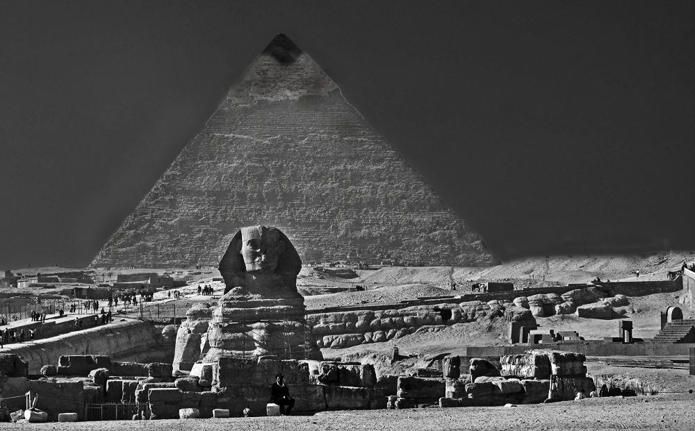
I've tried all sorts of things and discarded many of them. The best seemed to be creating a mask so the sky was selected and making that much darker so the pyramid stood out. I also made the pyramid more contrasty so the texture and the cap would appear more-I made a mistake with this so the cap got altered in size but I was working on a small image and I think i would have gone back to the original to get better results. I also had to use shadow/highlight command to improve the dark areas at the bottom and make the guy in the middle stand out more. I definitely haven't done a good job but I think with more time and a bigger image it ought to be possible to get a better result. I do think it's worth having another go. The sphinx needs some more work to bring out the shadowed area. |
Feb 2nd |
 |
| 32 |
Feb 20 |
Comment |
Orchid flowers are so beautiful and so difficult to take because they grow together up the stem. I find it a bit jumbled together because of this. I think the mono is better than the colour as taken as the background does impinge on the flower. I agree with Stephen that the background still needs some work in the mono. i also wondered whether the very dark leaves/petals on the far right and far left are actually too dark. They pull the eye away from the central flower. Could you try bringing out the shadow detail in the dark parts? i do like the water droplets. |
Feb 2nd |
| 32 |
Feb 20 |
Reply |
Thanks. i still think it may be too posed looking. |
Feb 2nd |
4 comments - 2 replies for Group 32
|
4 comments - 2 replies Total
|