|
| Group |
Round |
C/R |
Comment |
Date |
Image |
| 32 |
Dec 19 |
Reply |
You probably have all the email addresses for our group but if not let me know. |
Dec 28th |
| 32 |
Dec 19 |
Comment |
I agree with To that my eye went straight to the white, blank sky but if you cropped it off then you lose the top of the arch on the right, which then looked wrong. So instead, drop a cloudy sky into the space and it takes away the problem. i found the muted colours of the original very interesting and I also like the warmth you imported in the mono. It is a good representation of the alleyway but I felt you hadn't quite made up your mind which side should be dominant. The left has all the drainpipes and the bow windows but the right has the archway. I tried cropping the arch off so my eye was forced to look more at the left side and I lightened the shop front windows. Try it and see. |
Dec 20th |
| 32 |
Dec 19 |
Comment |
I'm going to disagree with the others. I prefer the colour because the dresses appear brighter as do their faces. I like the red things in her hand though I'd get rid of the red on the pole in the left background. i found the bright sky too much in the mono but not so bad in the colour. OK, it's not really suitable for competitions in either colour or mono, so I'd sick with the colour for the family album. I agree the two stances are interesting -take some more o them separately, against a better backdrop and see what happens. They'll probably be very happy to pose if they are dancing because then they are showing you something and not just 'having their photo taken' by Granddad. |
Dec 20th |
| 32 |
Dec 19 |
Comment |
Me too! I like the sepia treatment. I wondered whether you could increase the contrast just a bit on the front of the train as sepia always loses contrast. We don't have trains like this in GB so they always look strange and wild west to us Brits! |
Dec 20th |
| 32 |
Dec 19 |
Comment |
I found the knife well represented, although I wondered whether you could lighten the letters a little bit, as I didn't immediately notice them. I found the large apple too dominant in the image and I wondered whether you could angle the camera differently so the knife entering the top would be shown rather than the side of the apple. I do like the texture of the knife and the feeling of age. |
Dec 20th |
| 32 |
Dec 19 |
Comment |
I agree that the capture is good. It isn't posed in any way so fits the Pj criterion well. I much prefer it in mono as the pale blue does detract from the image. Do you enter Internationals? Try it in a Pj comp. |
Dec 20th |
| 32 |
Dec 19 |
Comment |
Just realised how the days have flown by. I like Rick's crop and I prefer the slight offcentre look. I don't object to square format for landscape when it is something like this which lends itself to square. The scene is beautiful and you were so lucky to get the snow. Both colour and mono are attractive in their own right -use the former for your Christmas cards and the latter for competitions. |
Dec 20th |
| 32 |
Dec 19 |
Reply |
Thanks Michael. I shall try it in competitions and see what people say, though probably not round here as everyone has photos of the cathedral and it's not seen as different. |
Dec 10th |
| 32 |
Dec 19 |
Reply |
Yes, you have to elongate it upwards to avoid the squattiness. |
Dec 10th |
| 32 |
Dec 19 |
Comment |
I had left it with the sloping viewpoint because all the angles seem to point up to the crown of thorns, but I couldn't decide whether to correct or not. I probably haven't got enough above the tower to straighten completely. The angles still show the upwards look on your view. Thanks |
Dec 10th |
| 32 |
Dec 19 |
Reply |
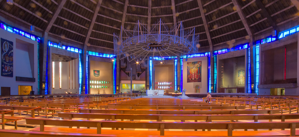
It isn't a garden -just a concrete pathway around the building. The whole thing is made of concrete so it is very stark. However the interior is quite different as the stained glass in the tower creates beautiful colours when you look up and the circular shape is quite different from any other cathedral. Here is a shot inside. |
Dec 9th |
 |
7 comments - 4 replies for Group 32
|
7 comments - 4 replies Total
|


